Dr. Michael Kampourakis wanted a website that combined his lighthearted nature with a design that would be attractive to visitors. Understanding the fear some people have of dentistry we created a website that looked decidedly less clinical than typical dental office websites while retaining the professionalism that instills confidence in visitors. Everything from the color choice to background patterns and the layout was tailored for this goal, resulting in a website that is pleasant to behold.
Overview Of The Design
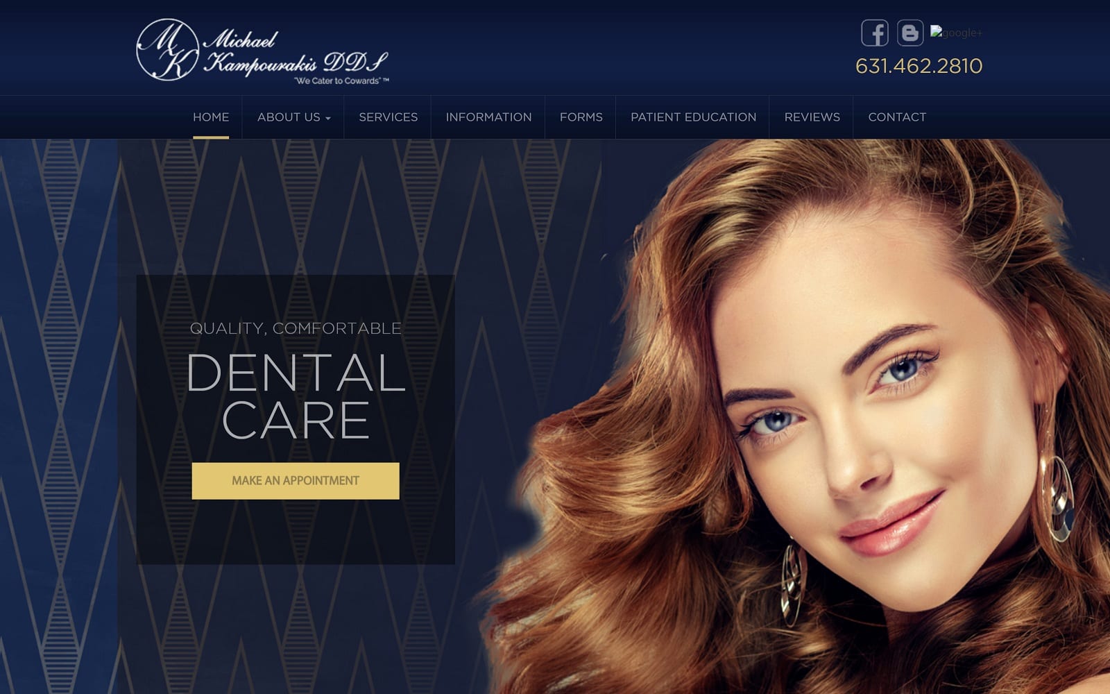
Dr. Kampourakis’s dental website is designed with an elegance that makes it appealing to the eye while remaining accessible and informative. The prominent display of the company’s logo gives the page an air of distinction, while the motto makes it lighthearted. The rest of the webpage prominently displays images of happy customers with shining smiles, promises of what a visit to this office can bring to their patients.
Use Of Colors
The images on this website are showcased by their stark, bright contrast against the dark blue background, presenting the results patients can expect while also showing that they are the center of the practices concerns. The primary colors in this website are a deep graduated blue, a color that traditionally is used to instill trust and ease worries in people, making it a popular choice for medical facilities and websites alike. This dark blue is complimented by the gold used for accents and buttons throughout the page that draws the eye to its action points. As the blue fades to black, it introduces a color associated with authority that can help calm anxiety in those who have concerns about the provider’s proficiency.
Analysis Of Design Elements
This website is designed with the goal of instilling comfort and security in the face of what can be an anxiety-filled experience. There is a professionalism to it that blends beautifully with the tongue in cheek motto ‘we cater to cowards’ that reassures nervous patients that this a dentist who knows their business. With the instant introduction of a button pointing to an appointment form and the phone number displayed prominently at the top, this website is aimed at grabbing anxious patients before their nerve breaks. The rest of the website contains comprehensive information to help soothe the nerves of those who prefer to confirm everything about their practitioner.
Marketing Aspect
The website tailors to an affluent group and set of neighborhoods, as well as those who are capable of laughing at themselves. This kind of lightheartedness helps to draw in those who are looking for a careful, patient doctor who’s willing to work with clients who have moderate to high levels of dental anxiety. The social media links at the top encourage connecting with the provider’s accounts, while the prominent appointment form helps in collecting email information from website visitors.
The Image this Website Reflects
This website reflects a good-natured practitioner with a sense of humor and a taste of style and elegance. All of the various elements in the website come together to reflect these aspects while retaining a clinical, if approachable, feel.
Michael Kampourakis, DDS Designed by Optimized360


