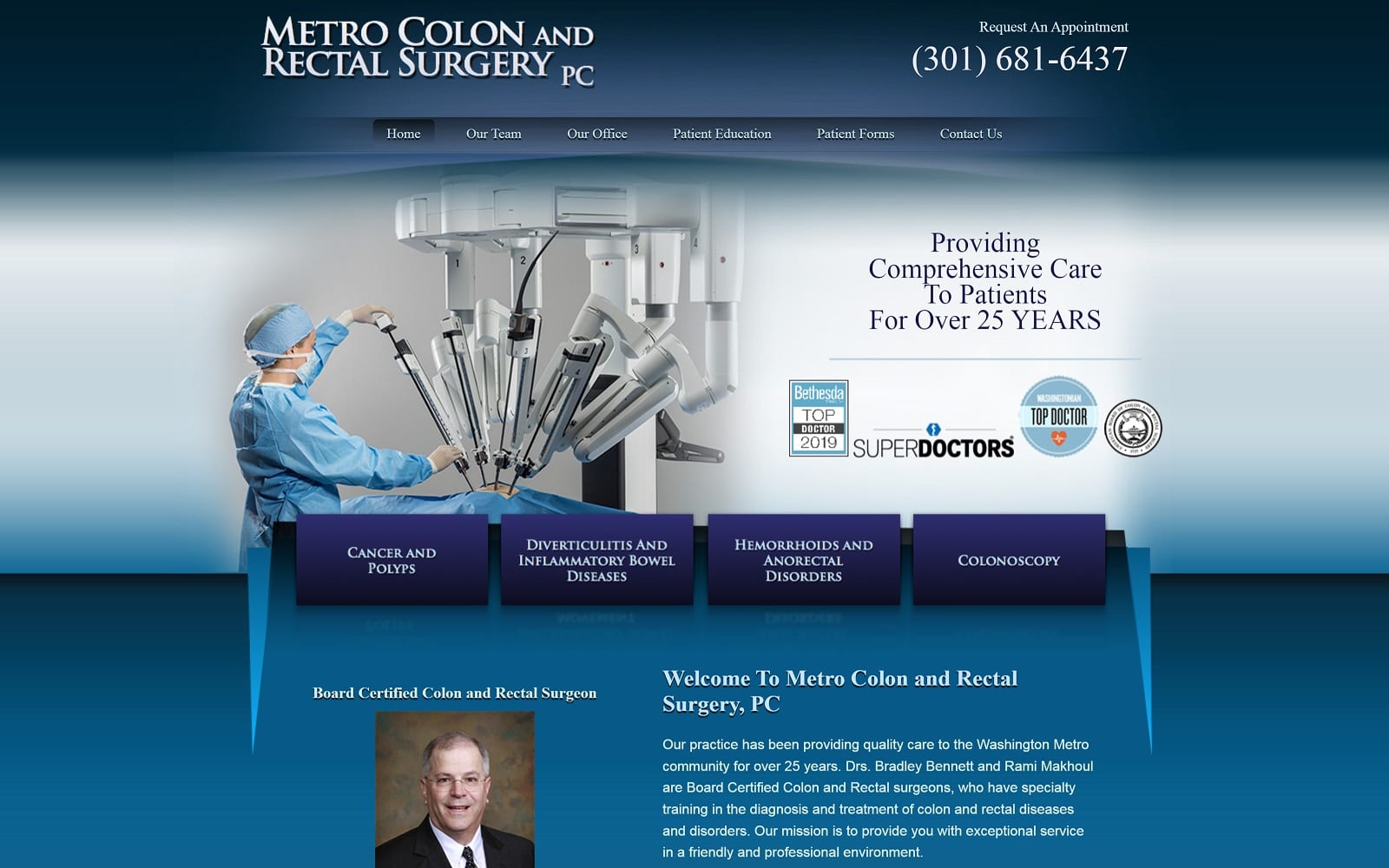
Dr. Bradley H. Bennett is a Board Certified Colon and Rectal surgeon, who has specialty training in the diagnosis and treatment of colon and rectal diseases and disorders. The client wanted a clean and professional medical site that patients can easily navigate. The site is more of a traditional design with plenty of depth, color, and texture based on the client’s wishes. However, a traditional design does not have to be a particularly boring design. We managed to integrate a professional and sleek design to match any surgeon’s needs.
Design Overview
The main focus of Metro Colon is providing comprehensive care for their patients. They have been in the medical field for over 25 years – we were given the duty of designing a website to match the drive and determination of the team. When you first visit the website, you are instantly grabbed in by the dark blue colors synonymous with the medical field. In bold font, we see the mission statement and a still image of the advanced technology Metro Colon and Rectal Surgery has in their arsenal. Right under the banner, we see the different services Dr. Bennett has to offer. All in bold, legible font as always.
Use of Color
We also accommodated for the specialty by using a baby blue and dark blue color scheme when designing the website to add to the healthcare profession. Combine that with a simple but effective navigational homepage and you have yourself an engaging website for both the younger and older audience. Patients who have confidence in the professionalism of their practitioners have less anxiety and a strong sense of faith during the entire experience, so it was vital to include these visual elements in the design of this site.
Elements of Design
Dr. Bennett’s website living proof that a fancy website is not everything. When you have the credentials and rewards to back you up, the traffic will come to you without much effort. The website’s contact page has all the information to both his Germantown and Rockville office locations with an appointment form for those who wish to inquire further. The navigation toolbar is basic but effective. His patient education tab is home to a lively amount of information that can be useful for patients battling with different rectum or colon issues.
Use of Images and Visuals
Although the website lacks photos, the plethora of information supplied alongside simple navigation is more than enough for a committed customer to make their decision. The website is a clear reflection of the team’s priorities and goals within the industry. Why need all the glam and glitz when you can have all your hard work and achievement do the talking for you?
Marketing Aspect
When you combine all the imagery and visuals with the rich amount of informational volume, you have the blueprint to successful website design. We implemented multiple links to their social media throughout the various web pages. If you ever get lost, all the contact information is located on the top and bottom banners of each web page. As an additional bonus, they also list their new patient forms directly on the website. This allows optimal access and less paperwork when it comes time to swing by their Maryland office.


