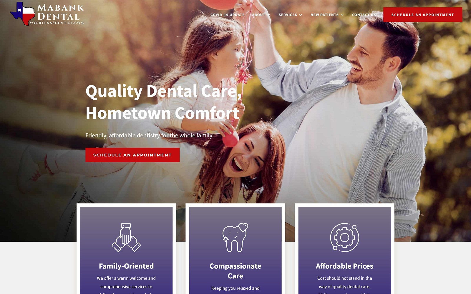
Servicing the Texas community since 1979, Mabank Dental focuses on a wide range of general and specialty dental services while providing optimal treatment options and patient comfort. We designed a website that would help highlight the different services offered at Mabank Dental while retaining its connection to the hometown community.
Design Overview
The website has a modern, professional appeal that stands to educate and inform the incoming web-visitors. Our navigation menu breaks down the services, testimonials, and educational patient information offered from Mabank Dental. The home page immediately gives a sense of community – there are actual pictures of the dental office along with the dental staff. Down below the rotating image gallery, we also included links that redirect web-visitors to the different services offered.
To read more about the importance of redirecting web traffic for SEO purposes, click HERE.
We also made it especially easy for incoming patients to request an appointment or meet the team through a customized widget. This widget is available on every web page on the right-hand side.
Use of Color
Since we were dealing with a dental specialty, we figured it would only be right to incorporate a light blue hue when designing the color theme. The site is predominately featured with a mixture of blue. This allows for optimal reading accessibility. Darker tones of blue for headers; lighter tones of blue for the background design. Most of the information on the website was to inform. We kept that in mind when choosing the color theme. The mixtures of blue are easy on the reader’s eyes. This allows them to digest the information in front of them with ease. The last thing you want to do on any website is to steer your readers away by using a harsh color theme.
If you are having trouble deciding the right color scheme your brand or website, watch this short 2 minute YouTube video by Neil Patel.
Design Elements
An optimal website design will share some key elements. If your elements of design are not attractive, you will end up losing out some incoming web traffic.
Spacing – We made sure all the spacing on the website would allow optimal reading accessibility for the viewers. We implemented square borders to hold a balance between text and images on the website. Framing is absolutely critical to web design.
Navigation – No matter where you are on the site, the navigation bar will always be available to you. You are never more than a couple of clicks away from where you need to be.
Visuals and Images – All the images on the website give the impression that the Texas natives are approachable and friendly. There are also videos on the website for more visual patients.
To learn more about web design basics, here is a short 3 minute YouTube video to get you started.
Marketing Aspect
Establishing patient expectations about your team’s mission for dental care is a great marketing tool. Not only does this set the stage to begin the patient-doctor relationship, but it also shows them that you care about your patients on a personal level. Mabank Dental has a tab on the navigation menu dedicated to explaining the dental process from start to finish.
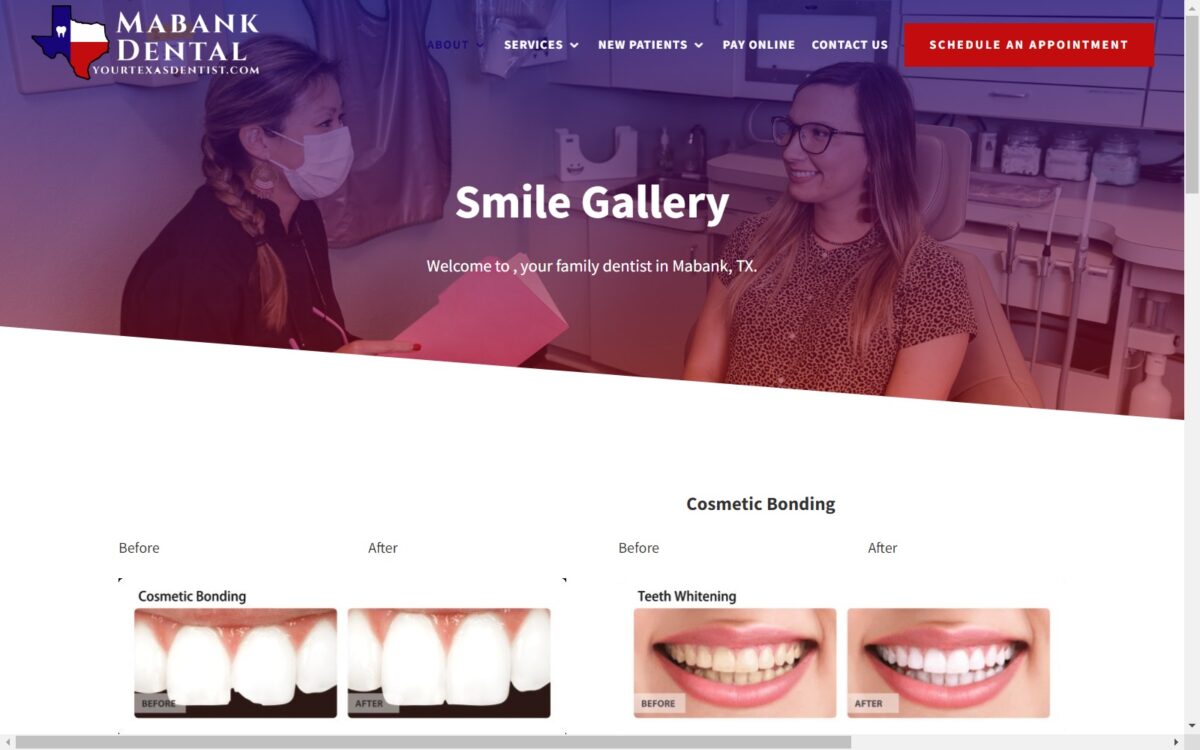
The gallery also displays before-and-after photos for patients to view. We also placed links to the dental team’s social media on the top and bottom banner of each web page.
