Dr. Mona Sidhu is proud to provide her patients with the best in dental technology, treatment options, and patient comfort. The treatment rooms at Smile Line Dentistry are cutting edge and designed with the patient in mind. They have invested in state-of-the-art dental equipment, including advanced sterilization equipment that exceeds federal and industry standards. Her staff members are more than ready to help you feel comfortable at Smile Line Dentistry.
Overview of Design
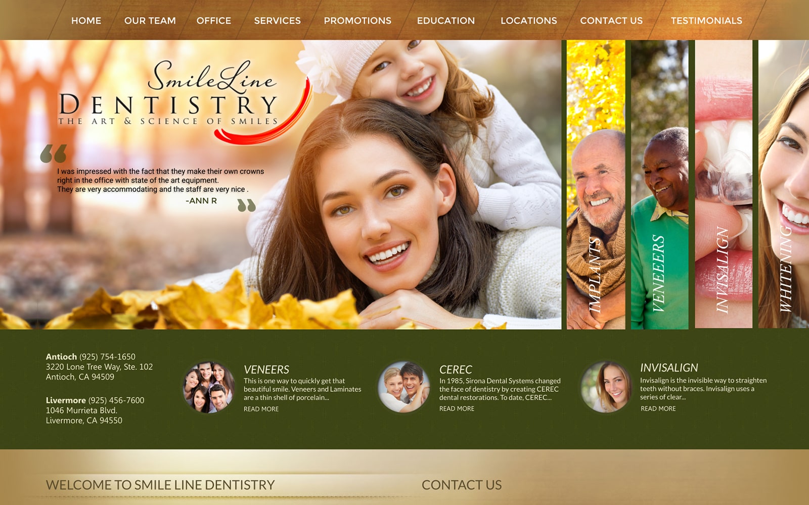
The website design is simple and easy to navigate. The navigation toolbar located at the top of the page makes it extremely easy for guests to view the services and promotion offered at Smile line Dentistry. There is also a convenient tab for visitors to examine before-and-after photos and their team accordingly. The site’s layout is laidback with testimonials sprinkled accordingly in plain sight when you first open the page. It is a great way to highlight the achievements that Dr. Mona Sidhu has done for both her team and her patients.
The greatest thing about Dr. Mona Sidhu’s website design is that there is no need for flashy aesthetics. Everything you could need is either on clear display on the navigation bar or on the landing page itself. When you scroll down the landing page past the testimonials, you will find an easily accessible contact page and a brief description of the doctor herself. The quality of her work defines her practice – the website is clear proof of that.
Use of Color
This dental website was created with warm color tones and clear text allowing patients to comfortably navigate the site. Dr. Sidhu wanted to emphasize her knowledge of advanced technology in treating patients in addition to providing great service. The overall design and color scheme is simple and effective. There are natural undertones and themes integrated with both the display pictures and colors used throughout the website. The wood brown compliments the olive green accordingly to match the website’s vibe accordingly.
Marketing Aspect
Overall. the website’s optimal nature theme in addition to the extremely simplistic display is great for both the young and old audience. Everything is accessible and easy to find along the wood and olive green color-way. This helps to minimize traffic buffering and unnecessary loading times as the website is direct and to the point – patients are the number one priority. The team at Smile Line Dentistry make that clear through a direct reflection of their website.


