Dr. LaRue, along with his team of friendly and helpful professionals are committed to providing their patients with the highest level of dental care in a pleasant environment. Dr. LaRue understands the dental anxiety that often accompanies patients heading into any dental office. He wanted to ensure that his website design would educate and encourage patients while being sensitive to their concerns and fears.
Design Overview
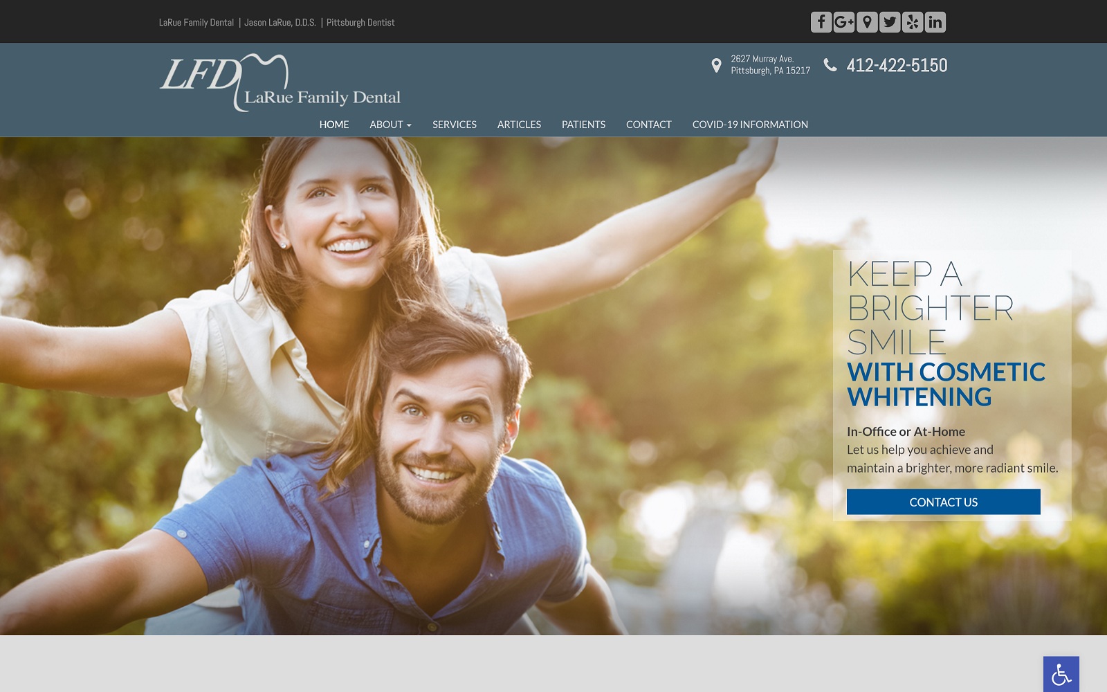
To ensure that patients would feel welcome heading into the dental office, we made sure to highlight the different services offered by Dr. LaRue. We also made sure to add past reviews and contact information to the office as well. We made sure the home page was also warm and reassuring for site visitors. We incorporated friendly images to give the impression that Dr. LaRue is approachable and professional.
We used a full-width navigation page to ensure that the website would feel modern and up to date with the competition. A great site design will have some key contemporary features. Click HERE for 5 Signs that Your Website is Outdated!
Use of Color
The background of the site is focused on using light color tones to ensure a sense of hope and relief to the patients. To complement the dental industry, we used dark blue to highlight certain calls to action. When used in combination with the other images and colors, blue creates a welcome contrast that presents the site as cheerful and modern.
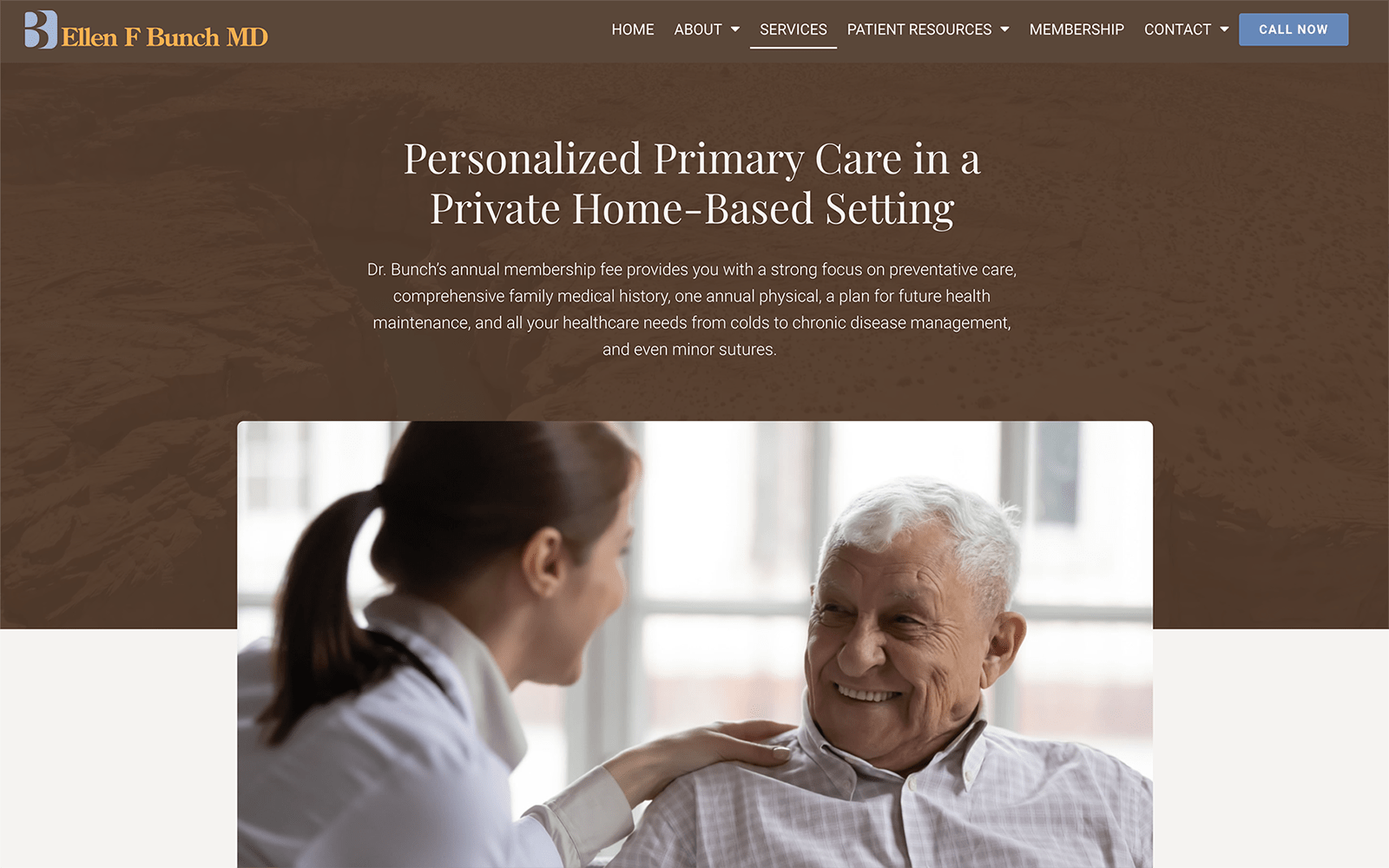
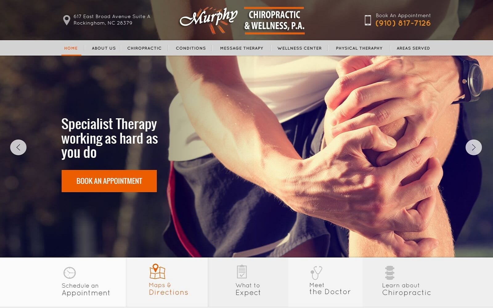
Here are some other examples Optimized360 has successfully delivered to their clients that implemented blue in their website design:
Elements of Design
The navigation menu features drop-down elements for additional information. Since Dr. LaRue’s main focus was to educate and inform, we made sure to include a separate tab on the menu for articles and patient use. The patient tab has directions to the office as well as new-patient forms as well.Making a lasting first impression is important. To add a personable touch, we also included a contact form on the home page as well.
When designing any website, formatting is particularly important. We ensured that we allowed open space for readers to steer and maneuver through. No one likes a cluttered page. We kept the formatting on the simple side – rich in informational volume, dense in quality. To keep the text and imagery in complete harmony, we implemented the use of square borders throughout the website.
Marketing Aspect
No dental website is complete without social media nowadays. We included widgets to Dr. LaRue’s social media platforms on the bottom and top of each web page. The entire website emphasizes the importance of maintaining a healthy smile through cosmetics. Smiling faces and happy patients represent the practice on the home page alone. It is an image that is a clear reflection of the services offered at LaRue Family Dental.


