The Ottawa Dental Team are a dedicated group of dentists focus on patient priorities at all costs. They understand that having the right group of dental hygienists can make or break a consistent oral hygiene routine. Dr. Haysam Shaaban, certified in implant dentistry from the University of Toronto School of Dentistry Implants, finds the field of cosmetic surgery both rewarding and challenging. As a result, he wanted to implement those very same features into his website to showcase his diversity of services offered.
Overview of Design
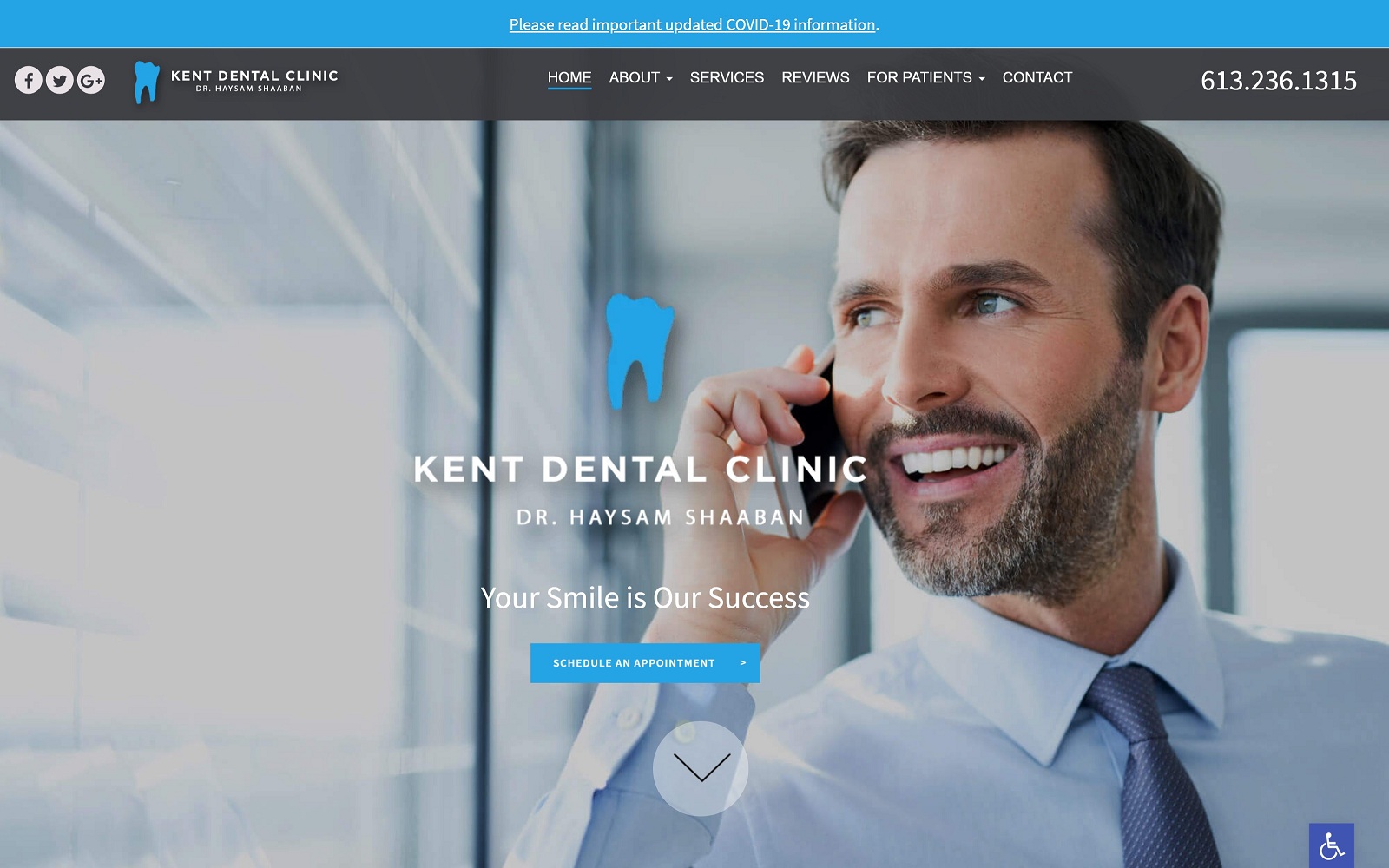
When visitors first enter the website, they will immediately notice the ample white space utilized. When dealing with dental work, patients will more than likely be anxious about the procedure. We used white space to provide a sense of professionalism and comfort. The homepage welcomes visitors with plenty of smiles through our rotating gallery. We also listed the different services available for easy access as well.
Design Elements
We catered the style of the website to fit the dental specialty in mind. When you enter Kent Dental Clinic, you are greeted with a modern interface. A clean and open website with rotating photos that highlight the professionalism that the Ottawa dental team displays at all times. The concise navigation bar allows patients to search for their intended purposes with ease. With a dropdown menu available, Kent Dental is all about being precise and efficient.
Use of Color
Blue, white, and grey are all incorporated to fill the dental theme at hand. We went with something that would be easy on the eyes, yet legible from afar. Combine that with the ample white space in the background, and you have the recipe for a strong color palette for the eyes. We all know that going all-in on fancy website gadgets can cause a ton of distractions. With all of Dr. Shaaban’s certifications and experience, there is no need to show off. In this case, less is much more.
Marketing Aspect
In addition to a clean interface, the website features ADApt security, rich with special effects. For security purposes, SSL has also been added to the website. Just like all the professional photos on the site, features of the website’s core directly reflects Dr. Shaaban’s attention to detail and care when it comes to handling patients.
Image the Website Reflects
All the smiling faces in addition to the slick navigation throughout the website make for a welcoming website for both younger and older patients. The website’s colors are professional, yet simple – also appealing to a wide array of patients. Overall, the website is modern and classy – just like dental practice at hand.
Kent Dental Clinic Designed by Optimized360


