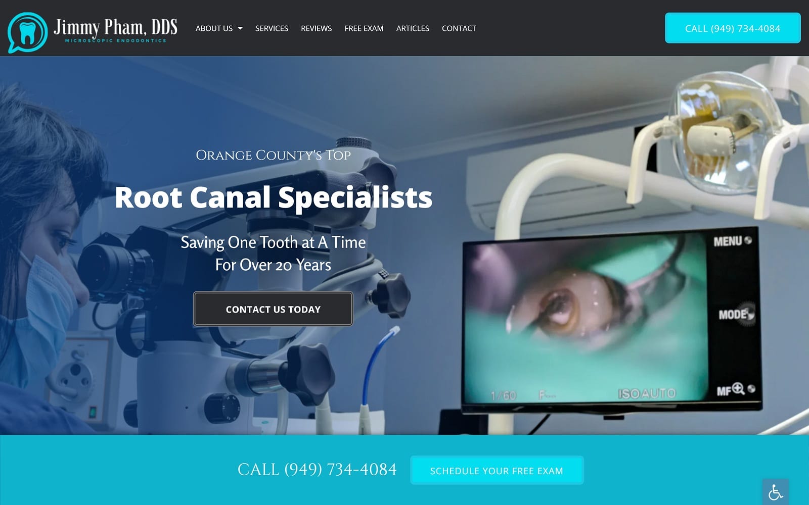
Irvine Endodontics understand the fears of the removal of root canals but emphasize the importance of it improving your oral healthcare. They try to relieve the discomfort that their patients are experiencing while making them feel comfortable in their center. Dr. Mansouri is great at what she does as a root canal specialist and will make sure that she makes the experience well worth it. She will be there through every step, from the procedure to recovery. She and her team are there to answer any questions regarding their office and will reassure of any decisions.
Design Overview
The website we have designed for Dr. Mansouri is a direct reflection of the color she has chosen for her practice. We have added some great features to enhance the website. There is on-site SEO which puts them above their competitors. Specialty content has been created and personalized for Irvine Endodontics. There is a website editor that Dr. Mansouri can utilize and website support she can contact. This is one of our best endodontics websites.
Use of Color
The color palette chosen is the optimum combination of soft and bright giving a soothing essence to the whole website. Purple gives a sense of security and at homely vibe. It represents the very nature of Dr. Cho and how he treats his patients at his facility. Dental work can be daunting, especially if you are unprepared. The colors we chose on the website will help counteract this issue from the very start.
Design Elements
As is appropriate for a professional site of its type. The root canal specialists avoid presenting a cramped appearance. While densely packed information isn’t always negative, the nature of the issues faced by visitors means that a clean and easy to manage interface is necessary. The open and airy design helps to carry through the impressions it opens with.
• Space – The openness of the site carries through to every aspect of the site, with the sole exception being the FAQ section, which still maintains a clean design by contains a significant amount of information in a small place.
• Navigation – The implementation of the hamburger menu makes the whole site easy to navigate, if you don’t find what you’re looking for by scrolling through their informative home-page, you just click the menu in the upper-right hand corner for immediate access to all other areas of the site.
• About Us – The About Us Pages are very clean and demonstrates the personal and professional attitudes of the staff incredibly well. One more demonstration of the straight-forward and open design of the site is present in these pages.
• Contact Information – For those seeking oral treatment there is often a sense of urgency, which is the driving reason behind the phone number’s prevalence placed at the top of the opening screen.
Marketing Aspect

Throughout the web pages, there is a constant acknowledgment of dental anxiety. From the mission statement to client testimonials, it is easy to understand that root canal work is no cake-walk. We made sure to emphasize Dr. Cho’s use of the most advanced, and up-to-date dental technology to ease patients visiting the site. Along with dental anxiety, dental work is not cheap! Dr. Cho also accommodates for his patients with in-office promotions as well. We made sure to highlight these promotions on the website banners accordingly.
Image the Website Represents
From the purple color theme to the delicate typography laced throughout the website, this root canal website represents the gentle, caring nature of the Irvine staff.
