New design idea

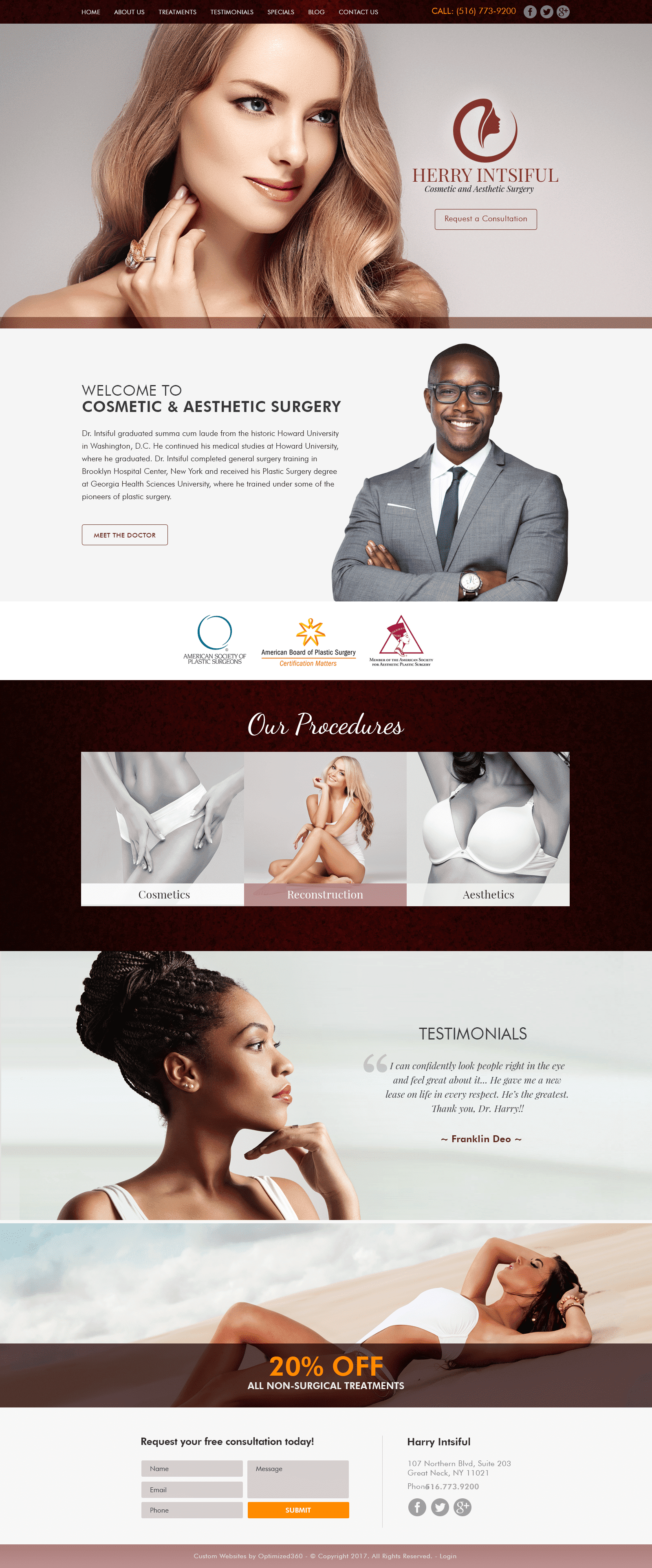
Dark brown, bright yellow-orange, tiger lily pink, and cognac red are all colors that bring warmth, complexity, subtlety, and passion to the forefront of Herry Cosmetic’s website design. While dark brown’s used as the warm neutral, tiger lily pink and cognac red help bled each division of the home page together to flow pleasantly throughout, creating an elegant, almost feminine design. Its choice in bright orange creates a vivacity to the website’s structure, attracting the visitor’s eye towards intricate and essential parts of the website’s makeup, making it the action color. By incorporating cream-colored imagery that’s aesthetically pleasing, its divisions are able to take up the space provided, giving way to large, encompassing, and intense visual experiences. Combine that with its choices in font text and overall layout, Herry Cosmetics showcases a picturesque, harmonious, and modern design that’s timeless.
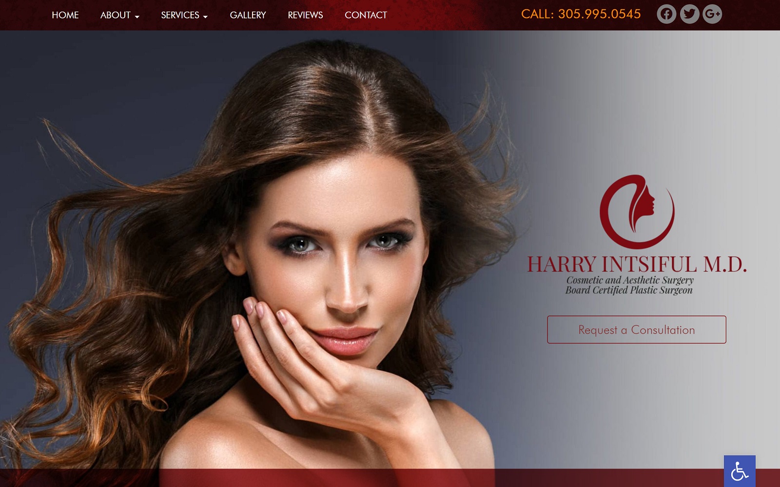
Herry Cosmetic starts with a transparent header containing its main menu section, social media icons, and click-to-call number. Its hero image consists of the business logo and action button, decorated with a thin, translucent border for the next sections. Its divisions contain layered pictures in combination with transitional pieces, semi-flat design, and slideshow applications, its biography section, services section, and testimonials help to highlight the critical aspects of the business. Near the footer of the home page, a discount can be shown for first-time visitors and patients for increased interaction and interest. At the footer of the page contains the HIPPA contact us form, social media icons, and the necessary information about the business, which includes the address and click-to-call number.


