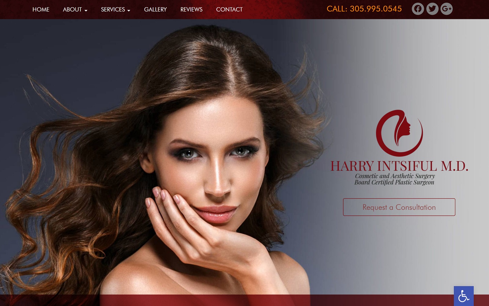
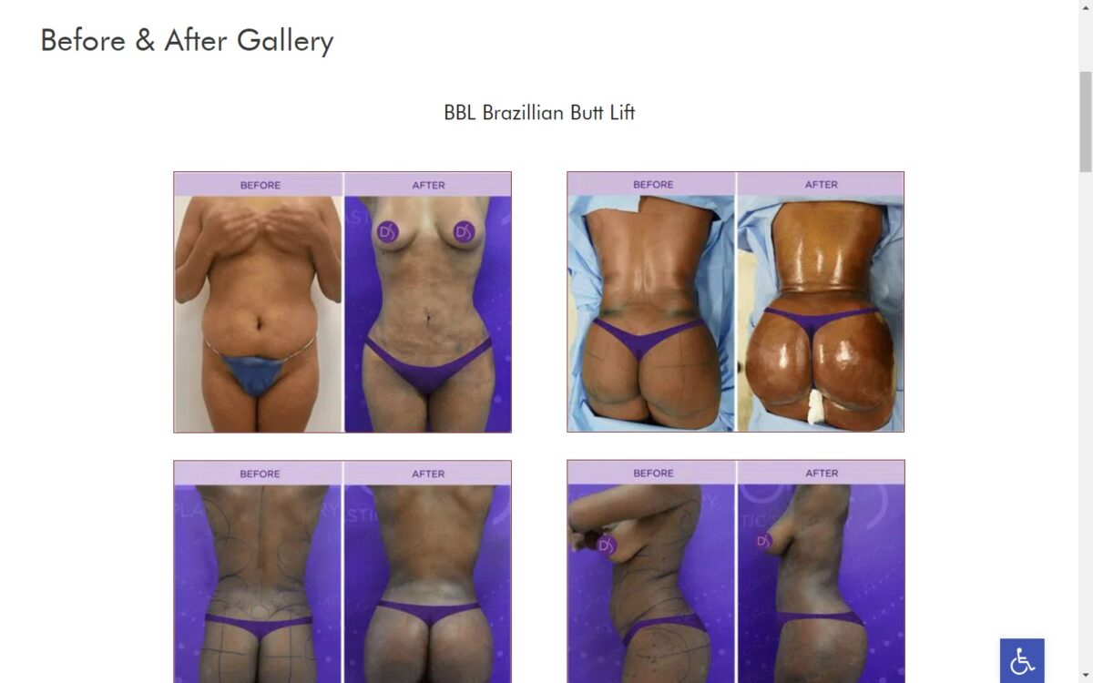
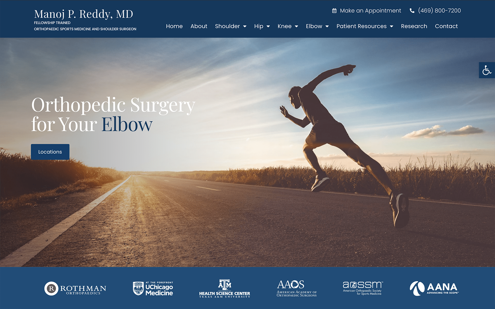
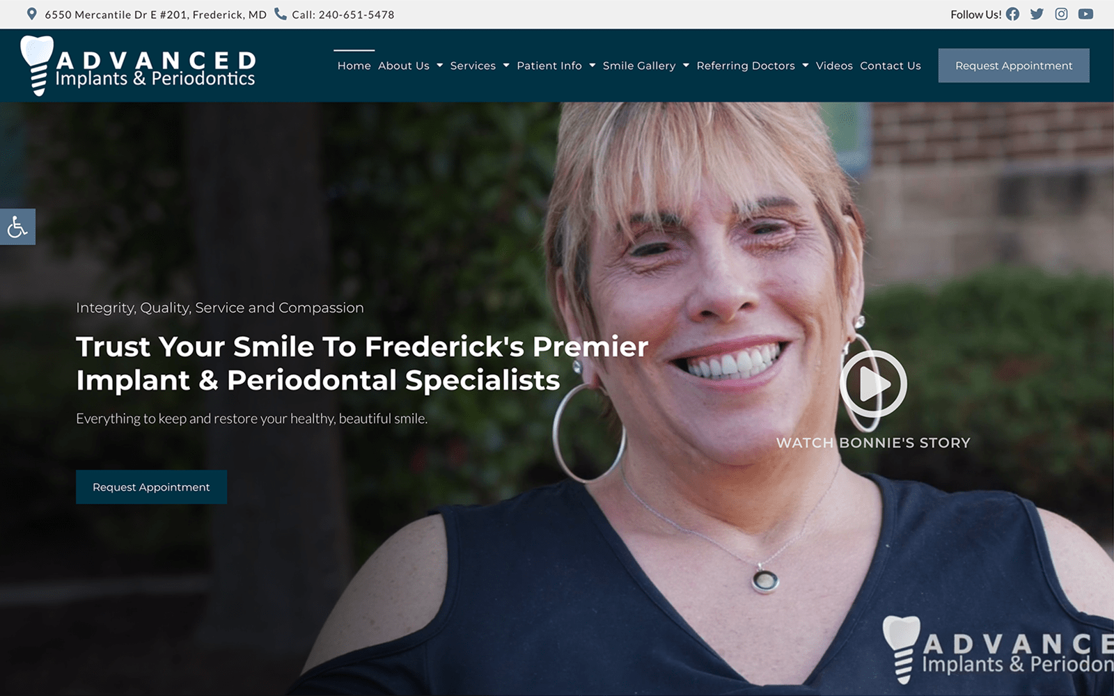
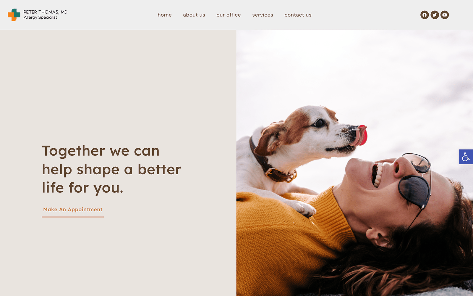
Harry Intsiful is a cosmetic and aesthetic surgery office. When dealing with any sort of aesthetic specialty, every small detail placed onto the website matters! When developing a cosmetic site, we ensure that all the visuals, typography, and elements of design match the specialty at hand. Visitors will find our dark-red, classy website an absolute treat when shopping around for cosmetic work.
Overview of Design
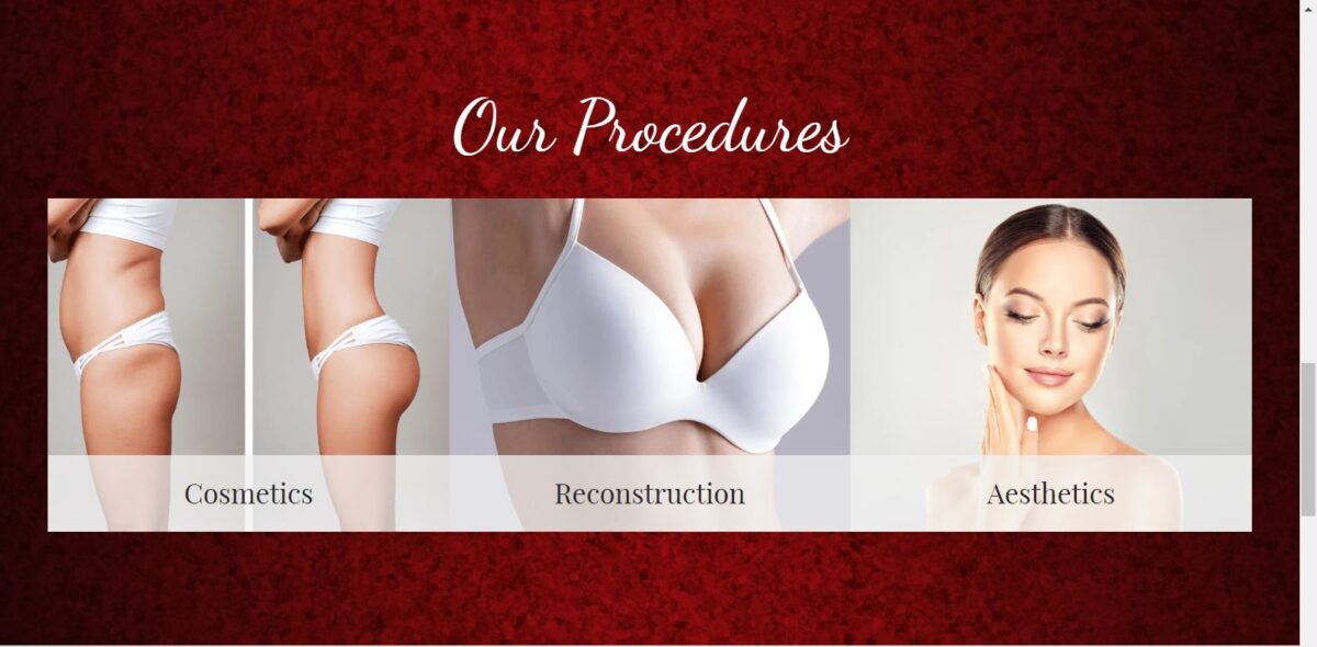
Surgical work should always be taken seriously. Patients need to ensure that the doctor they commit to is reputable, trustworthy, and experienced. We made sure highlight the services Dr. Harry and his team offered, along with previous testimonials on the navigation menu located on the top of every web page. To match the navigation menu, we added a rotating testimonial gallery and additional links to redirect new visitors to the different services offered. The imagery on the website, and the home page, in particular, all feature models that reflect the overall impression that the practice is here to help. This can be a great way for new patients to get a sense of familiarity and preview with the office staff and office building. This can help uplift patients who are on the fence about getting cosmetic work done.
Use of Colors
When you are marketing for any website, you want to make sure that the colors you provide match the specialty. We never want the color palette to overshadow any of the actual content on the site. The colors we chose to complement the typography and the overall layout of the website. To give an additional layer of comfort and ease, we implemented a color theme that would be eye-catching while also professional.
Red is used to give an energetic, yet urgent feeling about changing the way patients look and feel. Red also represents self-love that patients will have for their looks and bodies after the procedure is completed. When paired with the white background, you have for a stunning color theme that is both sleek and also professional.
Analysis of Design Elements
When incorporating multiple elements of design in any website, you want to make sure that everything flows together. We made sure spacing was expertly managed throughout the site by using white space to establish image areas and frame text. Navigation is spacious. No matter which web page you are on, the navigation menu is always available.
Actions speak louder than words and that is what Dr. Harry’s website represents. The website is kept simple and easily accessible to the visitors for smooth navigation. No extra pop-ups are used on the website to avoid clutter hence giving the website a fresh and clean look like the cosmetic procedures at hand.
Marketing Aspect
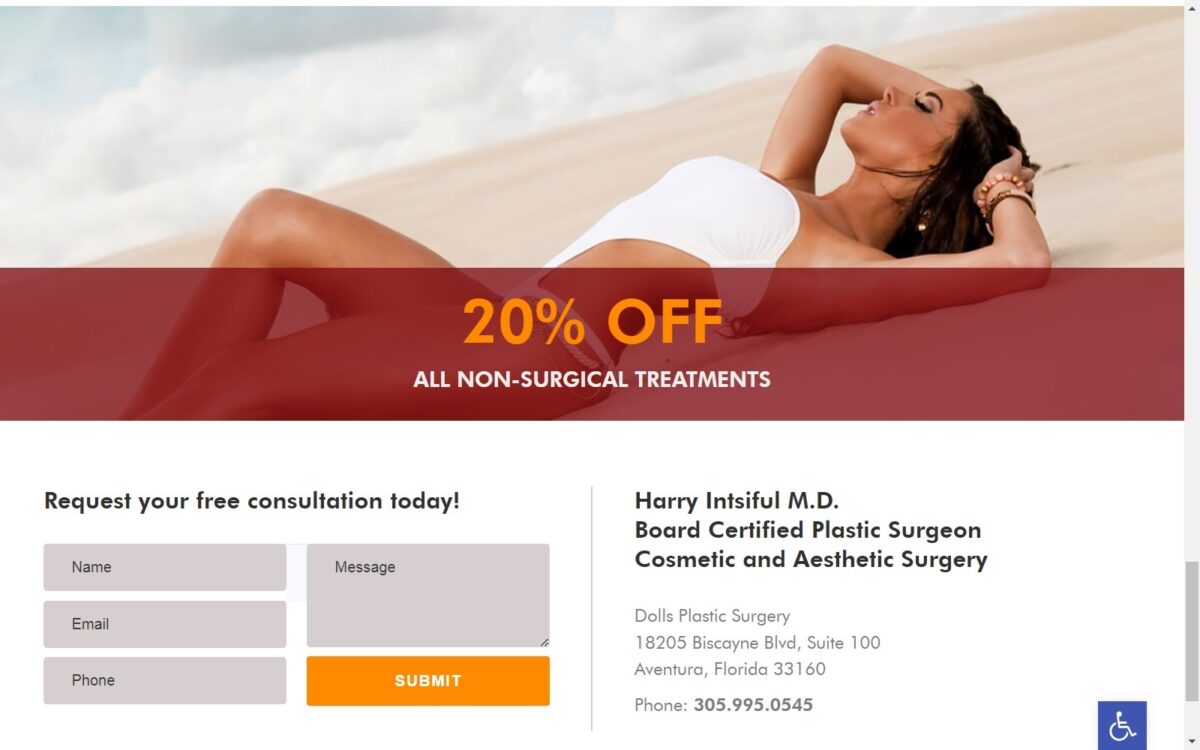
Cosmetic services are not cheap. Closing the deal and persuading patients to commit are strongly emphasized throughout the website. The testimonial slideshow is a great feature on the website that helps the patient come to a final decision. There is also an emphasis on diversity and class – no one should ever feel left behind when it comes to looking better! Dr. Harry understands that patients visit his website with disabilities. The website has integrated ADApt, conveniently helping the disabled achieve the most optimal web experience possible as well!
Image the Website Reflects
For clinics that focus on primarily cosmetic treatments aimed at improving the beauty and boosted confidence, there no better designs than Dr. Harry’s website. From the classy color theme to the use of models in his visuals, patients will find it hard to break their gaze from the website! The professional typography and service information also present the clinic as welcoming and experienced.
Harry Intsiful, MD Plastic Surgeon Website Designed by Optimized360
