Overview of the Design
Growing Hearts of Africa is a healthcare and educational foundation committed to saving and improving the lives of children in Ethiopia, Zambia, Botswana, Mozambique, and many other countries in Africa. Although it is not a medical practice, it does work closely with physicians to provide care that is funded by the generosity of its donors.
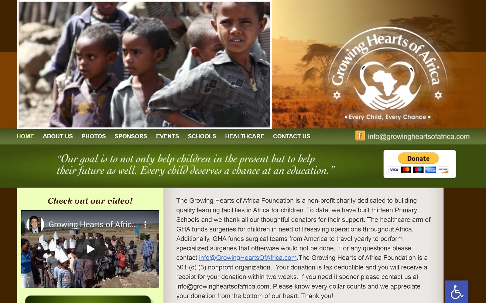
For this healthcare charity website, we chose a layout that encourages site visitors to contribute to the financial needs of this organization. The home page greets viewers with pictures of children who have benefited from the efforts of this foundation. We also included a brief explanation about the organization’s non-profit status and mission statement, as well as videos depicting Growing Hearts of Africa at work. Finally, sponsors are given the opportunity to donate through two different links on the home page and other pages throughout the website.
Use of Colors
This website utilizes a green and brown color scheme, which is simple and complimentary to the images chosen for each page. The colors are not flashy; but rather muted. Green can also be associated with money and the act of moving forward. Our hope is that the carefully selected shades on this site will encourage viewers to donate to this good cause.
Analysis of Design Elements
This website utilizes unique elements, including videos implemented directly into the website. Hearing and seeing the mission of this organization is often more effective than reading about it instead. We also included scrolling pictures within the home page of beneficiaries of the foundation.
Marketing Aspect
Growing Hearts of Africa could not exist without the contributions of its sponsors. This custom charity website serves as a marketing platform through which site visitors can connect with the foundation and keep up with its activities and efforts via social media links on the home page. Also, we utilized multiple videos and images of individuals in need, which tend to be stronger influencers than text alone. Finally, we offer multiple opportunities to make a donation to the foundation throughout the website.
Image the Website Represents
Since this foundation’s work is isolated to African countries, we chose a photo background for the home page that would be easily recognized as an African savannah. It is complimented by shades of brown and green, which set the perfect backdrop for pictures of children who have been reached, treated, and educated through this organization.


