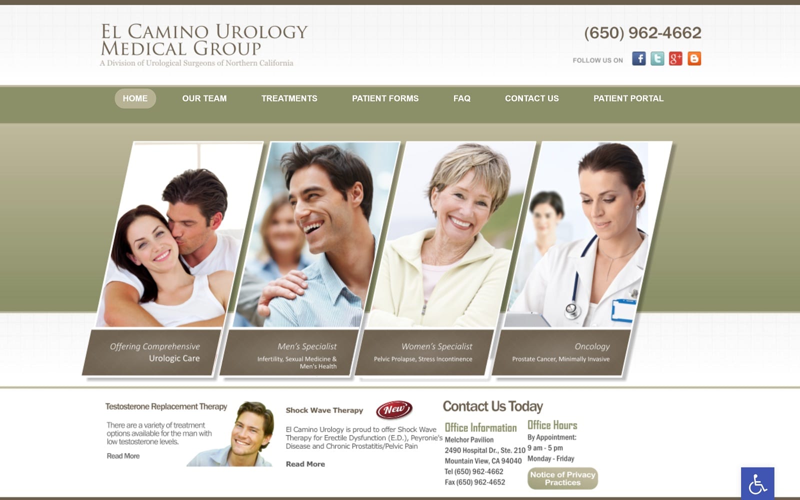
Dr. Michael McCoy came to us asking for a website that would capture his professionalism and dedication to service as a doctor of dentistry. We worked with him to select just the right blend of style, colors, and design choices to bring together the image he dreamed of, and the end result was pleasing to both the client and us.
Overview Of The Design
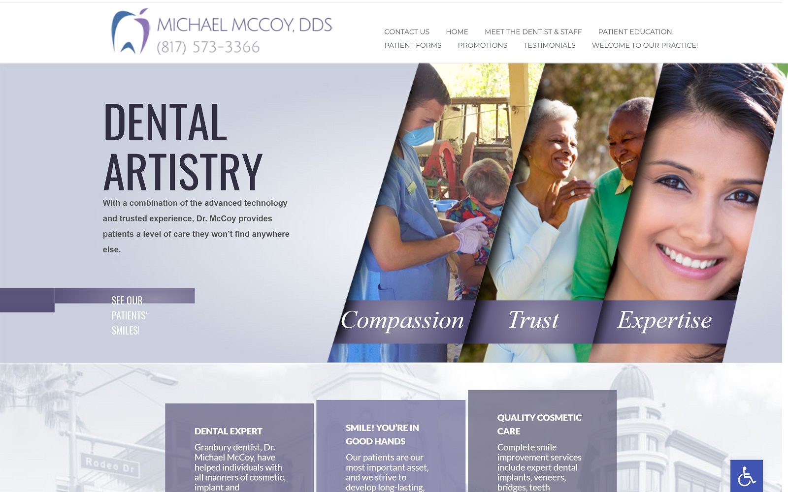
Here we have a design that captures the quintessential medical establishment, using a series of diagonal images to present the ethics that he works under. The end result of the website is a very polished and professional look that invites you to make an appointment with the knowledge that this practitioner is dedicated to his art and the happiness of his patients. Midway between compact and lengthy, the overall size of the homepage is navigable without being understated.
Use Of Colors
The white and purple colors that play prominently in this website are classic choices for medical practitioners. The white brings a sense of professionalism to the design of the website, as well as echoing the color of teeth well cared for and the purity of a hygienically sterilized environment. The purple is calming and evokes feelings of hope and optimism from the viewer, perfect for a practice that tends so often to those with anxiety about visits. The purple element is carried in every aspect, from the logo design to the color of the shirts in the photo.
Analysis Of Design Elements
Highly professional is one phrase that comes to mind regarding the design of this website. Everything about it, from the marked lines of separation to the watermarked image of the facility is reminiscent of the highest quality hospitals and medical practices. Each of these images reflects one of the pillars of his practice, as well as demonstrating the people he works for and with. The Before and After gallery presents a series of real work he has performed, rather than prepackaged stock photos that show perfect results. The gallery shows a realness and clarity that isn’t often seen in websites dedicated to selling their services.
Marketing Aspect
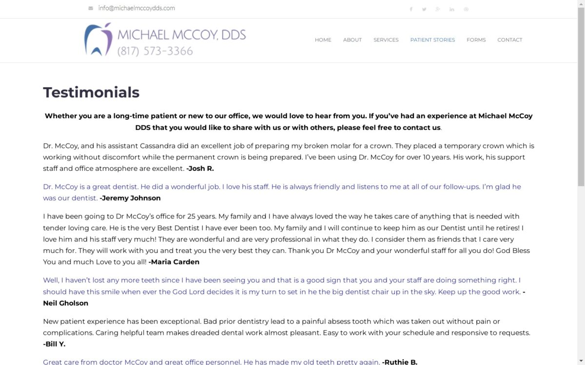
The marketing aspect of this website is aiming for those seeking a qualified and seasoned professional in their field. The contact information is prominently presented at the opening and closing of the page, while a series of success stories and testimonials leverage the best form of advertisement to his visitors. The before and after gallery plays prominently in marketing through actual results, something that can be a powerful tool for the right practitioner.
The Image this Website Reflects
This website represents a clinic dedicated to professional, high-quality care for patients from every walk of life. There is a particular type of customer who respects the highly regimented clinical environment found in hospitals, and this website is angled to target that kind of visitor. This sort of website would be inappropriate for a family dental practice, for but a highly specialized practitioner like Michael McCoy, it’s entirely perfect.
Michael McCoy, DDS Designed by Optimized360
