Overview of the Design
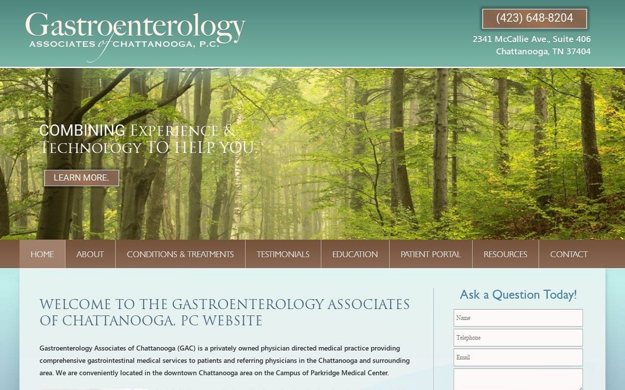
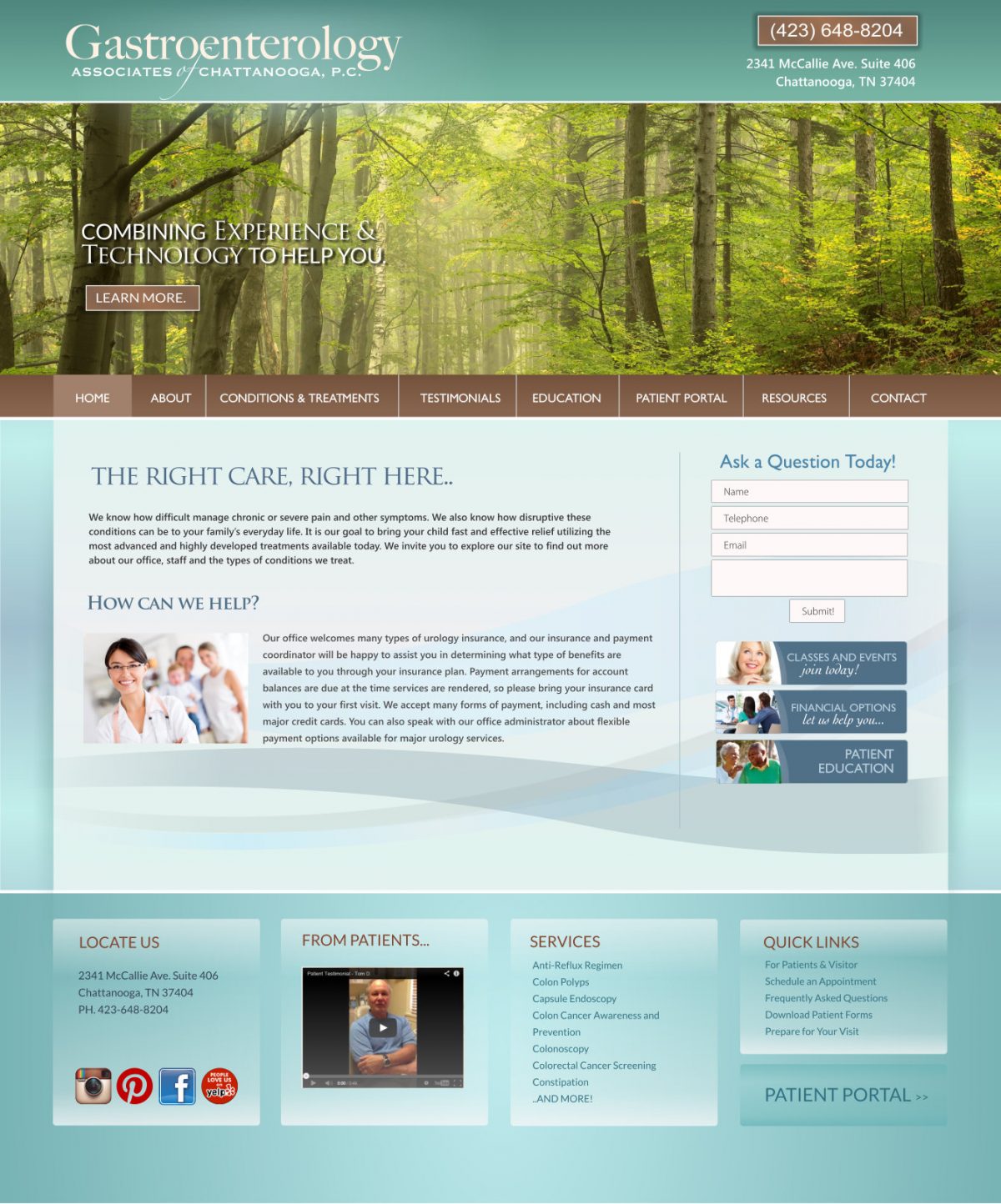
The Gastroenterology Associates of Chattanooga needed a custom GI specialist website that would appeal to both patients and their referring physicians. We decided on a professional space with a concise layout that is equally attractive as it is functional. We started by condensing the home page into a simple navigation bar, brief welcome text, and a contact form. Those looking for additional information about the practice are invited to explore the website through a series of sections and pages, including an extensive patient education area of the site.
The remainder of the website is reflective of the type of experience a patient should expect at Gastroenterology Associates of Chattanooga. We included an About section that includes information about the office, physicians, and staff. We also created Patient Portal and Resources sections within the site, which offer access to patient accounts, new patient forms, and information about financing. Finally, the Contact page directs visitors to the practice and provides an opportunity to contact the office directly from the website.
Use of Colors
Green, blue, and brown are colors that are reminiscent of nature in its purest form. For this website, we chose a natural color palette to reflect the grounded nature of the practice and its innate connection with the needs of its patients. These shades are soothing, relaxing, and give a sense of hope for better quality of life with treatment.
Analysis of Design Elements
This website is largely built in a traditional format. We used curves within the background to help soften the practice image and imply sensitivity and compassion toward the patient’s needs and concerns. We also incorporated many quick-links from the home page, which make it easy for visitors to navigate to any part of the site with the click of a button.
Marketing Aspect
Online GI doctor marketing is about targeting patients and referring physicians. We created a simple contact form on this website – not an appointment request form. This broad contact form invites any visitor to ask questions and find out more about the practice. We also implemented a patient testimonial section, as well as links to the practice’s social media accounts.
Image the Website Represents
Rather than smiling patients, nature is the visual inspiration for this website, given that the practice treats patients with both acute and chronic GI health conditions. We used a large header image on the home page that depicts a tree-lined path in the forest. Just as no two leaves are the same, the picture implies that every patient’s story and journey is unique. With the right care however, better health and improved quality of life could be attainable.
Gastroenterology Website Designed by Optimized360
