New Design Idea
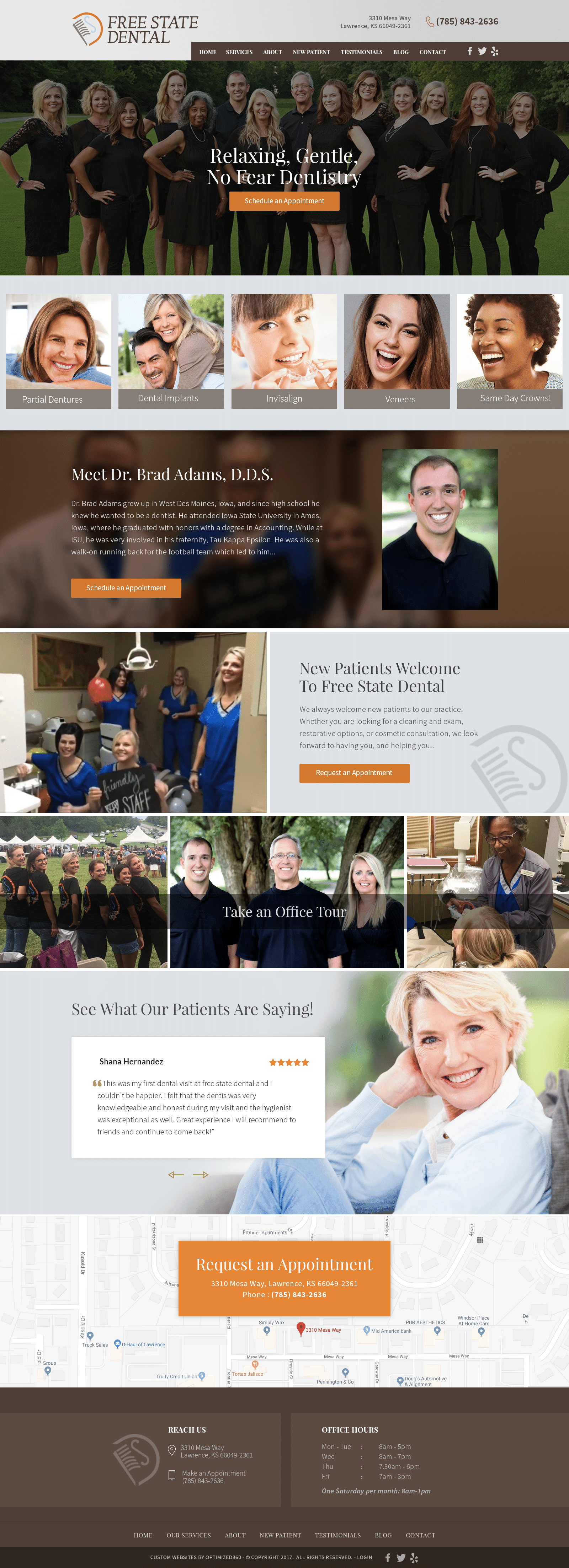
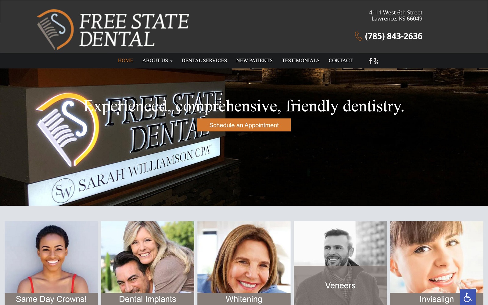
Free State Dental appeals to warm tones, such as bright orange, taupe brown, and tan, to endear its users and gradually welcome them to their place of work. Bright orange captivates the user and operates as the action color, bringing in notions of excitement, enthusiasm, and positive associations with health and energy. Both taupe brown and tan build a foundation for the orange, magnetizing the color’s effects with warmth, coziness, and comfort. Free State Dental lays out its dental webpage design with various elements, including semi-flat panels, hyperlinks, google maps widgets, and slideshow applications, and emphasizes their transitional effects with large serif fonts and playful image layouts. Free State Dental combines the elegant neutrality of brown and the invigorating effects of orange and combines them to target a wide array of audiences, specifically needing dentistry that’s effective, welcoming, and like family.
Free State Dental introduces its website with a large header, containing information such as its business brand logo, click-to-call service number, social media icons, and main menu services. Its hero image, layered with a transparent brown, contains the website’s introduction text and an action button for scheduling appointments. Below the hero image, semi-flat panels showcase the website’s services and expand when hovered over. Each section thereafter works to acquaint itself with the user with friendly imagery and action buttons for scheduling appointments. Its testimonials section operates through a slideshow widget, using arrow icons to transition between reviews. At the footer, visitors can interact with the google maps widget, and connect to the business with multiple click-to-call service numbers.
