Facial Esthetics works in a field that targets cosmetic issues. When dealing with any sort of facial or rejuvenation-based website, we always want to make a custom website that is marketed towards the audience. Reassurance and comfort were absolutely necessary when creating this site. We created a site layout that was both elegant and simplistic to ensure optimal site engagement.
Overview of Design and Color
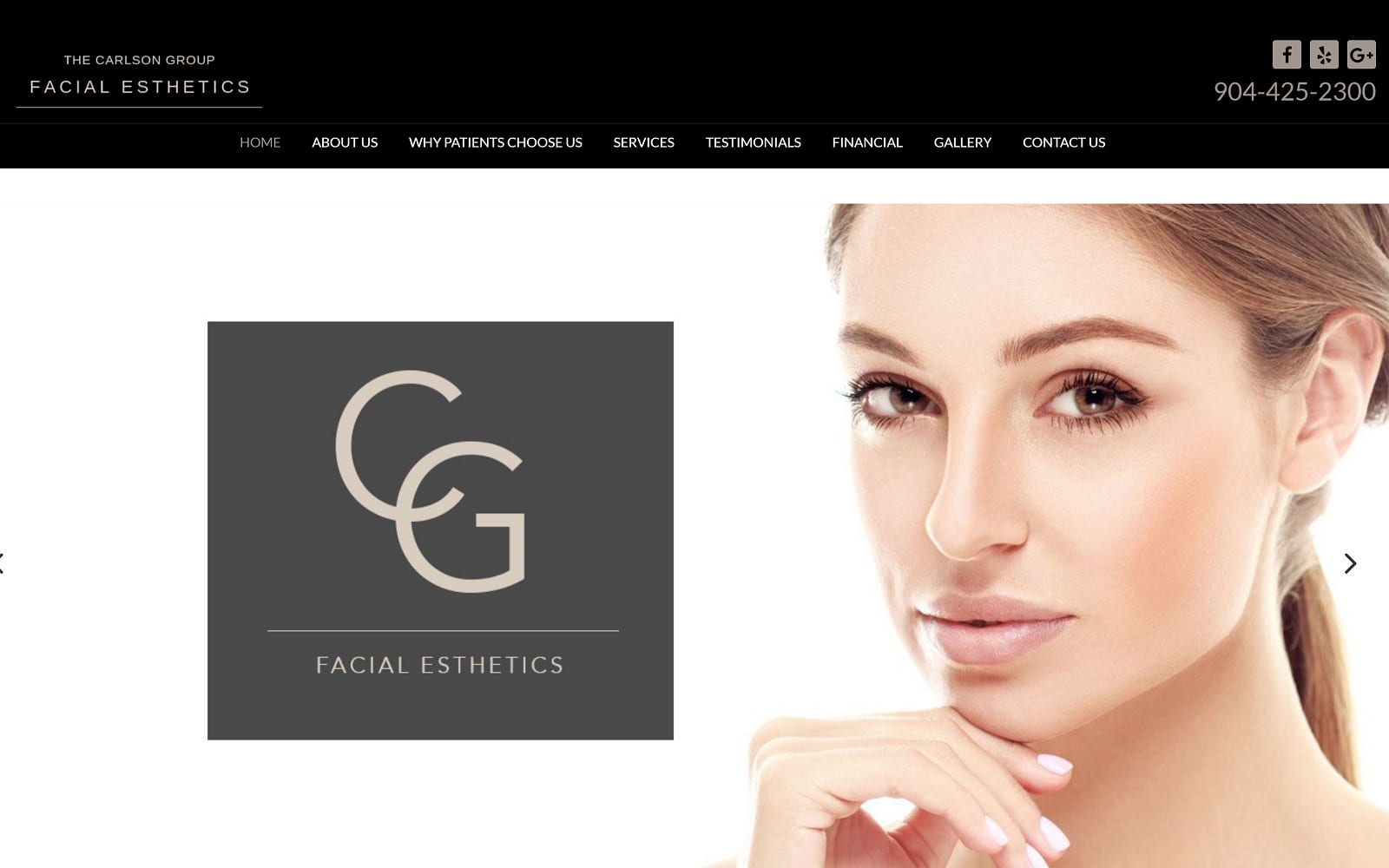
To accommodate for cosmetic surgeons and their specialty, we went with a clean, visual route when designing the website. The revolving digital photo gallery that guest instantly sees when they visit the page is a clear example of that. The first impression a guest builds is especially important when it comes to creating a working relationship. We went with an approach that is clear and concise. We incorporated a darker gradient when designing the site; more specifically, using black and white to highlight the sleek visuals that any site visitor would appreciate. The overarching design of the web page is a direct representation of the Facial Esthetics team: clean and stunning. There is a ton to explore on the web page – all conveniently located on the navigation bar. From testimonials and financial options, we designed a layout that would highlight all that Facial Esthetics had to offer.
Elements of Design
When dealing with any cosmetic website, you want to make sure that the elements of design match the overall project style. We made sure to space all the text and framework on the website out to match the classy and elegant site layout. The rich special effects we incorporated on the home page grasp the reader’s attention and promotes further engagement with the different services offered. The optimal spacing on the site using white space ensures that all the visuals and text balance together. This ensures that the web pages load quickly on both desktop and mobile devices.
To learn more about the importance of using white space on a website, click HERE.
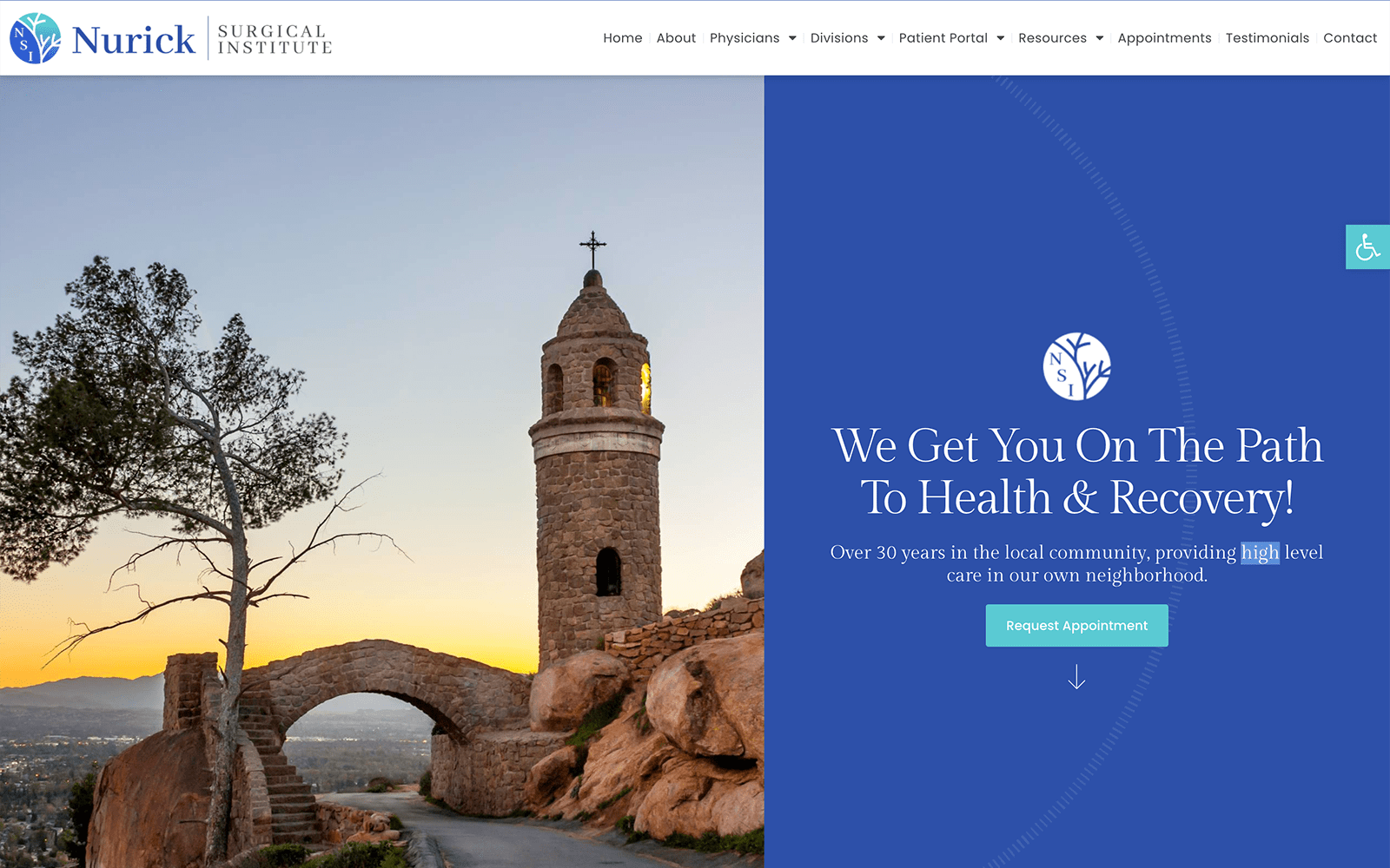
Having a mobile-friendly website can make or break any website. To learn more about the importance of optimizing your website for mobile devices, click HERE.
Marketing Aspect
When dealing with a special niche such as facial work, your number one goal is to provide your incoming patients with a sense of security and trust. The website’s optimal natural theme and simplistic layout make for a great combination that caters to both the young and old audience. The why patients choose us tab shows images from the actual Texas office as well as listing pros and benefits of being treated by Facial Esthetics. In addition, testimonials are a great way to produce and validate your results and experience. Any smart website will display testimonials. Overall, the layout is direct and to the point – patient care is their number one concern. That is clearly reflected in the marketing of the website.
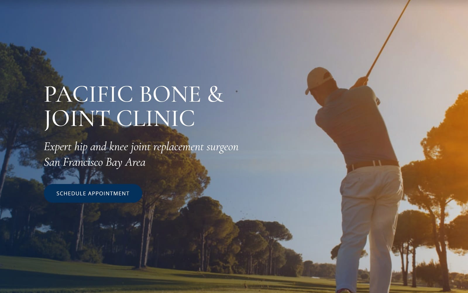
Does your website maximize your marketing potential? Here are 10 Essential Features Every Good Business Website Should Have.
