New Design Idea

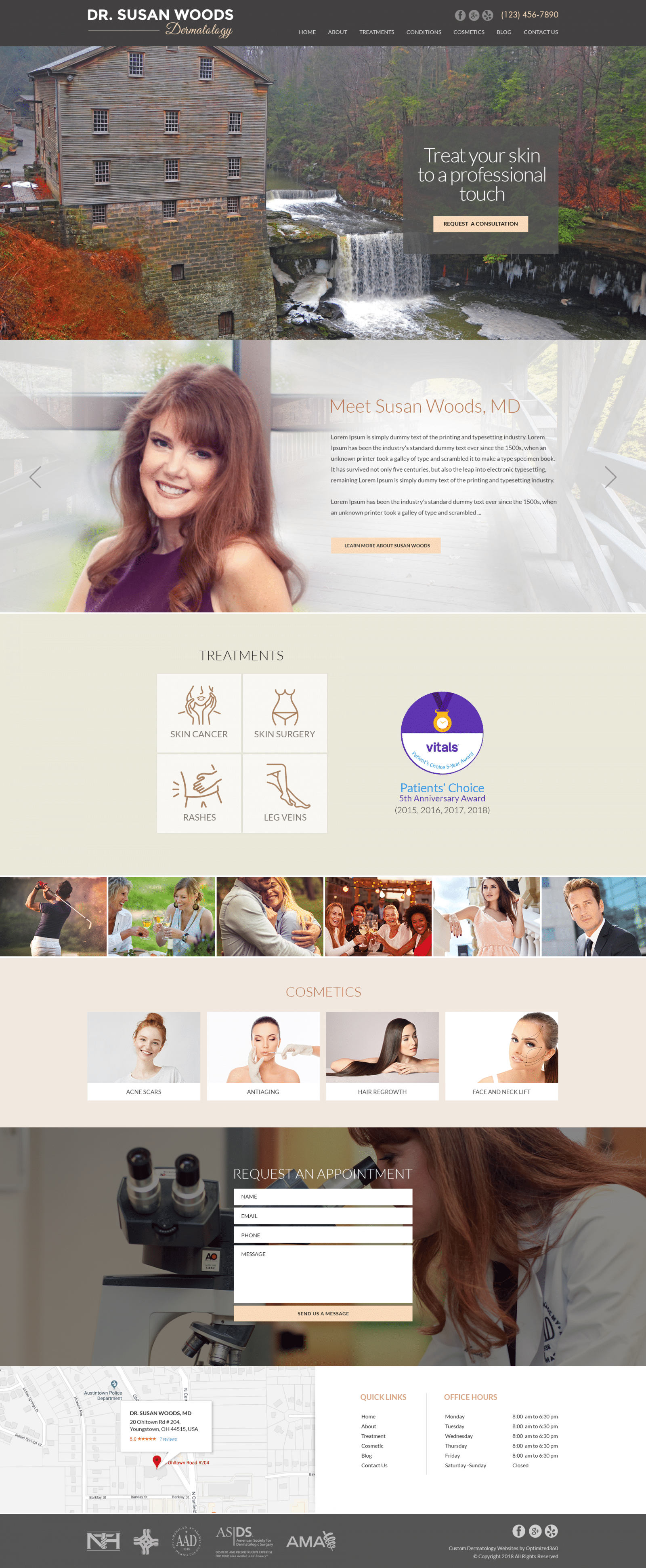
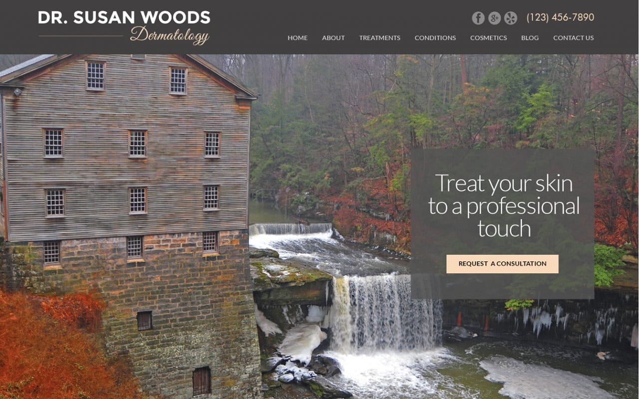
A dark taupe, cozy and inviting, dusty rose pink, nostalgic and feminine, and champagne, a joyful neutral that pairs well with almost anything; Dr. Wood’s website tackles these traits and turns the site into an exquisite, personable, and devoted website that reflects highly of the doctor’s personality and abilities. Beginning with the fresh, modern taupe and finishing it off with a delightful variety of dusty rose and champagne, the primary goal of the website is to relax, entice, and bring elegance back into their lives through quality skin and hair care. As a unique set up filled with personal images and relatable desires, its use of icons, images, and other design aspects make it a great example to interact and engage with for cosmetic treatments.
Dr. Wood’s dermatology website begins with a taupe header, containing the main menu section, social media icons, brand logo, and click-to-call number. It’s hero image matches in the color aesthetics of its theme, and thus helps transition the visitor from the header down. Throughout the page, sections such as the biography, treatment options, and other services are aligned flat with icons and images to help distinguish those sections from the home page. AT the footer of the page, the HIPPA contact us form, google maps widget, and quick links can be found, along with the social media icons and accepted insurances. Each part of the website contains interactive images and links to internal components of the site, and help create a cohesive collection of design elements.


