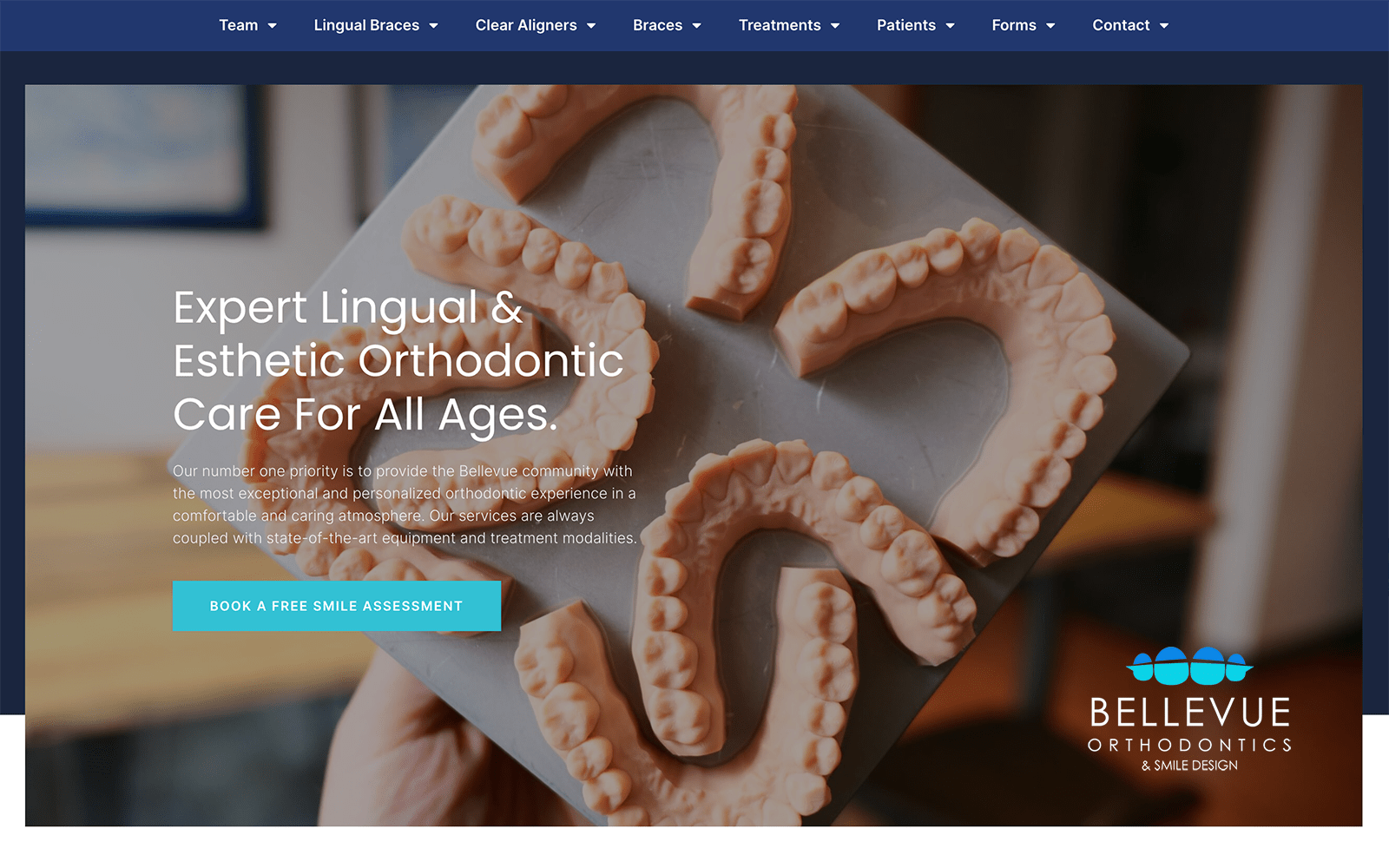
Dr. Victoria Callicutt chooses thoughtful colors that display the intricacies of her work, ranging from bright blue to sage brown with intermixing of teal and gray to convey a sense of elegance, charm, and tranquility to her cosmetic dentistry services. Each element entangles and descends further down the home page, interconnecting one section to another throughout the website. Each color aims to revitalize and bring warmth and depth, shown through its choice in gradients as its primary choice in color presentation. By choosing to work with complementary colors in subtle shades, it creates clarity of thought, as each color showed creates the natural impressions built from its source. Dr. Victoria Callicutt takes these hues and turns them into a sensual, enamoring experience for the visitor, implying her cosmetic dentistry services are more than services; they’re works of art.
Dr. Victoria Callicutt opens its dental website design by turning the hero image into the center focus of the site, with the main menu services, business logo, and hero border as accents. On the right side of the page, visitors can find the click-to-call service number alongside social media icons, and the hero border contains the action button for scheduling appointments. Dr. Victoria Callicutt presents its services with circle images, that when highlighted, over interact through semi-flat design. Its mission statement and doctor sections are encased in a white, shaded border for more natural connection and organization of information, and both these sections contain hyperlinks, click-to-call service numbers, and action buttons for contact. Its footer contains its social media icons, click-to-call service number, business logo, and main menu services for more information.


