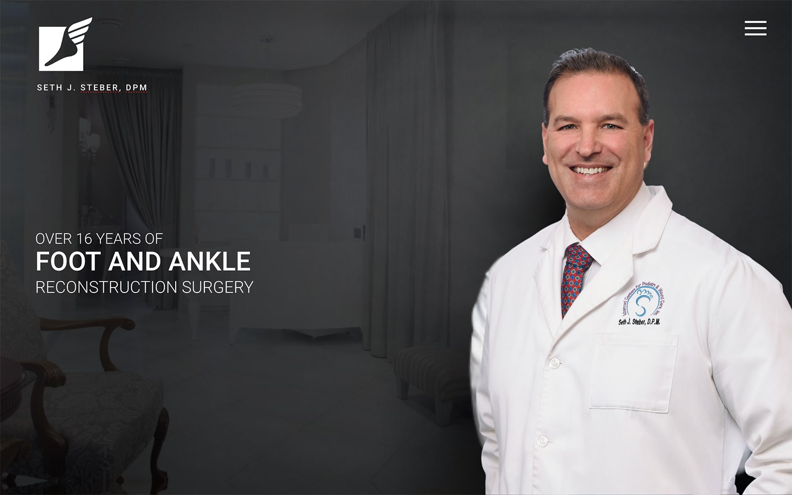
Dr. Steber runs a comfortable and stylish facility aimed at those who are in need of having reconstruction surgery performed on their feet or ankles. When he approached us, he asked for a striking yet personable website that will draw in new patients and instill in them a comfort and confidence in his practice. We put our best foot forward and worked with him to produce this website that we feel fits both of his requests beautifully, and we’re proud to present this design to you.
Overview Of The Design
This website takes beauty through simplicity to an art form. Visitors are greeted by a clear image of Dr. Steber himself alongside his logo and a declaration of his skill and experience. A simple drop-down provides access to the full spectrum of services he offers without interfering with the presentation. From there it gives only the most necessary information, links to the procedures and what they entail, and the information you need to make an appointment. Everything you need, nothing you don’t, elegantly presented, that’s this website design in a nutshell.
Use Of Colors
Colors primarily used in this website design are of the darker tones, black and grey, but there are subtle splashes of blue and orange found throughout as well. Orange is an inviting color, one that instills energy and helps to produce positivity in the viewer, while blue instills a sense of hope and calm. The darkness of the website helps to convey a sense of confidence in the professionalism of Dr. Steber and his staff.
Analysis Of Design Elements
Considering the overall darkness of the design the website is surprisingly bright, a technique that brings only those elements that need your attention to your eye. While there are multiple elements involved in the design, overall it comes together to present an image of a rustic and beautiful facility offering the latest in technology for the treatment of foot and ankle pain. The images that are included subtly hint at the active lifestyle that many feet and ankle patients miss, sending subtle promises that they’ll be out there enjoying that life again.
Marketing Aspect
The website is meant to draw you in and gain your trust quickly, part of the reason it opens with an introduction to the physician himself. From here it provide the visitor with information in a clean format, encouraging them to click through and spend more time on the website. The more time they spend, the more they learn, the closer they are to booking an appointment and having Dr. Steber, and his staff set you on the footpath to an active lifestyle again.
The Image this Website Reflects
This website presents a clear and professional office that focuses on relationships; a position made clear by the presentation of Dr. Steber at the opening page. He wants you to know him, to meet him, and to feel welcome in his office. This kind of approach immediately sets visitors at ease and lets them know they’ll be receiving incredible top-end service.
Dr. Steber Designed by Optimized360


