Dr. Robert A Stoner is the leading doctor at his self titled Orthodontic office in Indianapolis, Indiana. Specializing in children, adult and emergency procedures, Dr. Stoner and his team are highly qualified in both customer care and orthodontics. As a full-time practitioner for over 30 years, Dr. Stoner has successfully treated over 7,000 patients. We paid homage to this incredible feat by designing a website that created his ideal vision of dental aesthetics and patient satisfaction.
Overview of Design
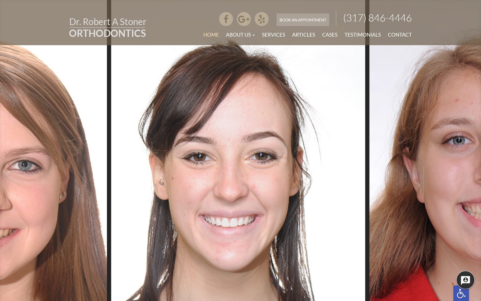
For Dr. Stoner, we went the more traditional route and featured his website with a full-width navigation menu with lots of optimal space for viewership reading. The interface is clean and open. When you first visit the website, you are greeted with friendly looking patients and a short mission statement about the office and doctor himself. As you scroll down the homepage, you are met with some great before-and-after marketing pictures followed by testimonials. As with orthodontics, imagery plays an important part in designing any website. All the pictures used throughout the website help compliment the specialty at hand. The depth of Dr. Stoner’s knowledge in the industry is integrated within our compact but extensive navigation menu.
Use of Color and Design Elements
We stuck to a simple light-colored color scheme throughout the website. This also adds to the ample white space throughout the website. Color plays an important visual component to any website. It is the first thing incoming patients see and take note of. Regardless of where you go on the website, the navigation bar is always readily available. There is accessible contact information all the way around the square borders that hype scale the website. The gallery is also a great way to engage the audience as well as show off some of the doctor’s most impressive cases. In general, the images on the website are all visual testaments to the services provided.
Marketing Aspect
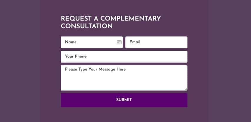
The main marketing is done through testimonials and a gallery of images. The website is simply a platform to help reach the masses, for Dr. Stoner. When you have decades of experience in the industry, not much fancy glam and glitz is needed to show your potential. The contact page provides users with a simple form to fill out along with an interactive map to reach their office in Indianapolis. If that were not enough, the links to the office’s social media are located at the top and bottom banners of any web page.
Image the Website Represents
This site represents a facility that is dedicated to family service and educating its patients on their orthodontic care. Patient involvement is a major element people are looking for in the modern orthodontic industry, so the educational focused aspect of this site is forward thinking and modern. That being said it also presents a welcoming and professional air, setting the right tone for their visit to your office.


