When dealing with a periodontics website, your number one goal is to always convey a welcoming impression into your office. Implant dentistry is already a daunting subject for plenty of patients, so your website should help your visitors feel at ease and give your practice a call.
Overview of the Design
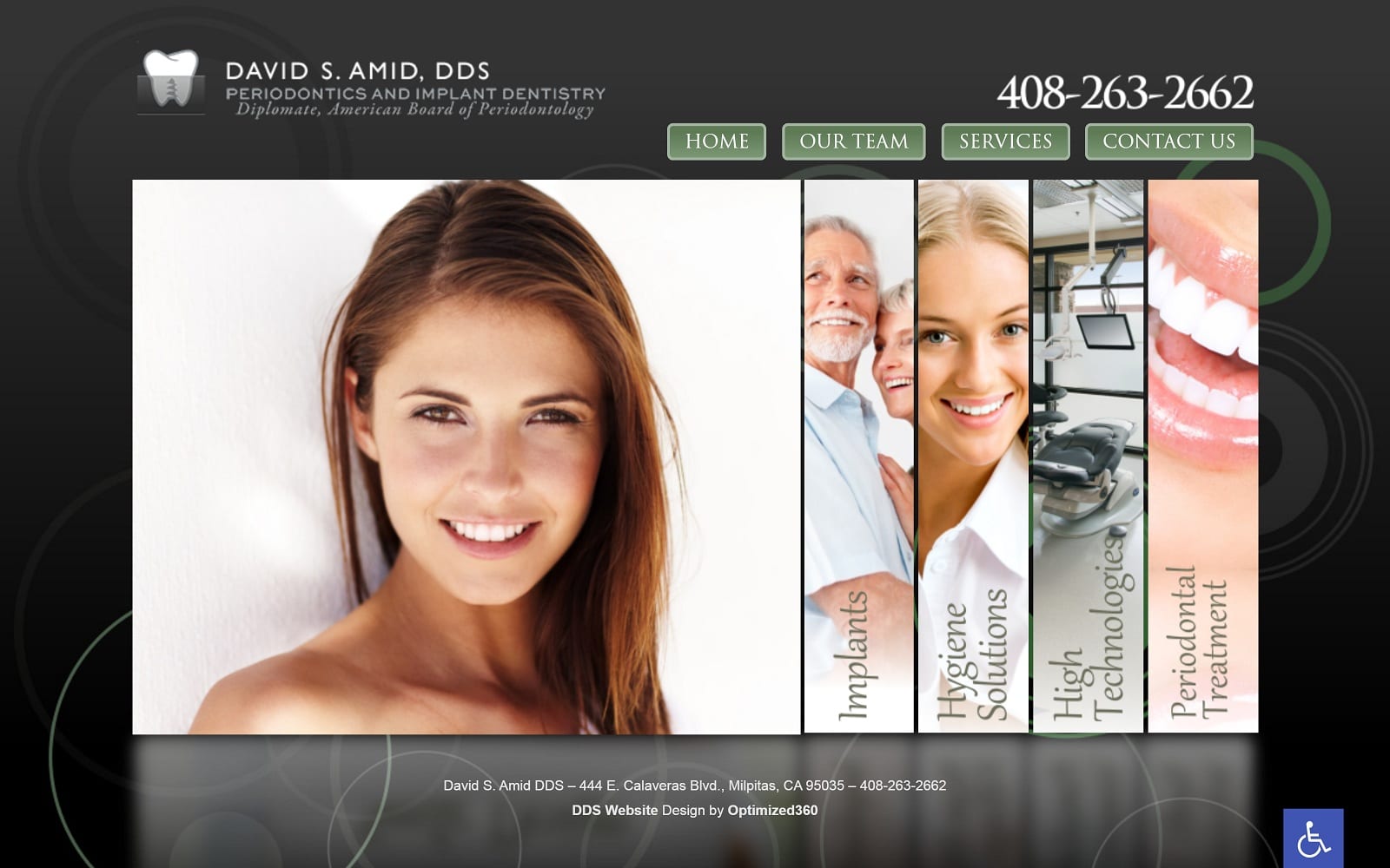
The overall look of the design is a mixture of boxes and buttons that help streamline the process for incoming visitors. The homepage is short and to the point. At a single glance, visitors can navigate through the entire site without any functionality issues. Patient conversion is the end goal for any dental website.
Use of Colors
Dental patients want to feel safe and secure when getting any sort of dental work. We utilized a mixture of black and green throughout the homepage. The sleek black background not only adds texture and a classy touch, but also helps the images stand out at the forefront of the design. We also utilized a moss green on the buttons to help compliment the black background.
Design Elements
The design of this site is very open with a streamlined approach, at no point is there too much information presented, the overall feeling being one of efficiency and minimalism. Websites like this will appeal to professionals from every walk of life, encouraging them to bring their friends and family in for reliable and consistent treatment.
Marketing Aspect
The buttons on the navigation menu have a hovering effect to help draw attention to them. We also implemented an office tour, patient forms, and testimonials to ensure that patients would feel at home and connected with the practice, even before stepping inside the dental doors.
The website is also equipped with ADApt technology – ensuring that potentially disabled patients get the full website experience as well. The ADA logo is conveniently located on the bottom right of each web page and allows patients that require additional assistance to adjust the text and images accordingly.
Image the Website Reflects
Dr. David Amos’s website is a prime example of minimalism done right. From the classy color pallete to the welcoming photos, all the design elements mesh together to create a first great impression that will help ease any worried dental visitor.


