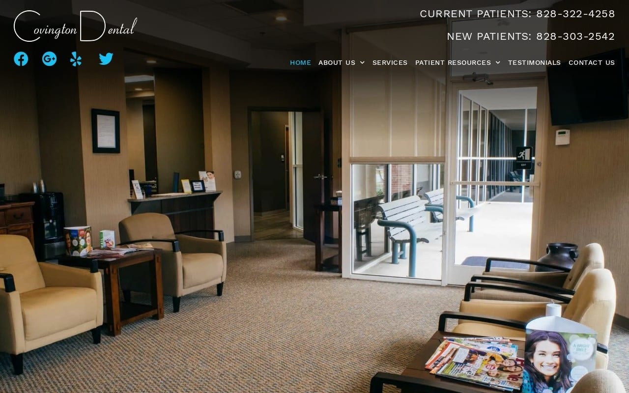
Covington Dental’s website focuses on welcoming visitors into the home of their practice with a hero image that is their front lobby. The presentation of the clinic is built on earth-tones that are reflected in the ruddy orange used in the website’s color palette. Combined with the sleek, professional tones of black this orange serves to draw the eye and make the site really pop visually. The overall dentistry website design of the site leans towards mobile users, while its mobile-responsive design makes it equally attractive on a traditional screen. Imagery takes center-stage in the site’s delivery of information, with each of the service links using a large image that reflects the results of the procedures offered. The Smile Gallery shows patients just how dramatic the results of their procedures can be.
Ease of navigation starts with a static header on Covington Dental’s website. Whimsical stylized images direct patients to direct-to-dial and click-to-map functionality, as well as bringing the patient back to the homepage at any time. Patients seeking to learn more about the facilities team can do so by clicking on the image of the doctor in the footer, and all of this is available without ever opening the hamburger menu on mobile devices. Once that menu is open patients have access to forms that can be filled out online, a new patient guide, and a tour of the office. All of these elements come together to provide full functionality and convenience for the modern patient.


