New design idea
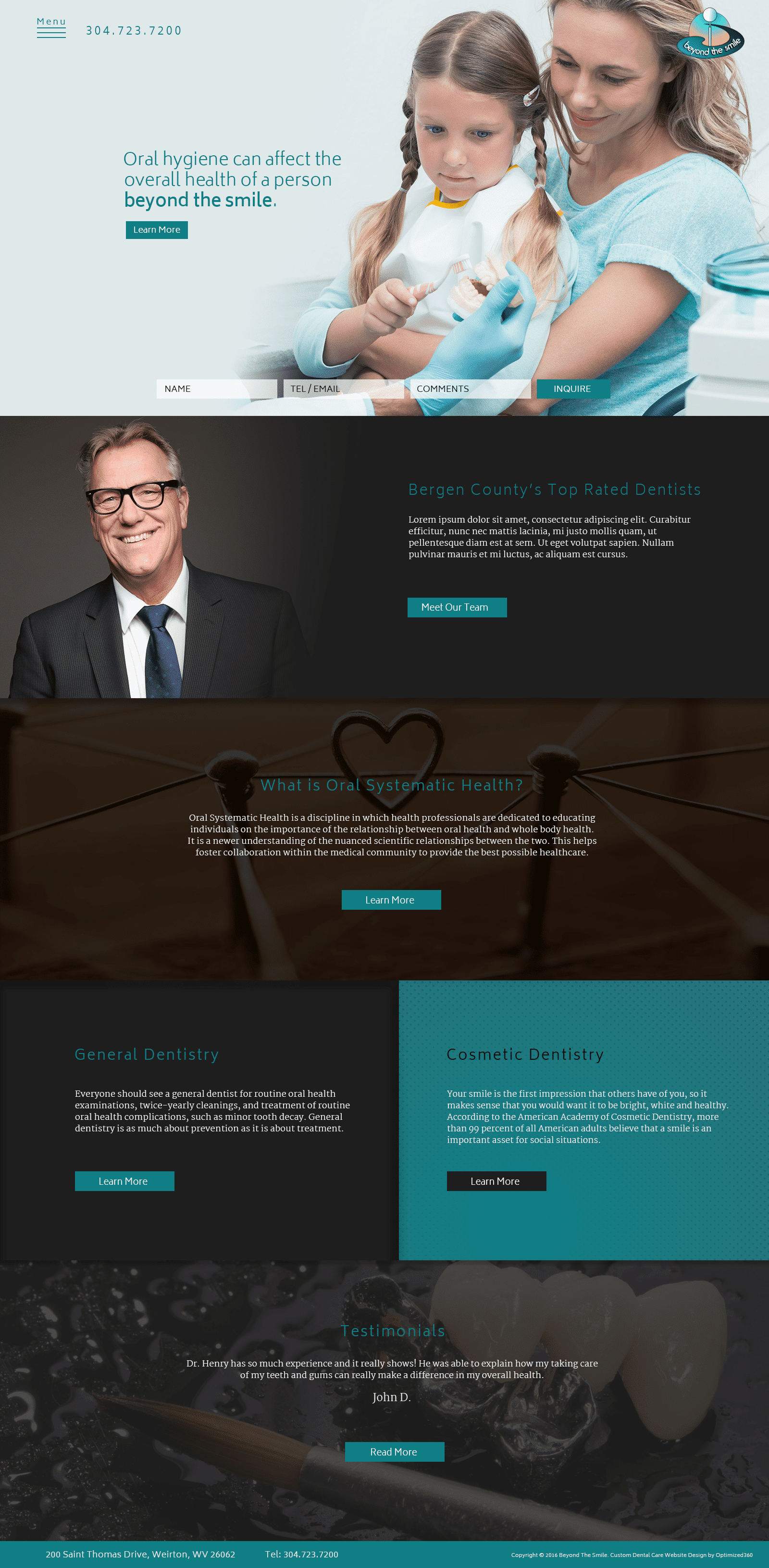
County Top Dentist embodies the conventional reliance of dentistry and adds a specific development to its overall website, combining a color scheme of teal, black, and white to add variation to its classy image. Teal combines the refreshing qualities of mint green and the soothing qualities of royal blue. When used throughout the website through its action buttons and subheaders, teal rejuvenates the user and inspires clarity of thought and clear communication. Black works as a secondary color throughout and is used in transition sections and background filters to bring elegance and simplicity to the dentistry website’s image. Most of its imagery acts as a background filter for presenting information, turning it into a dynamic space for engagement, and each of its design elements, such as its hamburger menu and HIPPA secure form, allows for the information on the home page to utilize the space at hand.
County Top Dentist establishes its website by immediately introducing its users to its hero image. The header sits as a hamburger menu on the left corner of the top page, with the click-to-call service number situated next to it. Within the hero image, introduction text and an action button can be found. At the bottom of the hero image, the HIPPA secure form sits horizontally across, allowing users to interact with and fill out the form. Following the hero image, the website’s divisions each contain its own action button associated with the information present, including its variety of dental specialties such as cosmetic dentistry and general dentistry. At the bottom of the County Top Dentist home page, the footer contains the business’s click-to-action contact information and copyright information.
