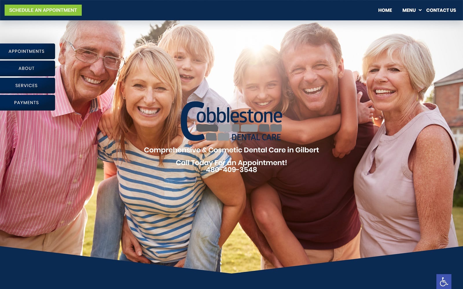
The Cobblestone Dental Care website is the visual definition of an urban-sleek, modern design. For a general dentist, you must have something that sets you apart if you want to stand out from the competition. We accomplished that with this design, giving visitors a visual experience that they will not get from any other general dentist around the area. From the entrance animations to the stylization of the site, there is a bit of gold for anybody younger or old dropping by for the first time.
Overview of the Design
For this website, we kept the menu small and simple; almost eliminating the need for the traditional navigational menu bar. Our dropdown menu opens to a plethora of service content for visitors to explore. On the side of the screen, we highlighted the main calls to actions such as appointments, information about the practice, and even an online payment option. To seal the deal, we also included the patient forms on the drop-down menu to ensure that patients would maximize their office time by minimizing appointment-day paperwork and wait times.
Use of Colors
Blue is the predominant color on the Cobblestone website. When executed properly, you can achieve a balance of intrigue and professionalism by conveying a sense of class and knowledge. We blended the royal blue with different sections of white to ensure that the visitor’s eyes would have a chance to breathe and digest the information in front of them.
Analysis of Design Elements
This website boasts a full-width layout that leaves no room for wasted ‘white space’ on the home page. To modernize the site, we also included motion effects that help the homepage make a grand entrance. We also avoided any long, droning text and sought to focus on the key items that any patient would want to know. We included a short doctor description followed by a list of icons that help display the practice’s featured services. We also highlighted the practice’s use of promotions on the homepage by including the new patient promotions they were having.
We polished out the site with background images that would also add some additional texture and flair to the site. We also understand that security is also crucial to any dentistry practice. Cobblestone’s website is equipped with the latest security options through SSL Security and is ADApt compliant due to our accessibility toolbox.
Marketing Aspect
Visitors have multiple places to schedule an appointment. From the top menu to the footer, visitors will always be just one email or call away from being a dental patient. For those still comparing local dentists, we included a dedicated patient testimonial section that spotlights positive reviews from real patients on the homepage. Even the colors play into marketing. Visitors come into the site expecting something modern and functional. The blue and white colors help create a polished medical aesthetic that helps balance the information on the page with the different buttons and menu options.
The website is also equipped with ADApt technology – ensuring that potentially disabled patients get the full website experience as well. The ADA logo is conveniently located on the bottom right of each web page and allows patients that require additional assistance to adjust the text and images accordingly.
Image the Website Represents
From the hero image depicting smiling faces to the overall fluidity of the different sections, Cobblestone’s website makes a great first impression. Not only is the homepage geared to market and provide patients with key information, but the inner-pages are concise and informative. To see more examples of general dentist website’s please visit our gallery.


