New design idea

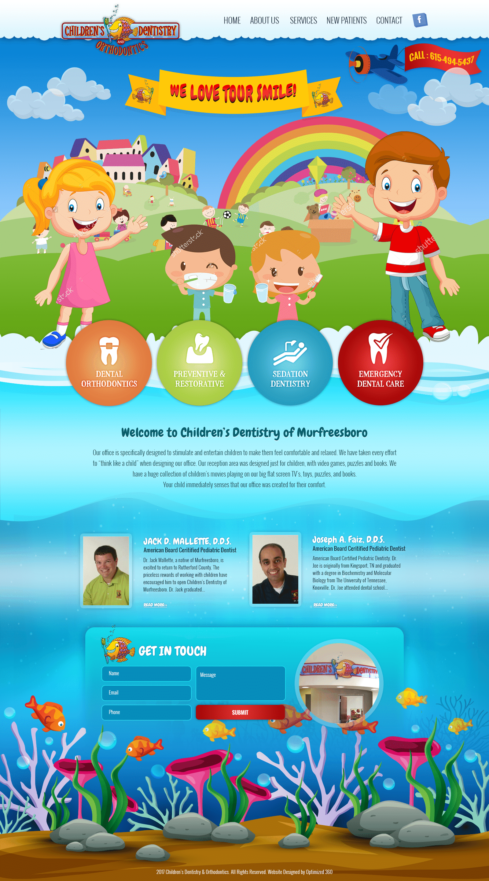
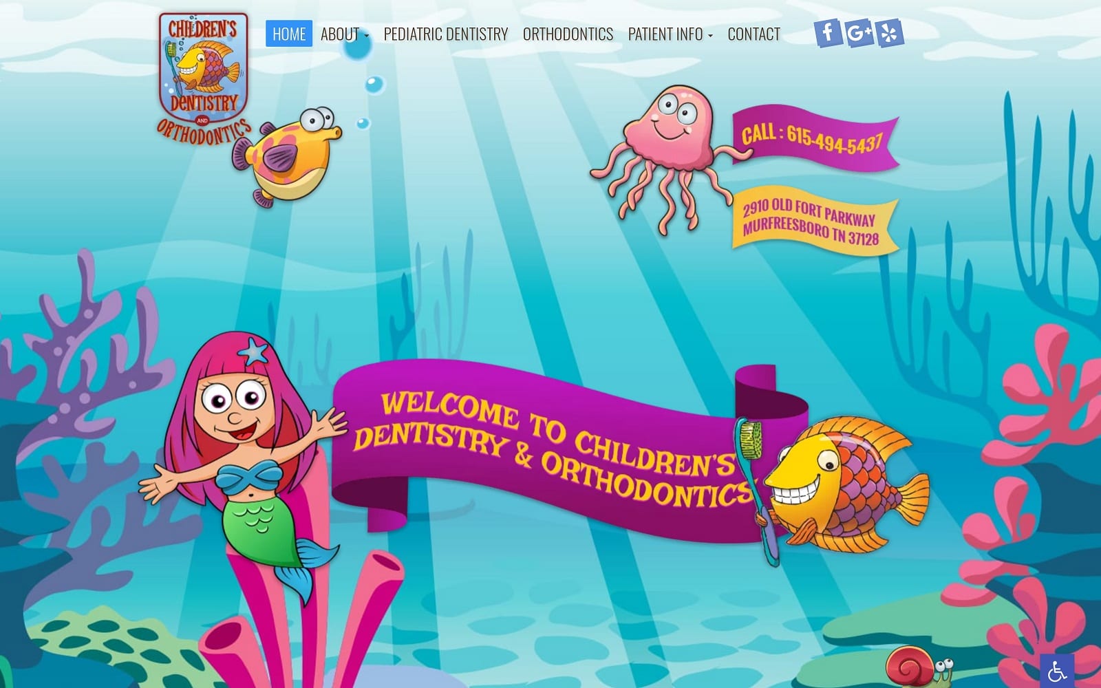
Children’s Dentistry And Orthodontics takes advantage of children’s attraction to bright colors and keeps its web space busy with bright colors, fun icons, and playful imagery. Among all the joyful colors, the pediatric dentistry website specifically uses energizing magenta, golden yellow, and glacier-like blue-green to attract its users to the essential parts of its website. By sticking with primary colors, it actively engages not only parents but children, as it is specifically designed for parents and children to sit together and experience excitement when going to the dentist. Animated images that engage with the cursor, along with playful banners and slideshow elements allow for Children’s Dentistry And Orthodontics to represent their business and their goals when treating children’s dental care. Created to stimulate, relax, and entertain, the overall design represents a unique concept that’s captivating and pleasing to view.
Children’s Dentistry And Orthodontics starts with a transparent header containing its main menu services, and when scrolling, it follows throughout the page with a solid border. Along with the header, social media icons and the business logo can be seen. Its hero image contains animated images that interact with the cursor, and each image contains click-to-call service numbers, addresses, and introduction text. Its featured services incorporate semi-flat panels for engagement that expand when hovered over. Near the bottom of the footer, a slideshow presentation showcases the business’s office space. At the footer, the HIPPA secure form can be found and filled out, with a red action button for engagement.


