Overview of the Design
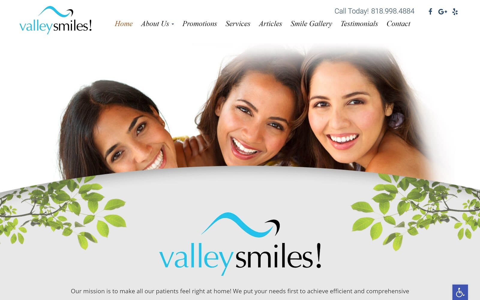
When our design team went to work on the Valley Smiles website, we made every effort to mirror the existing image of the practice in a way that would best represent it to online viewers. At first glance, a prominent picture depicting several smiling, friendly faces catches the attention of visitors and instantly gives the practice a credible and friendly image.
Moving through the site, we highlighted feature services that are paramount to the practice – specifically whitening, aesthetics, and general dental services. Then, visitors are given the opportunity to learn about a wide range of services and oral health conditions thanks to an extensive patient education section that also includes vivid imagery. Finally, we corroborated the reputation of the practice with real patient testimonials and reviews that bring out the best in the Valley Smiles team.
Use of Colors
Color sets the undertone of the Valley Smiles website. In this one, we chose to complement our use of imagery with beige and brown hues. These shades speak to the structure and stability of the office, as well as the dependability of the staff. Not too dark and not too light, they are meant to be perceived as a reflection of the high standards of quality Valley Smiles adheres to.
Analysis of Design Elements
There are many design elements that were carefully selected for the Valley Smiles website – some obvious, and some less so. The use of curvature on the home page of the website is not conspicuous, but it subtly creates a softer image of the practice as a whole. The unique parallax scroll effect, however, is one of the first things visitors notice as they make their way through each page. Parallax scroll is the use of background imagery that appears to remain stationary as text in the foreground moves while scrolling. This creates a three-dimensional effect that makes the practice website stand out to new and potential patients and also helps it appear up-to-date and modern.
Marketing Aspect
As a general dental office, the team at Valley Smiles is a direct-to-patient provider. Instead of receiving referrals, this practice schedules many first-time appointments as a result of marketing. For this reason, we place a simple appointment request form on each page of the website, making it easy for new visitors to schedule a visit at any time. As an added convenience, we included a map of the office location, as well an email address and phone number for alternative forms of communication.
Image the Website Reflects
Valley Smiles is a general dentistry practice that seeks to connect with local patients who are looking for a dentist they can grow to know and trust. Rather than focus on formalities, we chose to give the practice an energetic, yet relaxed image that provides a sense of wellness and optimism. Like the colors we used, our team also carefully selected the images on the Valley Smiles website. In keeping with its namesake, we chose outdoor images that remind viewers of natural beauty – from the green leaves and floral blooms of spring to the strong, but smooth stones that remain grounded year-round. Combined with a simple font, this helps visitors imagine Valley Smiles as an approachable and easy-going practice that promises beautiful and natural-looking results.
Dental Website Designed by Optimized360


