New design idea
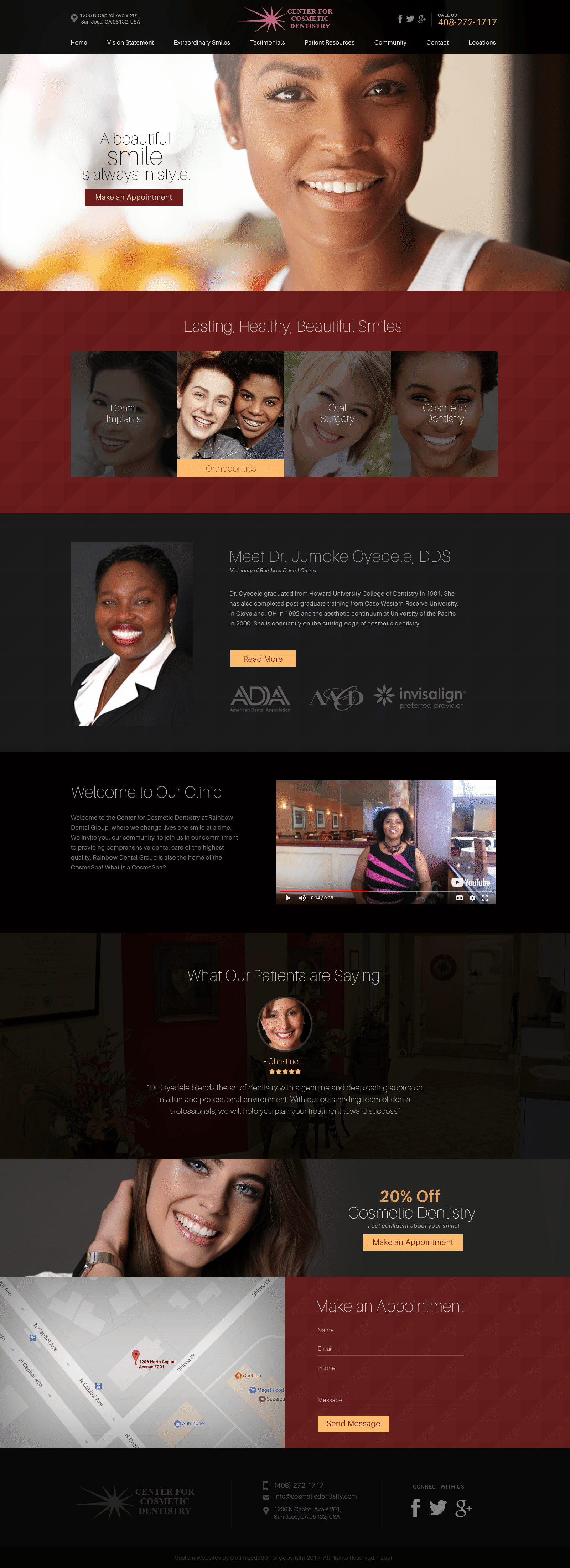
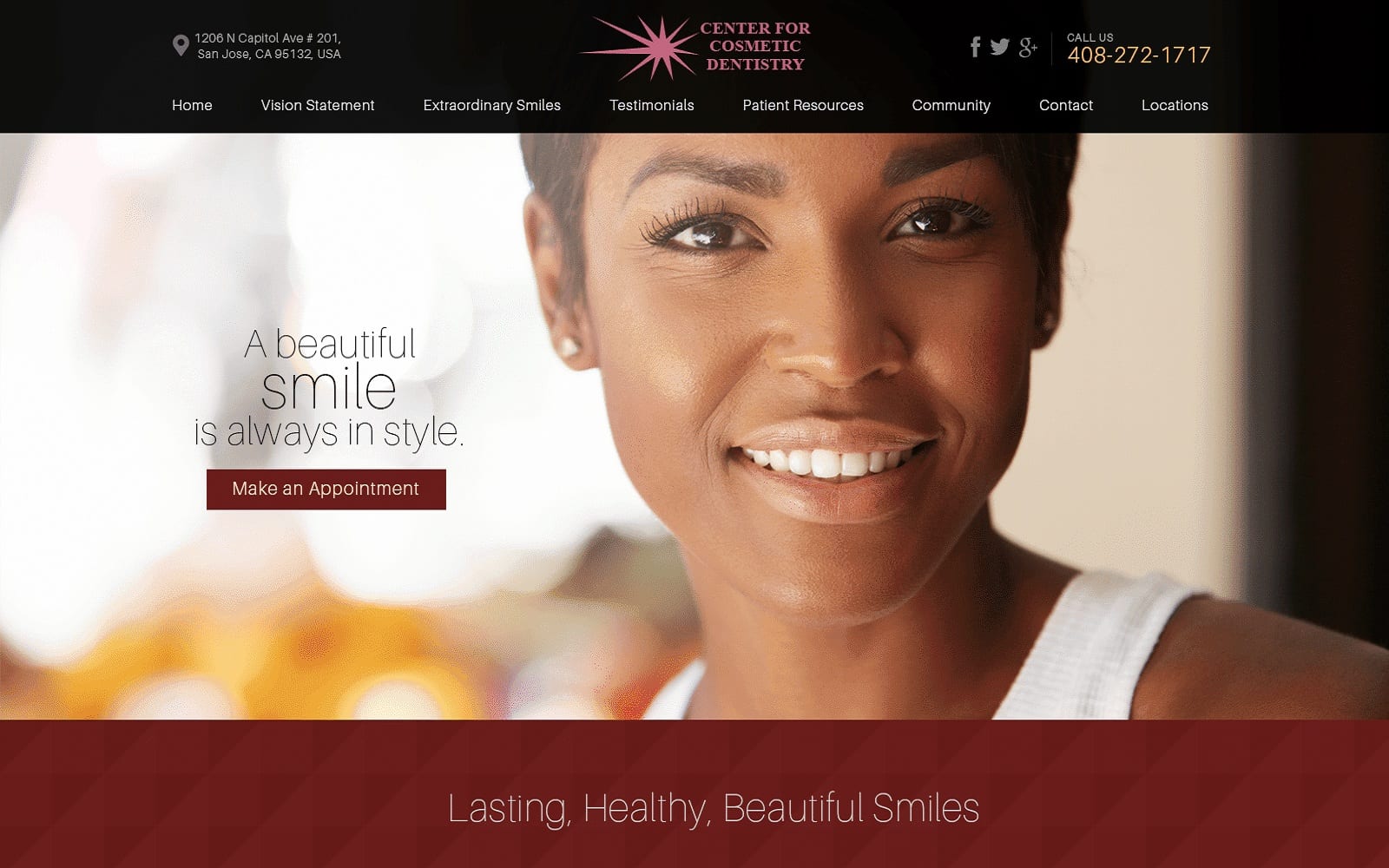
The Center For Cosmetic Dentistry’s website compels its visitors with a progressive, earnest, and refined palette by using colors such as dark maroons, bright peaches, and jet blacks to cultivate interest. Maroon conjures feelings of passion and magnetism, and thus attracts its users with deep patterns incorporated into the makeup of the web site with confidence. Jet black creates elegant, timeless features, and brings in a strong emphasis on its classic features. Bright peach helps to accent the dark colors by complimenting the warmth. It nudges the user to interact and engage and brings a soft touch to the overall dark background of the website, and emphasizes the web site’s maturity and competence. It also engages with the user by bringing in diverse images, appealing to a larger audience to showcase its dental services.
Center For Cosmetic Dentistry establishes its home page with a solid, black header, containing various amounts of information such as its business logo, click-to-action address, click-to-action phone number, and social media icons. Its hero image displays its introduction text and action button for scheduling appointments and helps transition into its featured services. Its featured services incorporate semi-flat panels for engagement, and each section thereafter engages with the user by applying different alignments in text for a subtle transition. Near the footer, special promotions, google maps widget, and the HIPPA secure form can be found and interacted with for interaction. At the footer, visitors can interact with the social media icons, click-to-call service number, click-to-action button, and business logo to return back to the home page.
