The Center for Healthy Minds knows that it can sometimes be intimidating to consider seeking help with mental health, and wanted their site to be as inviting and open as possible. Every aspect of this design, from the choice of colors to the hero image that was selected plays into an easily approachable site that provides ample information without drowning the visitor. A careful balance had to be struck to ensure that every concern of the patient could be addressed while not overloading the visual aspects.
Overview Of The Design
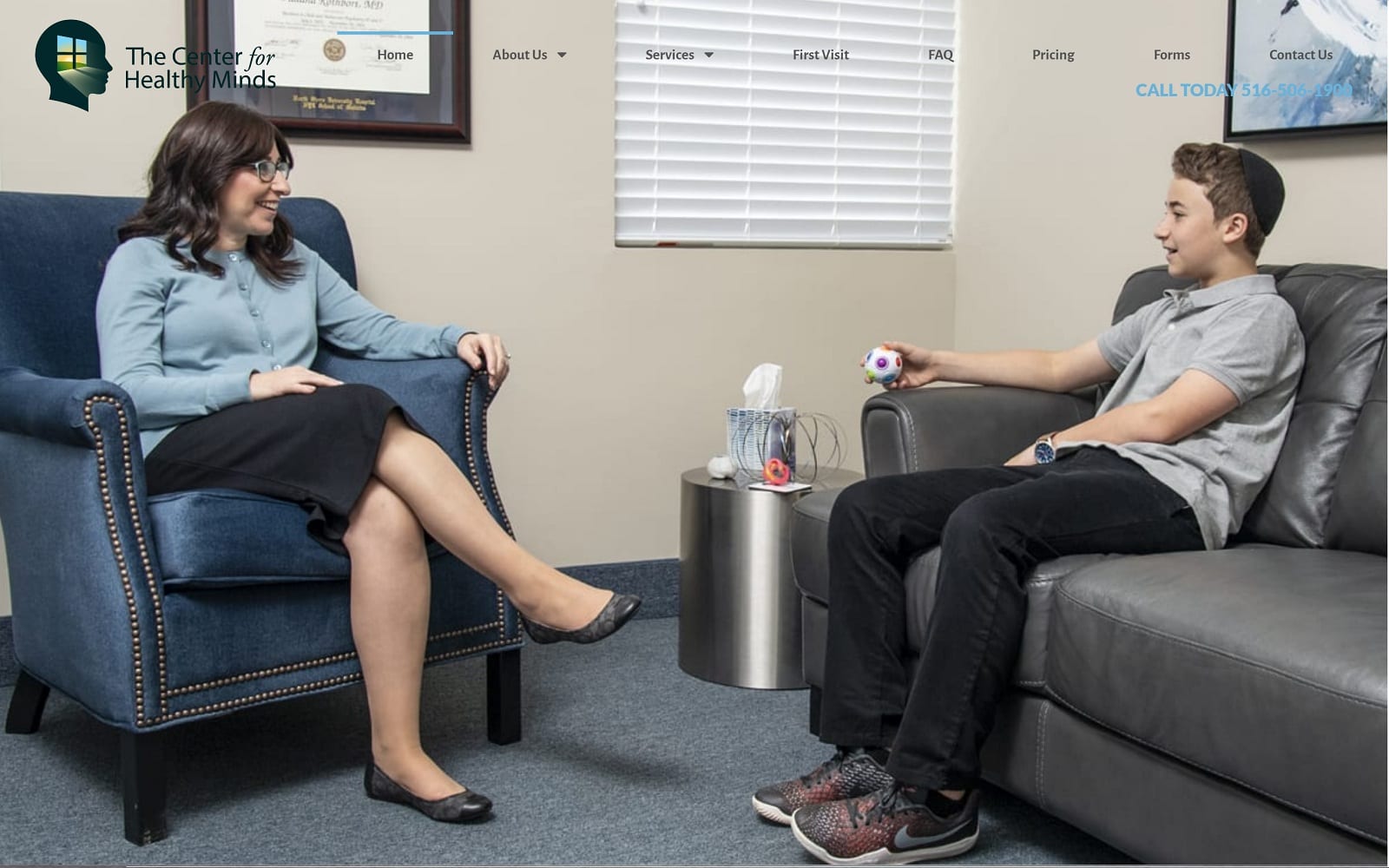
The perfect way to open this site was with an image demonstrating an open and friendly environment with a positive engagement between the practitioner and her patient. The bright, comforting colors of the office combined with the vibrant art on the walls served to set the right mood for a visitor coming to the site. Everything about the landing page is focused on a minimalist and streamlined approach while making extensive information available to the viewer.
Use Of Colors
The colors used in this site design echoes those colors found in the office itself, from the clinical white of the walls to the comforting greys and blues of the furniture and carpeting. For the purposes of the website, these colors are likewise echoed in the clothing that Dr. Rothbort and her patient are wearing in the hero image.
• Contrast – When used in site design grey tones tend to convey a sense of formality and sophistication and contrasts surprisingly well with the indigo blue shades that bring a sense of calm and healing to the viewer. White conveys a sense of cleanliness and works especially well for highlighting important points through this site.
• Calming and Inviting – Throughout the whole site you’ll see careful considerations made to ensure the site remains inviting and relaxing, aiming to set the viewer at ease. The color choices are perfect for this as they immediately project a sense of calm and don’t jar the eyes.
• Casual yet Professional – One of the clever aspects of the choice of color both in the office and in the site is how it conveys a sense of blue-jean casualness while still retaining an air of professionalism. The interplay of gray and blue serves to make the whole experience seem friendly and inviting without losing credibility.
Analysis Of Design Elements
As is appropriate for a professional site of its type The Center for Healthy Minds avoids presenting a cramped appearance. While densely packed information isn’t always negative, the nature of the issues faced by visitors to this site means that a clean and easy to manage interface is necessary. The open and airy design helps to carry through the impressions it opens with.
• Space – The openness of the site carries through to every aspect of the site, with the sole exception being the FAQ section, which still maintains a clean design by contains a significant amount of information in a small place.
• Navigation – The implementation of the hamburger menu makes the whole site easy to navigate, if you don’t find what you’re looking for by scrolling through their informative home-page, you just click the menu in the upper-right hand corner for immediate access to all other areas of the site.
• About Us – The About Us Pages are very clean and demonstrates the personal and professional attitudes of the staff incredibly well. One more demonstration of the straight-forward and open design of the site is present in these pages.
• Contact Information – For those seeking mental health assistance there is often a sense of urgency, which is the driving reason behind the phone number’s prevalence placed at the top of the opening screen.
Marketing Aspect
The marketing aspect of this site opens with the prevalence of the contact information on the first screen, followed by the choice to use a hamburger menu over a traditional bar menu. Hamburger menus have been shown to improve conversion and reception by the viewer, and having your contact information prevalent is vital. The straightforward writing in the site is also essential to it being taken seriously; hype based content has been shown to impact a site’s credibility negatively.
The Image this Website Reflects
This website’s design reflects an engaging and friendly atmosphere with a minimum of fuss. It’s clear from its design that the practice is about the patient and aiding them through their time of difficulty, and not overloading them with information. The personality of the professional is visible throughout the site, from the bright smile in her photos to the comfortable and welcoming choice of colors.
