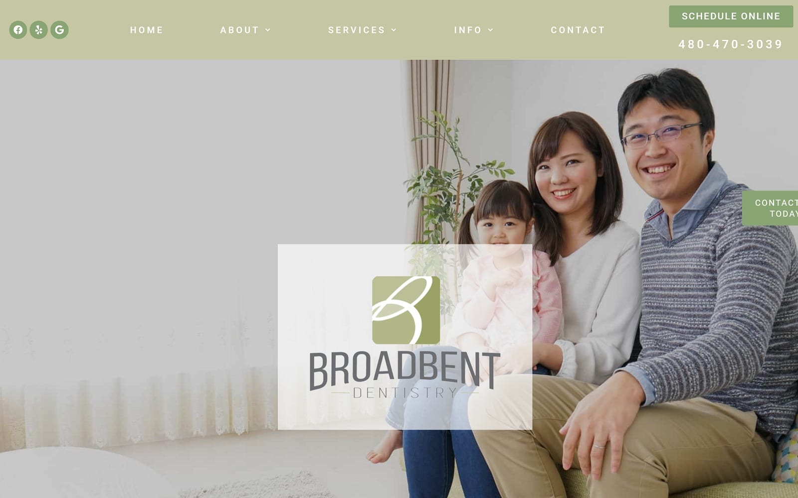
Broadbent Dentistry website greets visitors with a refreshing green and white color palette and images that capture happy moments among patient families. The logo is a simple but stylish design that combines the clinic’s palette with bold, striking fonts that stand out on correspondence and in the mind of its patients. The home page takes an image-centric approach that serves to introduce patients to the clinic and staff, helping to build rapport. Green as a color is tied to nature, healing, and well-being, and used in its various shades provides a good atmosphere for this site. This site is a perfect example of how a complex color palette isn’t necessary to create a striking website.
Imagecentric design that features the office and staff helps drive conversion by aiding the visitor in imagining themselves in the clinic receiving care. Images help to make your clinic change from being an abstract concept into a visual reality, an element of design that can make all the difference. The ability to schedule an appointment online is a convenience needed by busy patients who may not be able to reach out when your clinic is open. The website provides patients with an easy way to manage their services with Broadbent Dental, including patient forms, an online portal for their records and accounts, and their unique offering of an in-office dental savings plan for future concerns.


