Visiting your dentist shouldn’t just be pleasant, it could be a vacation from the rest of your day, and that’s why Dr. Cox went out of his way to bring a piece of Tuscany to Idaho. He wanted his website to represent the same bright slice of Tuscany that his office did, and the team at Optimized360 worked together with his office staff to produce that feeling in their website. Here you’ll find Italian hospitality blended with beautiful clay tiles and dental services that are just beyond the pale. By coordinating with the client, we produced a website that is as unique as this dental practice.
Overview Of The Design
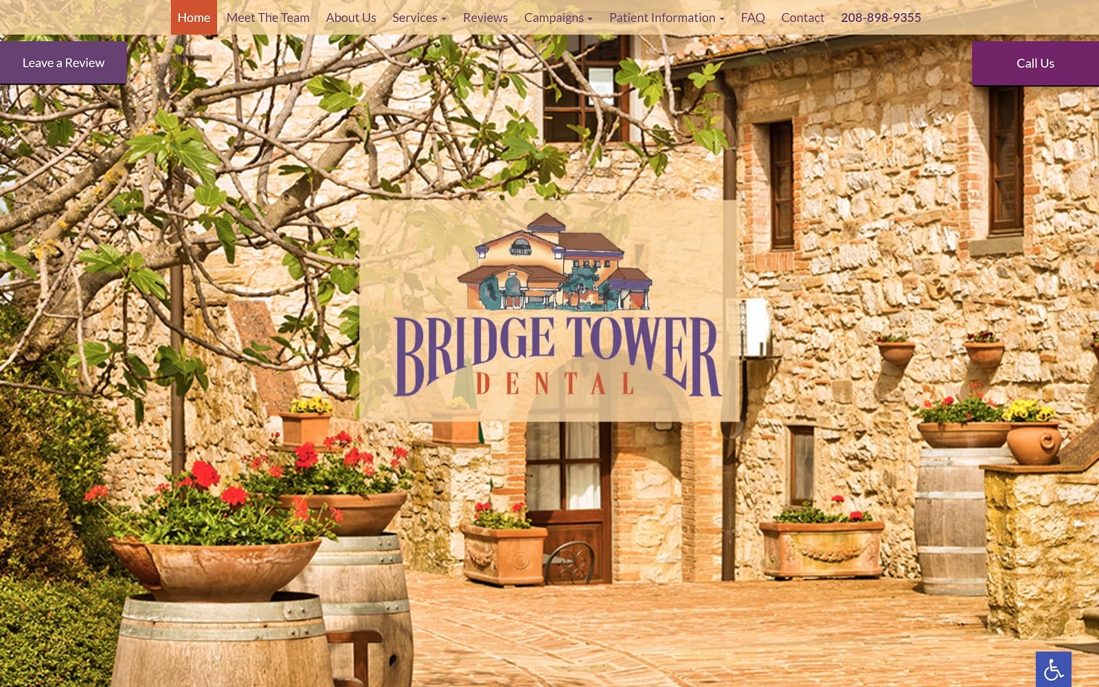
The website starts out by transporting you away from the idea of dentistry and the cold Idaho north through the use of warm colors and Tuscan designs. Planning a trip to Bridge Tower Dental feels like you’re planning a vacation rather than a dental visit thanks to the imagery presented on the website and the office that it represents. It’s clear from the initial design that they want you to contact them immediately, but they also make information about the office and its staff immediately available. Overall it’s a beautiful, fluid design that is striking and unique.
Use Of Colors
Soft, warm oranges and yellows come together with a striking purple to create an unusual but beautiful blending of tones. The warm orange tones help to invite the visitor in and transport them away from the colder climates of the north, bringing visions of a day away from it all while getting your dental care tended to. It was an unusual approach that we were happy to work with, and we feel the color scheme came together with the various design elements to create a powerfully attractive site.
Analysis Of Design Elements
When you visit this website, you immediately get introduced to the personality of the Doctor and his office staff. Warm hospitality, bright colors, and an image of an office staff that is equal parts energetic and unique in their personality. Everything about this page says “welcome home,” which is entirely fitting with the Tuscan theme present in the rest of the website.
Marketing Aspect
The marketing angle on this site is unusual and creative for a dental website, welcoming its visitors into getting away from it all with a day at the dentist’s office. You’re immediately presented with the phone number for the office while the colors immediate get you dreaming about a day at the dental office away from it all. In addition, Doctor Cox’s website is also ADA. This means that patients with disabilities will be able to interact and enjoy the website in the same optimal format as anyone else!
The Image this Website Reflects
This is a website dedicated to an office staffed by caring individuals who are eager to get to know you and make their relationship with you an active part of your dental care. When you drop by Doctor Cox’s office, you’ll be visiting your dental family who will always be eager to receive you and start your dental care journey. It isn’t just about today; it’s about a relationship with you and your oral health that will last a lifetime.
Bridge Tower Dental Designed by Optimized360
