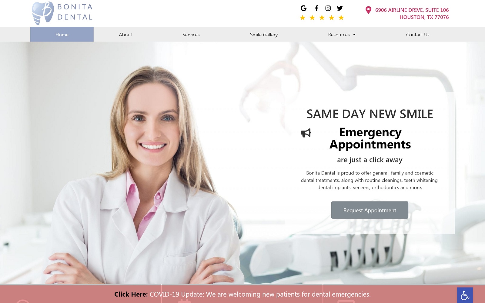
Bonita Dental’s website presents a playful and striking logo featuring a stylized blue tooth with a striated root and a B in a script font next to the name of the clinic. This logo reflects the simple but effective blue and white color palette and design used throughout the site. Bright images of happy dental patients are set above a dark blue base captioned with the services they serve as a link to. This design represents an even balance between image-centric design and text-focused design, resulting in a website that is a pleasure to view and easy to navigate. Mobile-responsive design concepts are integrated into the base concept of the website, resulting in a viewing experience that is effective in both traditional sizes and on mobile-devices alike.
The mouse-over reactive element of the service link images serve to inform visitors that these are links and entice them to interact with them for further information. The Smile Gallery shows patients the results they can expect when getting treatment from Bonita Dental, building confidence in the clinic. These images also serve to get the visitor seeing themselves walking out of the clinic with beautiful white teeth, an essential element of conversion. HIPAA secure forms are found near the footer of the page to aid patients in reaching out to the clinic, while direct-to-map functionality means they’ll never get lost on their way to an appointment.


