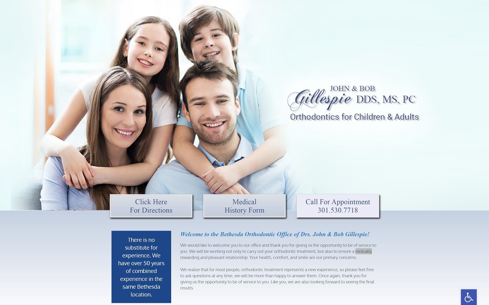
Located in the heart of Bethesda, Maryland, Bethesda Orthodontics for Children and Adults wanted to make it clear through their website design that the patient’s health, comfort, and smile were their top priorities. Bethesda Orthodontics has been located in the same location for over 50 years and has the experience and customer base to back it up. When designing their website, they felt that all the additional fancy designs that modern websites used were not needed. We catered to their needs to find a perfect medium for professionalism and modernism. No need to go all out when you already have the backbone support!
Design Overview
We designed a website that had lots of wide space to allow optimal user navigation. The navigation bar is spacious and easily legible (located on the top banner of each web page). Although not extremely thick in diversity, each tab is rich with information that users will find helpful. The Team tab is simple and effective in listing the educational background of the primary dentists. The home page is spacious and lays out the team’s philosophy above anything else. It also features several calls to action options as well.
Use of Color
Since we were dealing with an orthodontic specialty, we figured it would only be right to incorporate a light blue hue when designing the color theme. The site is predominately featured with a mixture of blue and purple. This allows for optimal reading accessibility. Most of the information on the website was to inform. We kept that in mind when choosing the color theme. The mixture of blue and purple is easy on the reader’s eyes. This allows them to digest the information in front of them with ease. The last thing you want to do on any website is to steer your readers away by using a harsh color theme.
Design Elements
Space is expertly managed throughout the site. The frames, text, and images are all legible and blend in symmetry with each other. The services page offers a large amount of volume for readers to digest. We integrated different fonts, letterings, and alternative links to help reader engagement. You can find these tactics all throughout the site. The images located on the website are all professional and clean. Some of the pictures are pictures taken from the Bethesda Orthodontics team themselves! This goes to show how committed they are to ensure that their website is a direct reflection of their craft. When visitors enter the site, they feel as if they already have one foot inside the office door.
Marketing Aspect
Regardless of which web page the visitor is on, they will always have a clear call to action in front of them. We made sure this was the case by adding directions to the office as well as contact information on the front banner. This information can also be found at the bottom of each web page as well. When in doubt, visitors can always visit the directions tab on our handy navigation menu for direct map access to the office. As a powerhouse in the dentistry world for over five decades, we made sure this was highlighted through their extensive testimonial tab. The vast amount of information presented on this website can quickly convince any first-time web visitor to pick up the phone and become a patient.


