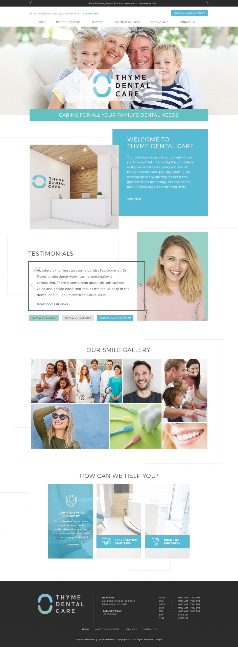
Dr. Michael Nguyen approached us looking for a pleasant, open and inviting site design for his practice at Bay Periodontics. For some patients, getting dental implants can be an incredibly nerve-wracking experience that is a blend of hope and trepidation. This dental practice owner wanted to overcome this concern and let people know that he was dedicated to “changing lives, one healthy smile at a time”, a concept that needed to be subtly reflected through the entire design of this site.
Overview Of The Design
As soon as you hit the landing page you’re greeted by the inviting smile of Dr. Nguyen, a direct invitation to becoming part of the Bay Periodontics practice family. It demonstrates that for some people just jumping right in is the best approach, which is why three forms of contact are listed immediately on landing, a button for scheduling an examination, a phone number, and an email address. “Take whatever path is most comfortable for you” is evident in multiple options presented. Along the bottom of the page, you’ll find a listing of all the certifications and organizations that are behind Bay Periodontics.
Use Of Colors
The site makes prevalent use of white, blue, yellow, and pink. These colors were not chosen by mistake, white is a color that represents professionalism, cleanliness, and purity, and conjures images of fresh white teeth. The blue instills a sense of comfort and hope in the viewer and is commonly used by medical facilities and other locations where calm is desired. Yellow and pink are both uplifting comforting colors that help to ease nervous patients and make them feel welcome and relaxed while reviewing their options.
Analysis Of Design Elements
It’s clear from the opening design of this website that you can expect a professional and caring relationship with the people who will be providing your dental care. While some dental websites focus on pictures of teeth and before and after pictures, Bay Periodontics focuses on the eyes and smiles of happy patients, before, during and after their procedures. This practice is all about people and a long association between practitioner and client. Reviews are prominently shown to help reassure those who need outside verification, and at the bottom of the page, all the contact information is provided, including a form to schedule an appointment. Nothing pushy, everything open, all about people.
Marketing Aspect
The marketing aspects of this site are the common utilization of location, prominent use of terms implying gentleness and a variety of pages covering all of the most common procedures used by those searching for this kind of treatment. Once a visitor lands on this site they are greeting by a smiling face and multiple phone numbers to provide an impulse connection based on a positive impression of the doctor and a desire to get treatment taken care of.
The Image this Website Reflects
This website reflects a warm and family-oriented dental practice that aims to make patients feel relaxed and welcome rather than just treated. Viewing this website you know there’s going to be an open and welcoming facility with friendly staff ready to wait on you, and that you’ll always be seen as a person during your visit, not just a procedure.
Bay Periodontics Dentist Website Designed by Optimized360
