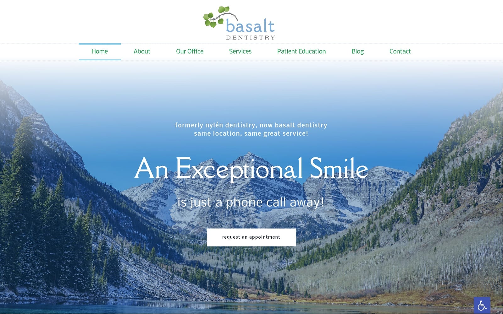
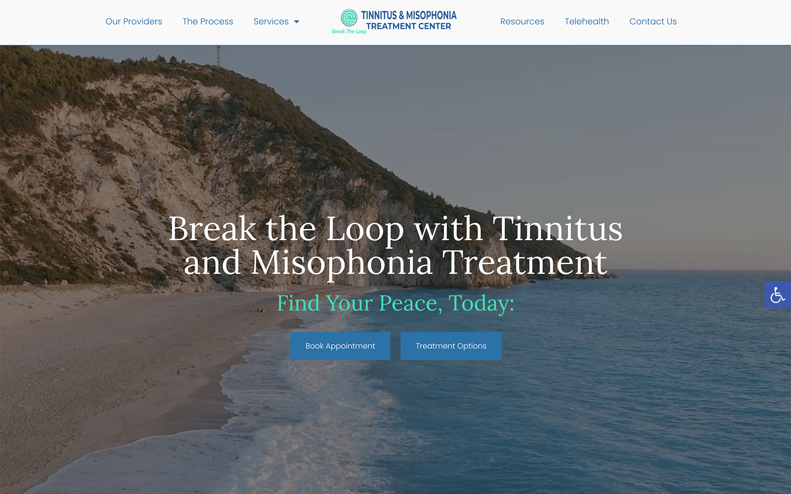
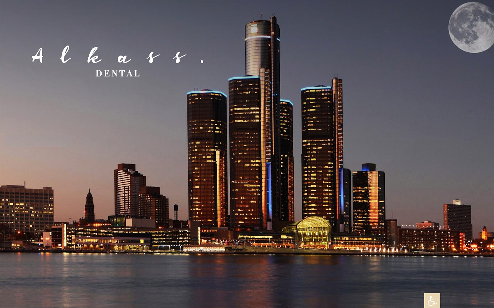
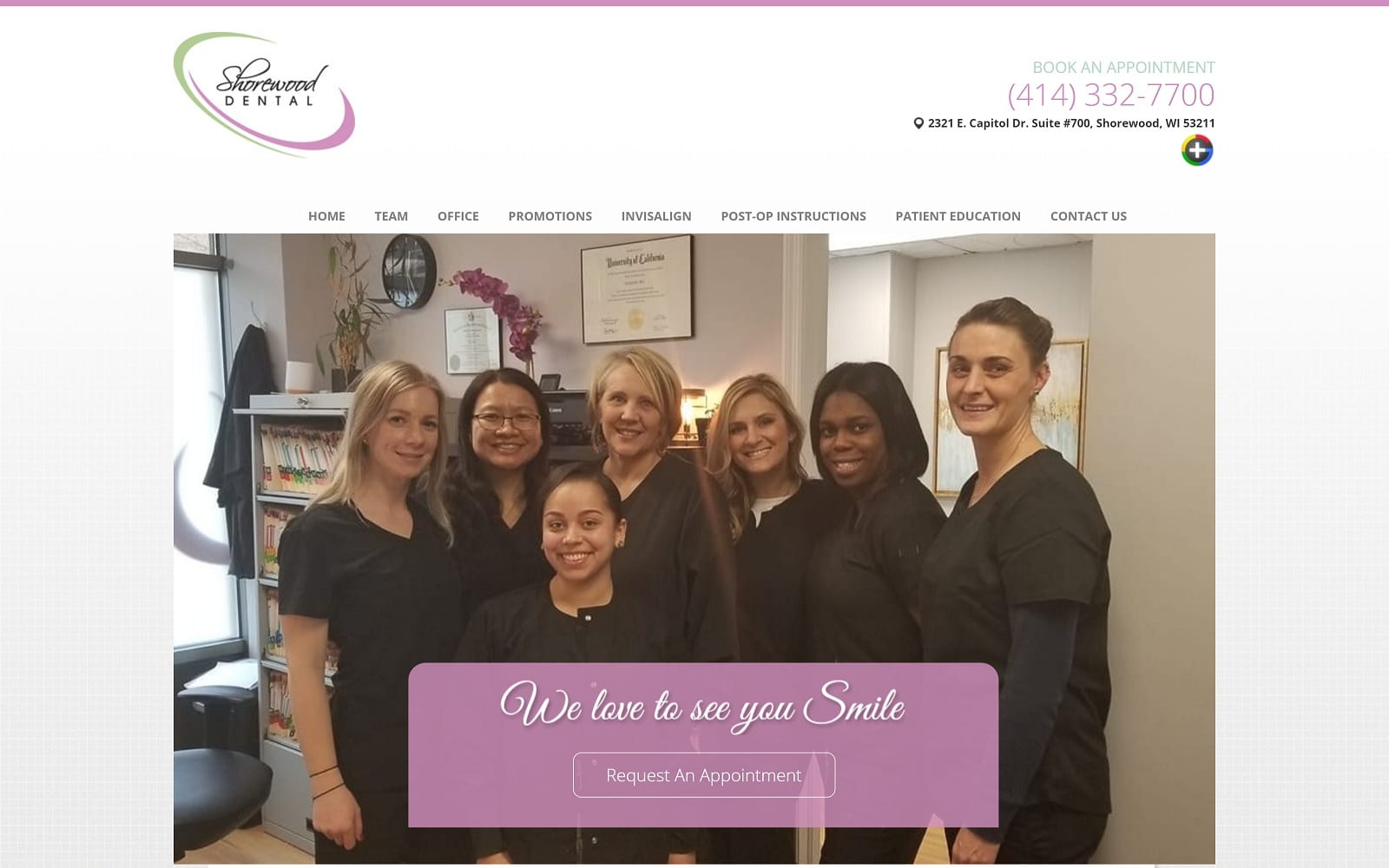
Basalt Dentistry plays with font, spacing, and imagery to entice its visitors, using its color scheme as a secondary aspect of its characteristics. Basalt’s Dental Website integrates both sans serif and serif fonts, in variations of sizes and colors, and fuses different points of capitalization to emphasize its modern, chic qualities. However, much of its core imagery and color scheme appeals to ideas related to clean, natural, and crispness. Mint green and baby blue both focus on relaxation and sophistication, offering clean, gentle effects complementary with its sleek, harmonious webspace. Basalt Dentistry appears to visitors with cleanliness and purity to its page, and by incorporating modern design techniques into its website, it focuses on clarity and aesthetics as its core mission for service its patients.
Basalt Dentistry starts with a transparent header, with the background transitioning into the hero image, containing its main menu services. Its hero image, which compliments the business logo, includes text and its action button for scheduling. The service section is organized within two columns, each section highlights the action button when hovered over, and each section is separated by a banner, containing various information related to the business’s services, including scheduling appointments. Its testimonials are outlined with images next to the reviews. Its footer contains the HIPPA secure form, google maps widget, and hyperlink icon for visitors to return to the header page without scrolling. In the right-hand corner of the home page, the accessibility tool can be found, containing tools such as high contrast, readable font, and grayscale for easy interaction.
