Overview of the Design
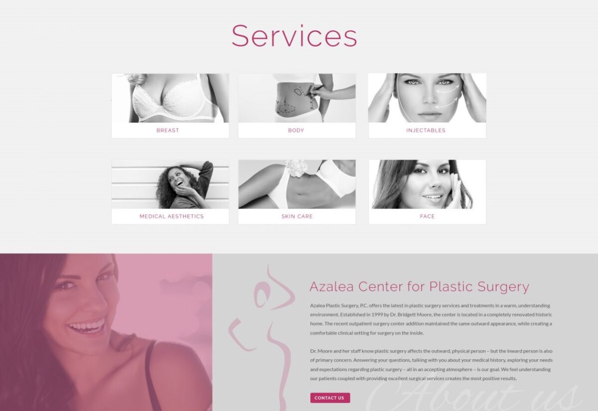
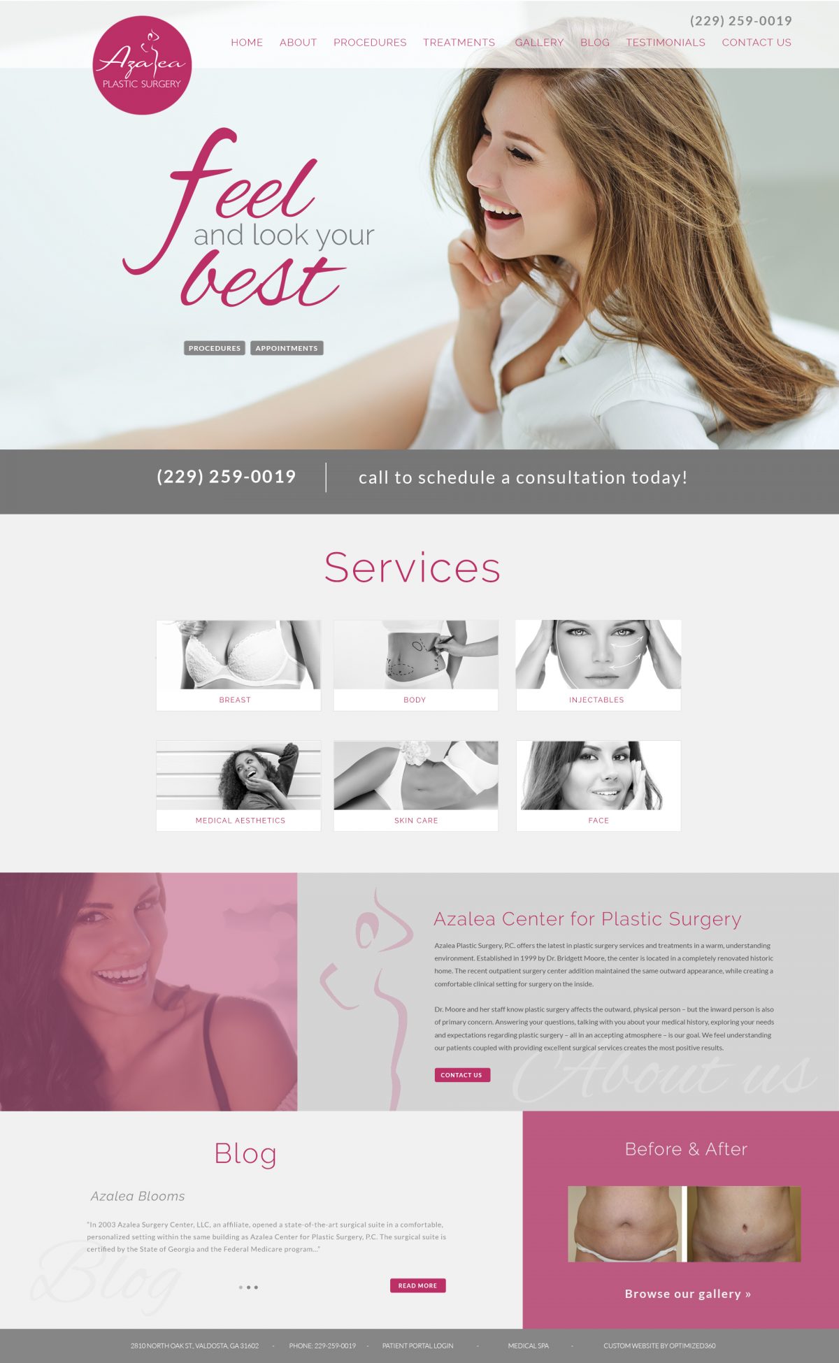
Cosmetic surgery is a sensitive topic for many patients since it has to do with the alteration of one’s personal appearance. For this custom plastic surgery website, we let the pictures do the talking with an extensive display of real patient results. The website has a traditional layout and standard navigation bar, as well as a home page introduction to the practice and its background. We also included a featured services section on the home page that is designed to immediately redirect visitors toward the types of services they are most interested in.
Patient education is very important – especially for individuals considering elective cosmetic procedures. For this website, we included extensive information about each of the surgical and non-surgical services offered by the practice, as well as an opportunity to post videos as the doctor deems appropriate. For the convenience of new and existing patients, we included a section that provides information about what to expect during an initial consultation. This area of the site also includes downloadable patient registration forms, as well as a list of pre-operative and post-operative instructions.
Use of Colors
This website uses a divided color scheme. The primary basis of the site is blue and pink, which together yield a confidently feminine tone. However, we created a small, but prominent black and white space on the home page to stand out from the rest of the site and highlight some of the featured services available from the practice.
Analysis of Design Elements
For this site, the special design elements are subtle, but effective. Specifically, the scrolling before-and-after gallery draws the eye, and the full-screen width design fills up the screen with no space wasted. We also created enhanced contrast within the special services section, which appears when each of the service options are selected.
Marketing Aspect
The most powerful online marketing for plastic surgeons is a great website and a before-and-after image gallery. That sets the foundation for any other future online ventures, such as advertising. For Azalea Center for Plastic Surgery, we provided both – a beautiful custom cosmetic surgery website as well as a comprehensive page full of Dr. Moore’s real-life plastic surgery patients pictured before and after their procedures. We also integrated the office blog into the website, as well as links to the practice’s social media pages. Finally, we included an appointment request form for easy consultation scheduling.
Image the Website Represents
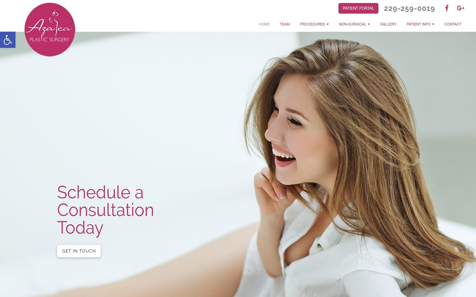
This plastic surgery website is all about looking and feeling your best. The profile of an ageless woman adorns the home page, as does a cursive font and the images of several women with beautiful skin and features. The idea is to create a space that is distinctly feminine, comfortable, and unpretentious.
Plastic Surgery Website Designed by Optimized360;
Overview of the Design
Azalea Plastic Surgery is a specialty surgical and non-surgical medical practice that appeals to a niche demographic. Our job here at Optimized360 was to hone in on that demographic and appeal to its interests and concerns. We are proud of the website we built for this practice, which strikes a balance between traditionalism and modernism. Furthermore, with the ability to quickly jump to specific areas of interest within the website, we made sure this site was user-friendly.
Use of Colors
Pink and white are the predominant colors used on this website, as they compliment Azalea Plastic Surgery’s offline branding and logo. These colors are bright and feminine, appealing to much of the female demographic that makes up much of Azalea Plastic Surgery’s clientele.
Analysis of Design Elements
This website is built on a traditional layout with a header navigational menu, primary image, and secondary black and white image menu that fills with color when selected. We chose a soft, fluid font for this website, as it makes the practice appear less rigid and more approachable. As users move down the home page, we create subtle, interactive elements, such as scrolling before-and-after pictures and an image that slides into place once the user reaches a specific point on the home page. For the convenience of patients and Azalea Plastic Surgery staff, we also created a link to a dedicated patient portal, where patients can manage their personal accounts.
Marketing Aspect
It is easy to convert site visitors into first-time consultations by offering an appointment request button directly on the home page. We also spotlight the practice phone number and link to its social media accounts. A patient gallery is very appealing to potential patients who want to see first-hand the types of results they might achieve by undergoing treatment from Azalea Plastic Surgery. We link directly to the image gallery from the home page, as well as from the primary navigation menu. Another beneficial plastic surgery marketing element is the use of an extensive video library that explains various types of cosmetic surgery and what purposes they may serve.
Image the Website Represents
When it comes to designing a custom website for a plastic surgery practice, aesthetics are everything. We created the Azalea Plastic Surgery site to stand out in a soft and subtle way with feminine imagery that helps potential patients feel more relaxed and confident scheduling the first-time consultation. Pictures of feminine shapes and smiling faces depict natural-looking beauty – something Azalea Plastic Surgery seeks to restore in patients hoping to make physical enhancements or simply turn back the hands of time.
Image the Website Reflects
This site reflects a patient first approach to the visitor by providing copious information about the services they provide and ensuring they start their relationship with the doctors and staff at Alazea by learning about them and the roles they play. The overall site is attractive and orderly and is designed to quickly get the patient into the office without presenting a ‘pushy’ feel.
Azalea Plastic Surgery Website Designed by Optimized360
