Located in the heart of Texas, Arc Dental is all about utilizing modern dentistry. For the Arc Dental dentistry team, modern dentistry is more than just using the latest technology. It is all about innovation and learning new procedures and tactics to better serve the patients. With a modern mindset at hand, we made sure to build Arc Dental a website that would reflect on this philosophy. Gone are the websites with one-dimensional graphics and stale text. We made it our mission to match the modern website design with modern dentistry.
Overview of Design
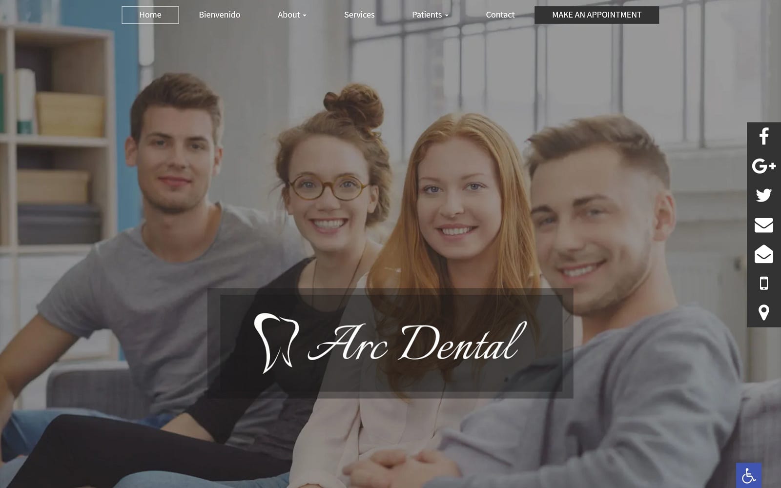
Rich, visual graphics make up a majority of the website. From the jump, the home page features a multitude of different images and engaging features that boost their services and procedures. Not one single space is wasted on this website. The site is modern and designed to operate on a full-width layout. Engaging visuals with parallax effects span the majority of the front page. These visuals create a border in itself and add a memorable and playful touch to a specialty that is often much too serious. The navigation bar is fruitful in variety and easily accessible at the top of any given web page.
Use of Color
We stuck to a basic black and white color theme on this website as we did not want colors to overshadow the large amounts of visual design. The font, much like the visuals, is playful and stand out. The navigation bar also has drop down elements that allow readers to fully dive into each subject. There is a little bit of everything in the navigation bar. Arc Dental has it all down. From a smile gallery and testimonials to a page dedicated to their mission statement and philosophy. The about us page offers a great breakdown of the dental team as well as an on-site office tour. With sites that have so much enriching imagery, it can be quite easy to feel overwhelmed. We made sure to space text and visuals properly to make them balance.
Elements of Design
To go along with their philosophy of modern dentistry, all their pictures (including stock images and before-and-after photos) are a clear reflection of the team’s dedication to patient satisfaction. The pictures are professional, engaging, and helps add a subtle hint of additional personality. Combine that with our custom-designed logo, and you have the blueprint for a trendy, yet satisfyingly professional web design!
Marketing Aspect
When you first enter the landing page, you are given the option to choose between English and Spanish. Not only does this help migrate in a completely new pool of clients, but it also shows the extreme attention to detail that Arc Dental places on customer satisfaction. There are also new patient forms available to save both patients and doctors time when it comes to finally commit to an appointment. On the navigation menu, there is also a link to their educational blog and external videos. Not only is this a great way to increase incoming traffic, but it also gives viewers a chance to see the dentists in live action. This can be the deciding factor between sticking with your old dentist and giving Arc Dental’s philosophy a try. In addition to all of this, there are always promotions being ran throughout the site. Need to schedule an appointment? Never again will you have to worry about struggling to find the office’s contact information. We included an interactive contact widget on the top banner for quick and easy access.


