Overview of the Design
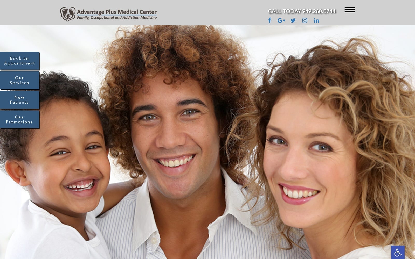
We build custom websites for family medical practices, internal medical practices, and holistic/alternative care practices. Advantage Medical is a family practice that offers a wide range of family, occupational, and addiction medical care. The practice is built upon the needs of its patients, from those seeking preventive care to those in need of chronic disease management. That is why we filled the website with images of patients of all ages and backgrounds, from young children to adults.
The home page design contains no above-the-fold text – only large scrolling imagery, a small menu, and a few tabs that allow for immediate options for new patients, including current promotions and appointment options. Further down, there is a brief welcome to the office, an introduction to the doctor, and a list of services provided by the practice.
Use of Colors
We chose beautiful shades of brown for this website. This color is neutral, appealing to people of all ages and gender. Brown is also reminiscent of the Earth itself, implying that Advantage Medical is a good place to build the foundation for future health.
Analysis of Design Elements
The design elements in this custom family medical website are very modern and up-to-date. We utilized a full-screen-width layout that makes a strong statement and takes advantage of all the available space in the browser window. To make a bold statement with the header imagery, we also condensed the site menu down to a small menu that expands when clicked upon. The special effects are subtle but present. For example, we included a header bar that appears invisible until the user scrolls down the home page. We also created scrolling testimonials for the home page, as well as an integrated responsive map to the practice.
Marketing Aspect
When searching for a family doctor or primary care physician, many potential patients will browse and compare practices based upon the types of promotions offered by the practice. For that reason, we made it easy for Dr. Bebawi to run and link to special promotions directly from the home page. We also made it possible to request a consultation from anywhere on the site via a contact form or appointment request on each page. Finally, a page dedicated to the practice blog allows the practice an opportunity to seem authoritative by providing helpful information about the practice and its services.
Image the Website Represents
Since Advantage Medical caters to patients of all ages, we placed pictures all over the website of patients and families depicting a wide range of ages. Overall, the site projects the image of a family-friendly practice that serves the needs of all patients.
Website Designed by Optimized360;With over 35 years of primary medical experience, Dr. Naguib Bebawi manages Advantage Plus Medical Center. Centered in Irvine, Dr. Bebawi specializes in Family Medicine, Occupational Medicine and Addiction Medicine. We made to highlight the cutting-edge services and technology Dr. Bebawi uses on his custom website.
Design Overview
We went with a full-width design layout to ensure that the site would come off as modern and classy. As web-visitors enter the website, they are promptly greeted with smiling faces from our parallax smile gallery. This also gives the impression that Dr. Naguib is approachable and friendly. We also highlighted the different services offered at the office. We rounded out the homepage with a call to action with a form to schedule a consultation with Dr. Naguib himself.
Call to actions are important to creating increased web traffic Here is a how-to Youtube video on how to use CTA buttons on your own website!
Use of Colors and Images
We complimented the imagery through the use of a black and white color theme. When used together, blue and white make for a contrast that is action oriented. White provides the optimal background for educating and informing incoming patients. Having a white background also adds credibility to any professional medical website. Blue is primarily used to highlight calls to action throughout the website while also helping soothe the readers by giving a sense of hope.
When designing any website, you want to make sure that the images on the website match the specialty at hand. All the images on the website give the impression that Advantage Plus Medical Center is credible and trustworthy.
Design Elements
One standout feature on the website is the lack of a traditional navigation menu. In its place is a hamburger menu. This allows more interface space for the readers as well as opening up the top banner for contact information and social media links. The patient questions tab is essentially a large FAQ page that hopes to answer any and all patient questions.
As you move down the tab, you will notice a tab dedicated to testimonials. This is a great way to attract new patients as well as giving your practice a boost in reputation. Being personable is key to establishing any new patient-doctor relationship. The services page is home to a plethora of information. Here, readers can learn more about the different procedures offered. When you click on any of the procedures specifically, you are redirected to another page that describes the procedure in more detail.
Marketing Aspect
Dr. Hubbard understands that dental work can be quite pricey. As a result, he offers in-house promotions and online coupons as well. Just visit the promotions tab under the hamburger menu to find out more. Not only does this show compassion and understanding, but this can also help add a layer of personability and credibility to the dental office as well. Establishing the patient-doctor relationship early on is crucial to bringing in both new and returning patients.
