Advanced Periodontics in Plymouth Michigan is managed by Dr. Bhola, Dr. Kolhatkar, and Dr. Jacobs, respectively. As specialists in Periodontics and implantology, these doctors specialize in conservative and surgical treatment of various gum and periodontal diseases. To match their conservative strategy, we created a website that would serve to inform and educate incoming web-visitors about the benefits Advanced Periodontics has ts to offer.
Overview of Design
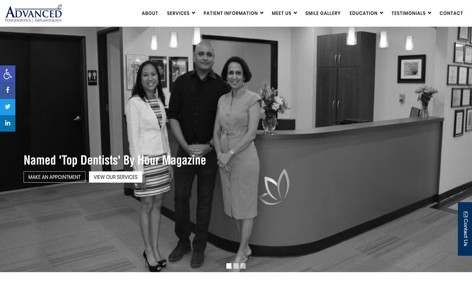
The overall design of Advanced Periodontics is both modern and professional. However, this does not mean that it had to copy the same exact blueprint as all the boring Periodontic websites. We paired modernism with parallax and rich special effects to bring the website alive. Combine our rotating image gallery with the personable staff biographies under the meet us tab, and you get the start of an awesomely designed layout. In an industry filled with robotic professionals, we made sure to help Advanced Periodontics keep a step up from the competition by including visuals of the dentists and the office.
Use of Colors
To match the specialty at hand, we integrated a sleek color theme using black and blue. Black and blue work well together in creating a simple aesthetic that helps keep the text and information legible. Michigan is encompassed by the multiple Great Lakes. The black and white help compliment the nature of the state as well. Blue is generally used to feature calls to action on the website as well.
Design Elements
Many of the pictures are from the actual office itself. This allows the incoming patients a preview of the doctors they will be confiding in. The patient-doctor relationship is crucial in maintaining trust. We made sure that the images on the website reflected the professional manner that the doctors operated under.
Since the main purpose of the site was to educate, we made sure to highlight the education aspects of the website on the navigation bar. The smile gallery is a great place to see actual examples of the team’s work. The education tab features additional information for the viewer’s pleasure. The site integrates square borders to help keep everything evenly spaced.
The navigation bar is always readily available, regardless of what web page you are on. This means that the information you are looking for requires no more than a few clicks! To add a personalized touch, we also created a custom logo that was simple but personable. The little details go a long way in standing out!
Marketing Aspect
Marketing your website is essential to the success and growth of your profession. When you properly market to your audience, the possibilities to grow are endless! The patient information tab holds an insane amount of education information. From an FAQ page to detailed rundowns of the various procedures offered, it is no surprise that By Hour Magazine named Advanced Periodontics some of the world’s top dentists.
Featuring testimonials on your website is another great way to show consistency and dedication to your craft. We made sure to highlight this on the website. Under the testimonials tab, you will not only find patient reviews but reviews stemming from Google and Facebook. For more visual patients, there are even video reviews!
Finding Advanced Periodontics will never be an issue. All the contact information is located conveniently on the top banner of the web page. From social media widgets to the office address, the top banner has you covered! The contact us page also features an interactive map and an appointment maker as well.


