Designing a website for prosthodontic services requires an in-depth look into the mindset of your patients. Finding a prosthodontics design for your website will help set up the visuals, but not all templates act with the same interests. Bringing to life aesthetically pleasing websites doesn’t just come from the visuals – it comes from understanding the user-face and color psychology. It features that many websites miss out on when it comes to improving the user experience. The best prosthodontics websites come from striking, unique color schemes, excellent responsiveness with patients, and easy-to-use features that most web visitors tend to need the most.
Medical websites are the one-stop-shop for patients searching for a better way to take care of their health for many to get a clear image of what kind of service quality your business can provide. Making a great first impression is what matters, and below, we’ve compiled a collection of web designs that can meet your design needs and serve as high-quality examples of prosthodontics websites.
1. Bates Dental
Aesthetics
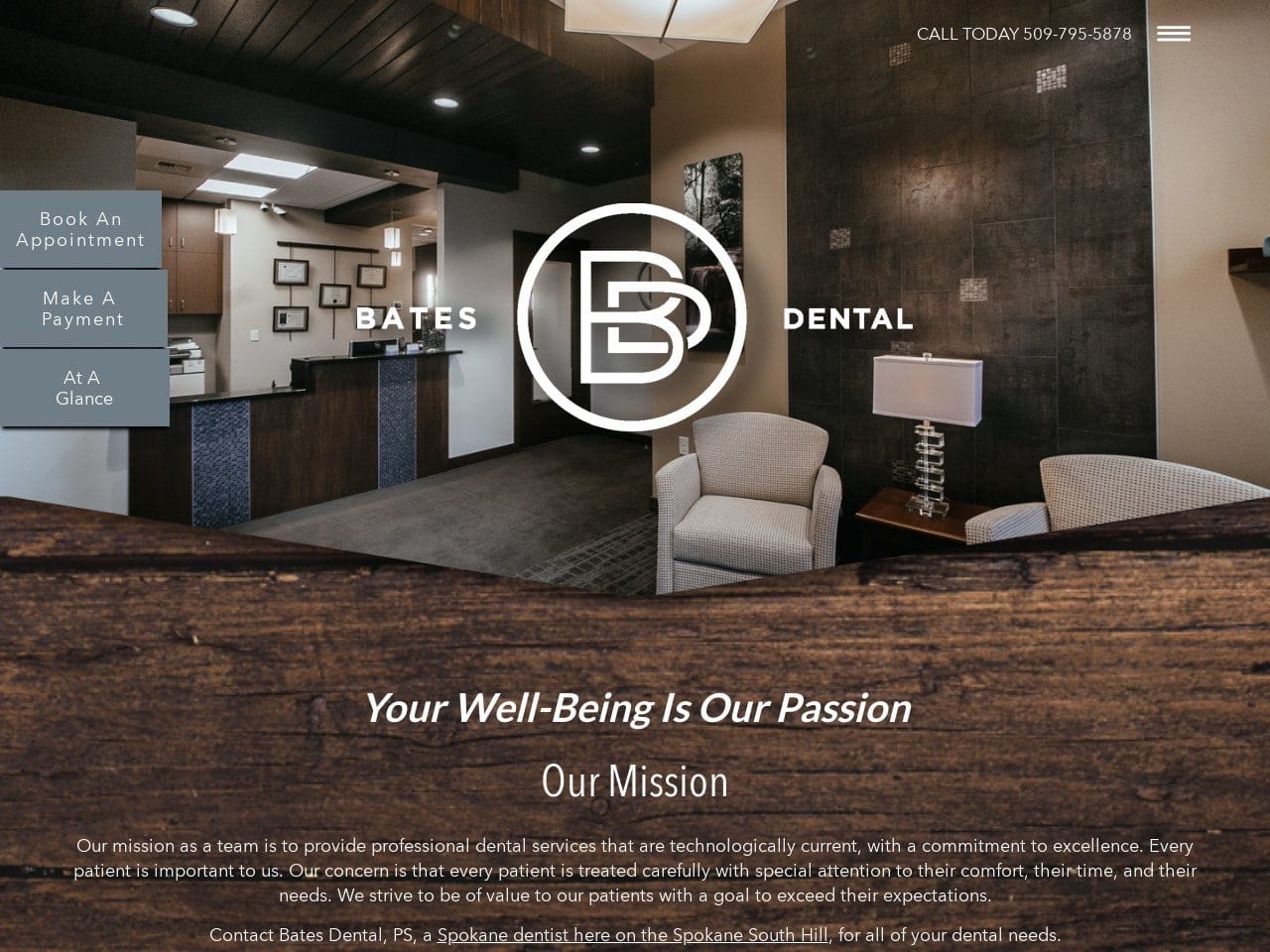
Bates Dental focuses on elegance, formality, and resilience as its defining features. Instead of using the traditional colors of blue, black, and white to represent its dentistry proficiency, the business’s color scheme turns itself into a place of special care and comfort in its patient’s treatment, with light-medium gray and navy blue as the action colors. Modern uses of interactive images and subtle hints of sleek transitions make this dentistry office a highly professional, mature space for dental surgery.
Functionality
Instead of outlining the main menu options along the top of the header, the menu opens up when interacted with, expanding on the right side of the page. Along with a click-to-call action link, all immediate action buttons are located on the left side of the page, allowing the header image and logo to take center stage. Its biography section and service section has interactive images for further information. Along with a slideshow testimonial, the footer image transitions lightly into the contact us form, allowing the viewer to easily interact with the home page for further information.
2. Tulsa Premier Dental
Aesthetics
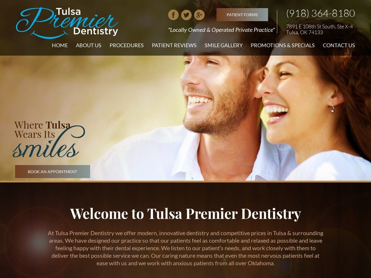
Deep, warm browns contrast the website, while the pure whites and deep blues accent the page, creating a dependable, communicative, and positive connotation to the dentistry’s image. Using gradients helps to harmonize the color scheme, as deep browns to blues represent earthy colors that flow naturally within the page and are also used as the action color to grab the viewer’s attention. The website’s design focuses on wholesomeness and steadfastness as its core values, using white to highlight information and its photography to convey the images of smiles as its specialty.
Functionality
With a translucent main menu header, the highlighted click-to-action button focuses on the patient forms as its focus instead of the phone number. As the header image expands warmly across, another click-to-action button can be found for scheduling. Its welcome section details multiple pictures outlining the inside of the office space and hyperlinks to its services. The image alongside the quotes gives the testimonials a face to the words that further attract the viewer to the page. Its blog excerpts relevant information on dental care and, along the footer, advertises its associations and products for dental care.
3. Perfect Smiles STL
Aesthetics
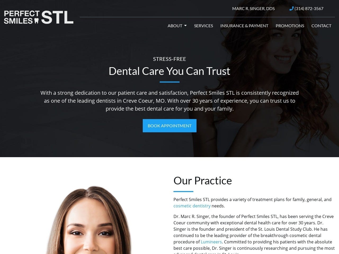
The website gives its company image and services a clean feel by taking on a conservative sophistication and classic minimalism aesthetic. The modern aesthetic is highlighted by the bright blue shown in the website’s action buttons and hyperlinks, quickly attracting the viewer’s eye throughout the page. Its image usefully encompasses the design choices of the site, and its use of transitional overlays among its images helps to neutralize the website and has its focus on the information present throughout the website.
Functionality
Its header reaches down towards the page’s center, encompassing the logo, main menu section, call-to-action buttons, and mission statement. Sections detailing the dentistry contain hyperlinks to attract the reader to its services, and its services section helps outline what the business provides by highlighting the image when hovered over. By moving from black to white to represent contrast, the footer contains the HIPPA contact us form, google maps widget, and relevant information such as its address, office hours, and associated links.
4. Charles Kim, DDS
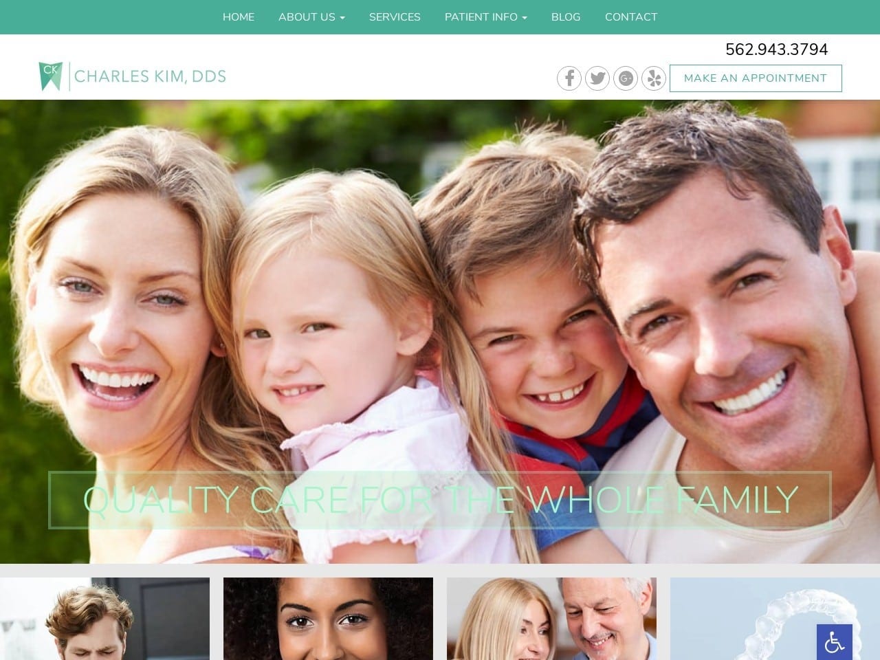
Aesthetics
Mint to forest greens represents the active colors of the website, while white helps to contrast the page’s use of color choice. Mint green can easily be associated with dentistry, while forest green brings depth to the overall page, both colors associated with energy, cleansing, and nature. White represents purity and simplicity, which, in combination, helps bring further association with its services to create a modern, friendly aesthetic unique to its dentist.
Functionality
A sectioned-out header containing click-to-action phone numbers, scheduling, and social media links, the header image envelops the website as it leads directly into its services, which, when hovered over, highlights in a light green hue. Its testimonial section previews its reviews from Yelp alongside images to further attract viewers to the business’s services. Its footer combines images, its HIPPA contacts us form, its office hours, and its google maps widget to encompass an elegant form of an invitation to its visitors.
5. Beautiful Smiles Denture Clinic, Inc
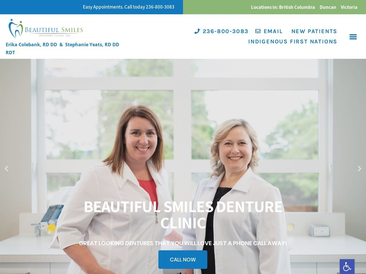
Visit Beautiful Smiles Denture Clinic, Inc
Aesthetics
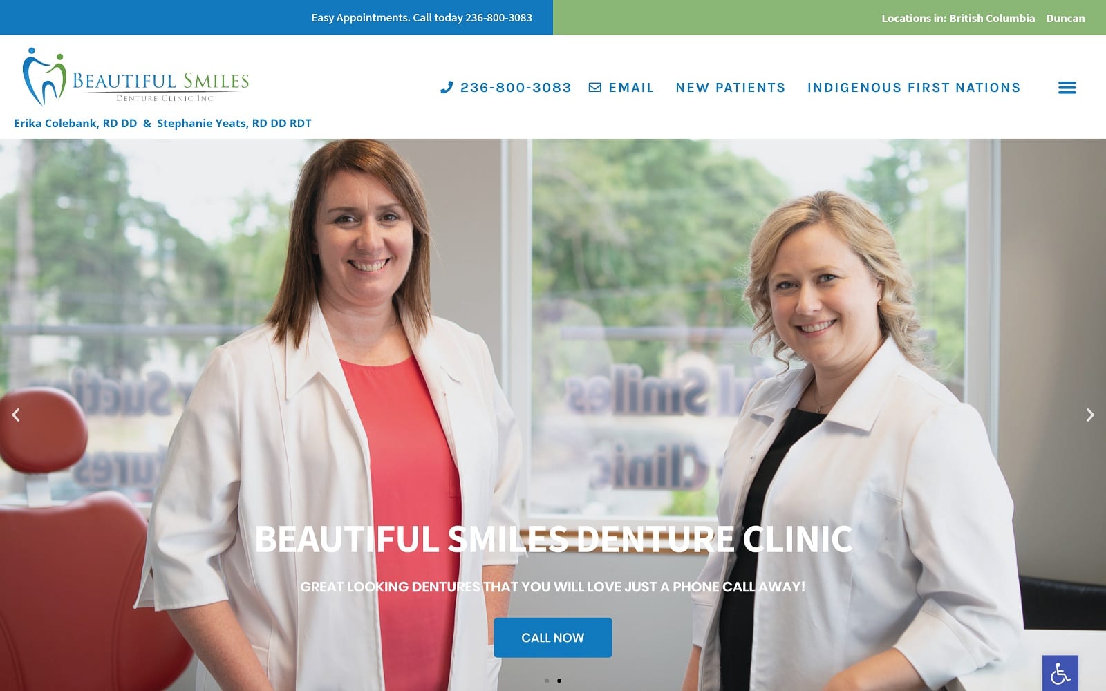
The website’s use of lime green, bright blue, and clean white create a minimalist yet energizing atmosphere. With white as the primary accent, it assures the visitor of cleanliness and safety, while the lime green and bright blue accent the page as a place of harmonious growth and sincere integrity. The website aims to nurture without overwhelming the viewer with information, gradually inviting the visitor to the page through clean, concise, stable, and positive.
Functionality
Initially loading an animated web page transition throughout the home page, the header scrolls through with the rest of the page while maintaining its call-to-action links to its phone number, email, and new patient information through desktop and mobile responsiveness. Within the transitional header image and an action button, the page focuses on its services and the latest technology to describe its business, with small images of its office space and its certifications to showcase dentistry.
6. Jacksonville Center for Prosthodontics
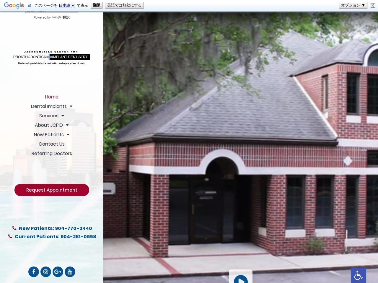
Visit Jacksonville Center for Prosthodontics
Aesthetics
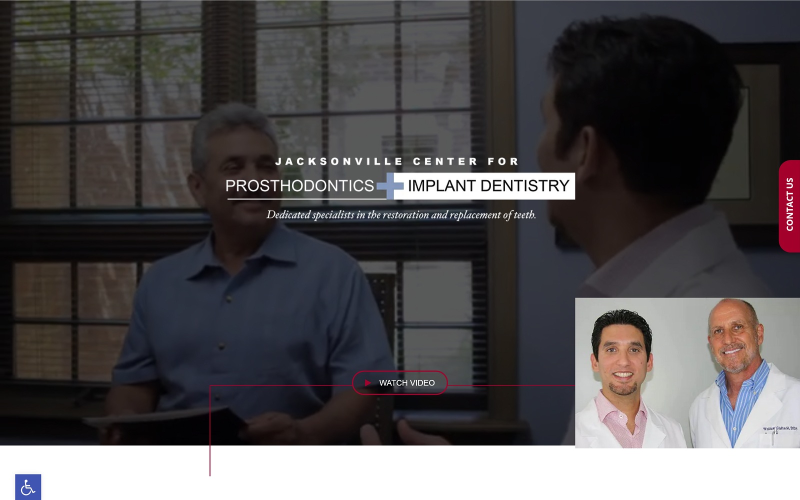
The Jacksonville Center hones in its ability to attract the viewer through deep sanguine red and cobalt blue as its primary colors. With red as the action button to energize and stimulate action, the cobalt blue, in connection with the professional white background accent, conveys an atmosphere of productivity, progress, and innovation. The center’s key aesthetic focuses on confidence as a way to assure its visitors and patients of its abilities, using active videos and professional photography to feature its services.
Functionality
An interactive video takes precedence over the top of the page, with the header on the left side to attract the visitor’s eye toward the central media. Alongside the header, viewers can interact with click-to-call phone numbers and language settings for enhanced interaction. With sections remaining at the right-center of the page in front of a translucent image, it previews its services and testimonials with colored overlays and slideshows to enhance its web viewing capabilities.
7. Weierbach Prosthodontics
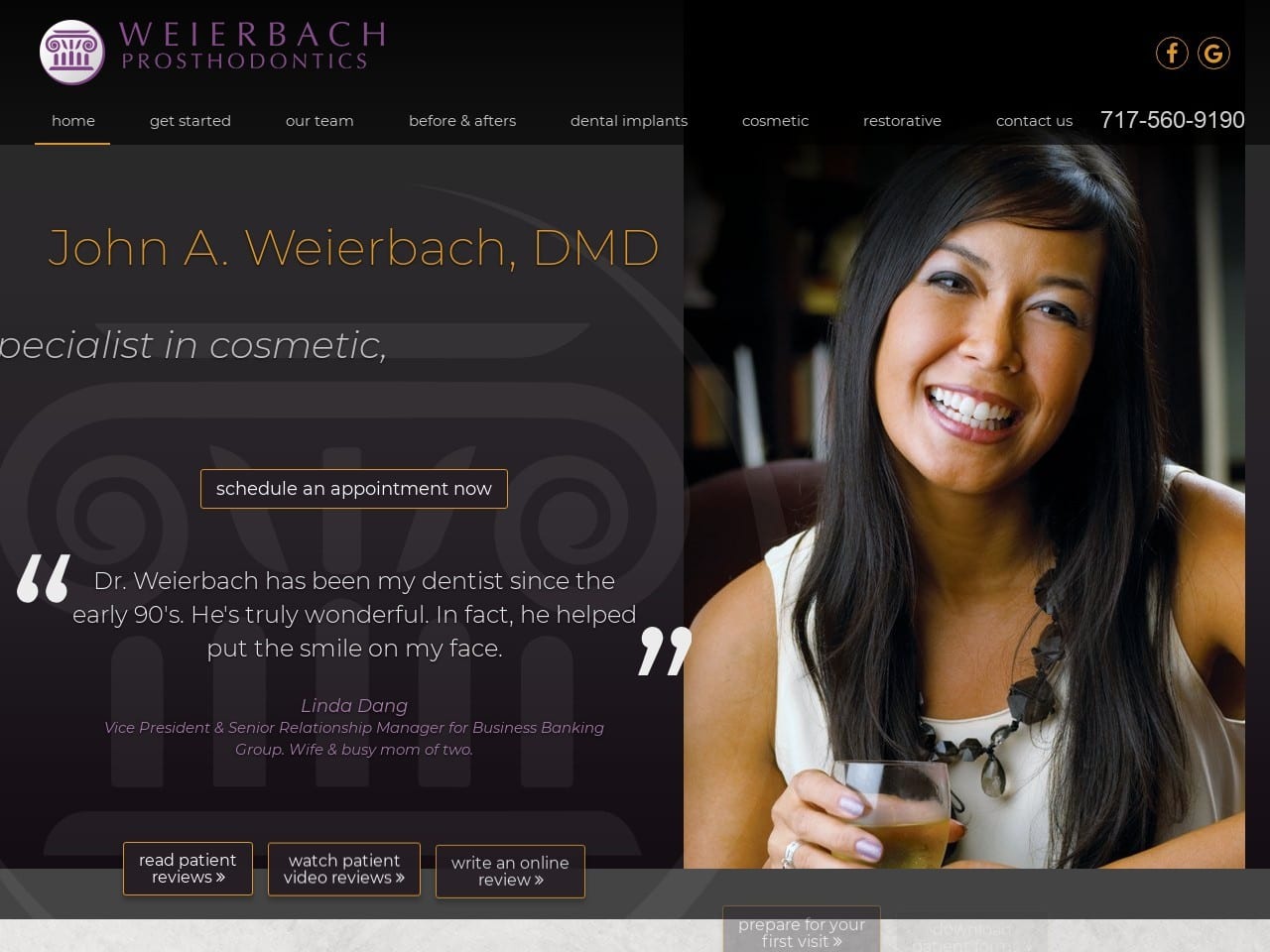
Visit Weierbach Prosthodontics
Aesthetics
Weierbach Prosthodontics displays an aesthetic of independent beauty with its choice in bright violet, luxurious black, marble gray, and marigold. The violet sprinkled across the page decorates the website with femininity when associated with the center image. With black and gray as the background accent and the marigold color as the call to action, this website incorporates ideas of prosperity and intricacy. It combines them to make its business image elegant and distinct.
Functionality
With the main menu header remaining static at the top of the page, it includes a click-to-call phone number and an interactive home logo for visitors. By previewing its main dentist at the front of the page alongside the appointment action button, the website uses action buttons and slideshow navigators. It hyperlinks to allow viewers to interact with the website. The page’s footer also contains click-to-call links and information related to its address, services, office tours, and repeating main menu header.
TOP 7 PROSTHODONTIC WEBSITES DESIGN IN 2021
For those who work in prosthodontics, this field promises a new array of materials and technology that can bring out the tremendous potential for patients with complex restoration cases. As these new materials are constantly developing, this potential can help improve traditional restorative procedures and implant dentistry, ultimately changing how dentists care for their patients.
As a unique facet of dentistry, prosthodontists make way to hone restorative treatments down to an art, but many prosthodontic websites today lack the finesse needed to attract new patients. Communities that are unaware of the importance of prosthodontists having a website that’s engaging, informative, and attractive to audiences. Here’s our small selection of some of the best prosthodontic websites for inspiration.
1. New Haven Prosthodontics
Visit New Haven Prosthodontics
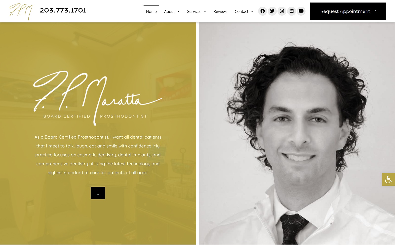
Why We Recommend This Website: New Haven Prosthodontics greets its visitors by profiling its leading dentists, creating a personal interaction that immediately engages with its viewers. Throughout the website, its golden tones and exquisite detail sets a high standard of care, offering comprehensive dentistry to patients needing restorative treatment. Its mobile-friendly appearance and script text make this practice highly unique and showcase what opulence truly is.
2. Beautiful Smiles Denture Clinic
Visit Beautiful Smiles Denture Clinic
Why We Recommend This Website: Beautiful Smiles Denture Clinic takes the trusted appearance of a dental office and explicitly advertises its specialization in dentures and prosthetics with a clean, simple-to-read layout that’s engaging and attractive. Cool light blues and vibrant greens accent the page, but most of the website contains white space, a highly valuable asset in web design that gives patients an easy basis for interaction. Through its use of transitions and large fonts, Beautiful Smile Denture Clinic makes an impact with its friendly approach to its patients.
3. Jacksonville Center for Prosthodontics
Visit Jacksonville Center for Prosthodontics
Why We Recommend This Website: Jacksonville Center for Prosthodontics works to bring out its unique approach to restorations through an interactive header, allowing visitors to greet patients through videos immediately. From there, their head dentists define how this practice qualifies for its services, citing their certifications and educational background as a place for patients to meet their dentist of choice. From there, testimonial videos and action buttons allow viewers to engage further with the website, and its blue-red color palette makes it easily digestible.
4. Lacombe Dental Prosthodontics
Visit Lacombe Dental Prosthodontics
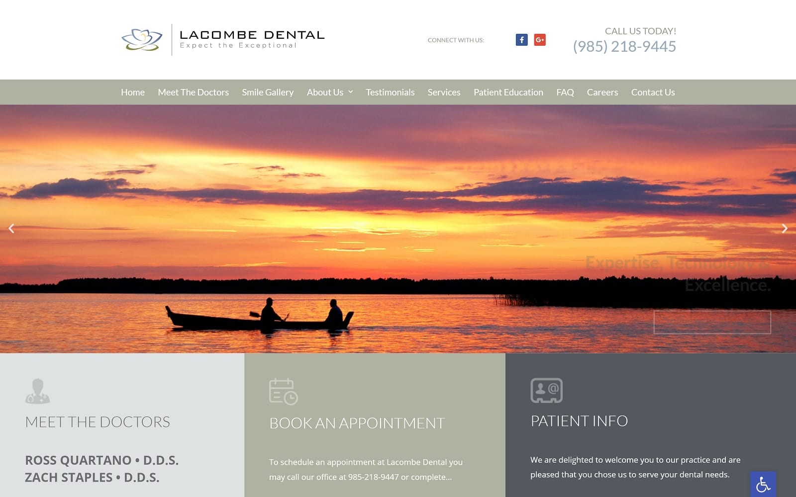
Why We Recommend This Website: Lacombe Dental centers its image through its local roots, presenting its thriving office through southern bayou Lousiana imagery. Through this engagement, neutral tones are used to counteract this imagery and, from there, give visitors a deeper insight into their office, services, and testimonials. These muted tones are created as a backdrop for the content itself, and through these methods, the practice’s dedication towards restoration and general dentistry is highlighted.
5. Howard Gordon, D.D.S.
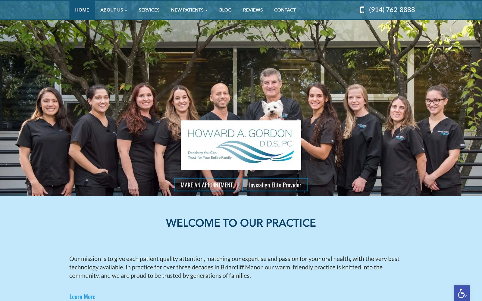
Why We Recommend This Website: Howard A Gordon takes full advantage of the web space given, using the header image space as the main greeting point. Featuring a static image, a thin header, and a center-aligned logo image, action buttons are placed upon this center image to give visitors quick access to their contact page. From there, opaque section dividers are used to emphasize further to create an easy reading experience and ultimately allow patients to take in their practice fully.
6. Pleasanton Prosthodontics
Visit Pleasanton Prosthodontics
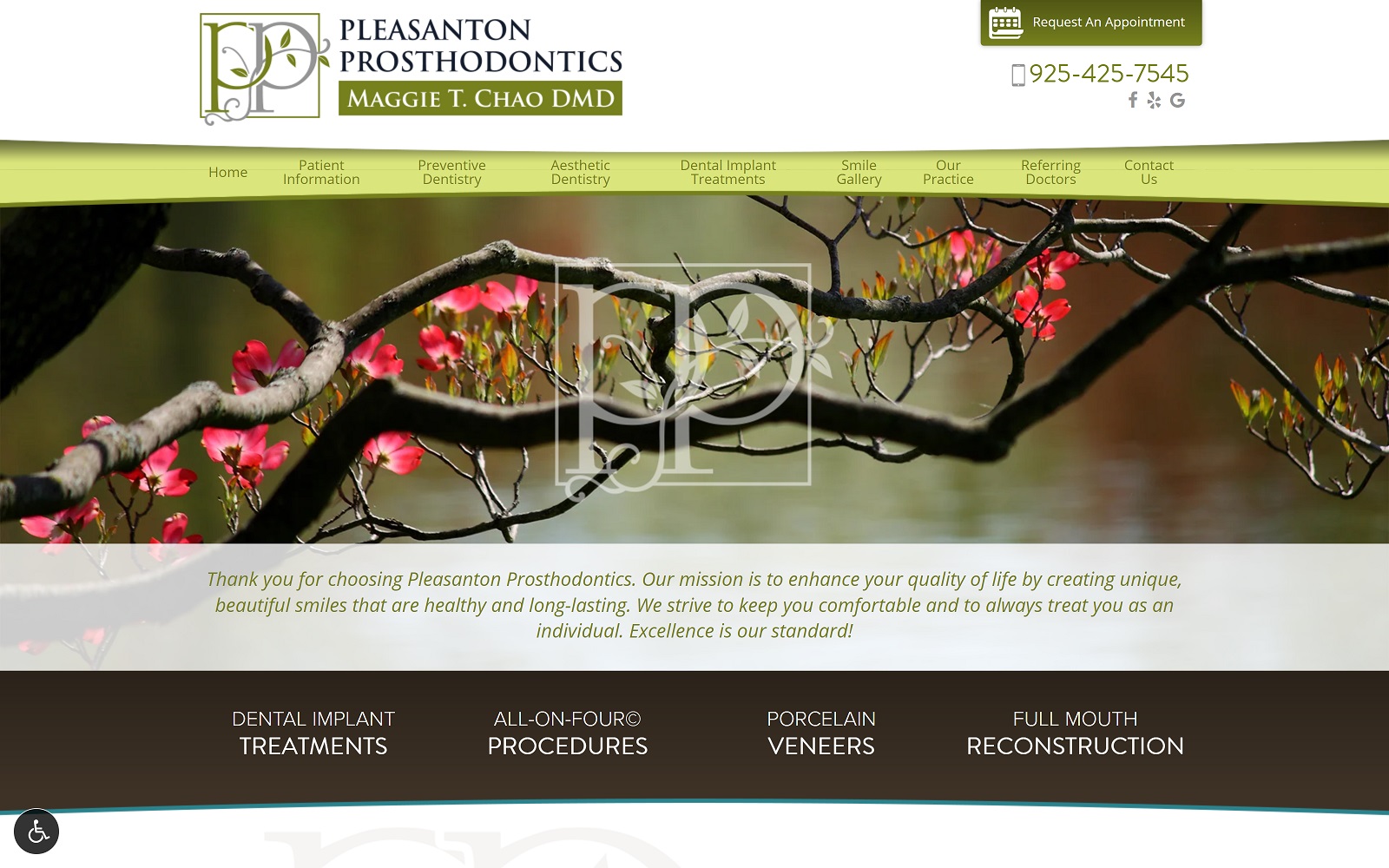
Why We Recommend This Website: Pleasanton Prosthodontics opens up with robin egg blues and light spring green. It uses natural scenery and a script logo to define its artistry with its services. Varying degrees of contrast are made through its use of colors and white space, and its large text font and action buttons make this practice easily readable and highly engaging. Uniquely enough, they even include a soft foods recipe guide for those recovering from restorations, making the practice warm and friendly to meet.
7. Weierbach & Genetti Prosthodontics
Visit Weierbach Prosthodontics
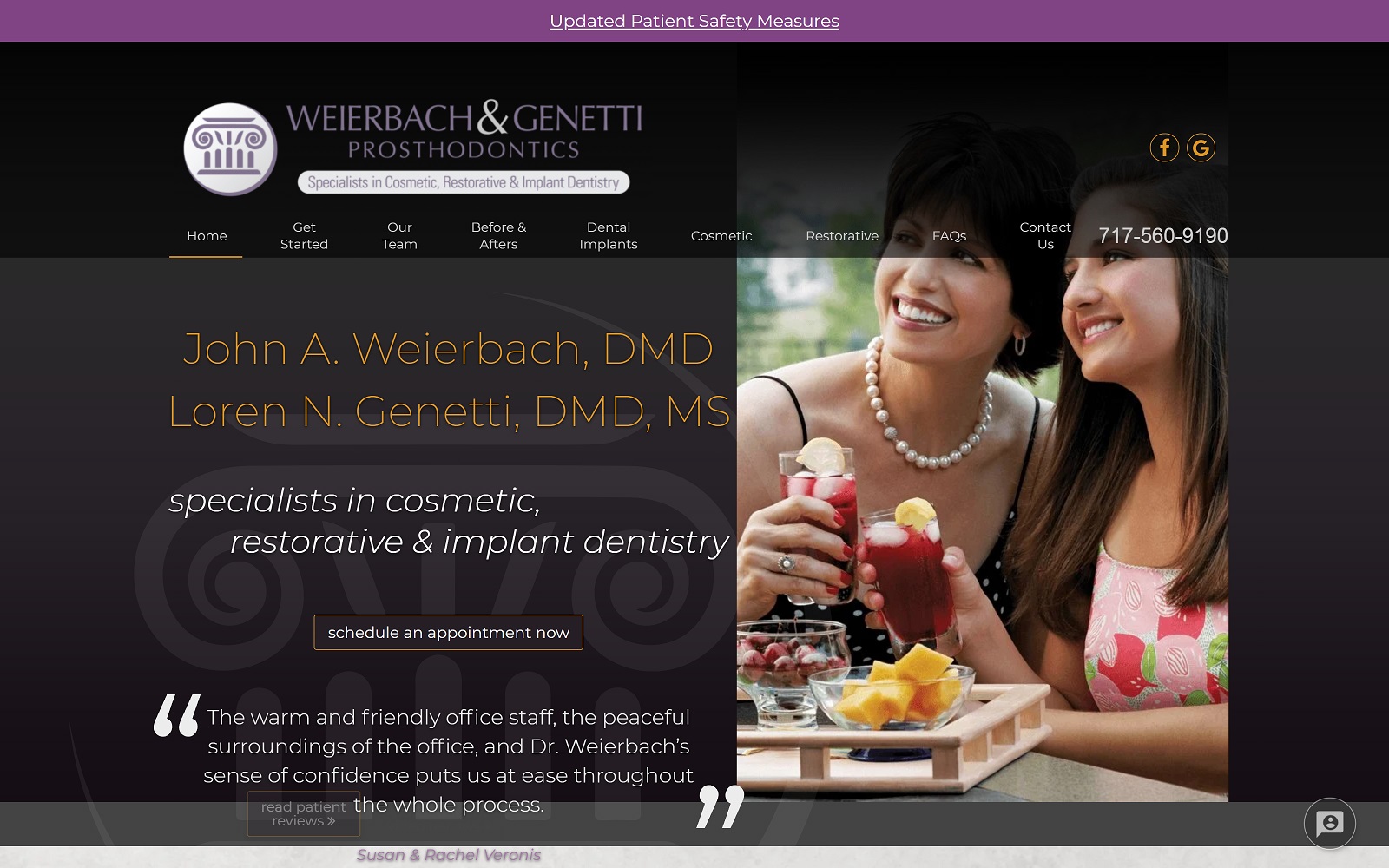
Why We Recommend This Website: Weierback & Genetti uses luxurious royal purples and deep blacks to accent the home page and bright oranges to provide pops of color to places where they direct the visitor toward their website. Throughout the homepage, this website utilizes stone-colored white space and large separators to set it apart while keeping a personalized tone. From there, they expand greatly on their services and biography, giving patients an insider’s look into who they are.
Tips For Starting Your New Prosthodontics Office
Website design is just one aspect of running a dental practice, but it can take a huge part of your time, effort, and finances. But where do you go from there? If you’re newly establishing yourself as a prosthodontic office within your community, these tips can help further direct you toward success:
- Meet With Fellow Dentists: Prosthodontics can be a challenging specialty to handle, but working with those who understand the field can give you a greater perspective on how to expand your practice.
- Invest in Dental Equipment: Begin with minimal operatories, depending on your practice’s space and finances. Your dental equipment is the heart of your business, and working with robotics technology can make your network infrastructure easier to manage.
- Establish a Practice Philosophy: Knowing how your practice should run is the key to making it run smoothly. Your philosophy should translate into all of your decisions, including how you manage your expenses, what insurance you accept, and how you approach your community.
- Make Room For The Grand Opening: When all the logistics are done, make sure to market your business to your community by advertising a grand opening and inviting all dentists you know for more exposure. Make sure to contact your local Chamber of Commerce for a ribbon-cutting ceremony!
Designing your website should be done by someone who understands dentistry. Your website should show others who you are and how you intend to help patients and associated dentists. Optimized360 can do just that by marketing your website through web-based marketing strategies, including SEO optimization, blog management, and pay-per-click advertising to get you started. To learn more, visit our gallery here to expand your practice to new heights.
Conclusion
All of these websites contain appropriate color, function, and style measures to meet their potential patients’ needs. The foundation of great web design starts with taking in the basics of visuals and working them into the programs we use to produce a prosthodontics website that’s worthy of praise. Digital technology has greatly improved how people interact with their businesses, so why not take advantage of it by creating the most solid, elegant, and responsive website out there? All of these examples focus on their own unique take on their business and can help you research what makes a prosthodontic practice successful and great.
Patients searching for prosthodontics and dentures in their area will likely turn to the most attractive websites out there because when people see the time and effort put into a website, they can automatically tell the quality of the business as a whole. To make the most out of your research, create lists, contact a professional website design team you can trust, and use these examples as a guideline to what you envision your prosthodontic website will become.


