Before introducing the best designs of lucky chiropractors, here are some key tips for creating an effective chiropractic website design:
- Promote pain relief services – Highlight the various pain management and relief therapies you provide, like spinal adjustment, soft tissue work, active release technique, corrective exercises, etc. These are likely what patients with back/neck pain are seeking.
- Show your expertise – Share your experience, chiropractic certifications, continuous training, and any specialty areas like sports rehab, prenatal care, or pediatrics. This establishes you as an expert.
- Discuss your techniques – Explain on your site the hands-on adjustment techniques you use and how they benefit patients, like improving mobility, correcting alignment, restoring function, etc. The more details the better.
- Feature patient success stories – Patient testimonials that describe in their own words how your treatments relieved their pain or improved their condition go a long way in convincing new patients.
- List conditions you treat – Clarify the many conditions and symptoms you can address, like sciatica, arthritis, headaches, tendinitis, disc injuries, and so on. This shows the wide range of patients you can help.
- Share before/after injury photos – Pictures of patients’ improved posture or movement after your care provide powerful visual proof of the changes your treatments create.
- Promote ergonomic tips – Blog posts or videos with self-care tips like ergonomic desk setup, proper lifting techniques, spine-sparing exercises, etc further position you as an expert offering meaningful health guidance.
- Outline your appointment process – Explain what new patients can expect during their first visit, any intake forms to complete, what to wear, how long initial appointments take, and other operational details to set expectations.
With an informative site design tailored to chiropractic patients, you can better attract and convert those seeking drug-free neck and back pain relief into satisfied clients.

Chiropractic services are known for providing hope and relief from pain, especially musculoskeletal pain. Each chiropractic office presents itself differently depending on its target audience and how they wish its services to be perceived. Some offices choose to go with a straight clinical approach, mirroring traditional medical services. Others prefer to present themselves as an alternative (yet medical science-backed) path to healing and relief from symptoms.
The first step in designing a chiropractic website is understanding the clinic’s personality. The next step is determining how they wish to be perceived by their clientele. While rewarding, this can be the most challenging part of bringing a clinic’s website to life. Below you’ll find an assortment of sites that are exceptional representatives of effective website design for chiropractic offices.
1. The Healing Path

What We Love About This Chiropractic Website: We’re starting with The Healing Path’s website because it combines the abovementioned concepts. The landing page presents the viewer with an open landscape and vibrant colors. Green, strongly present on the landing page, is traditionally associated with healing and growth. The couple in the image have their backs to us, making it easy to place themselves in the image mentally. Adventure, freedom, and beautiful views speak to a life free from pain and with improved mobility.
The individual pages, on the other hand, take a more clinical approach. Professionalism and a clinical atmosphere are present in every image and the pages underlying design. A white background and the strong presence of blue tones on the pages are deliberate. White is associated with purity and cleanliness, while blue both calms the viewer and sends a message of hope. It’s easy to see how these elements, in combination, create a site that draws visitors.
Break records not backs! Skyrocket your Chiropractic practice

The ease of navigation through the site is also worthy of note. At the top of the page, a quick click will make a call, send an email, or give you directions to the clinic. Just underneath this can be found access to the patient portal and an easy-to-use navigation bar that will get visitors directly to the information the visitor needs. Overall, it’s a strong contender for the best site on our list.
2. Belmont Chiropractic Center
Visit Belmont Chiropractic Center
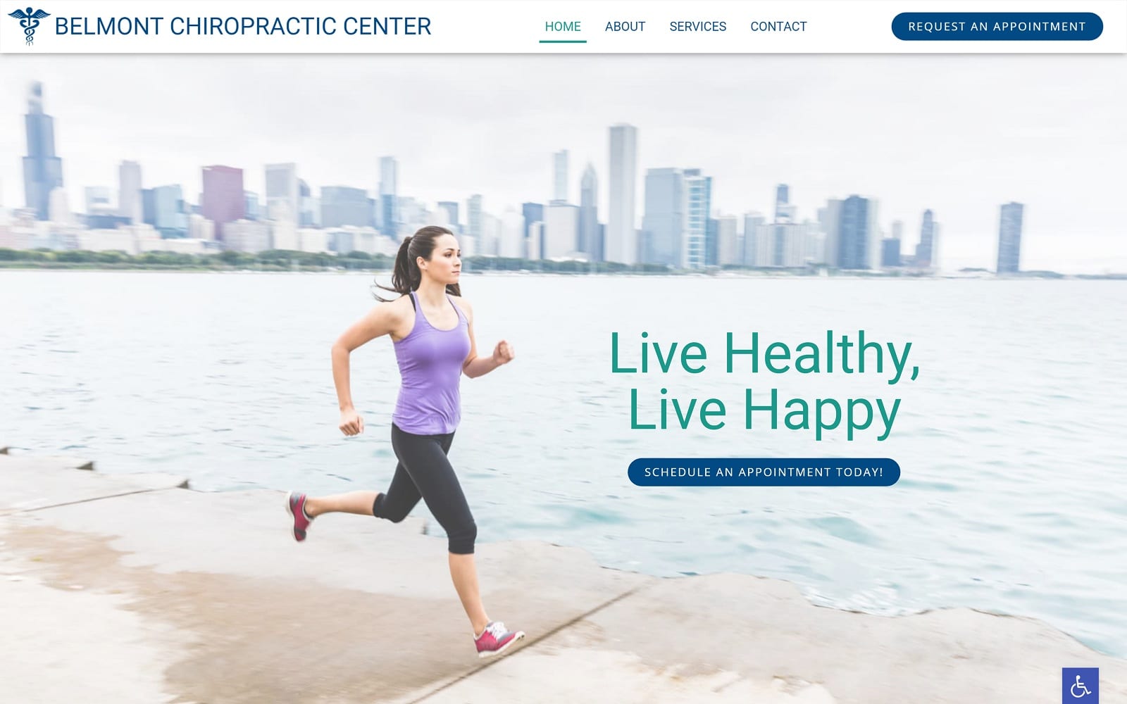
What We Love About This Chiropractic Website: Where our first website is clearly aimed at those who thrive on a more rural experience, Belmont Chiropractic Center is for the city dweller. The landing page immediately connects visitors with their home environment, with a beautiful boardwalk view. Behind the runner can be seen open waters and a city skyline. The use of blue and white on this page is subtle while remaining prominent. The runner represents empowerment, the absence of pain, and freedom of mobility. The whole presentation is meant to uplift the visitor and give them hope for the results they can expect from Belmont Chiropractic Center.
Navigating this site focuses on using the menu bar at the top and easy-to-identify imagery. Each link in the services section is presented with images that make finding the visitors needs easy and straightforward. The end result is a clean and professional site for the urban patient.
3. Parker Chiropractic and Wellness
Visit Parker Chiropractic and Wellness
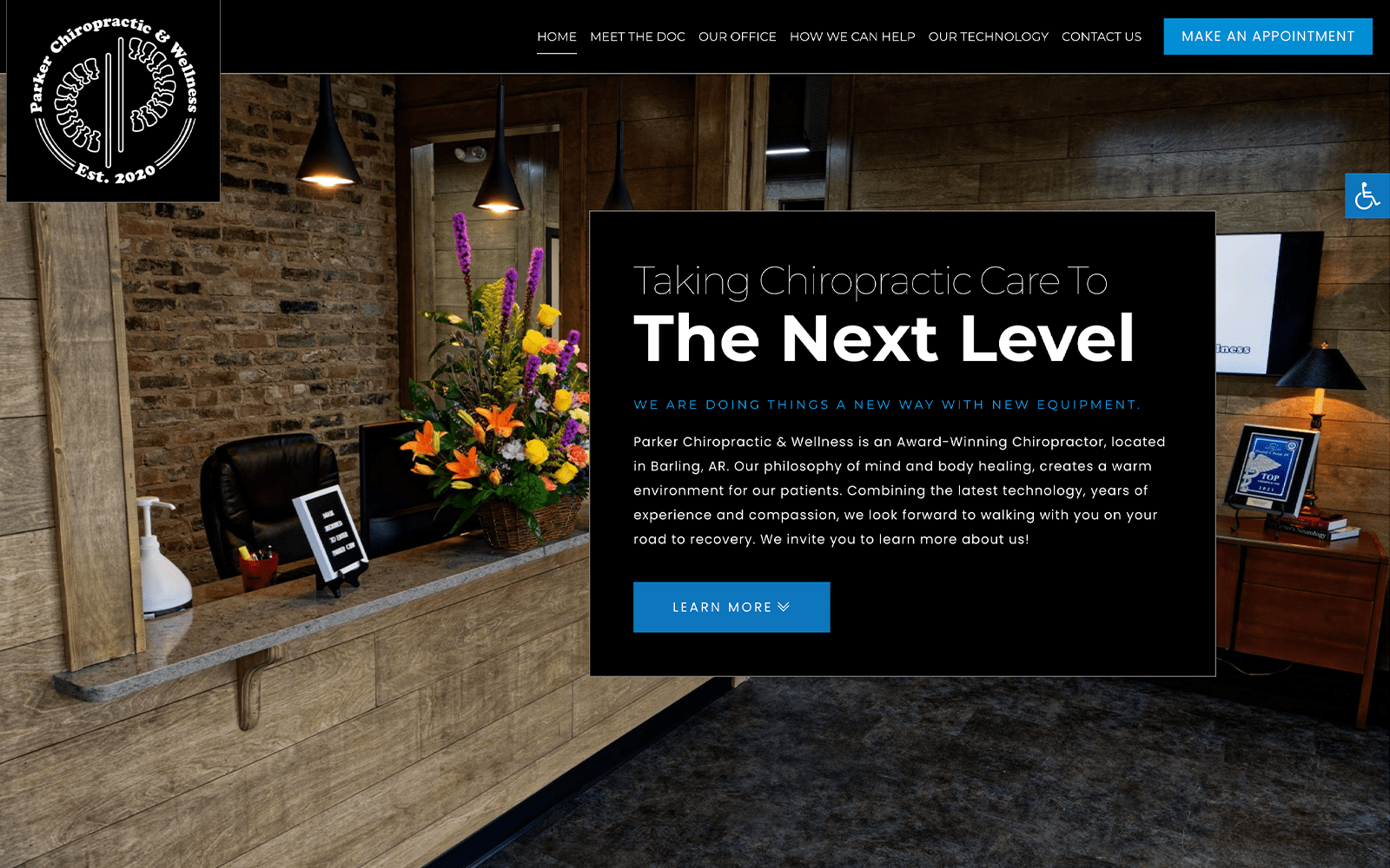
What We Love About This Chiropractic Website: Parker Chiropractic brings visitors right into their office when they hit the landing page. Warm and inviting, the office has a rustic feel that imparts a message of comfortable hometown care. The subtle browns, deep reds, and yellows are contrasted with the prominent black of the site to impart a sense of sophistication and comfort. The logo on this site is well worth mentioning, as it counterpoints the imagery to impart a sense of solid professionalism.
The use of imagery is central to the design of this site, in fact. Scrolling down the main page, you encounter images of advanced chiropractic tech, athletes excelling at their sport, and reclaiming their bodies. The overall result is a comfortable and sophisticated site that promises a great treatment experience to the viewer.
5 Must-Have Elements for a Chiropractic Website
4. Goodyear Chiropractic
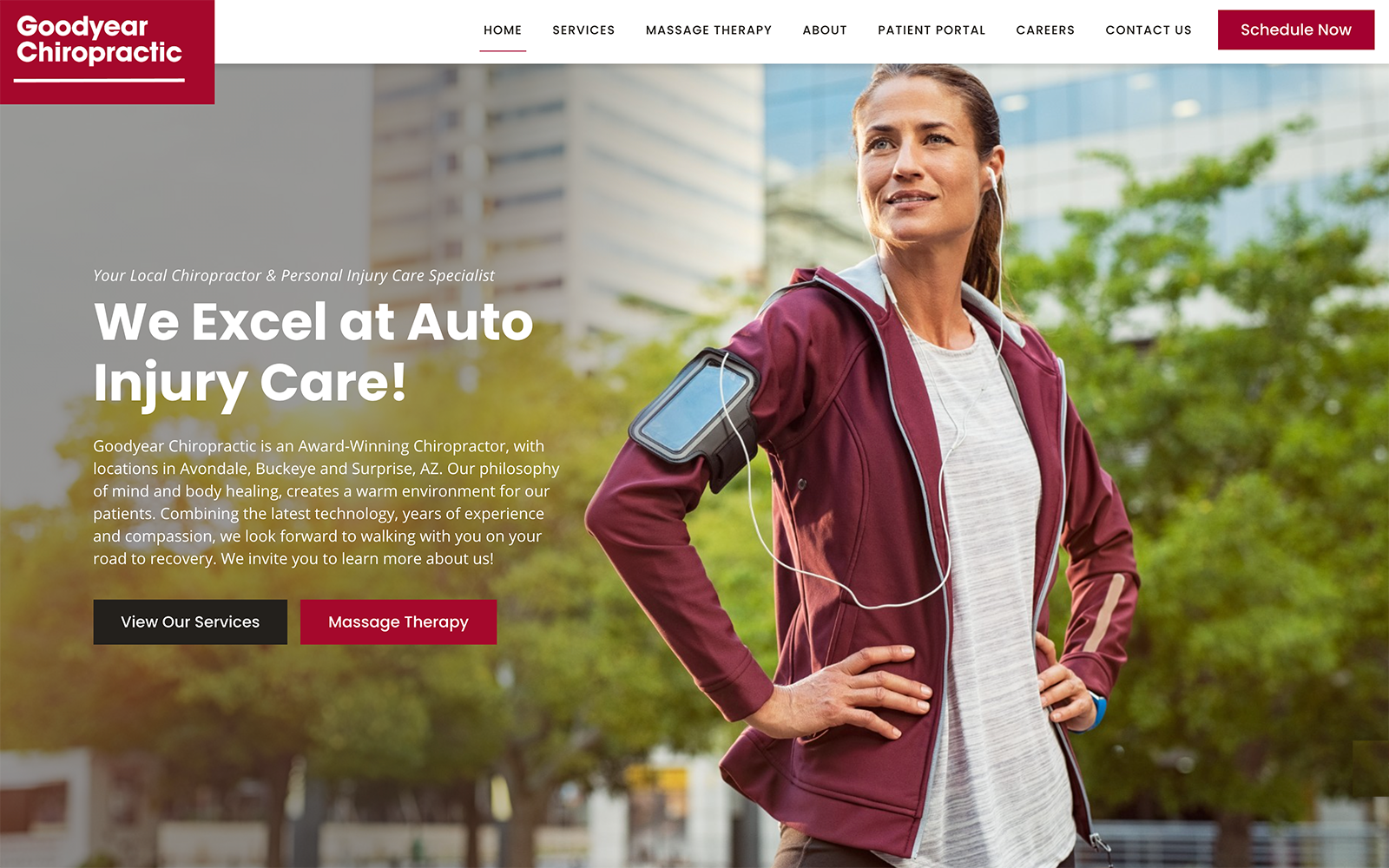
What We Love About This Chiropractic Website: Sometimes, focusing directly on your specialty is important. Goodyear Chiropractic starts selling itself for auto injury before you even land on the site. The name alone evokes images of tires, cars, and the open road. Along with a strong focus on their specialty, the landing page also presents an image of a patient who feels strong and confident. Even the choice of color on the site focuses on action and mobility. Red promotes a feeling of energy and excitement, encouraging the visitor to engage. Navigation throughout the site is straightforward and simple, and the “schedule now” button is prominently placed to make getting started easy.
5. Heritage Chiropractic Health
Visit Heritage Chiropractic Health
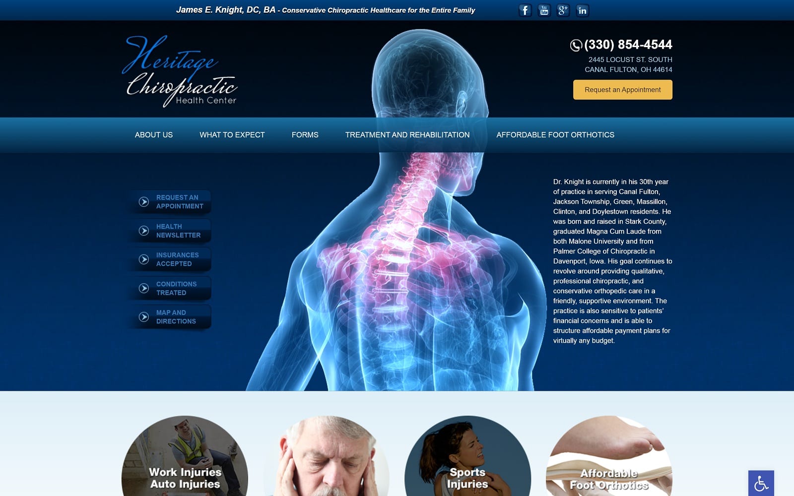
What We Love About This Chiropractic Website: From the moment visitors land on this website, the focus of this clinic is clear. The imagery used promises high-tech procedures using the latest technologies to treat advanced conditions. As a backdrop, it’s striking and immediately catches the viewer’s attention. The subtle shading of blues and blacks instills a sense of calm sophistication and hope of relief. Getting in contact with the clinic to get started is made easy by the access points that are prominently visible. Phone calls can happen with a click, or you can use the “request an appointment” button to get started with your care.
6. New Journey Chiropractic
Visit New Journey Chiropractic
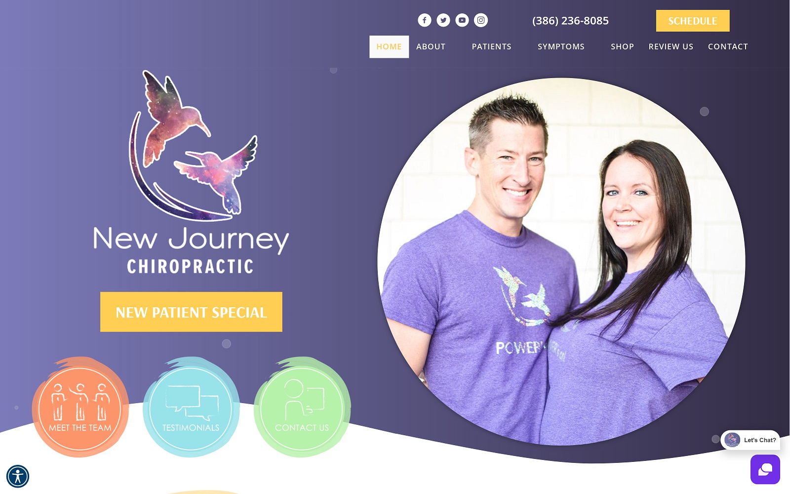
What We Love About This Chiropractic Website: This chiropractic office focuses on provider-patient relationships and recovery being a shared journey. The moment visitors arrive on the page, they are greeted with the smiling face of their future chiropractic providers. The lavender tones used in the site evoke feelings of tranquility and relief from tension. Also connected to the selected color is a sense of treating every aspect of the person’s health. The imagery of their office and their patients makes it clear that every visitor receives personalized service and care.
7. Hawkeye Chiropractic
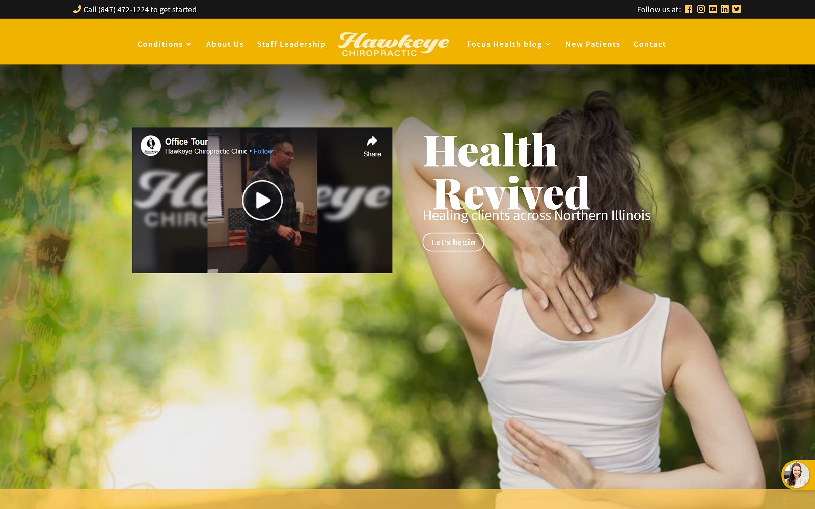
What We Love About This Chiropractic Website: Hawkeye Chiropractic uses a striking black, gold, and green palette. Everything you need to get started with your care can be found on the homepage, and an invitation to tour the office by video. This step helps visitors visualize themselves as part of the clinic’s patient family. By the time they make that first call, they’re already at home and ready to go “back” to a place they’ve never been. Overall it’s a wonderful build that provides all the basics while remaining professional and well-designed.
TOP 7 CHIRO WEBSITE DESIGNS OF 2022
1. Los Altos Spine & Sports
Visit Los Altos Spine & Sports
Aesthetics
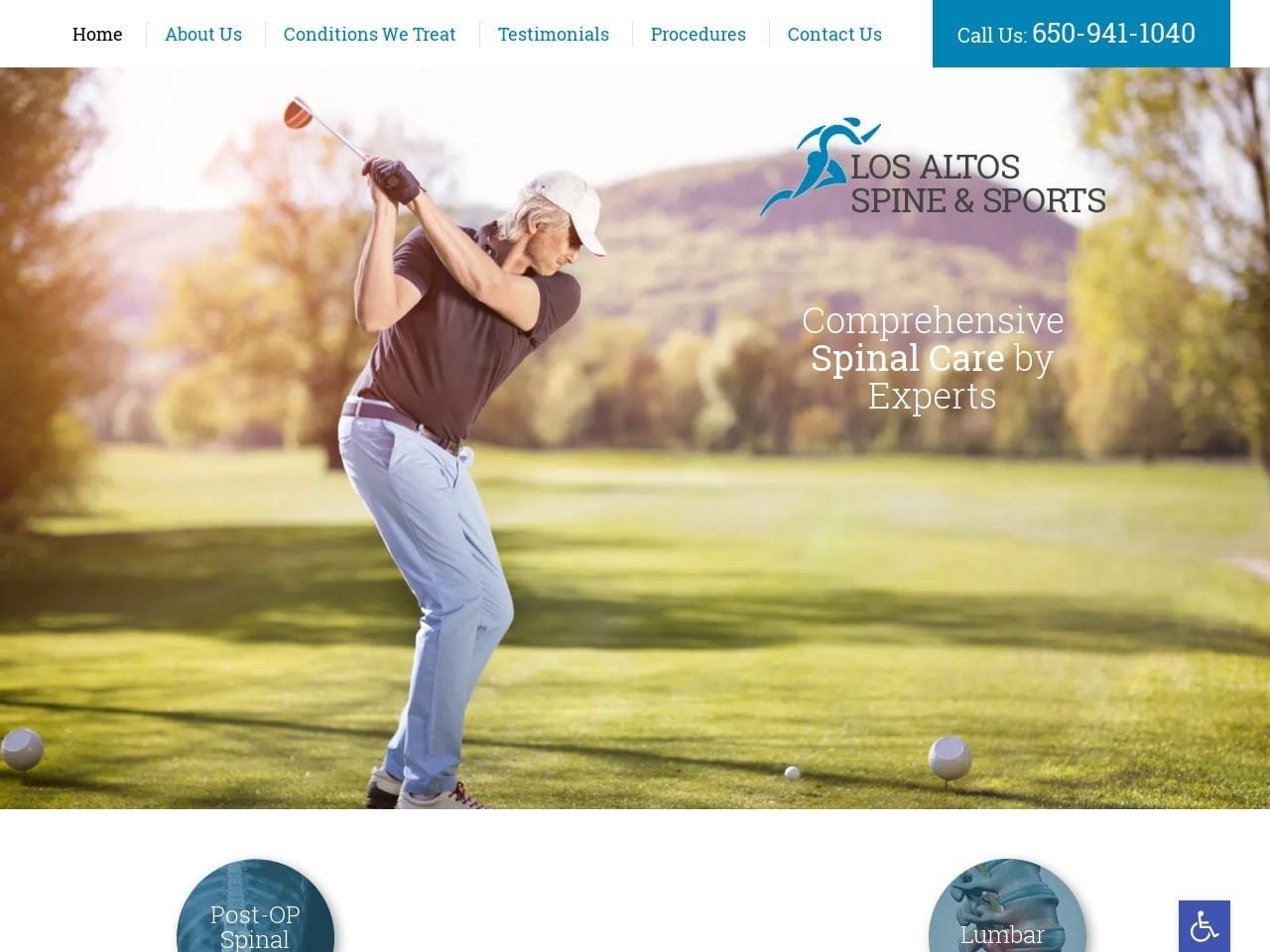
Beautiful imagery combines with a blue and white palette to create a website that inspires hope and ambition in those who view it. The opening image is eye-catching and uplifting for those looking forward to retirement and still participating in outdoor activities. Blue highlights the menu to make it easy to spot, contrasting well with the white text that presents the clinic’s number and other information. A clever navigation device uses an image of a spine labeled “spinal pain” and all the causes and concerns that can extend from it. Each section of the website appears with blue text that stands out and catches the eye, while the staff gets introduced in three striking bust shots showing a warm and welcoming smile.
Functionality
This website opens with a beautiful outdoor scene on a golf course, showing a life many with spinal concerns thought was behind them or fear would go away if their conditions worsened. The interactive spinal injury menu encourages the patient to engage and search further through the website for additional information. The Meet the Doctors section includes an innovative piece of design that allows visitors to schedule an appointment with their choice of physician instantly. The scrolling testimonial section has room for patient portraits and scrolls through a selection of entries to make the most use of the space. The bottom of the site features the practice’s office hours and a comprehensive set of quick links to aid navigation throughout the site. The sleek website design makes it great for viewing on a mobile device while remaining attractive and effective on desktop screens.
2. Herceg Chiropractic

Aesthetics
Herceg Chiropractic’s professional and stylish design predominantly incorporates blues, greens, and white elements. The slideshow flips between a series of images, any of which can appeal to the visitor as they demonstrate different concerns and lifestyles. The logo is quite minimalist, focusing on the use of text over graphic art, including the latter in a subtle way. The ‘Where is your pain?’ section is a rarely seen approach, with images illustrating where the image can appear and lead to related information. Videos provide information to the client while also introducing them to the staff and office.
Functionality
Blue and green are tonnes associated with healing, hope, and renewal. These concepts are central concerns of those suffering from spine, neck, and joint pain and are addressed both through the palette choice and the images used throughout the site. The navigation menu at the top of the main page and the prominence of the “Make an Appointment” button make reaching out to the office simple while encouraging patients looking for more information to dig deeper. The site’s ‘Where is Your Pain?’ section is creative and innovative, allowing patients to get information related directly to the concern that led them to the site easily. Patient education gets emphasized through the videos, which also build rapport with the patient by introducing the office and staff in a more directly relatable way. The bottom of the page presents the usual contact information, augmented with click-to-call functionality and a HIPAA-compliant form the visitor can use to reach out to the clinic.
3. ChiroLouie
Aesthetics
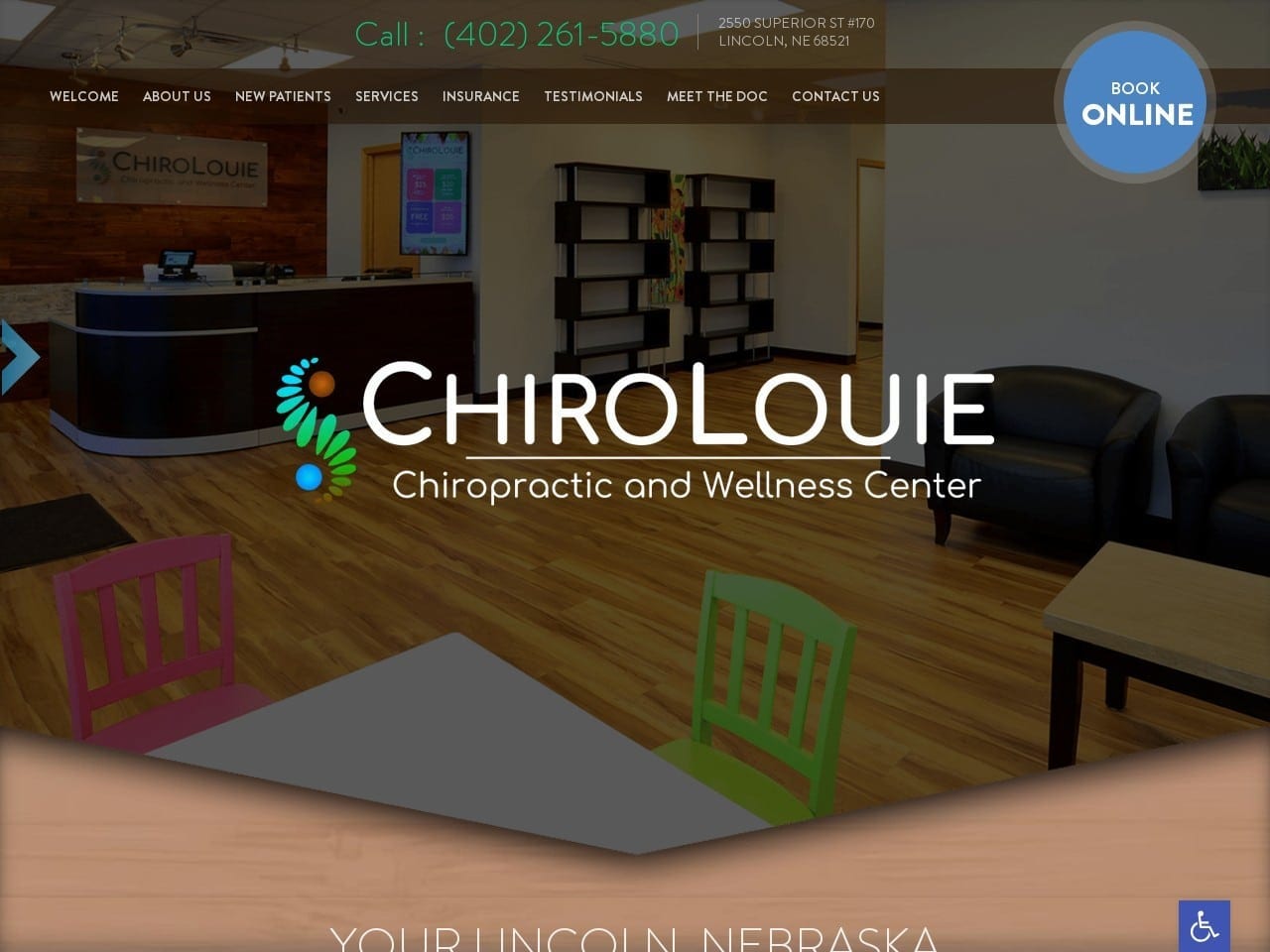
This clinic’s friendly and whimsical atmosphere is evident when a visitor arrives. ChiroLouie combines the services provided with the physician’s name, making it sound like a nickname given to a favorite local known for his craft. The color and design of the logo add to this while subtly referencing Dr. Yang’s heritage through the integration of the Yin/Yang symbol. The image of the office is presented immediately, showing an office that combines professional design with bright, playful colors and art. The website maintains this abundant use of color throughout, adding nature scenes to reveal more of the office’s personality and focus. Blue draws attention to buttons and other areas a visitor might take action in, including the prominent Book Online button. Buttons leading the way to additional service information appear with informative and playful imagery set against a woman’s smiling face exploring the outdoors pain-free.
Functionality
Dr. Louie Yang’s website provides a warm and friendly atmosphere from the beginning through the use of its warm color palette. Blue and green are used as action colors throughout the site, drawing attention to menus and buttons where patients can supply additional information. The transition from green to blue on the button mouse-over encourages visitors to click through and get more information. This same level of interactivity appears in the featured services section of the site, where stylized imagery combines with bounce-over mechanics and the text changes from white to ‘go for’ green. As one draws near the end of the landing page, you’ll find convenient direct-to-map navigation options, office hours, and phone numbers with click-to-call integration.
4. RTP Chiropractic
Aesthetics
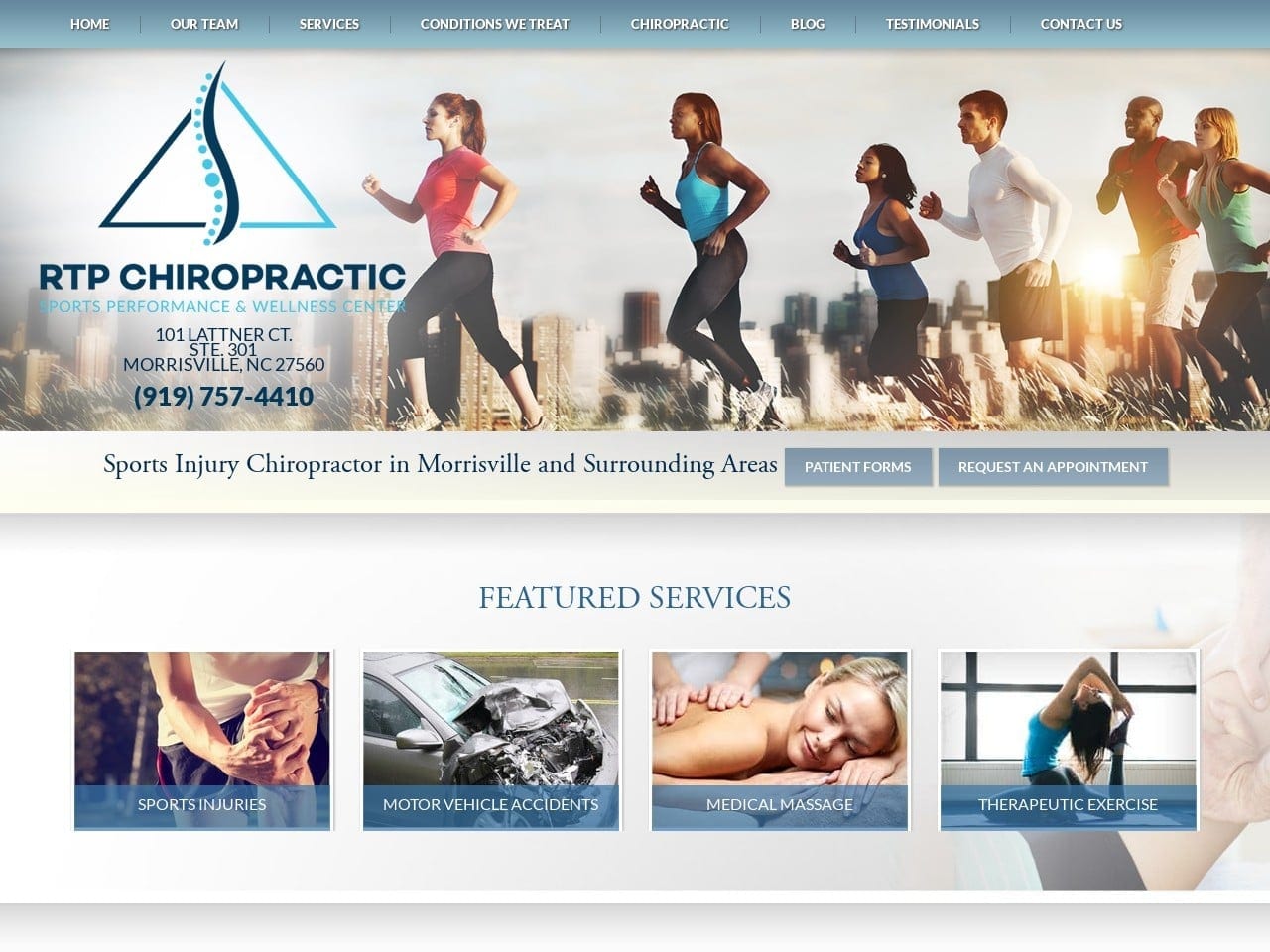
RTP Chiropractic went for a very simple design with minimal imagery and color used on a clean white background. Calm, trusting blue is used throughout the site to highlight buttons, sections, and valuable information. The featured services section presents the most prominent use of imagery outside of the hero image at the top of the screen, using them to display the type of work the office does and offering more information to the viewer. A light blue background highlights the doctor’s profile, a subtle hint to associate the physician with healing, serenity, and trust.
Functionality
Minimalism works well for this website, augmenting what is already a mobile-friendly design. On arrival, the visitor is immediately given access to a full menu that allows them to navigate anywhere within the site. The prominence of the patient form and request appointment buttons ensure that busy patients can handle both these concerns moments after arriving at the website. Areas of a site that show responsiveness encourage the patient to interact, such as the blue filter that rises over the buttons in the service section. The subtle movement of the doctor’s portfolio catches the eye, drawing attention to his qualifications and friendly demeanor. The direct-to-map direction option, prominent social media connection display, and phone number at the bottom of the page ensure patients can immediately start their chiropractic journey with the office.
5. Lakeview Chiropractic
Aesthetics
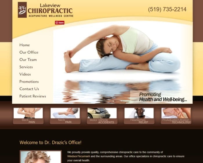
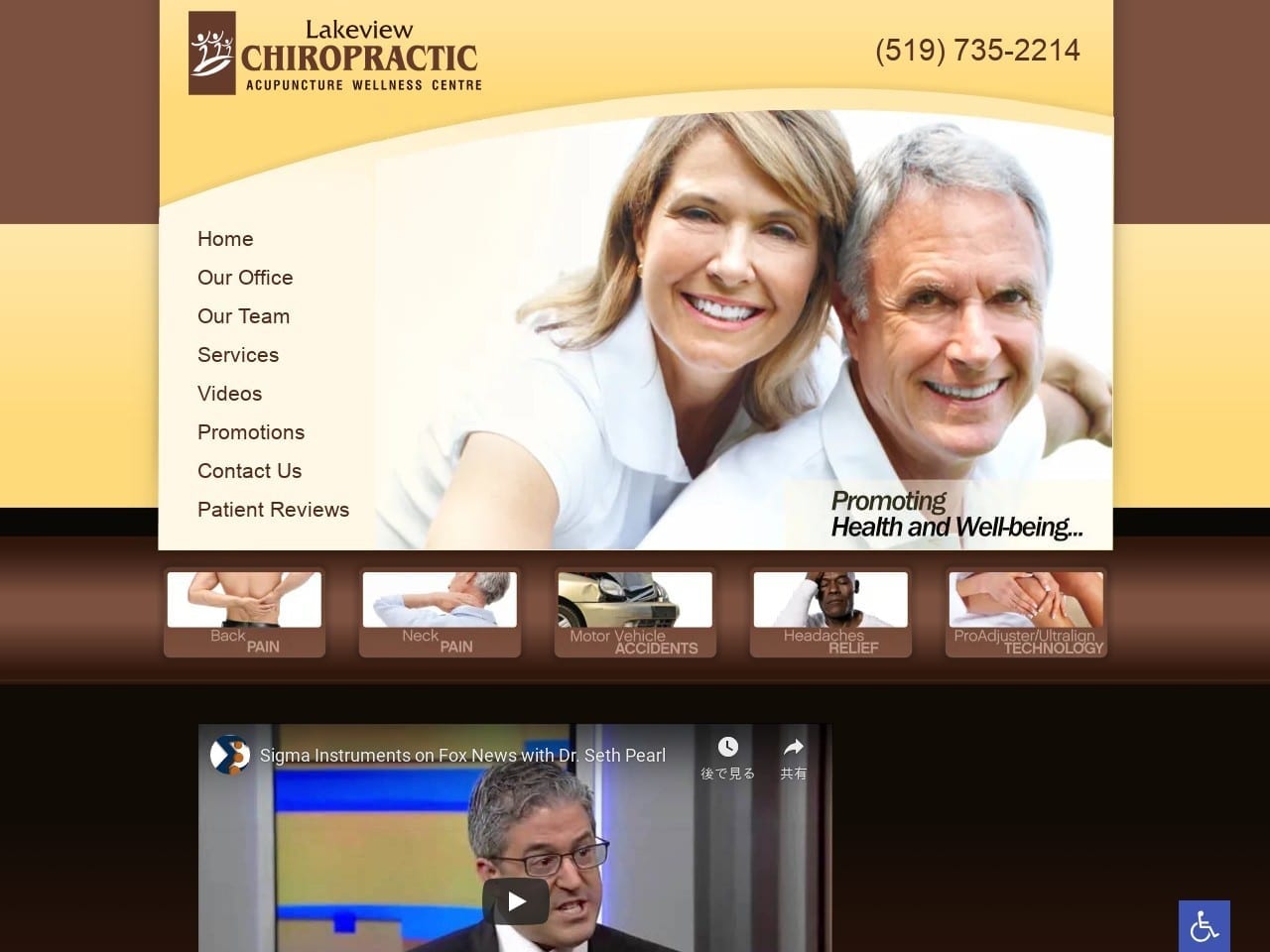
Visitors to the Lakeview Chiropractic site are greeted with a warm and comforting color palette with great use of imagery. The images display optimistic and pain-free individuals, a state of being that this practice promotes. Information about the concerns addressed is presented in attractive brown boxes with clear, bright imagery that indicates each type of concern. The video is used to present the physician as a prominent member of the Chiropractic community, as well as provide valuable information about related concerns.
Functionality
All elements of this website point to it being aimed at an older generation of patients, as is evident from the lack of mobile-focused design. The prominent use of images and immediate availability of the left-hand menu on the site that stays with you wherever you go makes getting around simple. The video is a great way to present the physician as an authority in his field and aids in rapport-building from the beginning. The lower area of the page presents information about the office’s services in a straightforward linear text format that aids in the ease of the site of use.
6. Lighthouse Wellness Center
Visit Lighthouse Wellness Center
Aesthetics
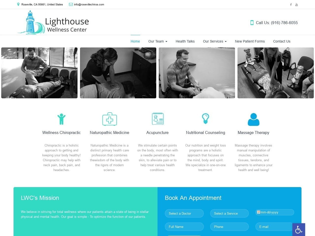
This website made excellent use of a minimalist design scheme to present as much information as possible in as clean and compact a space as possible. A simple white background combines with blue imagery and text highlighting on mouse-over to make an imminently usable site. The black-and-white imagery used in the site was a deliberate and conscious decision on the part of the designer. It presents the images in an attractive format without overpowering other elements of the site’s design. Points on the website where the visitor is intended to take action are easily identified by their blue motif.
Functionality
In contrast to the Lakeview Chiropractic design, this website is clearly targeting those who are tech-savvy and using mobile to handle their day-to-day concerns. This is evident in the sleek, minimalist, streamlined design. The blue images used to mark each section of the landing page draws the eye, especially against the stark white background. The forms allow the patients to reach out and commit to the office by submitting their desired information and establishing contact. The scrolling testimonials use a very simple design, allowing the content of the reviews to speak for themselves.
7. Creekwood Chiropractic
Aesthetics
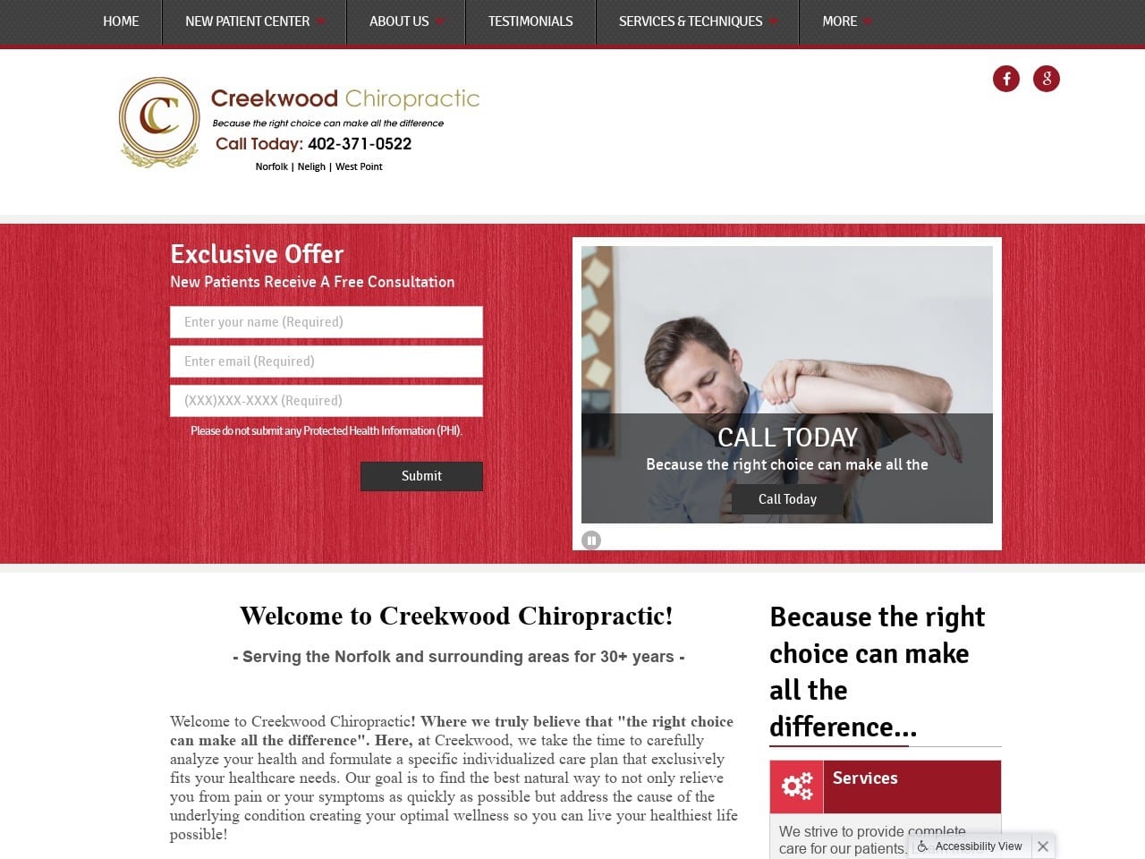
Creekwood Chiropractic combines minimalist design with a white, red, and gold palette to create a beautifully functional website. Black is used as an action color and accent, as well as for most of the text on the page. A beautifully designed logo with art deco elements gives the site a sense of elegance and sophistication, while its largely image-free design keeps the site flowing and light. Near the bottom of the main page are direct links to various forms, contact information, and the area section making great use of red action-related properties.
Functionality
This website bows heavily to the concept of ‘less is more’, and leans heavily on its color palette to do the heavy lifting. Red is an action color that is prominent and difficult to ignore. It calls the viewer’s eye and encourages them to take action at the indicated point. White’s primary role here is as a clean backdrop, though it does contrast well with the red and is used as a text color at various points as a result. The hint of gold in the site gives it a sophisticated look, especially as part of the logo design for this site. The streamlined design makes it very mobile-friendly, as does the lightweight nature of the design. Direct-to-map functionality is found as visitors near the bottom of the page, making it easy to get to the office for their appointment.
CHIROPRACTORS WEBSITE DESIGNS FROM 2020
Chiropractors are among the most skilled advertisers and marketers in the healthcare space. For years, they have been ahead of the curve in medical marketing. Many chiropractic websites have elements in them that peers should adopt; in fact, any professional should use many of the elements found among the great chiropractic websites in the healthcare industry. Let’s see what makes each of the following sites memorable.
1. Lakeview Chiropractic
Lakeview Chiropractic has one of the best home/landing pages. The navigation tools are immediately seen when a visitor arrives at the site. The Navigation Panel includes all of the following,
- Home
- Our Office
- Our Team
- Services
- Videos
- Promotions
- Contact Us
- Patient Reviews
The site is equally friendly to new patients and returning patients. New patients can review the Chiropractor’s credentials, services, information on billing policies, and more. Returning patients, as well as new patients, enjoy the ability to make an appointment online. The inclusion on this site of patient testimonials proves that chiropractors are exceptional at marketing. Dr. Drazic D.C has done great with his site, especially his home/landing page.
2. Los Altos Spine & Sports

Visit Los Altos Spine & Sports
There is no legal entity called Los Altos Spine & Sports; the name is used as a central online space for three health professionals – 2 chiropractors and 1 physiatrist. Even though each has its own private practice, they share common office space and staff.
On the “Office Policies” page, they clearly explain how their setup works.
Whoever designed this site had several challenges created by the unusual office setup, but all were met with professionalism. The site excels in introducing each of the three providers, fully explains financial procedures, and offers a complete service listing by the provider. It is interesting to note that the photo on the office policies page includes all providers with their support staff. This image is a powerful way of telling the public that while the three practices are separate, they all work as a team to promote health.
The Office Policies page also includes additional information for patients that sends them to other sites for education and information about the spine, pain management, and more. Transparency, organization, and successfully combining the three individual practices make this site a worthy contender for a top spot in our list of Outstanding Chiropractic Websites.
3. Lighthouse Wellness Center
Visit Lighthouse Wellness Center
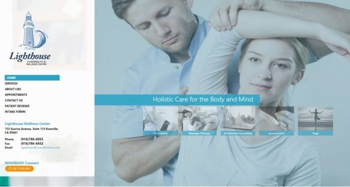
Consistency, communication, and compassion for its patients. This is evident when visiting their website at the Lighthouse Wellness Center.
Consistency is shown on the site as the layout and color schemes for each page on the site is uniform. This makes navigation throughout the site easier as you only need to learn how to navigate on one page to navigate on all pages. They also participate with Mindbody, a downloadable app that lets you schedule appointments and keep track of your fitness progress. Mindbody also works well with the Fitbit Activity Tracker. This practice
Communication is also ranked excellent on the site, as it clearly outlines its services, payment options, and office policies. Included on the site are downloadable intake forms.
Compassion is not an item normally ranked, but this healthcare provider site wants to let the patient know that they have a Hardship Pricing program if they need services but cannot afford them. The site explains this as follows,
“Our mission at the Chiropractic Health Center is to help as many people as possible to attain optimal health through chiropractic care. If you need and want our help but can’t afford our services, we will formulate a plan to meet your budget.”
One other factor that this site excels at is conciseness. Rather than using a lot of medical jargon, services and other items about the practice are told in easy-to-understand English.
The takeaway from this site is that the four Cs, consistency, communication, conciseness, and compassion, make this a top-notch Chiropractic website.
4. Heritage Chiropractic Health Center
Visit Heritage Chiropractic Health Center
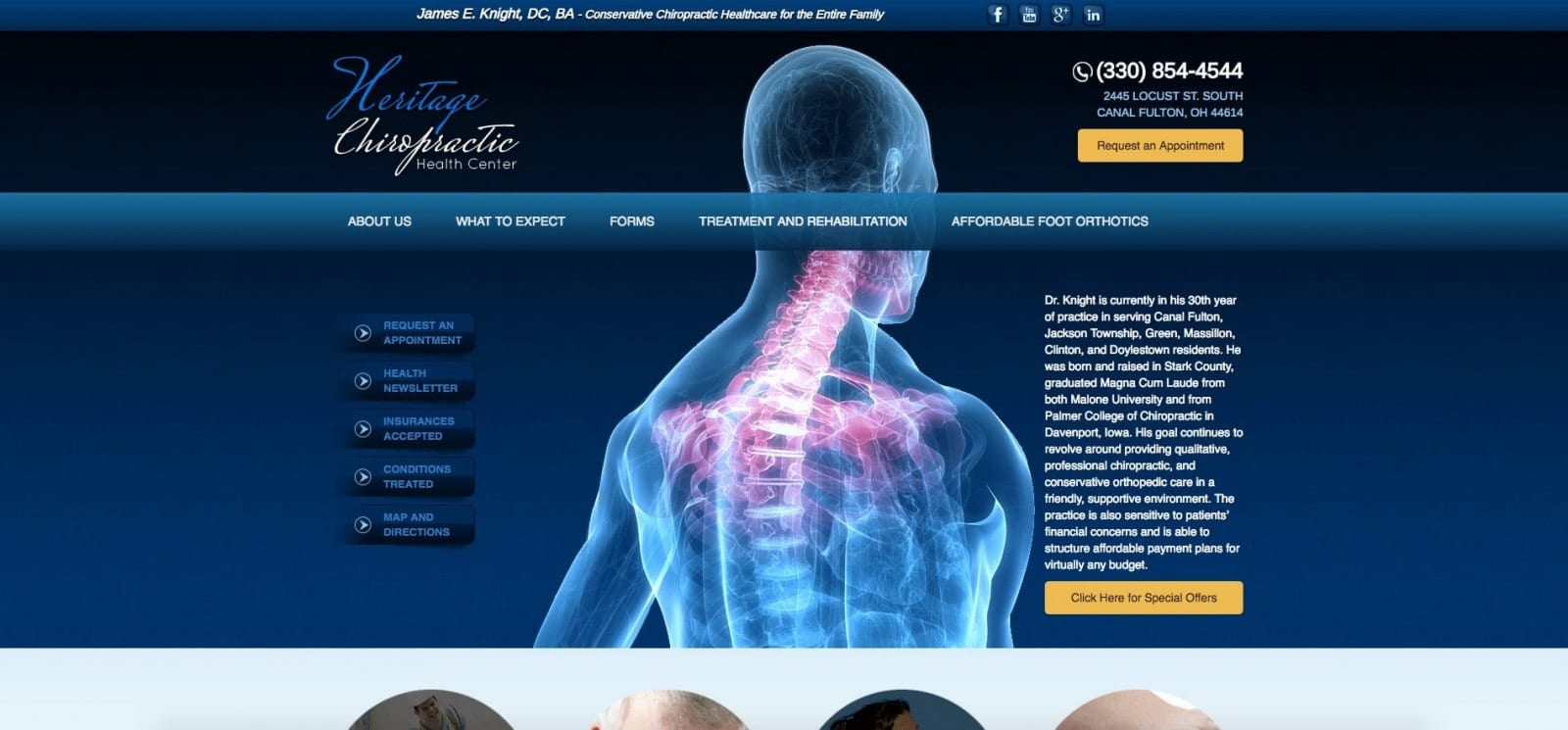
Heritage Chiropractic Health Center is an Ohio chiropractic center that has an excellent website. The top third of every main page is the navigation panel. The middle of each page is for content, and the bottom has three features: office hours, recent blog entries with a link to all blog posts, and an online appointment request form. At the bottom of each page, there is also a place telling visitors that the practice participates in Wellness.com.
Clear language, consistent navigation, downloadable new patient forms, and online appointment requests, as well as an educational blog about health issues, are all features that make the Heritage Chiropractic Health Center an outstanding site. Add in a subdued, very nice-looking blue background, and lots of images take the site from outstanding to excellent.
5. Synergy Health Center
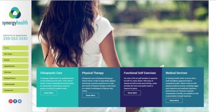
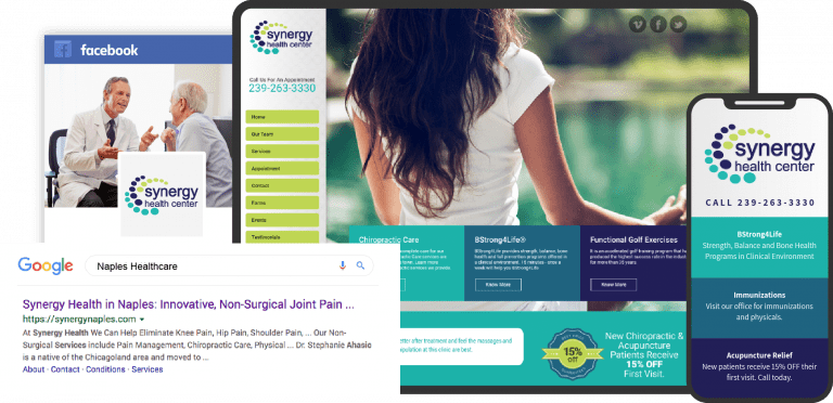
The synergy you get at Synergy Health Center is the combination of chiropractic care with physical therapy. This allows for better management of sports injuries. The practice’s landing page/home page is full of information that is provided in an informational and informal way. The services provided are,
- Chiropractic care
- Physical Therapy
- Functional Golf Exercises
- Medical Services
- Acupuncture
- Massage therapy
- Bone-density strengthening
Synergy shows amazing audience targeting. Located in Naples, Florida, where retirees flourish, functional golf exercises quickly get patients into the sales funnel. The other service that is geared toward retirees is bone density strengthening. People older than 50 are more likely to develop osteoporosis than younger folks. Announcing this service through the website shows an excellent example of a web design that converts clicks into patients. This is the best site as it targets specific audiences (golfers and retirees) and other demographics in Naples.
All sites share some common features that are important to creating an outstanding chiropractic website. These features include:
- Optimized for mobile users
- Allows for online appointment requests
- Have great designs
- Inform and educates patients
- Have consistent design from page to page
Conclusion
These sites are just an introduction, but they all have something valuable to offer those doing research for their own site. The varied use of color, the addition or exclusion of certain features, and even the site layout all have important roles to play. Despite all being built on similar principles and to meet similar needs, these websites all maintain a personality of all their own. As you research the steps involved in designing your website or working with a professional to have it done, note what inspires you along the way. When you have a clear vision of what you want your website to be, it’s easier to bring it to life to meet your patients and your practice’s needs. Check O360 if you are looking for the best chiropractic website design company in the USA.
