2025 has arrived, bringing some incredible innovations in the best therapy website design. Every year, the Optimized 360 team scours the internet for websites that deliver interesting designs, innovative features, and user-friendly experiences. As in previous years, we’ve compiled our findings into a ranked list that demonstrates what each of these sites have to offer, and often where they have space to improve.
Optimized 360’s Best Therapy Website List For 2025
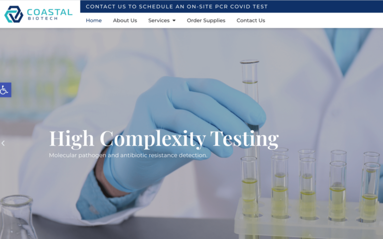
Modern Therapy Seattle

How We Graded Modern Therapy Seattle
Navigation (4.0): A static top bar menu provides fundamental navigation needs, while a hamburger menu is available on smaller resolutions such as mobile devices.
User Experience (4.0): The therapy website loads quickly and provides the most basic information in the static top menu. However, locating click-to-call and click-to-navigate functionality requires scrolling to the bottom. Social media links and access to the patient portal and contact us links are also found here.
Visuals and Color(4.25): The visuals on this site mirror the comfort and solace of the gray days of the Pacific Northwest that are relatable to their customers. The imagery of local outdoor areas is used to highlight the service areas of the site.
- Summit Green: cool tone, 39% brightness, medium saturation, medium hue
- Neutral Gray: warm tone, 12% brightness no saturation, no hue
Overall Score: 4.08
Why We Think It Stands Among The Best Therapy Websites of 2025
It’s always good to have a baseline from which you build a ranking of website for therapists; Modern Therapy serves this purpose. It’s a solid design worthy of being on the list of the best therapy websites of 2025, but mostly as a minimum barrier of entry. It’s an undeniably beautiful site with good customer support and functionality, but it suffers by ensuring these features are easily locatable.

How We Graded True Life Care
Navigation (5.00): The navigation on this therapy website is top-notch, starting with the roving top menu and mobile-friendly design with a hamburger menu. The layout is clear and easy to understand, making information readily available.
User Experience (4.75): The collapsing feature of the top bar means it can provide maximal information on landing while still keeping it readily available throughout the site. Click-to-navigate and click-to-phone links are in the menu, making it incredibly mobile-friendly. The presence of chatbot support is a great addition. The lack of immediately available accessibility options is its only black mark.
Visuals and Color(4.5): Images are used in the design to help connect the viewer with the clinic before they arrive. The therapy website’s color palette is clean, supporting contrast and readability, but it’s somewhat uninspired, leaving the site feeling generic.
- Pickled Bluewood: cool tone, 26% brightness, medium-low saturation, medium hue
- Danube Blue: cool tone, 67% brightness, medium saturation, medium hue
- Wedgewood Blue: cool tone, 44% brightness, medium-low saturation, medium hue
- Sandy Yellow: warm tone, 62% brightness, high saturation, very low hue
Overall Score: 4.75
Why We Think It Stands Among The Best Therapy Websites of 2025
True Life Care is a great example of designs and features on top therapy websites. Its mobile-friendly design has features and layout that contribute to a great user experience. It’s flaws are few, mostly in its uninspired color scheme and lack of accessibility options.
Newport Institute

How We Graded Modern Therapy Seattle
Navigation (5.00): Another example of perfect execution regarding streamlined navigation. All the necessary contact points are available. The roving top bar is a solid start and transfers seamlessly to a hamburger menu on the mobile platform.
User Experience (5.0): Providing a solid 5.0 to a website’s user experience is a rare pleasure. The collapsing feature of the top bar maximizes screen real estate. The click-to-navigate and click-to-call features provide convenience in a mobile-friendly format. The accessibility features are connected to the top bar, a rare but welcome placement of this feature on therapy websites.
Visuals and Color(4.75): The site uses videos and imagery to ground it in its community and share a glimpse of the experience visitors can expect. It’s beautifully designed, with the colors highlighting important information and action points.
- Mariner Blue: cool tone, 44% brightness, medium-high saturation, medium hue
- San Marino Blue: cool tone, 50% brightness, medium saturation, medium-high hue
- Venice Blue: cool tone, 29% brightness, high saturation, medium hue
- Sunglow Yellow: warm tone, 61% brightness, high saturation, low hue
- Port Gore Purple: cool tone, 24% brightness, medium-low saturation, medium-high hue
- Emperor Gray: warm tone, 33% brightness, no saturation, no hue
Overall Score: 4.92
Why We Think It Stands Among The Best Therapy Websites of 2025
This website does almost everything right, with its sole flaw being an overused color scheme that doesn’t set the clinic apart. However, they do amazing things with this color palette, and it’s a clear example of how good design can elevate an ordinary color palette to new heights.
Sondermind

How We Graded Sondermind
Navigation (4.5): Navigation starts off strong with a roving top bar menu with the expected collapse to a hamburger menu on mobile devices. The menu is well-organized and easy to navigate.
User Experience (4.75): The website loads quickly and has numerous useful links to help visitors get started. Information about the expansive services is easy to find and understand, and the site has a clean layout. However, it’s missing a critical feature: accessibility options on the landing page.
Visuals and Color(4.75): Sondermind uses a beautiful layout, one that is both striking and easy on the eyes. The images used in the site play a secondary role to the text, which has excellent contrast in every area.
- Sherpa Blue: cool tone, 17% brightness, very high saturation, medium hue
- Elm Blue-Green: cool tone, 31% brightness, medium-high saturation, medium hue
- Golden Sand Yellow: warm tone, 72% brightness, high saturation, low hue
- Gold Tips Yellow: warm tone, 50% brightness, high saturation, low hue
- Citrine White: warm tone, 91% brightness, medium-high saturation, low hue
Overall Score: 4.6
Why We Think It Stands Among The Best Therapy Websites of 2025
This site shows that you don’t need beautiful images to provide an almost perfect customer experience. The navigation lacks direct connect features, and the lack of chatbot or accessibility options is marked against it. Beyond that, it’s an ideal site design representing various services and areas.
Kandela Recovery Center

How We Graded Kandela Recovery Center
Navigation (4.75): The site has solid navigation features, with a roving top bar custom-designed to suit its particular needs. Important parts of the site are easy to find, and things are laid out logically.
User Experience (4.5): Kandela Recovery Center does a fairly decent job providing a positive user experience. Links are easy to find; contact points are prominent, and a chat interface that connects you with live staff. However, the site doesn’t provide accessibility options for visitors, which counts against it.
Visuals and Color(4.5): The colors in the site are distinctive and provide a significant amount of contrast.
- Terracotta Orange: warm tone, 60% brightness, medium-high saturation, very low hue
- Glacier Blue: cool tone, 61% brightness, medium saturation, medium hue
- Web Orange: warm tone, 50% brightness, very high saturation, low hue
- Blue Whale: cool tone, 13% brightness, very high saturation, medium hue
Overall Score: 4.58
Why We Think It Stands Among The Best Therapy Websites of 2025
Kandela Recovery Center represents a mental health company with multiple locations, and it does so incredibly well. The reliance on live chat services over AI chatbots is a big plus for their design, and it’s something we’d like to see more of, or at least a hybridization. The visuals are great, and the overall customer experience is top-notch.
California Care Recovery

How We Graded California Care Recovery
Navigation (4.5): Navigation on this site is streamlined and straightforward, using color design and layout to make finding desirable links easy.
User Experience (4.75): This site provides a good user experience thanks to several convenience options. These include access to live chat agents, immediate access to accessibility options, click-to-call functionality, and more.
Visuals and Color(4.5): The color palette of this site is well established and used to good effect with their overall design. The contrast between the text and background is clear, and the bright blues help direct visitors to areas of importance. The major drawback is that the color scheme is bland and standard and doesn’t contribute to the distinctiveness of the site.
- Midnight Blue: cool tone, 20% brightness, very high saturation, medium-high hue
- Denim Blue: cool tone, 46% brightness, medium-high saturation, medium hue
- Jordy Blue: cool tone, 78% brightness, medium-high saturation, medium hue
- Periwinkle Gray: cool tone, 85% brightness, medium saturation, medium-high hue
Overall Score: 4.58
Why We Think It Stands Among The Best Therapy Websites of 2025
California Care Recovery stands strongly on our list with solid website design and attention to detail. It makes the most of a common color scheme, providing a convenient and interesting experience. It’s a great example of how the right conveniences and a solid navigation approach can do a lot with a basic color scheme.
Deer Hollow

How We Graded Deer Hollow
Navigation (4.75): Navigation on this site is comprehensive and convenient, providing a smooth and simple experience. The roving top bar strongly contributes, retaining full functionality even as you scroll.
User Experience (4.75): This site’s user experience is almost perfect. The site loads smoothly on desktop and mobile, and its layout ensures you can find everything you need. Click-to-call functionality is integrated into the top menu, and chat is available as you scroll throughout the site.
Visuals and Color(4.75): The color scheme for this site builds on the traditional blue and white base of medical sites. The imagery introduces a range of skin shades, which pairs well with the brown in the site logo. Altogether, the site’s visual elements are striking, showing images relatable to those struggling with trauma.
- Blue Zodiac: cool tone, 15% brightness, medium-high saturation, medium-high hue
- Regent St Blue: cool tone, 77% brightness, medium saturation, medium hue
- Royal Blue: cool tone, 53% brightness, medium-high saturation, medium-high hue
Overall Score: 4.75
Why We Think It Stands Among The Best Therapy Websites of 2025
This site utilizes multiple aspects of the top Therapy Websites in the industry. It ensures that those seeking help for trauma are able to easily get the help they need with just a couple clicks. It’s an excellent source of information, and connects with its visitors through imagery and meaningful language.
Discover Optimized 360’s Top Therapy Website of 2025
We’ve seen quite a few different examples of outstanding website design in this list, but only one of them can come out on top. This time, the award goes to Newport Institute with a sizzling 4.92.
- Newport Institute: 4.92
- True Life Care: 4.75
- Deer Hollow: 4.75
- Sondermind: 4.6
- Kandela Recovery Center:4.58
- California Care Recovery: 4.58
- Modern Therapy Seattle: 4.08
Therapy Websites like these set the standard for excellence in web design as we move forward in 2025. The Optimized 360 Therapy Website development team builds on these to create outstanding sites for our clients. If you’re ready to take your website into the future with innovative design, contact our team today!