Attractive, well-thought-out medical website design is the hallmark of good medical marketing. Every part of your website, including the layout, images, and words you choose, has a purpose.
Effective medical website design aims to serve as your patients’ first impression. The first thing people often notice about your practice is its appearance.
An attractive, easy-to-navigate website will tell people that your business is trustworthy and takes pride in what it does. Frustrating website design indicates that your medical practice does not value quality. It can also convey that you lack pride in your work and the people you serve. Investing in good website design is important for your practice’s image.
One component of a medical website design that people don’t think about is the typography used on a website. Think about the different products you use and how various brands use fonts.
Beer manufacturers often use bold, edgy fonts in their designs to promise an enjoyable and lively experience. A multi-billion dollar corporation will use a font that communicates that it is strong and capable. Fonts used in a children’s daycare center might be one that’s colorful and fun.
Each brand uses a font and color scheme that communicates its company’s and brand’s essence. Healthcare professionals need to do the same.

What is Brand Essence?
Your brand essence is the heart and soul of your brand and is key in your medical website design. It represents the constant you maintain in your products or services. It includes how your staff interacts with patients and what your business represents.
You can summarize a brand message into three words. For example:
“quality, integrity, compassion.”
You can choose what you want others to know about you in your practice.
In this article, we’ll discuss some frequently asked questions:
- What is typography?
- Components of Typeface
- The Good vs. Bad
- Best Choices for Typography
- Overall Look Matters
- Typography for Doctors and Dentists
What is Typography?

Typography is the art of arranging type – letters and characters. How you arrange letters in website design for medical professionals can send different messages to your visitors.
The height, thickness, point size, line length, and spacing play a role in typography arrangement. In the past, people arranged letters by hand. Typography is more accessible today because of computers, open-source fonts, and photo editing tools.
What’s So Important About Typography?
Typography has the power to make impressive impacts in medical website design through little changes. The spacing between letters and the thickness of letters can impact how user-friendly your content is on smaller screens.
For example, Apple used Helvetica Neue before switching to an in-house font. Their designers introduced a font with increased letter spacing, enhancing readability on iPads and iPhones.

Medical website design professionals must consider their target audience when determining how to integrate typography into healthcare professionals’ website features. Those with poor vision may need a bigger font size with more letter spacing, while younger audiences might enjoy smaller fonts with unique curves.
What’s the difference between fonts and typefaces?
People often use the terms font and typeface interchangeably. These terms have two different meanings when used professionally. The term typeface refers specifically to what you see in a creative piece. Font, on the other hand, is the physical collection of letters and characters.
The Impact of Typography on Your Medical Website
Many in the medical profession may make the mistake of thinking the style of their typography should be an “in your face” type style. Consider who will be searching for the website. Usually, it will be prospective patients or possible competitors for your market share. Medical website design requires a good format with body text that shows the professionals it represents.
Quality healthcare website designs require punctuating the content with a legible, easy-to-read font. This is especially important for medical website design elements. They often use technical terms that other medical professionals may read.
Tools of Typography You Should Know
Choose typography that offers optimal white space between alpha and numeric characters so these characters are easier to read. For example, suppose we include chemical terms that contain superscript or subscript letters or numbers. In that case, the choice should allow enough leading, kerning, and tracking.
Leading keeps the spaces between lines of text from being too close together. Kerning adjusts the space between each character. This adjustment helps letters with “tails” or serifs not touch nearby characters. Tracking is an important part of typography that helps give each line of text a “finished” look.
These three concepts help ensure that difficult words are rarely split by hyphens. Widows occur when a word hangs on a separate line with a gap in the spacing from the rest of the text. An orphan occurs when a paragraph stands alone at the bottom of a page or column.
Components of Typeface
When you choose and arrange a typeface, you should consider several components.
The baseline is the line where the letters sit. The cap height is the distance from the baseline to the top of a capital letter. This comes in handy when aligning type.
The X height lies between the baseline and cap height. The height of the lowercase letter is significant.
The bowl is the curved part of the character that encloses the circular or curved part of letters like ‘d’, ‘b,’ and ‘o’. After bowls, you have the serif, little projections that finish a stroke in a letter. Finally, the defender is the longest point in a letter that ends below the baseline.
Serif Fonts
Serif fonts are fonts that have little feet. Readers find this font easier to read in long, printed works, so authors often use it in novels. Common serif fonts include Times New Roman, Georgia, and Garamond. These fonts are easier to read because the letters are quite distinct.
Sans Serif Typefaces and Font
Sans serif means without serifs. Arial and Verdana are common sans-serif fonts in medical website design. Many people often use these fonts in web documents and blogs because they read well on low-screen resolutions and appear more modern.
Blackletter
Goth and Old English are common blackletter fonts. These fonts feature thick and thin strokes, which designers used in Gutenberg’s Bible. Before 1500, people commonly used them, and today, writers typically use them in documents that aim to appear historic.
People find these letters incredibly difficult to read, so designers typically use them only in headers or logos today. This likely isn’t something that designers will use in medical website design.
Script Fonts
These fonts draw inspiration from handwriting. Think of the beautiful lettering that continues a wedding invitation. Casual scripts also mimic an individual’s daily handwriting rather than penmanship.
Good vs. Bad Typography
Ultimately, choosing the right typography for your medical marketing strategy is important. You must pick one that fits your audience and shows your brand’s essence.
Test various fonts to see what works best on your medical website design’s desktop version and on mobile devices. Consider how it will appear in multiple applications, such as business cards. Using the same typography and font helps build your brand.
Consider the efficacy of the typography. You might find one that seems relevant and edgy but suits neither your website nor your brand essence. Using a font like this can impact your brand’s image and turn people away from your website. Using the wrong typography can mean that your readers don’t heed the call to action.
Moving to the Best Choices of Typography
Typestyle selection in the medical and other healthcare professions includes those listed below. Stanford University recommends these for creative, effective marketing, communication, and branding.
Source Sans Pro, a sans serif type that works well with most medical website text. The design is easy on the eyes, especially for lengthy medical and technical white papers.

Crimson Text, stylish type for printed medical communications.

Fjord One, consider using this font as an accent, helping to grab website visitors’ attention quickly.

Other Issues to Consider
Remember that websites for all kinds of businesses, including medical ones, must follow browser capability guidelines. Browsers change font weights according to individual algorithms, which is important to note.
A “font-weight” is simply the thickness of the type. The choice of font style affects how thick or heavy the text looks. This depends on using italics, bold, or other styles.
It’s All About the Look of Website Typography
Medical website design is important for sharing information. However, typographical enhancements can help keep readers interested in your landing page, blog posts, and other content. If the text is hard to read, people may lose interest after finding you in their search results.
When individuals search for medical websites, the first glance at the site needs to be stylish and informative. Researchers have determined that websites have less than three seconds to grab attention.
Pairing Different Types of Fonts to Get Your Message Across
Specific places attract the viewer to a website. Whether it be a tagline or presenting a business name, the use of paired typography will shine through. Here are examples of where this works.
Script and Letter Types

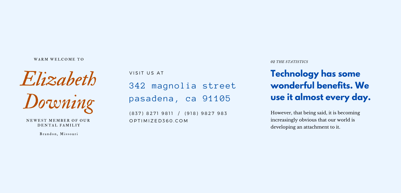
“Women Care” is what the viewer should pay attention to. The script font allows the viewer’s eye to look further.
Mixing Bold and Handwriting

This website design has uneven parts, but the bold tagline catches the viewer’s eye. The hand-written script adds to the tagline’s appeal.
Pairing Bold vs. Slim Weights

Many areas of text are noted on this medical website design. The designer highlights the bold parts of the tagline. The design displays less important phrases in a thinner, less noticeable style.
Color Pairing With Font Types

Though designers may choose the same typeface, one may still differentiate text with the use of color. This example shows a primarily pink color scheme, but the business name is the only blue portion of the view.
Differences in Type for Medical Professionals
The choice of type used in medical website design depends mainly on the particular medical practice. Surgeons, medical specialists, and primary care physicians may prefer a more formal website type. Dentists may choose a less formal type when their practices involve adults and children.
The most important factor in the choice of type is how the target market reacts to it. A medical target market comprises prospective clientele, medical vendors, and competitors. These variations affect the overall impact of the type chosen.
For example, vendors looking for doctors and dentists to sell supplies may not want to read website content with a sans-serif font. This is when splitting up type may be advantageous.
You can use serif type for site headlines while presenting the content beneath the headline in sans serif type. This is also true for medical sites that are marketing specific services or goods.
Professionals who market medical or surgical equipment have more flexibility on websites. These sites can use up to three types of styles. Be aware that competitors will view and judge the type you choose.
New vs. Existing Medical Sites
Another issue to consider is whether the practice is new or existing with a long-standing clientele. First impressions are lasting impressions, even for startup medical, dental, and medical professionals.
Choose content focusing on professionalism and type that offers a fresh image for announcing a new medical practice. Current medical sites might consider using two types of additions to their services. This can help ensure that people notice the information.
Keep type density at practical levels to avoid tedium. That’s the fastest way to divert site visitors’ attention.
Medical Professionals Websites
Many medical professionals write for medical associations or others in their local groups via a website. The typography chosen for this needs to be formal type. However, the chosen type should work well with typographical tools like leading, kerning, and tracking. This will improve medical and technical presentations.
Learn Typography Early
Learning the differences in typography styles is important for understanding medical website design. It also helps create effective website content.
Medical and dental students should use the recommended serif and sans serif fonts for their documents. This will help them learn to create professional-looking medical and dental texts.
Demographics Affect Type Style
The location of a medical professional, medical, or dental practice also affects type styles. Several serif and sans-serif types are available. Study those most often seen in medical website designs in your local area to determine the preferred type.
Metropolitan areas often use formal types to attract more potential patients and medical clients. In rural areas, less formal types suit the needs of this demographic region.
What Message Does Type Choice Send?
Learning typography tools is the main goal of creating a professional message. Understanding the target market and demographics is also important. This helps ensure the type used conveys a professional tone.
This points out the compatibility between the type chosen and links to branding. Once a medical brand announces the proper type choice, it should retain the ability to stay in memory. A definite connection exists between font choice and increasing online visibility.
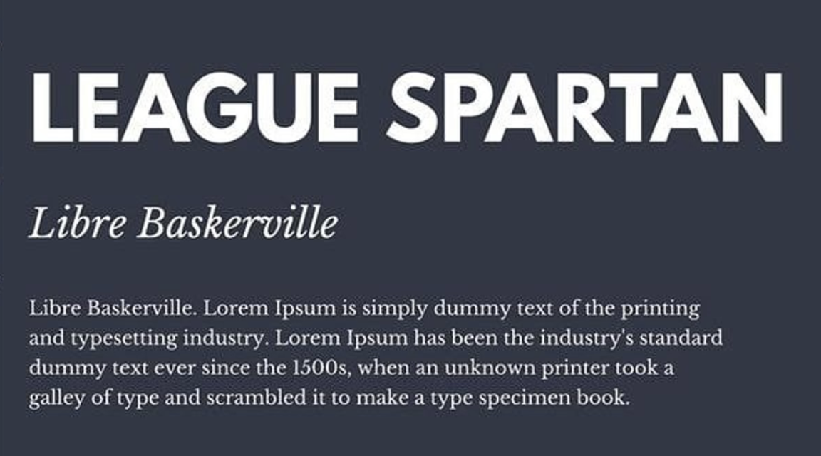
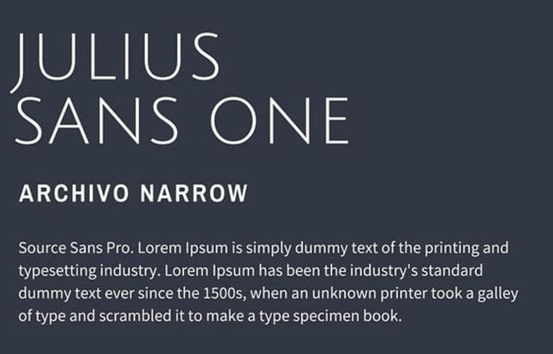
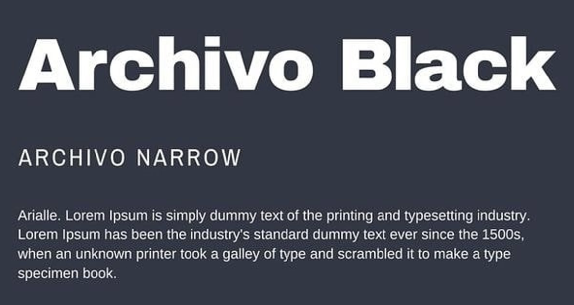
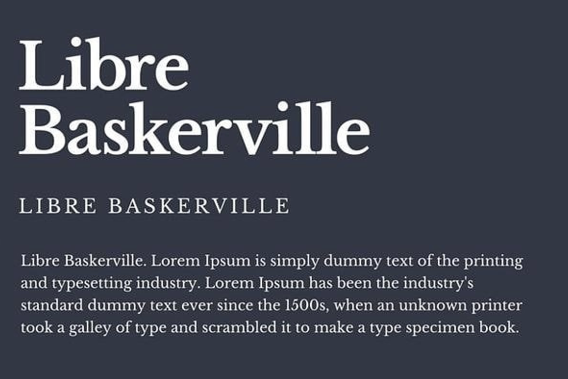
Font pairs examples
Conclusion
At the end of the day, good typography can help your medical website design engage visitors. It can guide them and help turn them into new patients. So many fonts and typefaces exist to choose from, and the experts at O360® know how to help you select them.


