2025 is underway, and the competition to stand out from other chiropractic practices through web design is underway. All websites have certain fundamental requirements, among them being responsive, sleek, and a trusted source of information. The best chiropractic websites are tailored to their clientele, outlining their approach to care, the services available, and the provider’s credentials. Great chiropractic websites deliver this information in an elegant design that reflects the practice’s personality.
Each year, the team at Optimized360 reviews the best websites of the previous year, looking for sleek and innovative designs. The results are used to hone our web designs, evolve our standards, and produce some of the best chiropractic websites in the industry. We present our findings to provide examples of those leading the charge to chiropractic website innovation.
Heritage Chiropractic Health Center
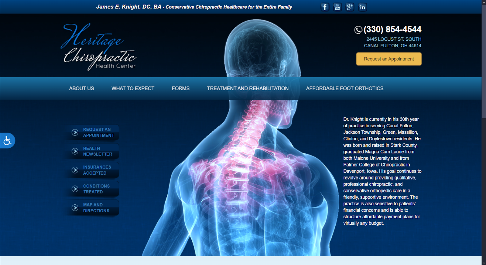
How We Graded Heritage Chiropractic Health Center
- (4.5) Navigation: This website provides useful navigation features to organize its services, including a static top navigation bar, multiple call-to-action buttons, horizontal web sectioning, and a hamburger menu for mobile responsiveness.
- (4) User Experience: The website provides fast loading times for ease of use. For content, content is provided in long paragraphs for deep explanation, and every navigation label translates information clearly.
- (4.5) Visuals and Color Theory: The website’s color palette focuses on creating a softer, more harmonious color contrast, and its visuals provide a professional, polished look. Its brand logo also provides an elegant contrast.
- Dark Oxford Blue: cool tone, 9% brightness, high saturation, medium hue
- Sapphire Blue: cool tone, 39% brightness, medium-high saturation, medium hue
- Maize Yellow: warm tone, 79% brightness, medium-high saturation, low hue
- Overall Score: (4.3)
Why We Think It Stands Among The Best Chiropractic Websites of 2025
Heritage Chiropractic Health Center provides a simple, easy-to-use interface for the user by focusing on keeping interactive elements to a minimum. It uses large, highly detailed images for backgrounds and service sections. It informs users with as much content as needed to encourage them to engage with the website’s navigation elements. It’s elegant and professional and uses design features great for practices looking to avoid visual clutter. These elements helps secure its place among the best chiropractic websites of 2025.
Integrity Interventional Pain Management

How We Graded Integrity Interventional Pain Management
- (4.25) Navigation: The website uses a collapsible introduction panel with a patient portal call-to-action button at the top of the page. Other elements include a roving top menu bar, a hamburger menu for mobile responsiveness, and additional call-to-action buttons for directing the user towards specific services.
- (4.5) User Experience: The website provides immediate accessibility and, by its design, makes all immediate services accessible for returning users. It’s adaptable to standard resolutions and mobile devices, and due to its optimization methods, the user experiences fast loading times.
- (4.25) Visuals and Color Theory: A complementary color scheme throughout the website helps bring direct contrast between elements, especially with call-to-action buttons and navigation features. Its images are personable and professional, as it uses photography of its members to present a friendly, relatable image.
- Dark pastel blue: cool tone, 25% brightness, low saturation, medium-high hue
- Grayish Blue: cool, 48% brightness, low saturation, medium-high hue
- Burnt pastel orange: warm tone, 56% brightness, medium saturation, low hue
- Overall Score: (4.33)
Why We Think It Stands Among The Best Chiropractic Websites of 2025
Integrity Interventional Pain Management works to build an immediate rapport with its users through its images. By using these types of images, it works to create an in-depth understanding, friendliness, and professionalism that users can feel trusted to have as their care provider. Because the images stand out as a unique feature, every aspect of color and web elements used here accentuates the practice’s trustworthiness. For this reason, it’s considered one of the best chiropractic websites to reference if you want to provide a good presentation.
Axom Integrative Health
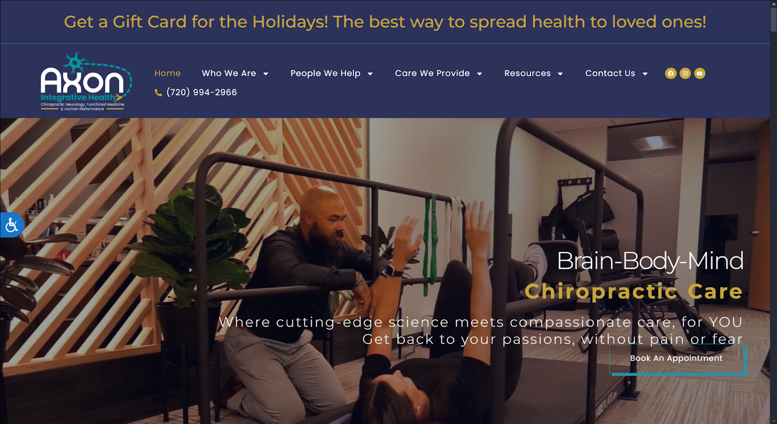
How We Graded Axom Integrative Health
- (4.15) Navigation: Axon Integrative Health integrates a roving top bar menu for easy access to all content. Social media links and click-to-dial calling are easily accessible. It does lack front-page click-to-directions, an important part of mobile-friendly design.
- (4.5) User Experience: Axon’s design is focused on providing a user-friendly experience. It’s responsive design and accessibility options are representative of this design. The site is easy to navigate, and information is provided in digestible bites to avoid overwhelming patients.
- (4.25) Visuals and Color Theory: The color choices on this website are simultaneously warm and soothing. In color psychology, Blue is a soothing color used to help ease worries and stress. The warmth of gold is inspirational and is associated with success in treatment, with green being a color of healing.
- Space Cadet Blue: cool tone, 22% brightness, medium-low saturation, medium-high hue
- Satin Sheen Gold: warm tone, 69% brightness, medium saturation, low hue
- Munsell Green: cool tone, 56% brightness, medium-high saturation, medium hue
- Overall Score: (4.3)
Why We Think It Stands Among The Best Chiropractic Websites of 2025
Axiom’s website is an example of the fundamentals of best chiropractic websites being well executed. It’s overall visual presentation and customer-friendly design gives it a firm place in our list. It’s video background element helps it stand out, and is a great feature for any website.
Shah Spine & Pain
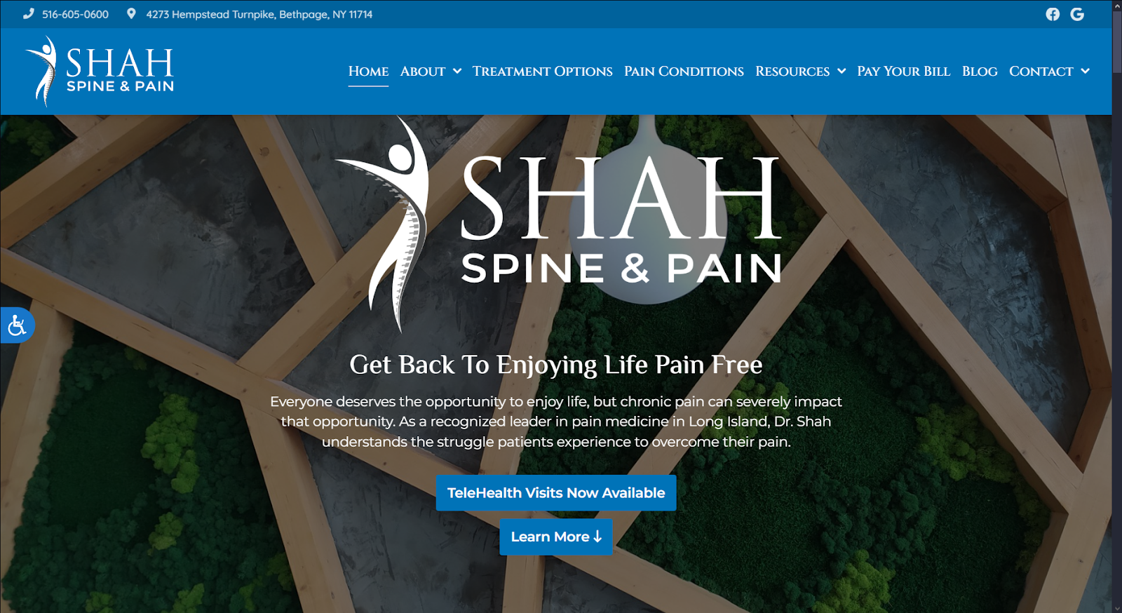
How We Graded Shah Spine & Pain
- (4.15) Navigation: Shah Spine & Pain offers elegant navigation features, which include a solid-color roving top menu, call-to-action buttons, and isolated sections for areas such as services, testimonials, and contact information. Click-to-call and click-to-map functionality is immediately available in the desktop site, but must be found on the mobile site.
- (4.5) User Experience: For the user, they’re presented with slideshow imagery and interactive videos that fully utilize its available web space. Its fast loading speeds make these visual elements highly optimized and its layout is expansive and engaging due to how it organizes its information.
- (4.5) Visuals And Color Theory: The website works with a four-color palette, using dark blues and blacks to create visual themes, which helps ease navigation. While red is used, it’s only used to draw immediate attention and inform the user of its specific service. Alongside that, its imagery is nature and architecture-focused.
- Dark blue: cool tone, 47% brightness, very high saturation, medium hue
- Warm-toned black: low brightness, no saturation, no hue
- Cool-tone gray: 53% brightness, low saturation, medium hue
- Red: warm tone, 44% brightness, medium-high saturation, no hue
- Overall Score: (4.38)
Why We Think It Stands Among The Best Chiropractic Websites of 2025
Shah Spine & Pain focuses on elegant beauty as its attention-grabber for new users. Because its visuals focus on themes of nature, interior design, and architecture, it easily translates to the user that through their services, their health can become aligned and whole. It sticks to blues as its primary color and thus allows for its images, call-to-action buttons, and other visual elements to stand out. This stands among the best chiropractic websites as a great example of how certain web elements can be organized non-linearly to help themes related to your practice translate to multiple audiences.
Mālama Pain, Spine and Joint Medicine
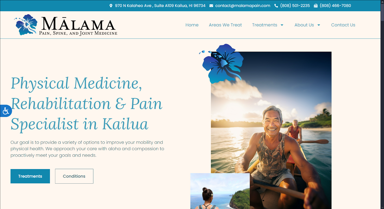
How We Graded Mālama Pain, Spine, and Joint Medicine
- (5) Navigation: Malama Pain provides a frictionless navigation experience on its desktop and mobile sites. The responsive nature of the website ensures that the click-to-call and click-to-direction functionality is always available. The top-bar roving menu means you can get anywhere on the site quickly and easily. Flawless.
- (4.75) User Experience: The accessibility options are immediately available, and the information is presented in simple language. The layout is lightweight and makes excellent use of space. It could benefit from the inclusion of a patient portal and make-an-appointment button.
- (5) Visual And Color Theory: Visual elements build rapport and community using images familiar to the local culture. The scenes selected are natural, soothing scenes that show people happy and pain-free. The primary color scheme is monochromatic, using a variety of shades of Dark cyan to create a soothing palette.
- Dark cyan: cool tone, 53% brightness, high saturation, medium hue
- Very bright pastel cream: warm tone, 95% brightness, medium saturation, low hue
- Overall Score: (4.91)
Why We Think It Stands Among The Best Chiropractic Websites of 2025
Malama Pain, Spine, and Joint Medicine is a gem among the best chiropractic websites. It combines beautiful visual design with convenience and functionality to create a flawless user experience. While the site could benefit from the inclusion of a patient portal and the “make an appointment” button, those are its only faults. If you’re looking for inspiration for your own chiropractic website, we strongly recommend this one.
Delaware Valley Pain & Spine Institute
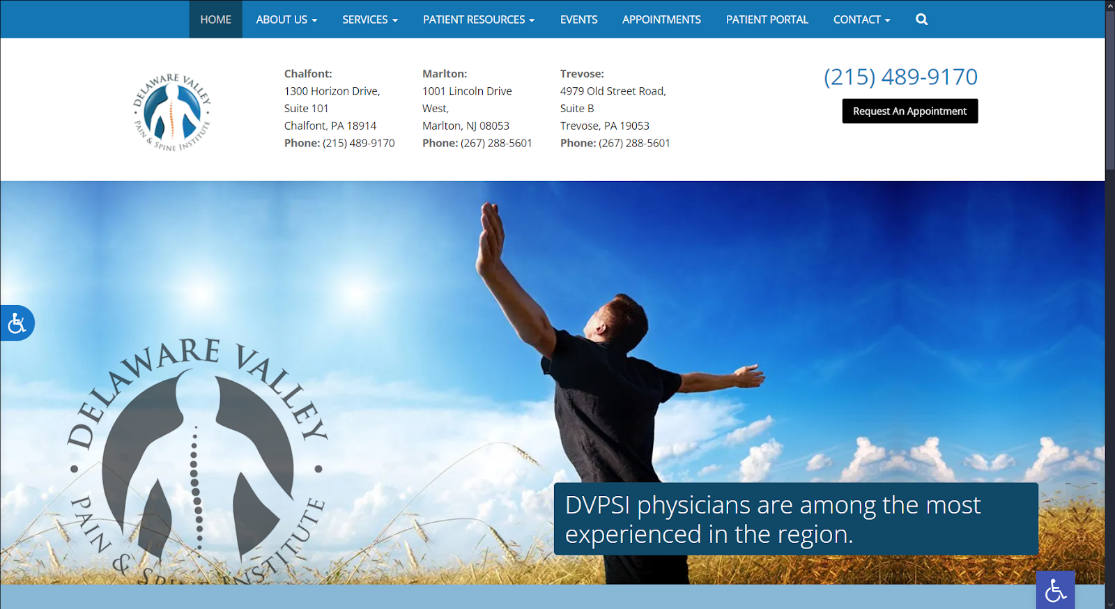
How We Graded Delaware Valley Pain & Spine Institute
- (4) Navigation: The navigation design of this site provides effective access to all necessary information. From the landing page, immediate access to all areas of the site is possible. Points were lost due to the fixed top bar menu on mobile and desktop sites.
- (4.5) User Experience: The request an appointment button streamlines starting treatments and managing follow-ups. Click-to-call and click-to-directions functionality are available for all three locations on the landing page. Accessibility options are available at the page’s left and bottom right areas.
- (5) Visuals and Color Theory: These visual elements of the site due an excellent job of inspiring hope and motivating visitors. The blue tones selected help calm anxiety and inspire hope for relief from their symptoms. The silvery gray tone stands out well against these brighter colors, and really help the clinic logo pop.
- French Blue: cool tone, 47% brightness, medium-high saturation, medium hue
- Indigo Dye Blue: cool tone, 29% brightness, medium-high saturation, medium hue
- Dark Sky Blue: cool tone, 72% brightness, medium saturation, medium hue
- Denim Blue: cool tone, 38% brightness, medium saturation, medium-high hue
- Silver Gray: cool tone, 79% brightness, low saturation, medium hue
- Overall Score: (4.5)
Why We Think It Stands Among The Best Chiropractic Websites of 2025
Delaware Valley Pain & Spine does a lot of things right. While it’s navigation element is lacking once you leave the landing page, it succeeds at providing all the critical information. It would benefit from including a top-bar menu on both desktop and mobile to ensure navigation remains fluid from area to area. Beyond that, the user experience and visual presentation of the site are exceptional and serve as one of the best chiropractic websites in the industry.
RTP Chiropractic
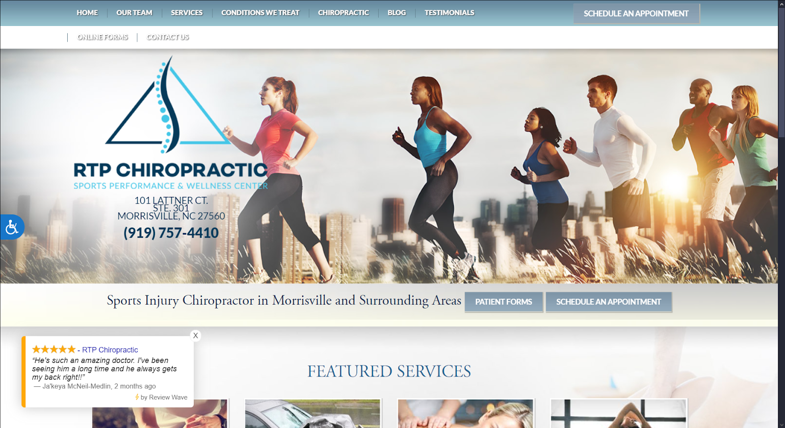
How We Graded RTP Chiropractic
- (4.25) Navigation: The site navigation is easy from the landing page, providing immediate access to all areas of the site. It uses a static top-bar design to lose functionality once you scroll away.
- (4.5) User Experience: Convenience is a focus of the design of the site, with patient forms, appointment buttons, and click-to-dial functionality being present on the main page. The accessibility options appear on the left to aid users of all abilities. The text on the individual pages is presented and easy to read.
- (4.25) Visuals and Color Theory: There’s a good use of imagery and color on the site that helps draw in the customer. There’s a lot of use of cool tones in blues and grays, creating a pleasant aesthetic experience. While the color scheme is cohesive and pleasant, it doesn’t have the draw of some of the other sites.
- Light Slate Gray: cool tone, 58% brightness, low saturation, medium hue
- Indigo Blue: cool tone, 37% brightness, medium-high saturation, medium hue
- Cerulean Gray: cool tone, 61% brightness, medium-low saturation, medium hue
- Overall Score: (4.33)
Why We Think It Stands Among The Best Chiropractic Websites of 2025
RTP Chiropractic shows excellent execution of design fundamentals, making it one of the best chiropractic websites of 2025. Implementing patient-facing convenience features and a smooth, lightweight design creates a great experience. While it could use updating with a roving top bar on both mobile and desktop, its overall design is worth recognizing.
Revealing The Best Chiropractic Website Design of 2025
The time has come for us to reveal our pick from the top chiropractic website designs of 2025.
- Mālama Pain, Spine and Joint Medicine (4.91)
- Delaware Valley Pain & Spine Institute (4.5)
- RTP Chiropractic (4.33)
- Shah Spine & Pain (4.38)
- Integrity Interventional Pain Management (4.33)
- Axom Integrative Health (4.3)
- Heritage Chiropractic Health Center (4.3)
With every element clearly in place, we present Mālama Pain, Spine, and Joint Medicine! This website exemplifies all of the greatest elements of modern design. From the latest patient convenience features to full integration with modern responsive design, it ties all the essential elements together flawlessly. It’s an excellent demonstration of the execution of aesthetic and functional web design combined with powerful SEO integration. Contact the team at Optimized 360 to get a great chiropractic website that will drive your practice’s growth in 2025!