Website design for healthcare websites includes some standard common framework (the bones) for custom and template websites. This includes:
- A home page with an informative header;
- Menus that are intuitive for users to navigate on your site;
- Call to Action that gets a response – “Call to action buttons can drastically improve your website conversion rate.” Says advertising blog guru Paul Olyslager;
- Provide relevant content that gives users the information they are looking for.
- Use the footer area for additional navigational links for your website.
- Your site is optimized for both desktop and mobile search.
The Healthcare Homepage
If someone arrives at your site and goes to your homepage, aka the landing page, the sole job of this page is to draw a visitor further into the site. So, they must complete an action for you as the site owner to feel you have a live prospect for your medical practice.
The use of an appropriate image on your landing page is incredibly important. Pages with images are 90% more likely to generate user action than pages that are text only—having a video that the user can choose to play or not increases the likelihood of success by a larger factor than no image or an image without video. One caveat about video is that it should never start automatically, and if it or a soundtrack is irrelevant, don’t use them.
The homepage should be made as local as possible. Use local landmarks or defined areas such as “downtown” or “two blocks from Grant Park” to use geographic markers in your patient catchment area.
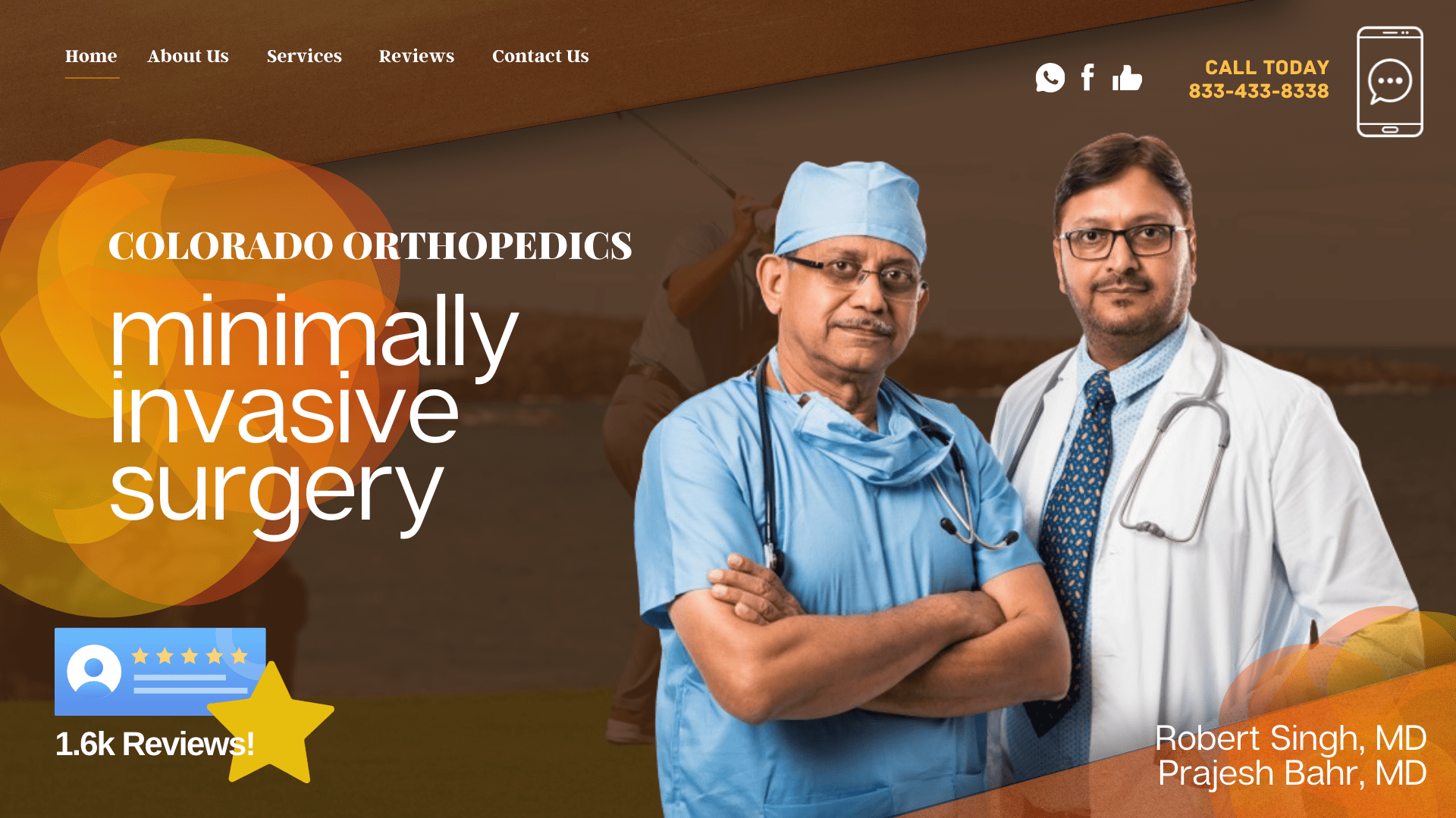
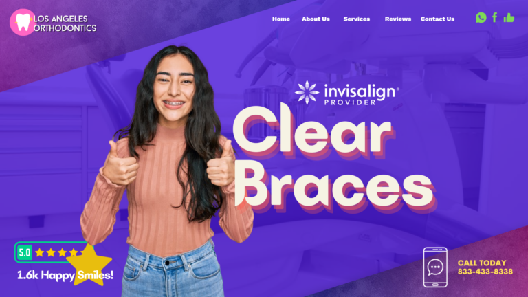
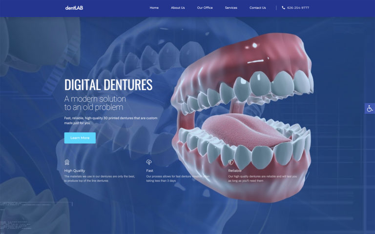
AN EXAMPLE OF AN EXCELLENT CUSTOM DENTAL HOMEPAGE
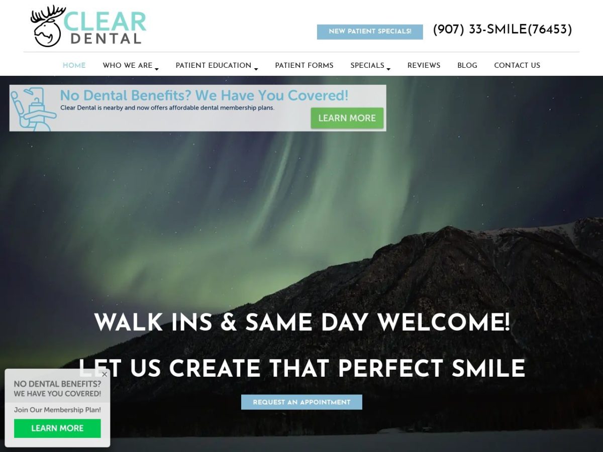
Use the homepage to answer the following questions.
- Who are you?
- What do you do?
- Why should I choose you?
- How do I reach you?
Another thing about the homepage and your entire site – you need a logo that tells the answer to all of the above things. An example is the following newspaper advertisement from 1913.
IMAGE SOURCE: HTTP://WELLCOMEIMAGES.ORG/INDEXPLUS/IMAGE/L0040514.HTML
Easy Navigation
People often feel that the more intricate a site is, the more impressed patients and prospective patients will be. Intricate navigation usually leads to one place – not your site! People who use the web for research, as 90% of consumers do have no time for websites where pages load slowly or navigating the site requires a compass and a team of people to support a safari – keep navigation simple, and answer to your calls to action will soar.
See How This Ad Answers the Questions that a Homepage Should?
Well-Designed Call to Action Buttons
People who visit your website do so because they are looking for something; based on their search criteria, it is you. Make sure your website buttons stand out. When you want your site’s user to do something (take action), create a button for each choice. They may include:
- Making or changing an appointment
- Print out referral forms or other information.
- Take a tour of your office.
- Print out information about a specific healthcare problem or a white paper your patients would like.
When patients take action, they also drop into what sales professionals using Internet marketing call the “sales funnel.”
Don’t Believe Content is Dead; It is More Relevant On Websites Than Ever
Professional web designers have heard almost since the beginning of time that keyword placement was the best way to get visitors to a website – that is, until the mantra, Content is King came into use. But, the successor to keywords did not have a long reign, and Content King was declared dead and replaced with the notion that SEO was the most important part of generating website traffic. That is until it was replaced by the trend of “Mobile Marketing.”
A professionally done website by an excellent website designer has all of the above elements working harmoniously. Sometimes, a designer will hire a professional content writer to create content that pulls the reading audience in with just the right recipe for creating website content. While we can debate forever whether content or something else is “king,” there is no doubt that we can agree that content is an important part of website design.
Content is written overseas often has glaring grammatical mistakes, and some appear to have been written with an English-whatever translation dictionary in hand. This can easily kill your site and help prevent your reputation as a solid healthcare professional from flourishing. Remember, you want people to visit your site and complete an action. When folks introduced to you by your website make an appointment, you are a winner. When they flee your site because of crummy content, you lose.
Best content management system for healthcare websites.
Mobile Optimized?
90% of people searching for information or needing an appointment with a health care professional begin their search on the Internet. Of them, 67% use a mobile device for their search. A template site made for viewing on a desktop computer or even a laptop does not always display correctly on smaller screens common to smartphones. There are several technical ways to improve your mobile optimization, but first, check out this free mobile testing tool from Google. It will rank how well your site is optimized for mobile search.
Look at the infographic below to learn more about the benefits of a responsive mobile site.
