In business, there are things you can control and things you can not. While you don’t have a say in who your competition is or whether a supplies order is held up in shipping, you can determine how people may view your urgent care practice.
An effective website for an urgent care center should be both attractive and functional. This means that it will impress visitors with its design yet will still work as a marketing tool so you can accomplish your business goals. This is important because.
From a design perspective, you want your website to look good. How your website looks will serve as your first impression to site visitors. But from a marketing perspective, you need your website to attract new patients.
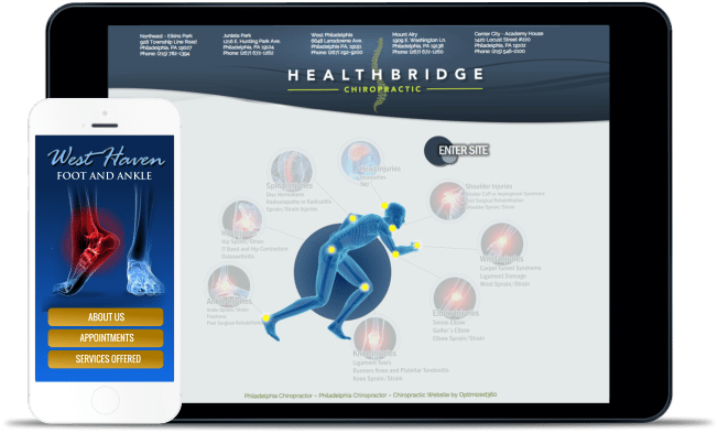
Creating websites for an Urgent Care physician helps start the design process by looking at what other ERs or Urgent Care Practices are doing. This helps to give you an idea of what you like and what you dislike. It also helps you see what healthcare industry doctors are doing.
Urgent Care Web Design greatly differs from designing for a dentist or a plastic surgeon. An Urgent Care website often needs to be designed to attract new patients and educate prospective patients about what type of emergencies you take care of.
Building the best pain management website.
The best urgent care marketing strategy will have a few design components that aid in its marketing strategy.
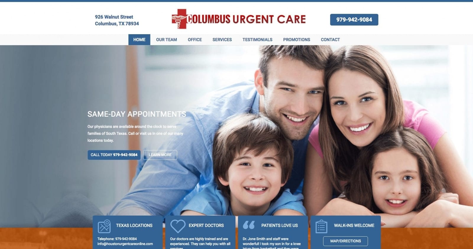
Prominent Display of Contact Information
Typically one of the first things visitors look for when they land on your website is how to contact you. Especially when it is literally an ’emergency’. By displaying your contact information front and center, you’re being transparent with visitors and allowing them to contact you during a potentially high-stress time.
If you were to list the top urgent care clinic websites, you would notice that every one of them makes their contact information easy to see. This contact information is accessible via mobile devices, so people can tap a phone number and call you. Remember, many of these emergencies happen when people are out and about, especially sports injuries.
Also, make it each for them to hit your email address and send an email. Many offices also offer texting as a means of communication. Check O360’s HIPAA Email service.
Frequently Asked Questions
While emergency medicine is not new, many people are just starting to become exposed to it since in the past, they only had an ER to go to. As a result, you’ll likely get a lot of the same questions over and over again.
A list of frequently asked questions does two things. First and most importantly, it allows people to seek answers to their questions without feeling silly or like they’re imposing on your office staff. It also helps filter the cases so you don’t end up with a heart attack patient in your beautiful urgent care.
Third, it frees up your office staff so that they do not have to answer questions that people call in for answers to repeatedly.
Services in the Menu
Every urgent care office is different. Some specialize in treating injuries only, while others focus on common illnesses like colds and pain. By listing your services in your website’s navigation, visitors and prospective patients can see what you offer and if your office is a right fit for them.
From a design perspective, this can be accomplished in numerous ways. From putting it front and center to listing it beneath another menu option (sub-navigation), it’s important that you discuss your medical marketing strategy with your designer to know what would be best. If you need help marketing your urgent care practice, take a look at our products.
Call-to-Action

The call-to-action is usually presented as a button that a visitor clicks. This button is typically placed in a visible spot. Designers like to say that it uses ‘precious real estate.’ With that in mind, it’s important that your call-to-action be tested and designed to accomplish its goal.
For many offices, the button encourages people to:
- Schedule an appointment
- Call the office
- Learn more
- Take advantage of a special offer
Responsive Design
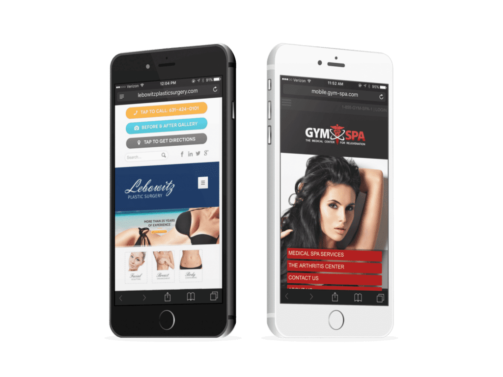
Responsive website design allows your website to cater to various devices and visitors.
Responsively designed websites are sites that adjust according to the screen size they’re being viewed on. This is particularly important today because of the wide variety of devices. Each tablet, cell phone, and desktop device has a different screen size and resolution.
Responsive websites help to provide an exceptional experience to visitors. Additionally, search engines like Google and Bing use whether a site is responsive or not to determine how to rank you in their search engine results pages. If your site is responsive, the you are more likely to rank highly. Check our mobile website design service.
This is because search engines are in the business of keeping their customers happy. By providing the most relevant and useful results, they’re making sure to give users of their search engine an enjoyable experience.
Recap
To recap, below, is the list of the most important elements you want to find on any urgent care website:
- Clear and Visible Contact Information: Ensure that phone numbers, addresses, and operating hours are easily accessible on the website’s homepage.
- Online Check-In and Appointment Booking: Provide a user-friendly online system for patients to check in or schedule appointments.
- Services and Treatments: Clearly list the medical services and treatments offered by the urgent care center.
- Location and Directions: Include a map or directions to help patients easily find the urgent care center.
- Insurance Information: Provide details about accepted insurance plans and billing options.
- Staff and Credentials: Showcase information about the medical staff, their credentials, and expertise.
- Urgent Care FAQs: Address common patient queries through a comprehensive FAQ section.
- Wait Times and Queue Status: If possible, display real-time wait times or queue status to manage patient expectations.
- Testimonials and Reviews: Highlight positive patient experiences and reviews to build trust and credibility.
- Mobile Responsiveness: Optimize the website for mobile devices, as many patients search for urgent care centers on their smartphones.
- HIPAA Compliance: Ensure that the website collects and handles patient information in compliance with HIPAA regulations. HIPAA-Email Service.
- Urgent Care Blog: Consider a blog section to provide informative content on medical topics and updates related to urgent care.
- Language Accessibility: Offer language options or translation services to cater to diverse patient populations.
- Social Media Integration: Include links to the urgent care center’s social media profiles for additional engagement and updates. Social marketing service.
- Emergency Information: Guide what to do in case of a medical emergency, along with emergency contact numbers.
By incorporating these essential elements, an urgent care center website can effectively inform and assist patients, enhancing their overall experience and encouraging them to choose the center for their medical needs. O360 offers custom website design to urgent care practices internationally.
