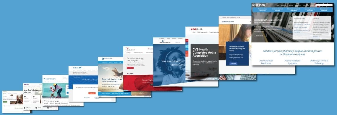
This guide looks at the websites of the top ten healthcare websites and insurance companies. The author writes it for doctors and other healthcare professionals looking for healthcare industry information. The reviews show how effective a top website is. They look at its design, usefulness, readability, and ease of navigation.
1. McKesson Corp.
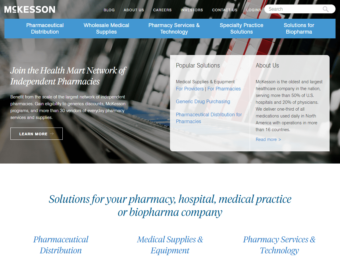
This website has a lot of information about McKesson Corporation. McKesson works with pharmaceutical companies and pharmacy systems. It produces prescription drugs and makes medical, surgical, and life sciences products.
The company offers practice support and solutions for specialty medical practices, including oncology, rheumatology, gastroenterology, ophthalmology, and neurology.
See more pharmacy websites.
Healthcare professionals can read the blog to find helpful information. The blog has articles about professional issues published a few times each week. Another information section of this website provides biopharma resources for companies wanting to bring specialty therapies to the market. This website offers white papers and brochures on McKesson’s solutions for the medical, surgical, and pharmacy sectors.
2. UnitedHealth Group
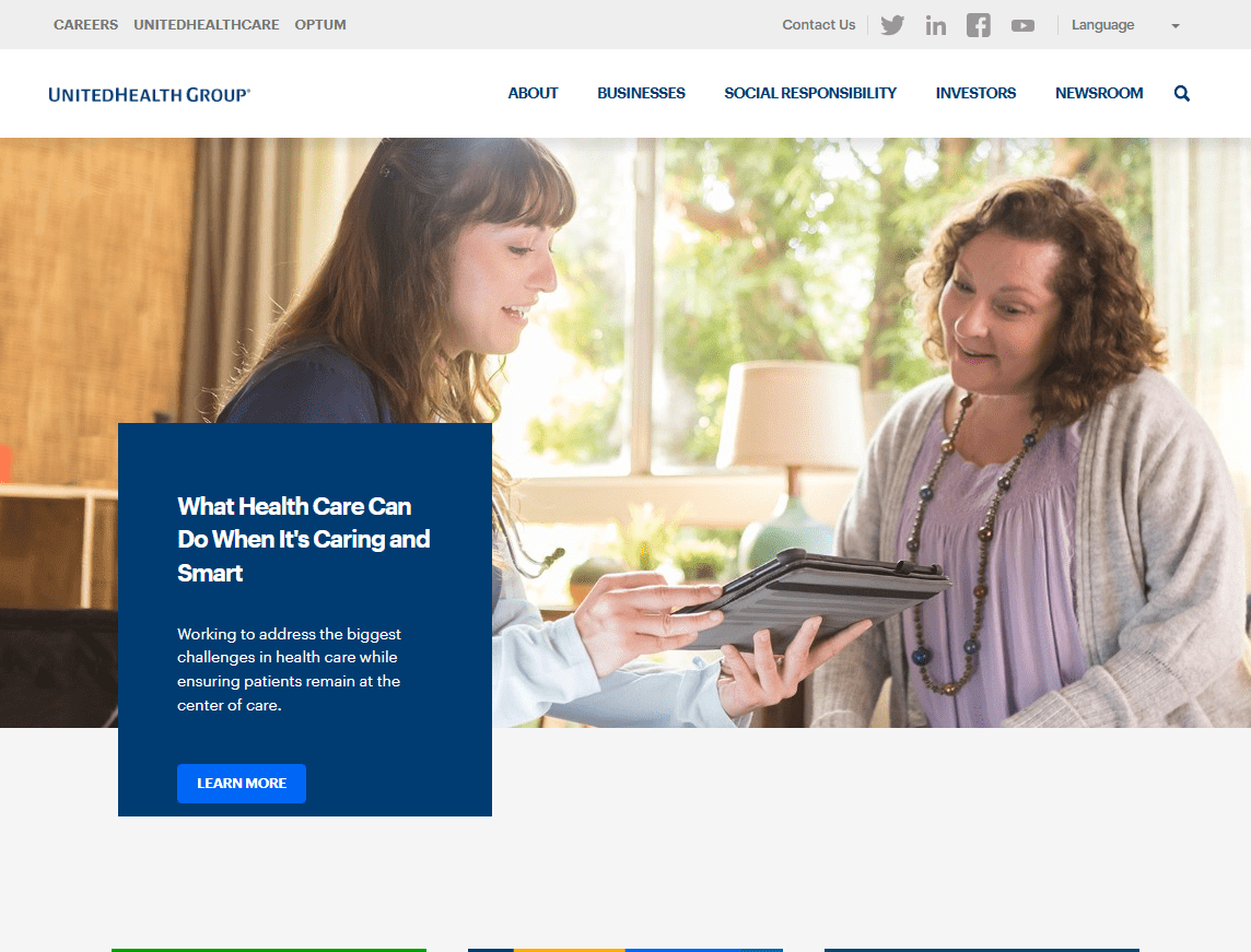
UnitedHealth Group has two subsidiaries that it provides links to on this website. One is Optum, a technology services provider specializing in data and analytics for health care management and pharmacy care. Optum offers solutions for government agencies, businesses, and individuals. The other is UnitedHealthcare, which provides health benefits programs as group coverage for employers, individuals, and families.
This website has a serious design flaw. It assumes the visitor knows that UnitedHealth Group has two subsidiaries: Optum and UnitedHealthcare. The visitor will click the “businesses” link to learn more about them. This is a poor navigation design.
To solve this problem, healthcare websites should describe what their subsidiaries provide separately. For example, it could say “services for health care providers” to connect to Optum information. It could also link “health benefits plans” to the UnitedHealthcare health insurance marketplace information. These descriptive phrases are more informative navigation links than generic word business.
Room for improvement in the content also exists. This website has scant helpful information about the healthcare industry. A close review of the websites reveals a bias toward the company’s interests. The information provided in the “news” section relates to their companies.
3. CVS Health
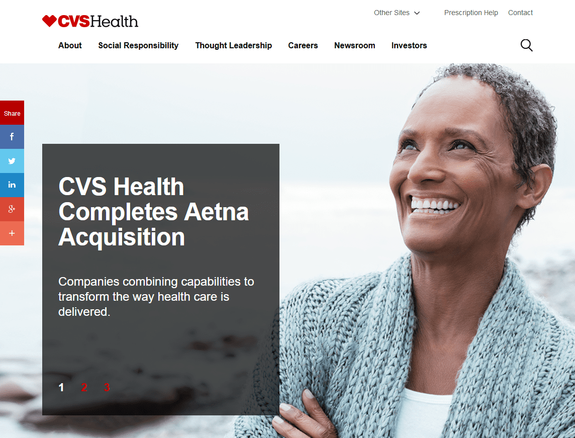
This is the main website for the CVS family of public health businesses and healthcare websites. The company recently bought Aetna Insurance. This guide also includes a website review.
The CVS website has links to its subsidiary companies, which include CVS Pharmacy, CVS Caremark, CVS MinuteClinic, CVS Specialty, and CVS Payor Solutions.
You can find these links in a dropdown menu called “other sites” at the top of the home page. These links should be more visible than in a dropdown menu if they are important enough for the home page. Listing them all out as text links in the header of the home page is better than placing them in a menu.
An interesting CVS web-based tool on the site shows the state-by-state impact of the CVS locations and services offered in America. This function is good, but there is an interface design flaw. Close inspection will reveal a button marked “create report” is at the web page’s top left.
It creates a report in PDF format. However, to use the feature properly, visitors must select the state they want to report about.
To select, use the dropdown menu below this button on the web page. Afterward, go back up and click the “create report” button to get the report. This button should be below the state selection area for a more intuitive design.
The CVS Pharmacy (cvs.com) healthcare websites attempt to block anyone outside the United States from using them. This means that people on vacation outside the US or in the military overseas cannot access their site.
You must use a US-based virtual private network (VPN) to avoid annoying IP address blocking. We should remove this idiotic blocking of non-US website visitors. It only irritates CVS customers since any hacker can easily get around it.
The CVS newsroom has some interesting articles about the healthcare industry and press releases about the company.
4. AmerisourceBergen Corp.
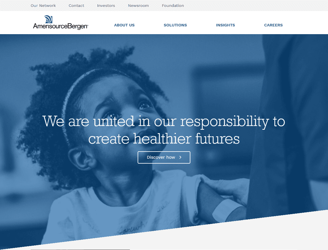
Of the healthcare websites reviewed in this guide, this one has the best intuitive navigation and useful design. The top menu choices on the header include About Us, solutions, insights, and Careers. These provide clear information and links to get to the desired portion of the website easily and quickly.
The dropdown menu for the solutions link includes health systems, pharmacies, doctor practices, manufacturers, and animal health. These categories are easy to understand.
The insights dropdown menu has an “explore topics” option, which leads to a large library of content on many subjects. Topics include advertising, analytics, pharmacy buying, and cell and gene therapy. You can also find information on clinical trials, pharmaceutical distribution, marketing, legislation, inventory management, medical care, and patient support services.
Information about practice management, specialty pharmacy operations, secure supply chains, technology, etc., is also available.
This content library is incredibly extensive and searchable. It contains useful information for many healthcare practitioners, especially for those involved in pharmacy operations.
5. Cardinal Health
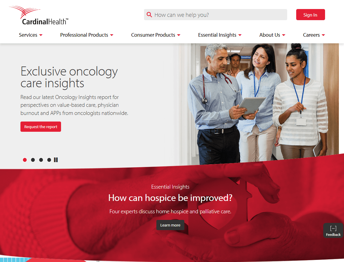
This website divides the information into services, professional products, and consumer products. The consumer products section has a tool to help users find a retail store that sells Cardinal Health products.
An essential insights section of quality content to read also exists. The dropdown menu allows visitors to choose a filter. This helps show articles that interest the web visitor more.
These filters sort through the articles based on the type of viewer (called “audience”). The categories include acute, manufacturer, payer, physician office, and retail pharmacy.
This website does an excellent job of inviting visitors to sign up for a company newsletter. A small but obvious “connect” button for the email address entered exists. An invitation to get the newsletter appears at the top of the essential Insight web page.
Along with this feature, a plus sign on the feedback button lets web visitors share their opinions about the website. The smart design of healthcare websites includes features that are helpful and easy to see. They do not block the user’s view or become annoying.
See the best healthcare websites of the year.
6. Express Scripts Holding
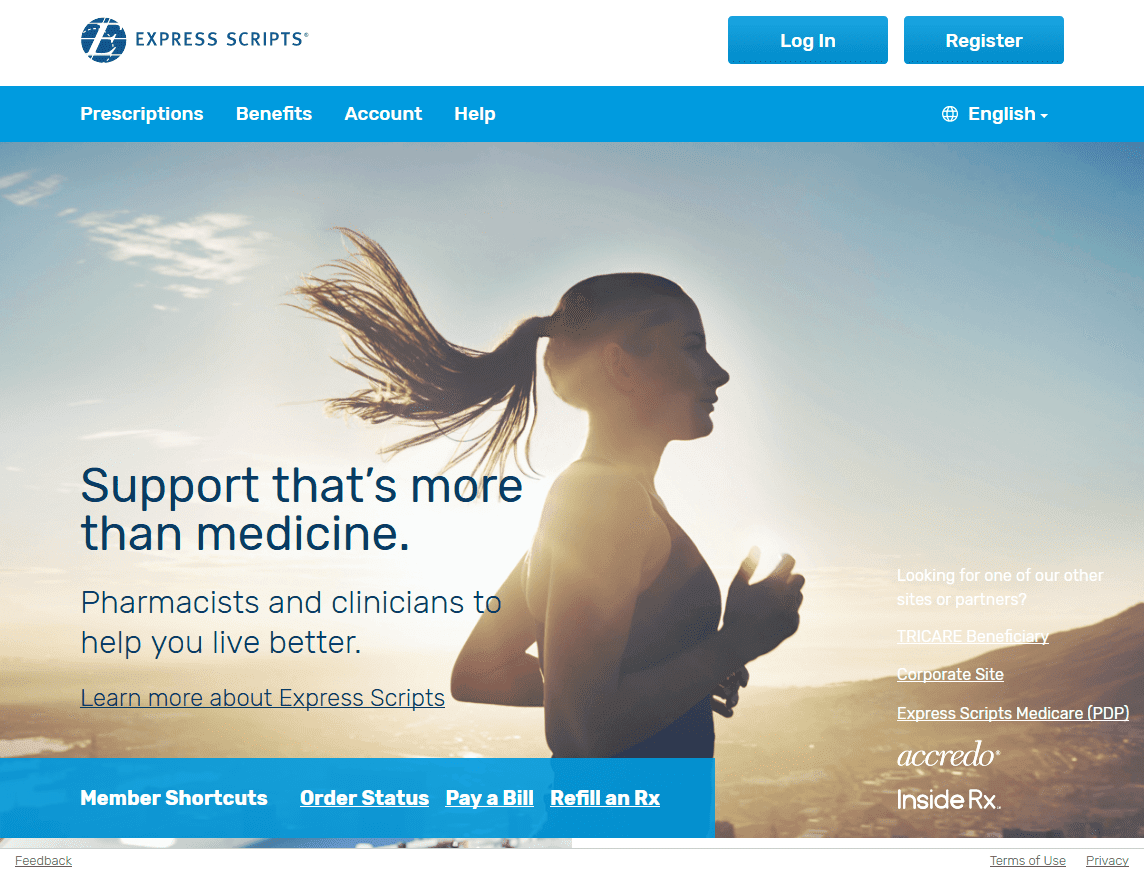
This website is for members of the Express Scripts drug benefit plans. You can access it through your employer, health plan, or Medicare Part D insurance. The website lets members arrange prescription delivery or pickup at a nearby pharmacy that their plan covers.
The website interface is simple and easy to use. Members can get information about the program and take advantage of services such as paying a bill, refilling a prescription, and getting help. The only information of general use for health care practitioners is the up-to-date news about pharmaceutical recalls.
7. Anthem
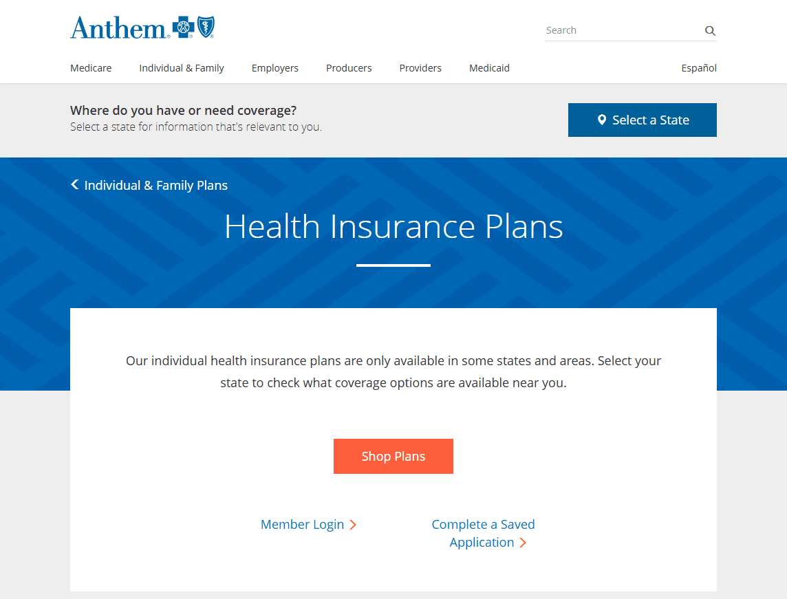
Anthem is the trade name of the Blue Cross/Blue Shield health insurance program. This website is for members and providers of this health insurance. Anthem is available to some with federally supported Medicare and Medicaid. Anthem health care plans are also available through some employers and as individual or family policies.
Among healthcare websites, this one is extremely well-designed. Website visitors can search for information by selecting a category on the home page representing their interests. This selection produces a list of web pages.
These pages let users shop for different Anthem healthcare plans. They provide extensive information about the various programs and offer assistance for those who need it.
New members can enroll in their plan on this website and pay their bills online. Existing members can log in to review their account details. A blog of information also exists. The blog articles cover topics about preventive health care, member news, and common health insurance questions.
8. Kaiser Permanente
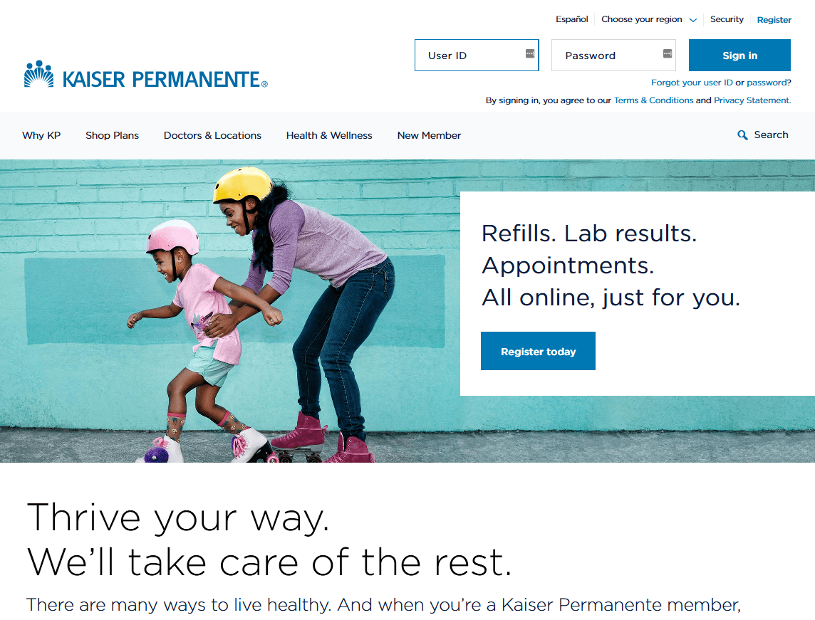
Kaiser Permanente is a large health maintenance organization (HMO) operating numerous healthcare facilities. It serves more than 12 million members. These members are found in multiple states, including California, Colorado, Georgia, Hawaii, and Oregon.
The designers created this website for member use. The design is well-executed, and the interface is intuitive and user-friendly. The website is available in both English and Spanish. It helps people explore plans, sign up for membership services, find the care they need, and manage their health.
Kaiser is proactive in managing its members’ healthcare. The website provides plenty of resources for members to learn about their health conditions. It offers online programs and information, including prenatal care, weight loss diets, health problem solutions, and exercise routines.
Nearly 5,000 high-quality articles on healthcare issues are searchable on the Kaiser database website. Anyone who wishes to read these articles does not need to be a Kaiser member.
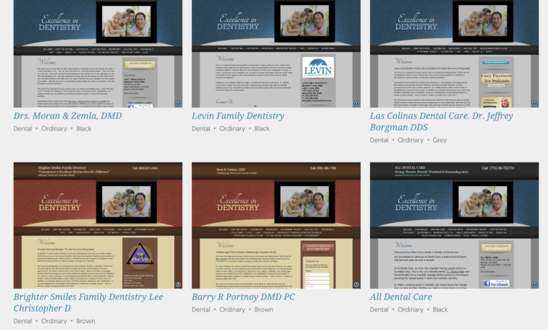
View O360 Healthcare Website Gallery to see more well-designed sites.
9. Aetna
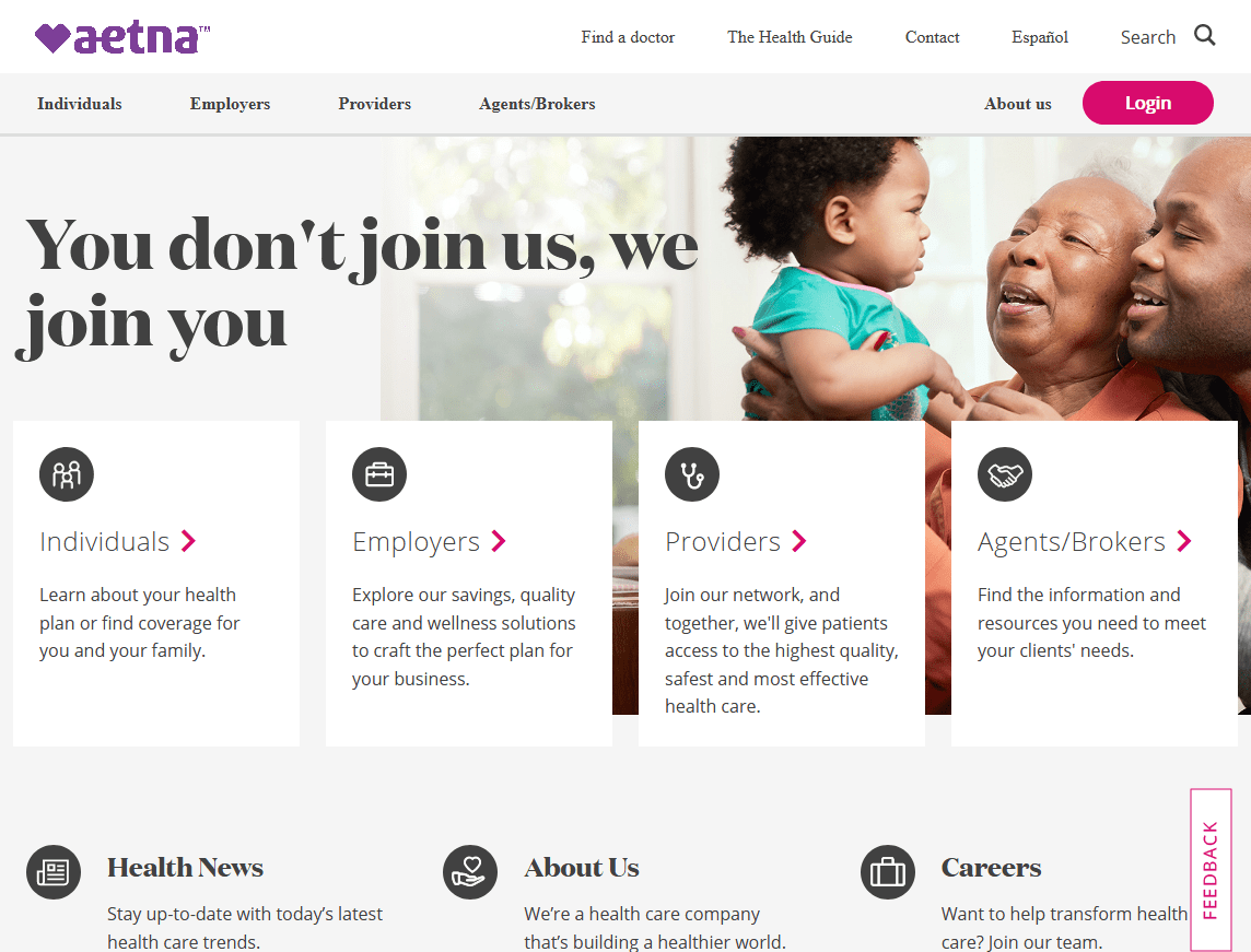
CVS recently acquired the insurance provider Aetna in a merger. It still maintains a customer service website for its policyholders and members. The website also has information for employers, providers, and insurance brokers/agents. The website is available for English and Spanish speakers.
Individuals can request an insurance quote, sign up, and pay the bill online. Employers can review plan options and get a quote. Once they contract for services, they can manage their plan online, get questions answered, and pay medical bills. Visitors can find information about out-of-pocket costs, nursing home coverage, cost sharing, and Affordable Care Act plans.
Once accepted, healthcare providers can apply to join the network and get an online account to learn about the programs. Insurance brokers and agents selling Aetna insurance can manage their sales accounts using various support tools on the website.
One useful resource on the website is the health guide. Members can select the categories of living healthy, understanding health care, and managing health. The health guide is available to anyone who wants to read the articles. You do not need to be an Aetna policyholder or member to use this resource.
10. Humana
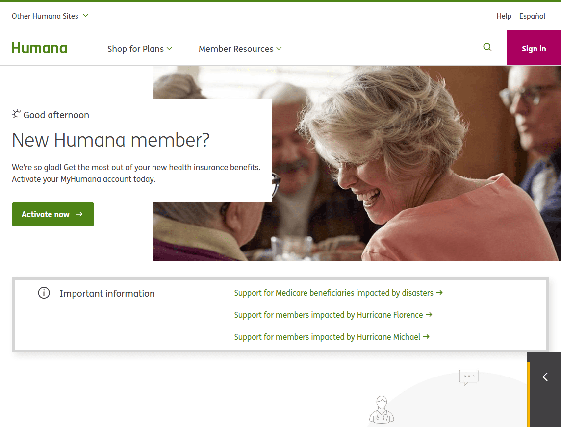
Humana is a large health insurance plan company with over 14 million insured customers. The website’s design accommodates members’ needs well. It helps individuals and businesses select plans and access member services. New members can register after enrolling in an individual plan or joining through their employer.
Humana’s website has links to other sites. These sites help employers, providers, caregivers, insurance agents, and brokers who sell Humana policies.
Humana has a Go365® wellness program for its members, which rewards them for doing things that create a healthier lifestyle. To see most of the information, a person must be a member of Humana. Only a few articles are available on the home page.
Conclusion
The CVS and UnitedHealth Group websites may have a few design flaws that designers should correct. Suppose Humana has more articles available for its members. In that case, it should provide more information on its public website. This will help increase the website’s authority and improve its search engine ranking.
The AmerisourceBergen Corp. website is an excellent resource for browsing articles by category. Aetna’s website meets the needs of everyone who uses its products and services.
The best-designed healthcare website reviewed in this guide is Kaiser Permanente’s. Kaiser has a large database of articles that anyone can read, which, along with its great website design, is why it ranks the best.
Need a website? Check the #1 healthcare website designer in the USA.
