With the internet always full of new content, every website wants to rank high in search results. However, even if a website looks great, it won’t rank well without a solid user experience.
Every website should focus on user experience. How users navigate a website is crucial for that experience. Here are our suggestions for web navigation and ways to improve your website’s interface.
How Wayfinding Makes The User Experience Easy
Intuitive web navigation starts with one simple term — wayfinding. While it sounds like a term for sailors and pilots, wayfinding refers to how people position themselves in a space. Ease of wayfinding is necessary for a positive user experience.
This method helps people navigate. People often use the term in theme parks, airports, and subway stations. You can also use it online.
In the digital world, wayfinding is key to good web design. It includes principles that help organize your site. These principles guide users as they navigate each page on your website.
Create Identity
Your website is your identity. The all-encompassing space allows your users to orient themselves within it. But within your website, your website will have regions and sections of information that you want users to engage with.
Every section should have its identifier. For example, sections like “About Us,” “Blog,” and “Services” provide clear, descriptive titles. Using these signs marks each place, making it more intuitive for your patients.
Make Landmarks
Landmarks on your website improve site navigation and user experience. They give direction and make the site easier to remember. For example, you can add an interactive video from your practice instead of using a static hero image.
Adding a dynamic element to your web page will help your patients remember it. They will also recognize your practice better.
Form Structured Paths
Paths, or the navigation itself, are the challenging part. In web design, every link on a website creates a path. However, many links lead to dead ends. This happens because they do not connect information effectively.
The key to making clear paths is their ability to come back to you. This helps you, the website owner, share the ideas you want patients to understand.
Divide Into Regions
In web design, regions are ways to define parts of a website visually. This helps make each section clear and unique when viewed alone. One way to separate regions visually is through color theory.
It becomes a cohesive unit by using different color combinations in sections of the website. Each section stands apart when viewed individually.
Limit Their Choices
To make all this theory work, your website’s story should be short, sweet, and concise. Do not give your users too many choices. Each choice you give to your web users tells them where to go and communicates what story you intend to convey. Users will quickly lose interest and look elsewhere when your website has too many links or visuals.

Navigation, Browsing Habits, and The Healthcare Web
Browsing the internet today has changed how focused we are. The average attention span of an internet user is just 40 seconds. Chronic stress and fast-paced work environments can shorten attention spans.
If your website isn’t user-friendly and easy to navigate, you will get less return on your investment. This is important for sites like yours.
Fast-changing, short content has made the internet like an “external memory storage” for people. This study from 2020 serves as the basis for this. You can often find information that is hard to locate on one website on another website. Websites that cannot keep up with the short attention spans of their users often struggle because of this.
At Optimized360, our focus for marketing websites starts with understanding how users browse the internet. Your target audience in the healthcare web space will have internet behavior patterns unique to your specialty. Some common ones we’ve observed while helping practice include:
- Quick Scrolling: Users scroll, use the drop-down menu, hover over areas, and use search bars to find specific information. However, good visual design and a solid landing page help them engage with these search functions. Using a mega menu also improves the user experience (UX). You can then update your search engine optimization from these insights.
- Link-Clicking: Many site visitors will click links in long-expanding web tabs to look into various topics. If your website includes links that users click on, you can use them as a source of engagement. Use this to your advantage – if your highlighted service doesn’t match what users are interested in, you can build off it.
- Cost Examination: Your visitors check the services you offer. They also look at how clear your pricing is. Finally, they consider how appealing your practice appears. If you make comparisons, you can draw inspiration from your local competitors.
- Page Abandonment: Page abandonment happens often. It usually occurs because of user experience design that includes broken images or 503 errors. Websites that lack updates for a long time or don’t have SSL typically lead to poor web traction.
- Reading Reviews: Sometimes, the testimonies and reviews grab users. If the reviews are authentic and believable, your website will have a better chance of gaining traction.
- Frequent Visits: Users who visit your website often are likely returning patients. This can create chances for new marketing campaigns, like flu shot promotions or annual physicals.
Forty seconds doesn’t sound like enough time for you to engage with users – it may seem impossible. And that’s where good, intuitive navigation comes in. You’ll see the results if your website’s design is clear.
Parts of The Home Page: A Cheat Sheet For Easy Navigation
When someone enters your website, the first information they’ll need is where they are. It all starts with you – your name, your business, your services, and your website. In web design, these details make you exclusive and attractive to your audience. Your website should highlight what you consider your best features.
Below, we’ll break down what a basic home page should have so your patients can find what they need:
Header and Navigation Bar
Your website should show your domain name, practice logo, and navigation bar first. This helps your patients know who you are and what services you offer. At the top of the page, these sections should build a connection with your audience.
They should show all the ways users can engage with your services. They also serve as a beginner’s guide to your interface. It gives a short overview of you and your content. This can help users know what to expect from you.
With the navigation bar, your menu helps your users find and follow pathways. If your practice hosts a wide range of services, you can categorize topics into subheaders.
To make websites mobile-friendly, we use hamburger menus. These menus keep the user’s view clear. This is important because users often view websites on smaller screens.
Some websites use a vertical navigation menu. This can help focus on the main content of your page, especially if it has many visuals.
Hero Images and Slideshows
The navigation bar should not be the only source of information. Hero images and slideshows can also help. They can show important details about your services. This way, patients can understand what makes you unique.
Hero images are often static images centered at the top of the screen, like a greeting message. The hero image sets the tone for your audience and meshes with your color scheme and imagery. It can be a stock photo, a personal photograph, or even a custom image with text.
Some websites use slideshows to showcase multiple images with various messages as an attention-grabber. Slideshows need some extra work to look good on mobile phones. They can slow down websites if the connection is weak, so remember that.
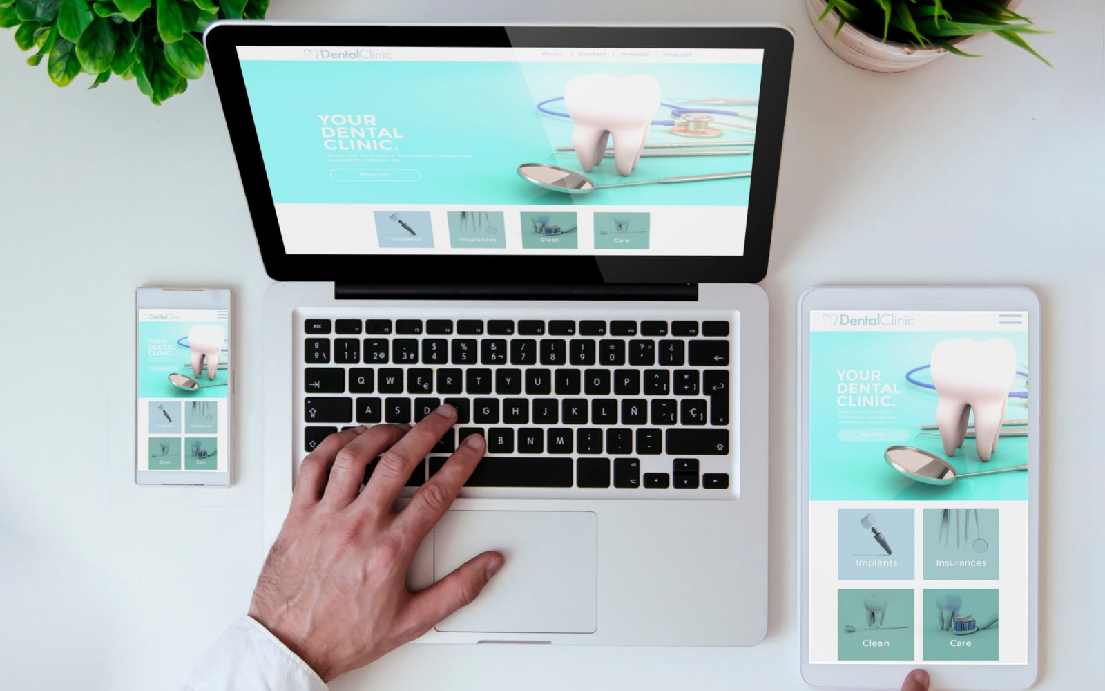
Website Content
The content itself is your website’s backbone and your web copy is what will influence the user experience. The names of services and how you mention them can greatly affect your website. It takes good writing and smart marketing to make it successful.
SEO uses data from Google Analytics or other web tools. This helps find keywords that your audience uses to find your services.
You can use text to provide the core of your message and as signs for your users’ web navigation. If you have a good web copy, then it will make all of your images, audio, and other visual elements stand out.
Sidebars, Footers, and Plugins
In some designs, sidebars hold extra content. Advertisers often use them for ads, calls to action, and search boxes. This helps improve web navigation.
In recent years, many websites have removed the sidebar. It takes up space and can block content. However, it really depends on personal preference.
Footers, however, are a constant. They’re like headers as they contain all the information the user needs to know that they didn’t find while scrolling. Most often, they’ll contain contact information, terms of service, social media icons, and privacy policies.
They can also be a great way to add calls to action, email subscription forms, and sitemap plugins for more visuals. This section is the conclusion to your home page and is a must-have in the healthcare web industry.
Find Your Corner of the Healthcare Web With Optimized360
Web navigation can go in many directions, but if you’re feeling directionless with your website, work with Optimized360. We work with many medical practices in the U.S. and Canada.
We provide different web design services. Our marketing experts focus on improving your site’s performance and rankings. Talk to our website design experts today if your design needs improvement. We can help you provide better care.
