Let’s take the pain out of your pain management web development project.
We have built nearly 3500 websites for physicians, including anesthesiologists and pain management practices. One very common element that all these healthcare websites share is the need to effectively communicate the value of that practice in a very short period.
Our experience shows that the typical pain management website visitors in recent years are very different from those of even two years ago. They spend very little time on your website, and in a very short period, they are likely to check out all pain management specialists in your area.
Therefore you should note that:
- They’ll give you just a few moments to glance at the “Home Page” images, hoping to find a subliminal connection between you and your brand.
- Maybe they will check you out on your “About Us” or “Meet the Team” pages. If they do, you’re doing well.
- And if they make contact via a form or email, don’t take them for granted; they’re probably doing the same with your competitors down the street.

Potential patients want to see what they expect, not necessarily how you plan to present the content to them. What they care about is establishing a level of trust with you. At best, we have about 20 seconds to present your medical practice to a prospective new patient; the following are a few things we can do to take the pain out of visiting your website.
Let’s make sure your website ‘converts’
We’re not building online brochures (websites used to be re-purposed collateral pieces like brochures posted online) but active, engaging, patient-capturing sales tools. Sure, your website needs to have deep, rich content, but it also needs to ‘convert’ those looking at it to connect with you, pick up the phone, fill out the form, and schedule the appointment. With every image and paragraph shown, we should expect the visitor to take immediate action.
Let’s not waste any time loading a webpage.
The time it takes for your web pages to load is a critical element in keeping visitors on your website long enough to engage them. Since we only have 15-20 seconds of their attention, we cannot waste any precious time waiting for pages to load.
Google expects that your website will load in three seconds or less. Your search engine rankings will suffer if it gets hung up loading images or connecting to plugins and other third-party applications. As a result, Google won’t send interested traffic your way. Contact your website development or web hosting company; they can run tests and determine your desktop and mobile page load times.
If you’re interested in running a few tests yourself, try this handy online utility to check the page load speed of your website.

Make it mobile-friendly and ‘mobile-first’
The importance of having a website that looks and performs fabulously across all mobile platforms cannot be overstated. We have posted countless articles pleading with independent medical professionals to update their websites to support mobile.
Consider who your next new patient is and how they will find you. The likelihood is that they will use a mobile device (phone or tablet) to search originally, then research, and then connect with you.
Google just revamped their indexing method across the entire internet and is making ‘mobile-first’ the priority in who gets ranked highest.
Your patients expect that you’ve taken the time to layout your mobile website with their browsing habits in mind. They expect to easily find staff bios, patient reviews, office hours, and a single push-to-call option. You owe it to them – let’s give them what they want. Check how O360 designs websites for pain specialists.
Don’t be afraid to use video.
Using video on your chiropractic website can work to build valuable trust between your web visitors and your office. Videos make effective marketing tools that bridge the gap between conversions and sales. It provides visitors with interesting and useful information that makes them want to return to your website and practice. By using videos on your website, you certainly increase the time the users spend reviewing your information. These attributes tell search engines like Google that your site has good content. This can lead to better rankings on search results. Examples of patient education videos for medical practices.
Include testimonials
Videos can range from highly-produced office walk-throughs to patient testimonials to Q&A with the Doctor. Think about how you can pre-educate and prepare your patients with information you or your staff repeat daily regarding symptoms, procedures, treatments, and physical therapy. Well-crafted videos on your website can free up much time while establishing trust and appreciation with the patient. Look below; we use videos on our website too!
Need more inspiration? Check out these modern pain management websites; you’ll find most of the above tips. These work and Optimized360 is ready to help take the pain out of your website.
Recap
Here’s a list of best practices specifically tailored for a website design project for a pain specialist:
- Clear and Intuitive Navigation: Ensure that the website’s navigation is user-friendly and straightforward, allowing visitors to find relevant information easily.
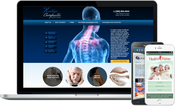
- Mobile Responsiveness: Optimize the website for mobile devices, as many users search for medical services on their smartphones and tablets. Mobile website designers.
- Accessible Design: Design the website with accessibility in mind, ensuring that all users, including those with disabilities, can access and navigate the content. Accessibility plugins available via O360.
- Patient-Centric Approach: Focus on addressing the needs and concerns of pain patients, providing valuable information, and offering solutions to their problems.
- Trustworthiness and Credibility: Build trust with potential patients by displaying professional certifications, accreditations, and testimonials from satisfied patients.
- Empathetic Content: Create content that showcases empathy and understanding for those dealing with pain, offering reassurance and hope. Custom Content Creation by O360.
- Highlight Areas of Expertise: Clearly showcase the pain specialist’s areas of expertise and specialized treatments to attract the right patient demographic.
- Call-to-Action (CTA) Buttons: Include prominent and strategically placed CTAs to encourage potential patients to schedule appointments or contact the specialist.
- Fast Loading Speed: Optimize the website for quick loading times to improve user experience and reduce bounce rates.
- Educational Resources: Provide informative articles, videos, or downloadable resources that educate visitors about pain conditions and available treatment options.
- Privacy and Security Measures: Ensure that patient data and communication on the website are secure, following relevant data protection regulations.
- Visual Appeal: Use visually appealing design elements, images, and colors that align with the pain specialist’s branding and create a soothing atmosphere.
- Consistent Branding: Maintain consistent branding across the website to reinforce the pain specialist’s identity and credibility.
- Contact Information Visibility: Display contact information prominently on every page to make it easy for patients to reach out.
- Integration of Online Forms: Include patient intake forms or appointment request forms for convenient and seamless communication.
- Social Proof: Showcase patient success stories, testimonials, or case studies to build trust and credibility. O360 Social Marketing Plans.
- Easy-to-Understand Language: Use clear and jargon-free language to ensure that all users easily understand medical information.
- Localized SEO: Implement local SEO strategies to optimize the website for local searches, attracting patients in the surrounding area. SEO package by O360.
- Regular Updates and Maintenance: Plan for regular website updates and maintenance to keep the content current and relevant. O360 website maintenance package.
- HIPAA Compliance: If the website collects patient information, ensure compliance with HIPAA regulations for patient data protection. HIPAA-Compliant Email Service.
By incorporating these best practices into the website design project, a pain specialist can create an informative, user-friendly, and trustworthy online presence that effectively connects with potential patients needing pain relief services.


