The Best Color Schemes For Medical & Dental Websites
According to modern color theory, color affects human behavior regardless of cultural background. Colors can instantly influence our decision-making and perceptions of a person, brand, or establishment in moments. That is why choosing the right color for your medical or dental website is important. You only have a few seconds to make an impression on potential patients.
Why is color theory important for Healthcare Professionals?
Color has influenced human emotion throughout history. Graphic designers learn to use specific colors to set the mood and create an atmosphere. Your color preferences back your logo and reflect who you are as a provider and practice.
While a substantial budget helps, they don’t always lead to great marketing campaigns. Smart choices made early can help build your brand.
Cool Colors
You can find inspiration in the natural blues of nature, such as water. Blue is the primary color of the cool group—shades of green and purple spring from additions of yellows or reds.
Blue – The Number One Color
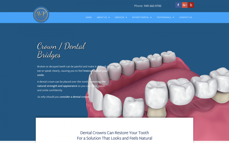
Example of a Blue Dental Website
For years, different shades of blue have been immensely popular among dental websites. Blue is the color of trust and intelligence.
Many professionals associate themselves with this color for obvious reasons. Blue calms patients, assuring them that they are in capable hands. According to Professor Jill Morton’s research in color psychology, “blue is the #1 favorite color of all people”.
People often feel nervous when choosing a dentist. They want to know that the dental office is professional, clean, and honest.
View examples of blue websites by O360.


In 5 Words: calm, responsible, refreshing, friendly, sad
Color psychology indicates blue light evokes emotions that provide a peaceful, easy feeling. Lighter shades of blue can be as refreshing as a spring breeze, while darker shades are strong and dependable. Bright Blues brings life to website design for optometrists and chiropractors. The hue of the blue can change how visitors view chiropractic websites.
Green – For the Environmentally Aware Dentists
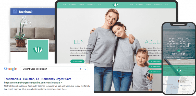
Example of a Green Dental Website
In 5 Words: outdoorsy, organic, energizing, refreshing, envious
Blue and green are calming, but green brings a subtle energy from its yellow. Using green helps balance many design elements often used in website design for healthcare professionals. Bright shades are vibrant and refreshing.
Dark shades often represent affluence and stability in color psychology, while muted olives invoke thoughts of nature. The color green appears throughout nature in all different shades. Green represents the color of environmental conscience and eco-friendly dentists. Green is great for medical or dental practices trying to convey their political views on “Going Green.”
This easily communicates to patients that they are consciously aware of the environment and our planet. Green websites will attract new dental patients who want a more natural and organic dental experience. See our Green Website Gallery.
Purple – Royal and Creative
In 5 Words: royal, creative, imaginative, spiritual, luxurious
Color psychology indicates that, as a mix of red and blue, purple takes on certain attributes depending on the balance of colors. People often describe darker shades as regal and associate them with wealth and luxury.
Use lighter shades of purple in your website design for optometrists. These shades will show the spring-like and romantic side of this color.
View our Purple website and Pink Website Galleries.
Warm Colors

When you think of fall, images of warm colors likely dance through your head. When we envision autumn leaves and radiant sunrises and sunsets. We may also picture vivid shades of red, orange, and yellow. These colors are a significant part of that picture.
Both positive and negative connotations related to particular warm colors often amplify emotions. One shade can be energizing, while another is elegant and powerful. Warm colors can be passionate, uplifting, and happily energetic. See our orange website design examples.
Red – Use it Sparingly or Not at All
Example of a Red Dental Website
In 5 Words: evocative, exciting, romantic, dangerous, urgent
An essential part of website design is not to overwhelm visitors. Red’s color psychology associations bounce back and forth between fire and passion for love and anger. Red transforms from bright and energetic to dark and powerful. Red is an incredibly versatile accent color in web design.
The vibrancy of red makes it a great accent color that can make your website stand out. However, using red as the main color for a medical or dental website could be harmful. The color red can easily scare away patients who are reluctant to grab a seat in the medical or dental chair.
Red conveys messages of danger, pain, and anger throughout society. Color psychologists say that being around too much red can make us feel irritated and agitated. These are the last feelings a dentist should evoke from existing and potential new patients.
Red can symbolize power and strength. However, it can also bring up negative emotions, so it may be best to avoid it. O360 Red Website Gallery.
Orange
In 5 Words: earthy, youthful, expressive, child-like innocence, enthusiasm
Orange represents a season of change. Color psychology reveals that muted shades are earthy and inviting. Oranges tend to invoke feelings of health and vitality, so it is no wonder orange commands attention. It appears less glaring than red, and people consider it more friendly.
Yellow
In 5 Words: happy, positive, encouraging, permanent, antiqued
Yellow runs the gamut in emotions evoked. Bright, happy shades create the feel of energizing sunshine. As part of a medical website design, use yellow to fit best with your office personality.
• Established practices may use darker and golden yellows to hone in on a sense of permanence and reliability.
• Bright yellows are perfect for practices that are cheerful and upbeat.
• Soft yellows work to invoke calm happiness.
Neutral Power

Black – Dark and Sleek
In 5 Words: direct, professional, strong, powerful, edgy
Black is a neutral whose use can shape many medical marketing ideas. Depending on how designers apply, a black campaign can come off as edgy or elegant. Traditional and modern designs incorporate black to carry the direction of the design and make the text legible.
Pure grays are lighter shades of black. When used in website design for healthcare professionals, gray can appear conservative and modern. View O360’s Black Website Designs.
White – Peaceful and Honest
Example of a White Dental Website
In 5 Words: clean, pure, fresh, spacious, simple
White space can be a strategic part of minimalist medical marketing ideas. Color psychology reveals that white’s neutral appearance gives it power over other colors. Website design for optometrists embraces the idea that “less is more.” It uses white as a key design element.
White websites are often wide, open, and exceptionally clean. Typically, they have straight lines and elude a sense of light and purity. Dentists who use white websites want to show that they have a clean office and are open about their business practices.
These dental professionals use real skills instead of tricks to attract patients. They keep their practices open and honest, which draws in many new patients who value modernity and transparency. See website examples with overall white themes.
Brown – Warm and Inviting
Example of a Brown Dental Website
In 5 Words: earthy, safe, traditional, reliable, warm
Brown is a background color full of warmth and texture. Shades of brown appear in natural stone and wood design elements.
Dentists who select website themes associated with brown, beige, tan, and taupe often reflect an image of a small-town, homely feel. This website style is great for a private practice in small towns looking to attract more traditional patients.
This popular color scheme is naturally inviting without being pretentious. It provides a comforting feeling that a new patient can wander around and get familiar with the practice. Check out our brown website examples.
Beige and Ivory
Common backdrops like beige and ivory are often the background benefiting from brighter accent colors. Surrounding colors influence neutrals, and designers can use them to showcase a sophisticated medical website design.
Ivory is a tad warmer than white yet incorporates some of the pureness of white. Beige also takes on characteristics of the other design colors as a background neutral with texture. Check our Beige Website Examples.
How to choose relevant colors for your practice?
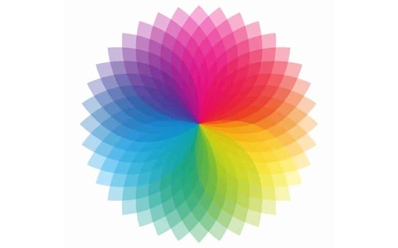
Gather a group of employees if you find it difficult to understand the practice’s overall vibe. Together, brainstorm words and phrases that show the key aspects of the practice and the team. Using color psychology, color choices can confuse website visitors and patients if they do not match the people and places they see in person.
The color blue is popular for medical website design. Including blue in waiting rooms, content pages, or other areas where patients interact can be beneficial.
Designers utilize blue when seeking to modernize a space with sleek white paint and accents. While the simplicity of a monochromatic design can be powerful, use it in moderation. Patients and visitors might lose interest without some color to catch their eye.
How do the colors come into play?
Designers can use colors to create a well-balanced logo that embodies the brand’s message. Healthcare professionals should meet with website designers.
They need to plan the overall design and choose color elements using color psychology. Color wheels are an essential tool for designers to find eye-pleasing color combinations. Chiropractic website designs that use colors that complement rather than clash will retain visitors longer.
Color advice by experts for doctors.
Keep in mind
- The colors in the medical website design should match the practice’s style. Use warm colors for pediatric practices, and choose darker, more professional colors for adult practices.
- Using too many colors can make a website look unprofessional and distract from important information. Therefore, limiting the color palette to a few key colors is important.
- The chosen colors should be easy to read, and there should be a good contrast between the text and background. This way, readers can easily access important information.
- Choosing web-smart or web-friendly colors that will display consistently across different devices and operating systems is important.
- When choosing the color scheme, you should also consider the images and videos on the website. You should contrast them appropriately with the other colors on the page to ensure they look good.
Use of colors in medical websites
- The color scheme used for medical websites should evoke a sense of calm and trust.
- Successful medical environments associate cool green and blue tones.
- Too much of the color red can evoke a sudden feeling of danger or panic, while yellow can still feel disruptive to website viewers.
- Avoid using black for medical sites except for the site text and navigation. White is a good choice for a background or emphasis color.
- Thoughtful color selections are essential for the site’s color scheme. Use a color wheel to find similar, opposite, and three-color matches.
- Open space is a design element that keeps you from overusing your selected colors.
- Navigation elements should guide the viewer’s eyes across the web page. They should highlight the most important sections.
- The feedback from the site analytics will help you determine how well your color scheme and layout are working.
Use of dark colors in healthcare web design
- Dark-colored website designs aren’t suitable for all websites, especially dental and medical websites.
- In Western culture, people often link black to evil and death. This association can make it unappealing to potential clients.
- Websites for doctors and dentists should focus on being easy to read and user-friendly. You can achieve this by using clear, large text on a light background with high contrast.
- Personal information, slideshows, and videos can attract potential clients to a dental website.
- Designers should use a font size of at least 16px and ensure it contrasts well with the background. Line height is also important.
How Your Website’s Color Scheme Affects Your Marketing Efforts

- Updated on 09/02/2022
- Written on 07/05/2017
Color psychology is the study of how color affects human emotion. It is a powerful tool for designing an impactful website, as the colors you select can influence the mood of your visitors.
Marketers often use blue to promote relaxation, while red can drive people to action. In fact, many restaurants use red in their logos because it stimulates hunger.
Using color psychology, the colors you pick for your website, dental practice, and marketing materials can influence how people view your brand. The right colors can create a positive impression and help attract more clients.
When marketing for dental practices, remember that the colors you choose for your brand will stay with you for years. Studying color psychology is important. This will help you make smart choices about using color in your medical marketing.
What is color psychology?
Color psychology is the science of how color affects the brain. Studies show that customers take about 90 seconds to form an opinion about a product. Up to 90% of this opinion comes from the product’s color or branding. How you use color can play a significant role in the success of your medical practice.
Color psychology, however, is a complex topic that requires skill to apply correctly. Your demographics complicate it. Men respond to color differently than women and younger people interpret colors in a different way than older people.
Study your audience’s demographics to understand them. Based on this information, create detailed personas. This will help you choose the right color scheme for your marketing.
Colors and Branding
The human mind is incredibly complex, so we cannot put it into simple categories. However, we can make general conclusions about some colors. Understanding these generalities will help you choose the right colors to brand your practice. When you begin developing dental marketing strategies, it’s important to consider what you want your brand to say.
Are you pursuing a website design that portrays a fun and youthful design? Perhaps your goal is something more polished and traditional.
In dental marketing, we often see more of the latter than the former. Your patients want to know that their dental care professional is skilled. They need to feel confident that the person working on their mouth knows what they are doing. Several dimensions of your brand’s personality deserve your consideration.
Sincerity
Color psychology indicates blues categorize sincerity and communicate a wholesome, down-to-earth, and cheerful tone. When customers think of sincerity, think of a small town where everybody knows everybody and everybody calls you friends.
Excitement
This dimension is best described as red and various red tones. Think of a daring, trendy young person who is imaginative and independent. Red might be a good color for dental marketing ideas targeted at a more youthful audience.
Competence
In color psychology, the color green suggests that a brand is reliable, intelligent, and successful. Think of a corporate leader whom co-workers admire.
Sophistication
The color purple represents sophistication. This works well for practices focusing on high-end services, like cosmetic surgery or cosmetic dentistry. It tends to be more feminine and charms the audience.
Ruggedness
Color psychology reveals that people associate yellow with ruggedness, which feels tough and outdoorsy. Dental marketers do not often use this color. It does not fit any specific dental niche and might turn away more people than it attracts.
Choosing Shapes
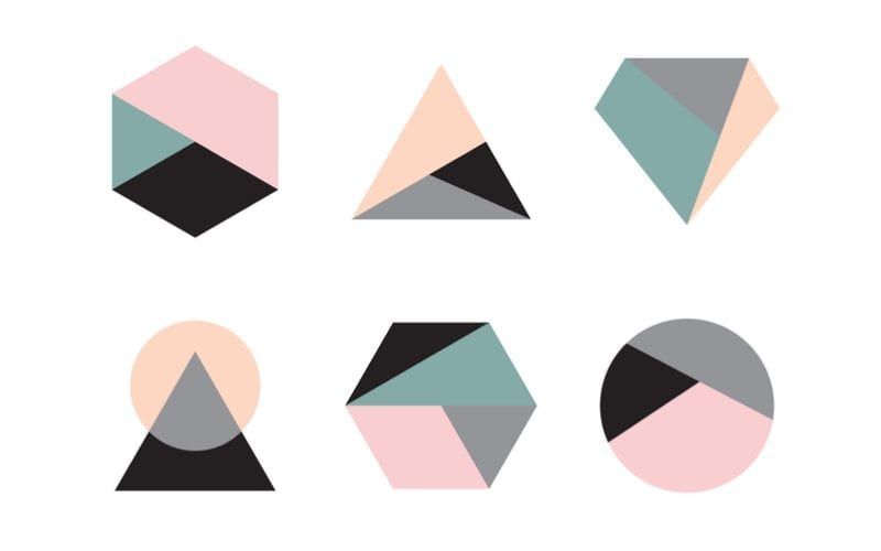
The various shapes used on your website will play a large role in communicating the essence of your brand. You can manipulate basic shapes like circles, triangles, and ovals to reflect your message. You can alter them to appear stable, soft, threatening, or hard.
Once you choose a shape for your logo, adding the right color helps complete it. This color also reinforces the message you want to share about your brand.
Choosing a Color for Your Dental Website
Choosing the right color for your dental website will depend heavily on the color you choose for your brand. An effective and beautiful design won’t combine a beautiful blue logo with a red-themed website.
The most important thing to remember is that your website should be part of your larger brand messaging plan. It should complement your office interior design, printed materials, and outbound marketing materials. Your dental marketing campaign shouldn’t use color psychology to ensure the color theme runs through consistently.
The colors you choose for your marketing campaigns should look good on paper and in various digital formats. As high-definition displays become more common, choose a color combination that looks good on all devices. This will help to create consistency.
Choose Something Timeless
When choosing a color scheme for dental marketing, remember that your colors should last many years. Simplicity is important because it can transcend fads that quickly go out of style. Color psychology reveals that certain associations are nearly hardwired into our minds.
We’ve all seen logos that feature color schemes that scream the decade in which designers created them. Burnt orange and florals are a harsh reminder of the 1970s, while the 1990s used a lot of blue and sharp lettering.
Using a clean and simple color scheme can help you create a strong brand and avoid the high cost of redesigning your logo.
In the long run, classic colors and logos help reduce waste. They do this by cutting the need to throw away old stationery or often replace business cards. This approach helps your business and creates stability for patients.
Whether your practice is new or well-established, consider what your colors say about you. What image do you want to communicate to your audience?
Whatever you choose, work with a skilled team. They can help you decide based on data, not just feelings.
Conclusion
Now that we’ve explored color psychology and the impact of colors on medical and dental websites, you can choose your website design better. Choosing a color for your dental website is important. It should reflect your dental office and match your brand image.
In summary, blue is a common color for medical and dental websites. It conveys a sense of integrity and professionalism. White is peaceful, brown is warm and inviting, and green is eco-friendly. If you insist on using the color red for any reason, remember to use it sparingly.
Knowing how colors influence feelings can help you pick the best colors and designs for a medical or dental website.
Check the dental website designers at O360.


