With 2024 behind us and 2025 underway, our team has explored some of the best orthopedic websites coming into the new year. These websites represent innovative designs focused on customer experience and ease of navigation. Our team uses these reviews to remain leaders in the medical website design industry. Come with us as we find our top 7 best orthopedic websites of 2025!
Our Picks For The 7 Best Orthopedic Websites of 2025
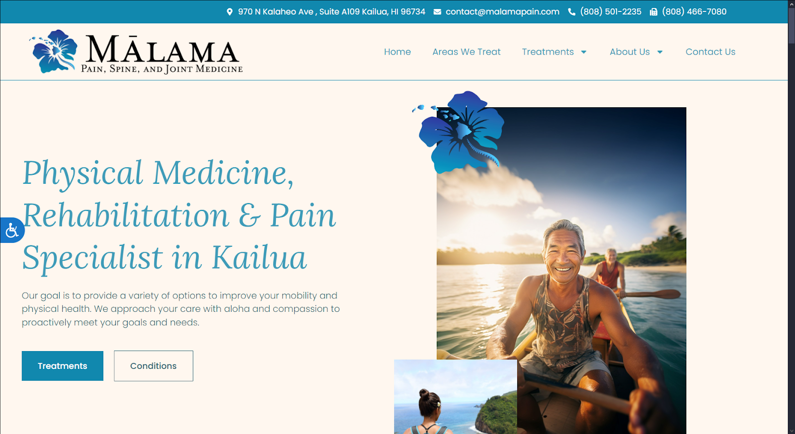
Mālama Pain, Spine and Joint Medicine
How We Graded Mālama Pain, Spine and Joint Medicine
- (4.75) Navigation: Navigation throughout the site is seamless and intuitive, driven by a roving top bar menu. The site integrates mobile responsive design while retaining critical navigation tools for visitors. It could benefit from adding access to a patient portal and an appointment setting button on the landing page.
- (5.0) User Experience: Mālama Pain is geared towards ease of use and a positive customer experience. Accessibility options, click-to-call, and click-to-drive are available in desktop and mobile designs. Any information visitors may want is immediately available, regardless of where they are on the site.
- (5.0) Visuals and Color Theory: The colors and imagery used for Mālama Pain are focused on their community. This cultural connection is important to connecting with visitors while inspiring hope and confidence in the practice. The warmth of the color palette combines with cool blues to inspire and soothe in equal measure.
- Dark cyan: cool tone, 53% brightness, high saturation, medium hue
- Very bright pastel cream: warm tone, 95% brightness, medium saturation, low hue
Overall Score: 4.91
Why We Think It Stands Among The Best Orthopedic Websites of 2025
Mālama Pain is a rare example of near-perfect execution in medical website design for orthopedics. It does almost everything right from the layout and color choices to the smooth integration of navigation features. The result is one of the best orthopedic websites we came across and is an excellent source of inspiration for developers.
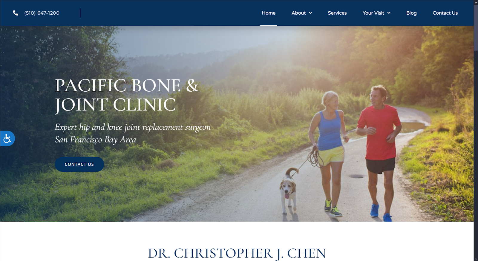
Pacific Bone & Joint Clinic
How We Graded Pacific Bone & Joint Clinic
- (4.5) Navigation: Pacific Bone & Joint Clinic follows the fundamental guidelines of desktop and mobile-friendly navigation. The roving top bar stays with the user throughout the site, and the information layout is easily discerned from the menu choices. The roving top bar does lack links to their social media platforms, which is a slight strike against it.
- (4.5) User Experience: The overall user experience on the site is positive, supported by an intuitive layout and easy access to critical components. Accessibility options are prominently available without being obtrusive. Click-to-call and click-to-navigation are both available, but navigation is less convenient, being located at the bottom of the landing page.
- (4.25) Visuals and Color Theory: The design of Pacific Bone & Joint Clinic is clean and uncluttered, with imagery that appeals to its target audience. The color palette selected is invariably cool tones, focusing on blues and whites.
- Yale Blue: cool tone, 20% brightness, medium-high saturation, medium hue
- Pewter Blue: cool tone, 64% brightness, medium-low saturation, medium hue
- Snow White: cool tone, 98% brightness, very low saturation, very high hue
Overall Score: (4.41)
Why We Think It Stands Among The Best Orthopedic Websites of 2025
Website design for orthopedics has to run the line between professionalism and approachability. We feel Pacific Bone & Joint Clinic achieves this goal effectively, balancing navigation and functionality expertly. The one area we find it lacking is in its palette selection; their color palette is a bit flat and washed out. This makes action areas less distinctive than they could be. Regardless, it’s an excellent representation of the best orthopedic website design for orthopedics.
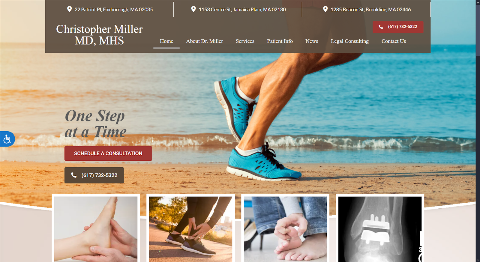
Christopher Miller MD
How We Graded Christopher Miller MD
- (4.75) Navigation: The desktop navigation is flawless, with all areas accessible through the roving topbar. All critical areas of the site are immediately available from the landing page. The mobile site reflects this approach, using a standard hamburger menu for navigation. While it retains the click-to-call in the menu, the click-to-navigation is relegated to the bottom of the mobile page.
- (4.75) User Experience: The site is comfortably laid out and easy to read, with high-demand information easily within reach. The landing page includes phone numbers, clear access to their services, and a schedule a consultation button. Everything needed to quickly and conveniently find all the information their visitors may need.
- (4.75) Visuals and Color Theory: Christopher Miller’s color and imagery choices make it a great example of website design for orthopedics. The colors are warm and inviting, and clear images mark access to services and other important information.
- Auburn Red: warm tone, 39% brightness, medium saturation, very low hue
- Umber Brown: warm tone, 32% brightness, medium-low saturation, very low hue
- Isabelline White: warm tone, 92% brightness, low saturation, very low hue
- Champagne Pink: warm tone, 87% brightness, low saturation, very low hue
- Sky Blue: cool tone,. 86% brightness, very high saturation, medium hue
- Overall Score: (4.75)
Why We Think It Stands Among The Best Orthopedic Websites of 2025
The landing page welcomes visitors with warm imagery and easy access to everything they might need quickly. Phone numbers, links to set an appointment, and even click-to-navigate for those accessing from non-mobile devices. The information is presented and organized in a way that truly drives the user experience. These elements earn it its place on our list of the best orthopedic website of 2025.
Integrity Interventional Pain Management

How We Graded Integrity Interventional Pain Management
- (4.5) Navigation: Integrity uses a collapsing roving top menu that remains accessible throughout the site. This effectively provides a large panel of important information for the visitor without interfering with general web browsing. The accessibility of the menu and other high-demand points are a plus.
- (4.25) User Experience: This website is painless and respects the visitor’s time. Critical information, such as phone numbers and access to online services like a patient portal, are prominently placed. Accessibility is immediately available. The main page integrates click-to-call and click-to-email functionality on the home page, but click-to-navigate is relegated to the bottom of the page.
- (4.5) Visuals and Color Theory: The color palette reflects a cool but friendly professionalism while sticking to a primarily gray-blue palette. Staff images are a plus, introducing the visitor to the practice staff. This is a great way to build rapport before the patient ever arrives at your clinic.
- Dark pastel blue: cool tone, 25% brightness, low saturation, medium-high hue
- Grayish blue: cool, 48% brightness, low saturation, medium-high hue
- Burnt pastel orange: warm tone, 56% brightness, medium saturation, low hue
- Overall Score: (4.41)
Why We Think It Stands Among The Best Orthopedic Websites of 2025
Integrity checks all the basic boxes used in website design for orthopedics. They provide an easy-to-navigate site with good information, all in an aesthetically pleasing design. While it certainly has room for improvement, the site was well-designed and laid out.
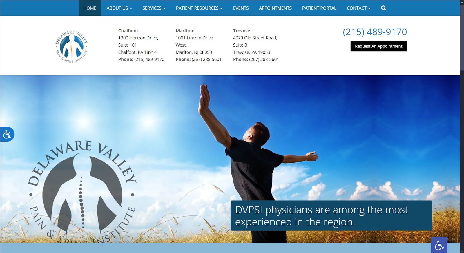
Delaware Valley Pain & Spine Institute
How We Graded Delaware Valley Pain & Spine Institute
- (4.0) Navigation: Choosing your first stop in the website is easy with the fixed top bar menu. It contains a significant amount of information. However, it’s fixed position means scrolling away from that first landing page leaves you without quick access to other areas of the site. This issue persists in the mobile website.
- (4.25) User Experience: Delaware Valley Pain & Spine Institute provides a comfortable experience for their website visitors. The information is well presented and easy to read, the website design isn’t overly cluttered, and access is provided to scheduling, click-to-phone, and other features.
- (4.5) Visuals and Color Theory: The overall visual theme is bright and open, built on a cool blues and grays palette. The logo is a work of art, and the color choice makes it easily contrast with the otherwise bright tones of the site.
- French Blue: cool tone, 47% brightness, medium-high saturation, medium hue
- Indigo Dye Blue: cool tone, 29% brightness, medium-high saturation, medium hue
- Dark Sky Blue: cool tone, 72% brightness, medium saturation, medium hue
- Denim Blue: cool tone, 38% brightness, medium saturation, medium-high hue
- Silver Gray: cool tone, 79% brightness, low saturation, medium hue
Overall Score: (4.25)
Why We Think It Stands Among The Best Orthopedic Websites of 2025
Delaware Valley is a beautifully designed site that provides visitors with a positive experience. It’s great work, from the welcoming visual elements to the easy-to-understand service information. While it could use a transition to a roving top bar menu and retaining the click-to-directions in the menu bar, it’s a solid representation of website design for orthopedics.
Dr. Harpreet Bawa
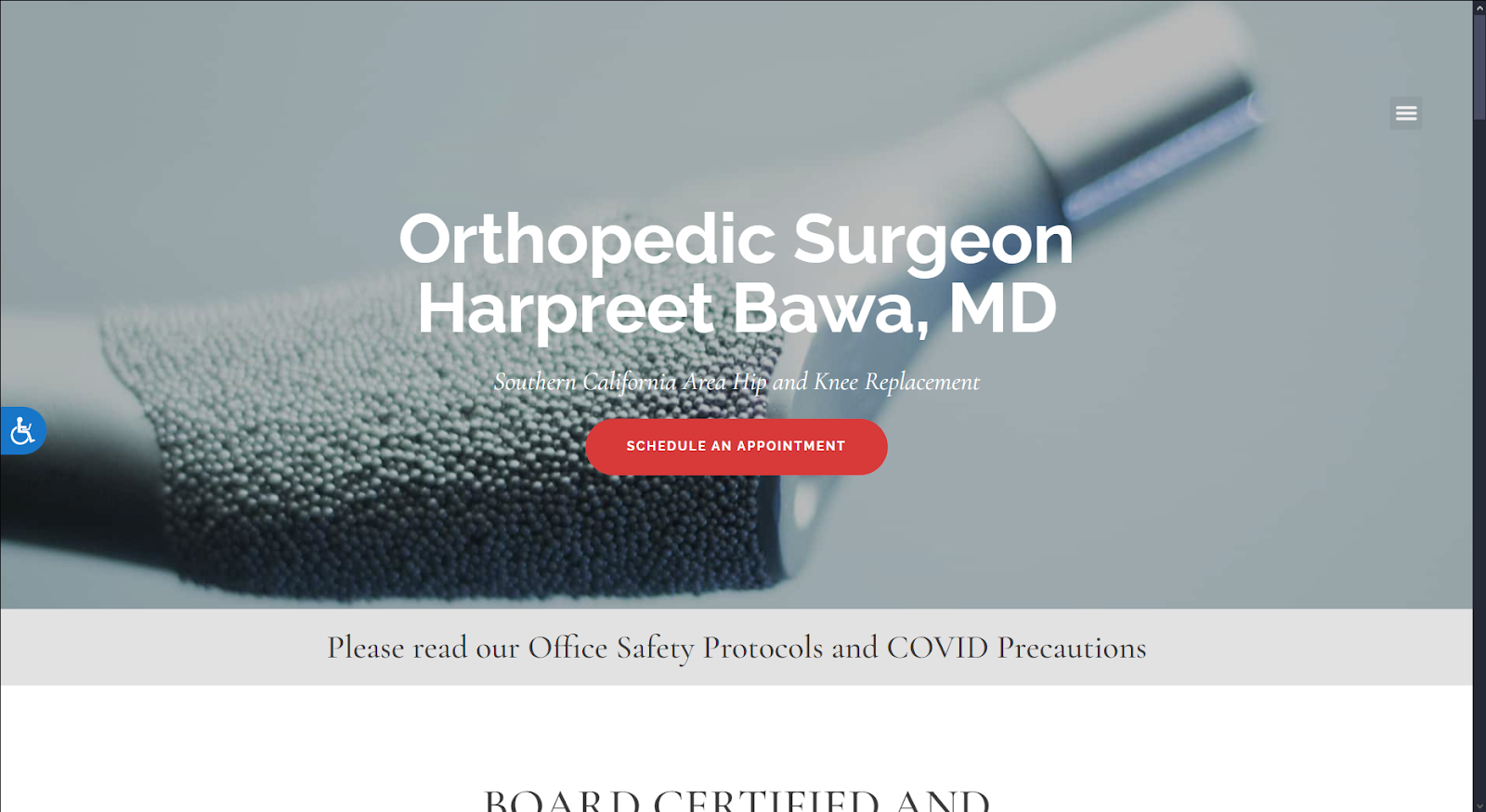
How We Graded Dr. Harpreet Bawa
- (4.0) Navigation: This site balances navigation with visual minimalism regarding its menu bar. The menu is a static top bar collapsed into a hamburger menu. Except for the menu remaining static on the mobile site, it has a very mobile-friendly design.
- (4.25) User Experience: The site’s visual elements are excellent, provided you’re viewing the site on mobile. Regardless of platform, information is reasonably easy to access. Collapsing the top bar with a hamburger menu, even on the desktop site, is an interesting choice.
- (4.25) Visuals and Color Theory: Visitors to the site are immediately introduced to the physician, his philosophies, and the reviews of satisfied customers. This is achieved through an integrated slide show. The color choices are generally warm and welcoming, built upon a cool grey foundation, making the site feel very welcoming.
- Cadet Grey: cool tone, 65% brightness, very low saturation, medium hue
- Rose Madder Red: warm tone, 49% brightness, medium-high saturation, no hue
- Bronze Yellow: warm tone, 60% brightness, medium saturation, low hue
Overall Score: (4.16)
Why We Think It Stands Among The Best Orthopedic Websites of 2025
Sometimes, it’s good to go back to basics; this site does that quite well. The heavy focus on mobile viewers is understandable, given the modern patient. If you’re looking for a mobile-centric design with less concern for desktop viewers, this is a good site to review.
Dearborn & Associates Institute for Joint Restoration
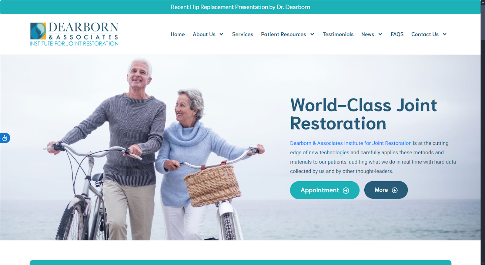
How We Graded Dearborn & Associates Institute for Joint Restoration
- (4.25) Navigation: Dearborn follows a standard design for their navigation, opting for a static top-bar menu. This menu is well-laid out, with information being presented intuitively in drop-down menus.
- (4.5) User Experience: Visitor experience is a cornerstone of this website design for orthopedics. Visitors can schedule an appointment quickly, find contact information for the clinic, and more.
- (4.25) Visuals and Color Theory: Dearborn uses a cool and soothing palette, leaning on blues, yellows, and greens. These selections give the site an air of authority while comforting visitors.
- Verdigris Blue: cool tone, 66% brightness, medium-high saturation, medium hue
- Dark Sapphire Blue: cool tone, 36% brightness, medium saturation, medium hue
- Bright Yellow: warm tone, 78% brightness, very high saturation, low hue
- Cerulean Blue: cool tone, 60% brightness, very high saturation, medium hue
- Green Sheen: cool tone, 65% brightness, medium-low saturation, medium-low hue
Overall Score: (4.33)
Why We Think It Stands Among The Best Orthopedic Websites of 2025
Dearborn is a strong contender for a leader in website design for orthopedics. The site’s layout is clean and visually appealing, with navigation being simple and intuitive. While it would benefit from a roving top bar menu and the inclusion of access to a patient portal, it’s a solid build.
The Final Verdict For The Best Website Design For Orthopedics
Here we are at the end of our list of some of the best orthopedic websites from 2025. There’s been some good contenders on this list, but there can only be one best of the best.
- Mālama Pain, Spine and Joint Medicine (4.75)
- Christopher Miller MD (4.75)
- Integrity Interventional Pain Management (4.41)
- Pacific Bone & Joint Clinic (4.41)
- Dearborn & Associates Institute for Joint Restoration: (4.33)
- Delaware Valley Pain & Spine Institute (4.25)
- Dr. Harpreet Bawa (4.16)
With their beautifully designed website, that title goes to Mālama Pain, Spine, and Joint Medicine. It deserves recognition for building rapport with its community to providing an outstanding visitor experience. It’s time to get a website that will rank among the best orthopedic websites of the year to come! Contact the team at Optimized 360 today to get outstanding results.