With 2024 behind us and an exciting new year ahead, our team decided to review the best healthcare websites. Finding these designs each year helps us improve our craft so we can continue delivering websites that connect with patients and drive the growth of your practice. After much consideration, we produced this list of seven of the best healthcare website examples of 2024.
Our Picks For The 7 Best Healthcare Websites of 2025
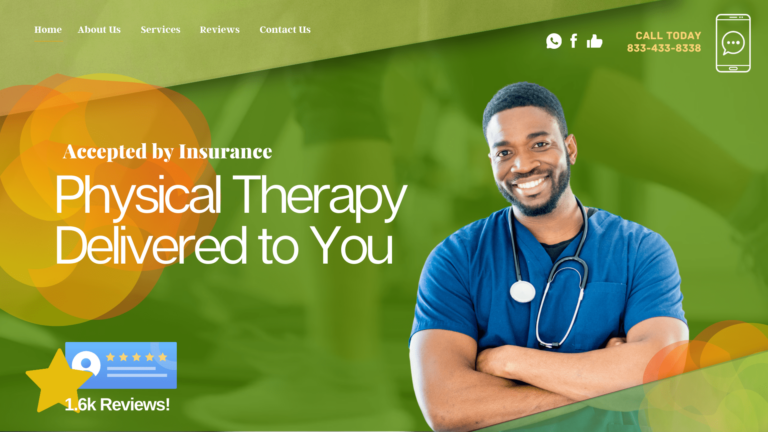
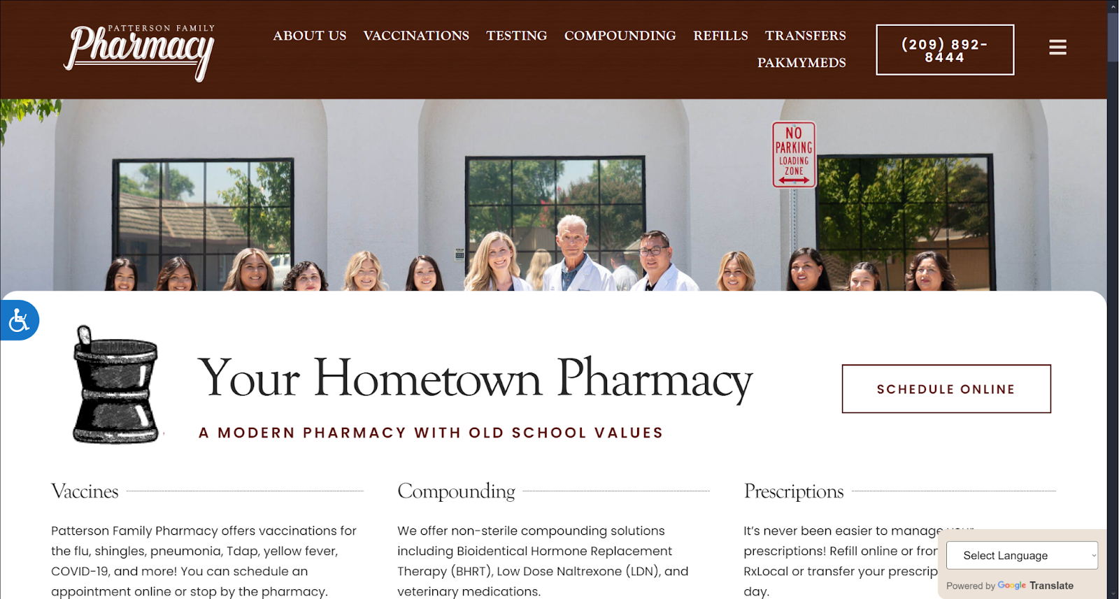
Patterson Family Pharmacy
How We Graded Patterson Family Pharmacy
- (4.25) Navigation: Patterson Family Practice fills out the basic checklist for convenient navigation. A prominent and clear roving top menu stays with visitors throughout the site and compresses to a hamburger menu on mobile devices. High-demand links are prominently available, and related buttons are large and visible.
- (4.5) User Experience: The site focuses on relevant content, using lightweight or optimized images to ensure speedy load times. The layout makes it easy to scan the page and quickly find what you’re looking for. While located at the bottom of the page, social media links and click-to-map functionality are available.
- (4.5) Visuals and Color Theory: The theme used by Patterson Family Pharmacy combines warm whites, browns, and reds with a soothing blue tone. Images highlight products, introduce the staff, and build rapport with site visitors.
- Seal Brown: warm tone, 17% brightness, medium-high saturation, low hue
- Linen White: warm tone, 90% brightness, medium-low saturation, low hue
- Rosewood Red: warm tone, 19% brightness, medium-high saturation, very low hue
- Navy Blue: cool tone, 50% brightness, very high saturation, medium hue
- Overall Score: (4.42)
Why We Think It Stands Among The Best Healthcare Websites of 2025
It’s rare to see a website design for healthcare effectively use brown as a primary color, but it’s happened here. Seal brown is the primary color throughout the site, beautifying the site and guiding visitors throughout. The site is frictionless to navigate and provides a great user experience. However, the click-to-drive link should be included in the roving top bar, not at the bottom of the page. Otherwise it deserves its place among the best healthcare websites of 2025.
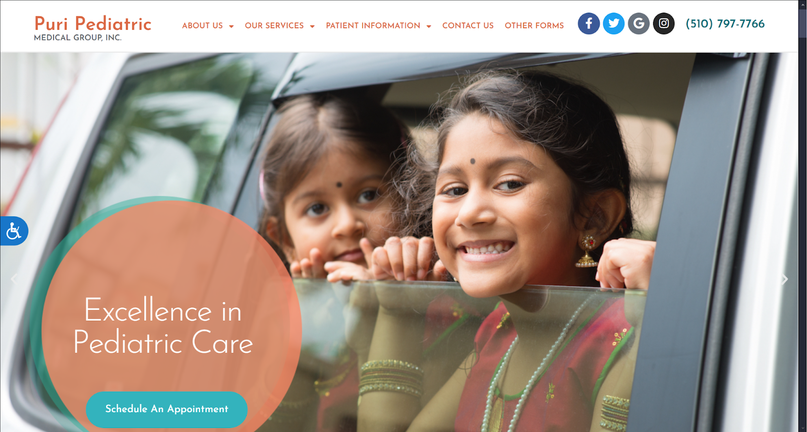
Puri Pediatric Medical Group Inc
How We Graded Puri Pediatric Medical Group Inc
- (4.5) Navigation: The roving top bar menu is the standard of design, and Puri Pediatric makes good use of it. It includes social media links, click-to-call functionality, and quick access to high-demand areas of the site. It transitions smoothly to mobile platforms using a hamburger-style menu at the top.
- (4.5) User Experience: Puri provides a quick-loading site through an image-light design and image optimization when these are used. Content is presented in consumable pieces that are easy to read and absorb.
- (4.75) Visuals and Color Theory: The color palette used is a cool mixture of blue and green, with salmon pink to highlight the site’s critical points. The images used in the site represent the diverse community it serves.
- Copper Red: warm tone, 57% brightness, medium-high saturation, very low hue
- Blue-Green: cool tone, 66% brightness, medium saturation, medium hue
- Cadet Blue: cool tone, 67% brightness, medium-low saturation, medium hue
- Salmon Pink: warm tone, 71% brightness, medium-high saturation, very low hue
- Ming Blue: cool tone, 41% brightness, medium-high saturation, medium hue
- Overall Score: (4.58)
Why We Think It Stands Among The Best Healthcare Websites of 2025
Puri Pediatric is counted among the best healthcare websites in 2025 due to its community-centered focus and excellent design. Combining locally significant colors, smooth navigation, and substantive content helps it stand out. Most notably, it’s a solid representation of how image light design can be attractive and effective.
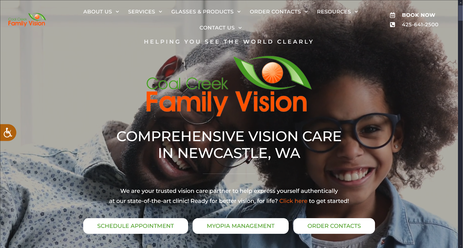
Coal Creek Family Vision
How We Graded Coal Creek Family Vision
- (4.75) Navigation: Coal Creek Family Vision makes easy navigation a primary feature of its landing page. Important links are immediately available, including appointment scheduling, ordering contacts, and a click-to-call link in the roving top bar. It all transitions smoothly to mobile devices without losing functionality or convenience.
- (4.5) User Experience: The landing page immediately helps to uplift visitors with a smiling pair of patients in an engaging video. Accessibility options are prominently available, and the overall layout ensures visitors can find the information they need quickly and easily.
- (4.75) Visuals and Color Theory: Orange and green combine to create a visually pleasing palette. The video makes careful use of color and motion to draw in the visitor without distracting them from the content.
- Persimmon Orange: warm tone, 58% brightness, high saturation, very low hue
- May Green: cool tone, 57% brightness, medium-high saturation, low hue
- Overall Score: (4.66)
Why We Think It Stands Among The Best Healthcare Websites of 2025
Coal Creek Family Vision perfectly uses a video background on its landing page. Using background videos is a delicate art form, and it’s rare to see it used so effectively. It provides visitors a clean, smooth experience through its layout and beautiful color scheme earning its place among the best healthcare websites of 2025.
Quantum Healthcare Services LLC
How We Graded Quantum Healthcare Services LLC
- (4.25) Navigation: The landing page of Quantum Healthcare Services focuses on immediate contact with the clinic. In a rare design choice, the top bar menu takes prominence, though it’s a static menu rather than roving with the visitor. Action points are well-highlighted with green and brown.
- (4.5) User Experience: This site loads quickly and provides immediate access to high-demand points. Click-to-call and click-to-drive functionality is quickly available, as is the option to request an appointment. The design focuses on busy patients who want to focus on contacting their providers.
- (4.0) Visuals and Color Theory: Every element of visual design is aimed at helping the visitor get things done. The background image is muted with a transparent overlay of green-gray, with the other colors highlighting key areas of the site. Overall, the site is visually neutral.
- Artichoke Gray: cool tone, 67% brightness, low saturation, low hue
- Chestnut Brown: warm tone, 53% brightness, low saturation, very low hue
- Russian Green: cool tone, 54% brightness, low saturation, low hue
- Spring Green: cool tone, 88% brightness, medium-low saturation, low hue
- Cafe Noir Brown: warm tone, 22% brightness, medium-low saturation, very low hue
- Nickel Gray: warm tone, 47% brightness, very low saturation, low hue
- Overall Score: (4.25)
Why We Think It Stands Among The Best Healthcare Websites of 2025
This is a beautifully low-key site that delivers a positive user experience and is easy to navigate. It’s an excellent representation of the use of neutral colors in design and belongs among the best healthcare websites of 2025.
Wisconsin Endodontic Group
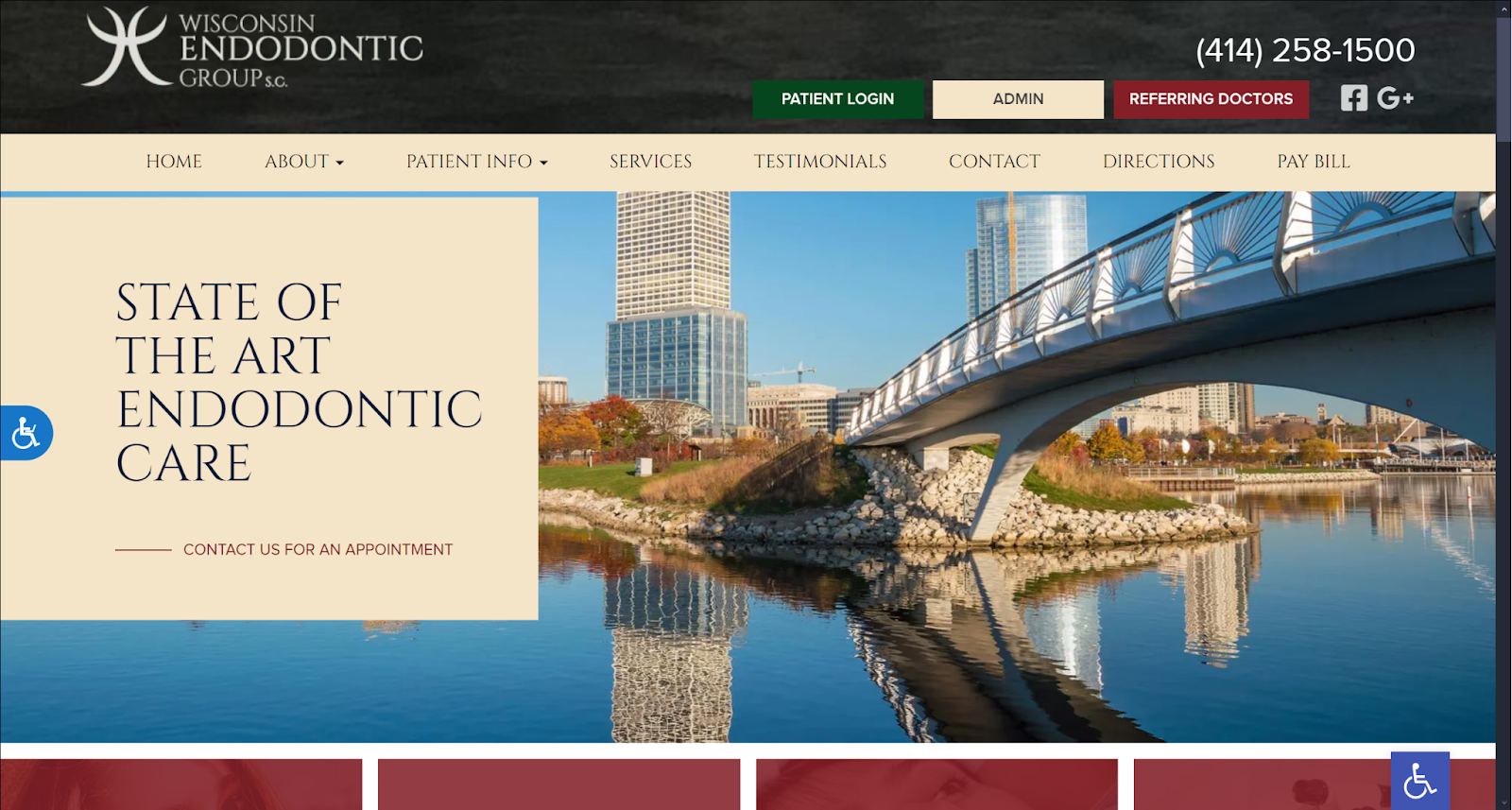
How We Graded Wisconsin Endodontic Group
- (5.0) Navigation: Wisconsin Endodontic has used its roving top bar to maximum effect, making navigating the site intuitive and simple. The navigation approach is simplified for the website admin, patient, and referring doctors. It translates seamlessly to mobile for a greater user experience.
- (5.0) User Experience: Everything about Wisconsin Endodontic’s site is aimed towards a positive user experience. Everything the visitor needs, whether a patient or a referring doctor, is immediately available. Click-to-call links are available in the top bar, with directions just a click away on the directions tab on the menu.
- (4.75) Visuals and Color Theory: Wisconsin Endodontics provides a beautiful and engaging experience with its design. Its connection to the community is prominent in the image used on the landing page. Images and colors combine throughout the site to make high-demand areas easy to locate.
- Antique Ruby Red: warm tone, 30% brightness, medium-high saturation, very high hue
- Forest Green: cool tone, 25% brightness, high saturation, medium hue
- Champagne Beige: warm tone, 92% brightness, medium-high saturation, low hue
- Khaki Yellow: warm tone, 93% brightness, very high saturation, low hue
- Overall Score: (4.92)
Why We Think It Stands Among The Best Healthcare Websites of 2025
Wisconsin Endodontic’s is a stunning design display for the best healthcare websites. It’s a combination of stunning color and imagery, easy navigation, and a smooth user experience that earns it a place on this list. Their consideration of all aspects of their business and the convenience of those who use their site is admirable.
1620 Primary Care
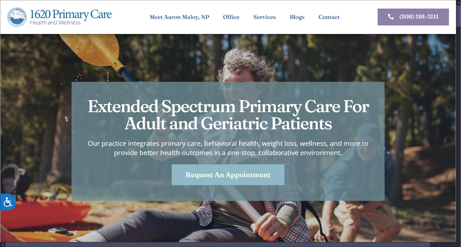
How We Graded 1620 Primary Care
- (4.0) Navigation: 1620 Primary Care provides a comfortable and intuitive navigation experience. It utilizes the standard roving top bar menu and provides access to the most commonly accessed parts of the site. Its mobile responsiveness is smooth and seamless.
- (4.5) User Experience: The page quickly loads, and the needed information is easily located and digested. It provides the necessary accessibility tools and organizes its information well.
- (4.5) Visuals and Color Theory: The site uses a cool, soothing blue-gray color scheme that makes scrolling the site a soothing experience. The imagery reflects activities common in its community and a bit of the physician’s personality. It was a positive experience overall.
- Dark Sky Blue: cool tone, 73% brightness, medium-low saturation, medium hue
- Cornflower Blue: cool tone, 31% brightness, medium-high saturation, medium-high hue
- Light Blue: cool tone, 89% brightness, high saturation, medium hue
- Overall Score: (4.33)
Why We Think It Stands Among The Best Healthcare Websites of 2025
1620 Primary Care uses solid website design and execution to win its spot on this list. Sometimes, the right design limits visual clutter and focuses specifically on its needs. The site provided by 1620 Primary Care lacks certain features, such as click-to-direction functionality in the top bar, but otherwise is a good baseline website to start from.
United Basin Healthcare
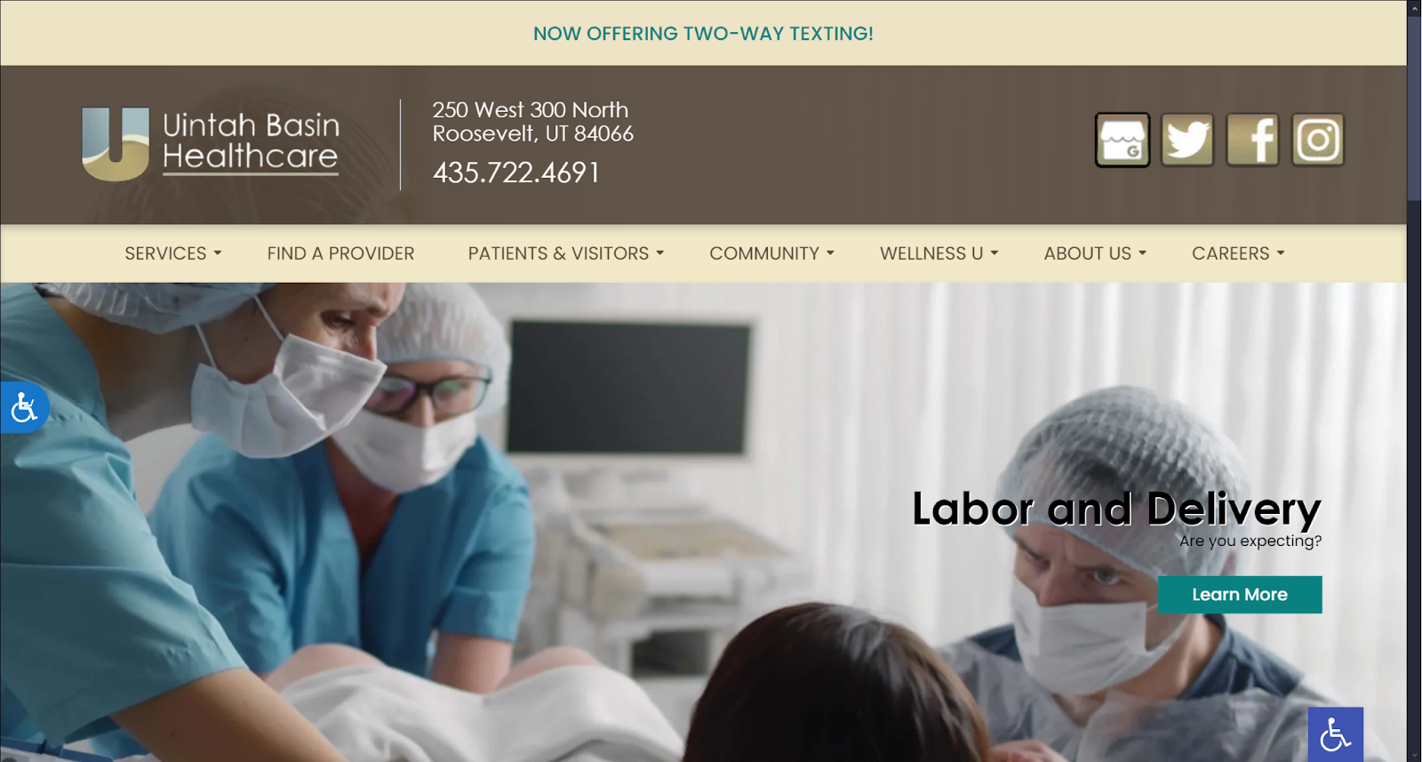
How We Graded United Basin Healthcare
- (4.25) Navigation: The static top bar on the landing page makes it possible to get anywhere you need within the site. The social media links are prominently visible, and connections for everything from services to career opportunities can be found here. It could be improved by being a roving top bar, but it is serviceable.
- (4.5) User Experience: This site clearly cares about the convenience it can provide its users. It actively promotes two-way texting with direct links to directions and click-to-call features.
- (4.25) Visuals and Color Theory: The imagery used in this website reflects the services they provide, while the color scheme brings warmth. Teal Green effectively highlights important action points, such as learning more about their services and links to the two-way texting they’re promoting.
- Parchment Beige: warm tone, 91% brightness, medium saturation, low hue
- Umber Brown: warm tone, 37% brightness, low saturation, very low hue
- Teal Green: cool tone, 49% brightness, medium-high saturation, medium hue
- Overall Score: (4.33)
Why We Think It Stands Among The Best Healthcare Websites of 2025
United Basin Healthcare provides its visitors with an effective, fast-loading website. Its visual elements are attractive, directly focusing on the visitor experience. While it lacks a roving top bar, it makes up for it with the abundance of information available on the menu and landing page.
Optimized 360’s Pick For The Best Healthcare Site of 2025
While we’re just coming into 2025 with the posting of this article, we believe the sites we reviewed will make an impact. We’ve reviewed each of them and analyzed their strengths and weaknesses, and we’re proud to announce our winner.
- Wisconsin Endodontic Group (4.92)
- Coal Creek Family Vision (4.66)
- Puri Pediatric Medical Group Inc (4.58)
- Patterson Family Pharmacy (4.42)
- 1620 Primary Care (4.33)
- United Basin Healthcare (4.33)
- Quantum Healthcare Services LLC (4.25)
Wisconsin Endodontic Group leads the pack with a near-perfect execution of all the most critical website design elements. It also integrates them to create a great visitor experience that will help drive practice growth. Contact the Optimized 360 healthcare website design team today to help drive growth and connection with your patients.