Everywhere you look, people are constantly communicating with phones and mobile devices. They use them to order food, connect with friends, and search for medical providers. We cannot underestimate the impact of these searches on healthcare marketing.
Studies show that 60% of healthcare-related searches come from mobile devices. If mobile optimization is not part of your web design plan, you will lose over half of potential new customers.
The Growing Importance of Mobile in Healthcare Searches
A large part of internet traffic comes from mobile devices. Therefore, having a site that works well on them is essential. Without a website optimized for mobile traffic, you severely impact your ability to engage with new visitors.
Further, patient retention levels are down for practices having websites without mobile optimization. Current and potential patients value their ability to engage with their healthcare through mobile devices. From scheduling appointments to asking questions and paying medical bills, mobile optimization is now an expectation.
The Statistics Speak Volumes:
- More than 60% of people initiate healthcare searches on mobile devices.
- Nearly 77% of patients will wait to schedule an appointment after visiting your website.
- The majority of patients use online scheduling for their first appointment.
- Google search rankings prioritize mobile-friendly websites.
Getting the most out of your SEO and marketing efforts requires that your website adapts to meet these trends.
Understanding Mobile Optimization in Healthcare Website Design
Mobile optimization is core to keeping your website competitive and relevant in the modern marketplace. Understanding this idea is the first step to making important changes. It helps you connect with your patients better. The process begins with understanding the elements of design that make a website responsive to mobile users.
A professional website design is essential, whether viewed on a desktop or a smartphone. Critical areas containing contact information, appointment forms, and service descriptions must be just a few taps away.
Below are some other key features of mobile-friendly website design:
Key Features of a Mobile-Optimized Healthcare Website:
- Responsive Design: Adjusts layout and content to fit various screen sizes.
- Fast Load Times: Ensures pages load quickly to reduce bounce rates.
- Clickable Elements: Buttons and links sized appropriately for touchscreens.
- Readable Text: Utilize Fonts and layouts that don’t require zooming or excessive scrolling.
Each feature enhances the user experience, driving engagement and ease of use. Several ways are available to achieve these features, including using image optimization to help reduce load time. This process ensures you can provide a high-quality visual experience without causing slow page load times.
How Mobile Optimization Improves Your Healthcare Website
Those seeking healthcare in the digital age have expectations about the service they receive online and in the office. Before quality care, convenience is the most important resource to the typical patient. Patients already have lives that are busy enough without stopping in the middle of their day to make a call.
Patient Communication
Human contact, even during healthcare, should be limited to when they seek it or visit the office. People now view a phone call from the office, which once served as a courtesy, as an imposition. The average medical patient would rather receive an email or text than a phone call.
Further, they’d rather communicate through a patient portal than call the office directly. Patients feel happy when they can manage most of their healthcare experience with a few clicks.
Improve the patient experience with:
- Online Scheduling/Rescheduling
- Google Map integration to make getting directions easy.
- Prescription refill requests through the online portal.
- Text and email notifications about upcoming appointments.
- Direct communication with the doctor via the patient portal.
These are the fundamentals of providing patients with a convenient, positive experience. You should also consider polling your patients to improve your service to them online.
Enhanced SEO Performance
This shit towards online interaction through mobile devices has not escaped the attention of Google and other search engines. This clear preference for finding and interacting with healthcare organizations has led to Google using mobile-first indexing. This means a mobile responsive site will find its way to the top of the search results faster than one that isn’t.
Your SEO efforts will be more effective when mobile optimization is part of your design. Using keywords, meta descriptions, and helpful content is important. However, they must be easy to see on a mobile device.

Mobile Optimization Challenges in Healthcare Web Design
While optimizing your website to serve mobile internet users is important, you must also know what to avoid. In the effort to improve your site, you may encounter numerous pitfalls.
Slow Load Times:
Healthcare is a complicated topic, and conveying information to patients efficiently and effectively can present many challenges. The saying “a picture is worth a thousand words” still holds, but they can be weighty.
Optimization is critical, as 53% of visitors leave if load times take longer than 3 seconds. The solution is to optimize images and use lazy loading. This helps reduce image size and stagger loading to improve load times.
Clumsy Navigation:
Techniques for easing navigation on a desktop don’t translate well to a mobile device. Mobile optimization must ensure that your site is equally easy to navigate on any device. You can achieve this by combining navigation elements into a collapsible menu. Also, use button sizes that work well on different platforms.
Overloaded Content:
Misunderstanding the meaning of the words “easily accessible information” in the context of web design is easy to do. Some designers and developers make the mistake of packing every page as full of information as is feasible. This can make a website cluttered and confusing, making information difficult or impossible to find. You can avoid this by organizing information on separate pages that are easy to navigate.

Mobile-Friendly Strategies To Enhance Your Healthcare Site
Mobile-friendly design starts with a website that is responsive enough to accommodate desktop and mobile visitors alike. Responsiveness, in this case, refers to the speed and the presentation of the available information and navigation elements.
The balancing point is providing this experience while retaining a seamless, professional experience that represents your practice.
Some key points in responsive design are:
Seamlessly Speedy Experience:
As mentioned earlier, modern patients are extremely impatient regarding loading times. If your site takes in excess of 3 seconds to load, you lose over 50% of your visitors.
This reaction goes beyond their visit to your landing page. The longer your internal pages load, the more likely they are to go elsewhere.
Optimizing web speed requires image optimization, caching technologies, and avoiding heavy scripts in your website design.
Effortless Navigation:
One of the first things a patient will look for on your website is your contact information. This includes your email address, phone number, office hours, and link to your patient portal. These elements should be prominently visible from the home or contact us pages. In both cases finding their way to this information should be effortless.
Responsive design uses interactive elements like buttons that are large enough to click easily. Menus should be easily accessible, with hamburger menus being common and effective. Your menu layout should be intuitive, with topics easily organized and selectable.
More to these designs exists than making it easy for your patients to find what they want. Patients easily understand a well-designed website. This makes navigation intuitive so patients can confidently find information.
This confidence translates to their perception of your practice and staff. Finally, be certain to check your website’s responsiveness across various platforms.
How Patients Benefit From Mobile Optimization
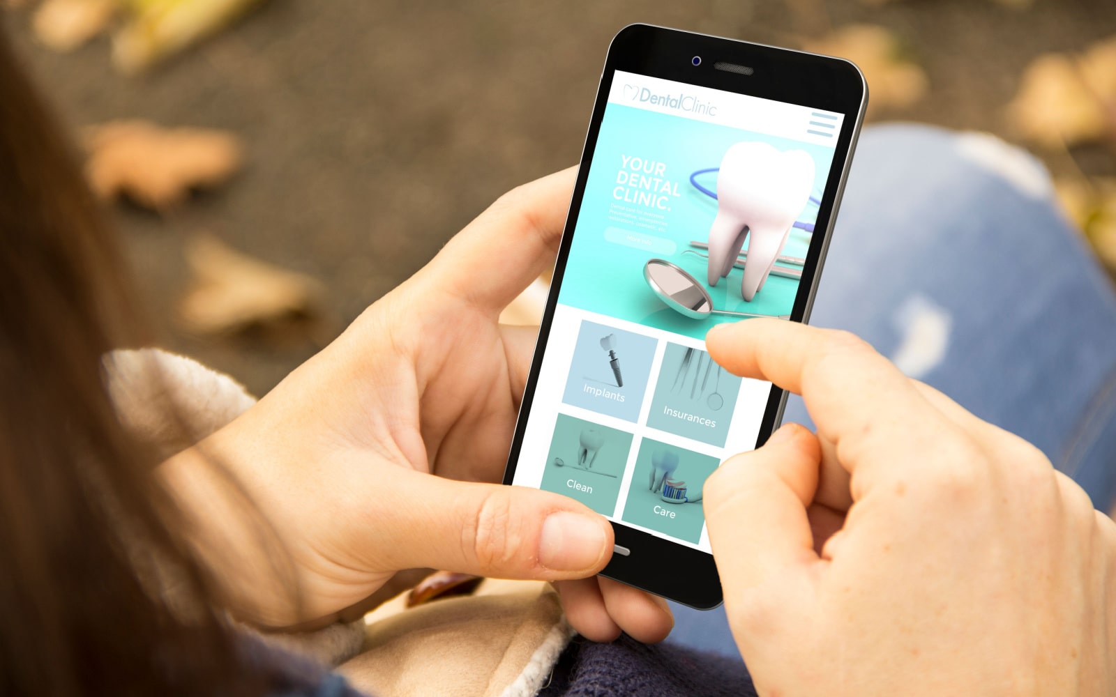
The most important aspect of healthcare is patient accessibility. It starts by making the care they need easy to find and is a cornerstone of their experience. Mobile optimization is the process of improving patient healthcare accessibility at every stage.
Patients benefit from mobile optimization by:
- Scheduling appointments through easy-to-use online forms.
- Using clickable phone numbers to streamline contacting your office.
- Coordinating their appointments through real-time availability, preventing fallthrough.
- Looking up symptoms or treatments for common ailments.
- Locating your practice location in seconds.
- Accessing patient portals for prescriptions or test results.
Patient experience barriers to receiving their healthcare in various ways. They may struggle with making and keeping appointments, finding addresses, or knowing when they need care. Online reminders, easy-to-navigate websites, and comprehensive patient portals can address all these concerns.
Embrace Mobile Optimization for Better Patient Outcomes
Mobile optimization improves patient outcomes in healthcare websites. These changes allow patients to overcome challenges associated with meeting their health needs. From online scheduling to follow-ups conducted through the patient portal, mobile optimization shows your patients you care.
Redesigning your healthcare site to meet the needs of the modern marketplace isn’t a simple task. It requires technical savvy, an understanding of the marketplace, and the fundamentals of SEO. Optimized 360 improves patient engagement and retention for our clients with mobile-optimized site design.
Contact our team of professionals and take the first step toward improving patient confidence and relationships with mobile optimization.

